 Adobe Community
- Home
- Photoshop ecosystem
- Discussions
- Re: Design the Photoshop Forums Banner Challenge 2
- Re: Design the Photoshop Forums Banner Challenge 2

Copy link to clipboard
Copied
***Voting for Round 2 has CLOSED! Congratulations to Matt Cannon View the submissions!***
Hi all,
Round one of the Forums Banner Challenge was awesome. Congratulations to the winner of the last round -- Trevor.Dennis, and well done to all of the other entries. Incase you missed it -- Check out the first Banner Challenge!
It sounds like you're itching to get going again, so let's kick off Round two!
Purpose: Create a fresh Photoshop Forums Banner for the Photoshop forums overview page.
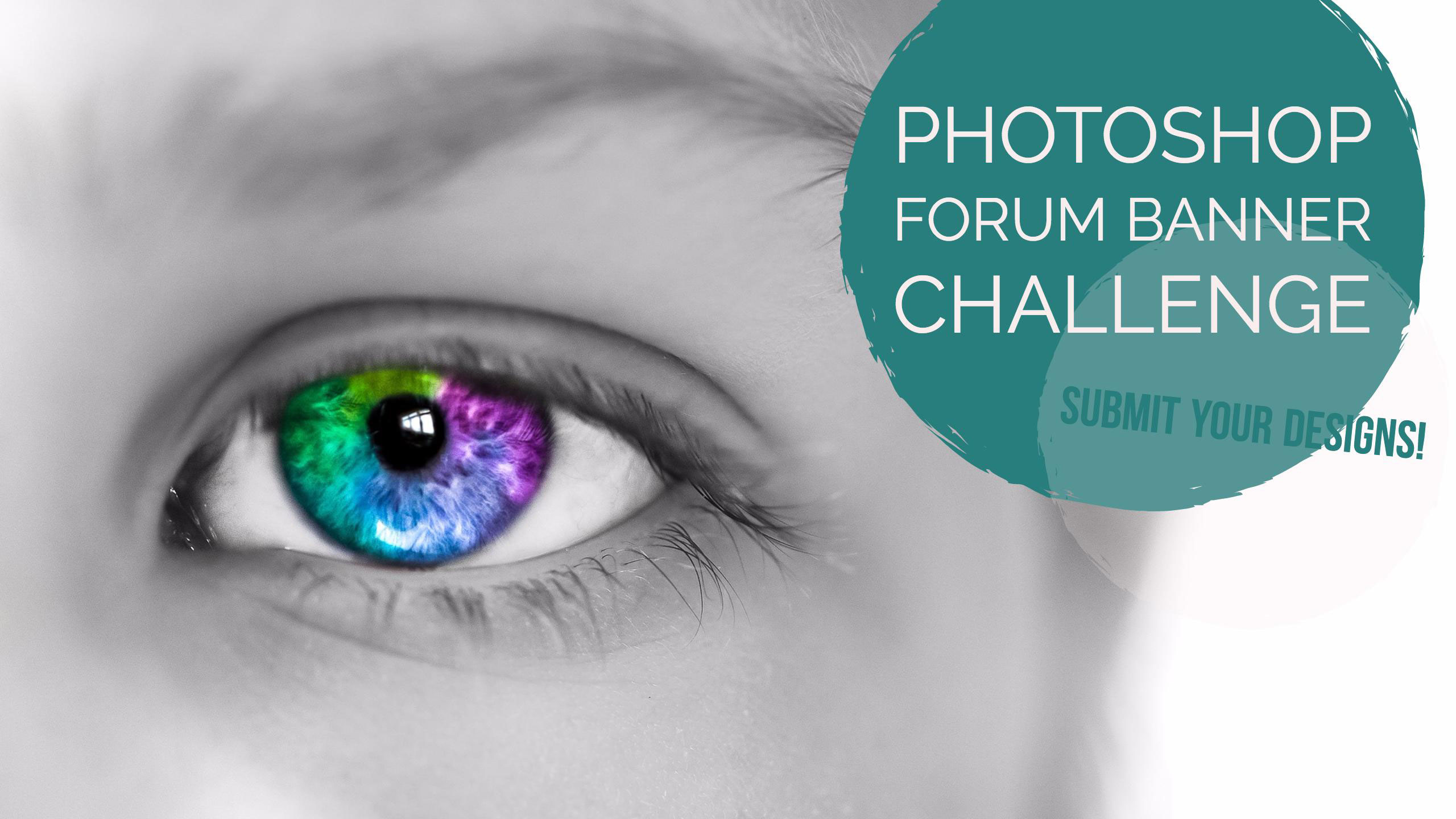
Using the template in this post, submit your Photoshop Forums Banner design by attaching your image in a response to this thread. We’ll then select the best submissions and use them for our Photoshop Forums banner image. A new banner image will be selected by an internal Adobe committee every 3 or so months and used in the Photoshop forums.
Use the above template design as a starting point for your designs which will help you position your imagery so it won’t be covered by the forum's CSS banner elements:
Image dimensions: 1150px ×150px (72dpi)
File size: 30kb or less
File types: .JPG or .PNG
Please keep all submissions Photoshop-related (Photoshop UI is OK to use), safe for work, and use image content you have the rights to (do not use any copyrighted images).
Post your designs to this thread, and we'll select the winner around February 2017. The chosen winner's design will be featured in the Photoshop Forums which is seen by over 35,000 people each month!
Looking forward to seeing what you can come up with.
Regards
Adobe Social Team
***Voting for Round 2 has CLOSED! Congratulations to Matt Cannon View the submissions!***


 1 Correct answer
As most of you have already discussed --
Congratulations to mrcannon for winning round 2 of the Photoshop Forums Banner challenge!
Your design has now been added to the main page and will stay until the next challenge.
Thank you to each who entered and to those that voted. Some really awesome entries.
Regards
Pete
P.S. Would you like to have more of these banner challenges in the future? Would you like other forms of community challenges?
Explore related tutorials & articles
 73
Replies
73
73
Replies
73

Copy link to clipboard
Copied
The way I am going, it is going to take me till some in February to complete my idea.  It's all good practice though.
Copy link to clipboard
Copied
I was concerned February was TOO MUCH time Trevor, if folks would like more time, that is easily arranged. Nothing set in stone here.
Regards
Pete

Copy link to clipboard
Copied
OK I'll kick off with one that was at the end of the other thread but was too late for the last competition entry - that should get the ball rolling


I'll post a new entry later this morning
Dave
Copy link to clipboard
Copied
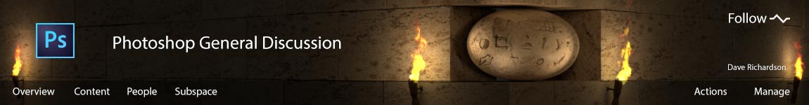
and a new one (click for full size).....
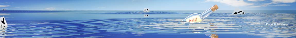
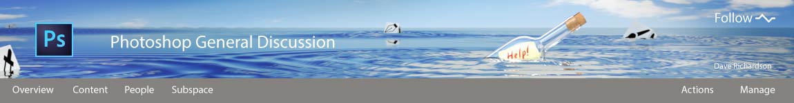
Dave

Copy link to clipboard
Copied
@Pete.Green,
I''m getting a 404 error on the Template link.
Re: banner dimensions. That should be 1150 x 150 px, right?
1400 would be way too wide and result in 250px cut-off.
Nancy
Copy link to clipboard
Copied
Nancy
The template is 1150 x 150 px
I tried to attach here as a PSD but it was a "forbidden" file type
Dave
Copy link to clipboard
Copied
A PNG Template:
Link to PSD
Nancy

Copy link to clipboard
Copied
Hi
Pete, I'v said this in the first tread. Can you confirm ?
Challenger dont need to add a grey background for the 35px Menu at the bottom, because the site add it's own black semi-transparent (opacity) background on the element. (Opacity is not the best way to handle this, rgba should be use )
.j-placeNavBg {
background: #000 none repeat scroll 0 0;
bottom: 0;
height: 35px;
left: 0;
opacity: 0.3;
position: absolute;
right: 0;
top: 0;
}
They should use a 30% black background to their muck-ups.
My 2¢ again.
Copy link to clipboard
Copied
I agree with you about the borders. It's not necessary to add them as this forum's software (JIVE) takes care of that.
postrophe wrote:
Opacity is not the best way to handle this, rgba should be used.
I doubt Pete or anyone else at Adobe has access to JIVE's underlying CSS code. I'm pretty sure that's all locked down and out of reach.
Nancy
Copy link to clipboard
Copied
Nancy OShea wrote:
I agree with you about the borders. It's not necessary to add them as this forum's software (JIVE) takes care of that.
postrophe wrote:
Opacity is not the best way to handle this, rgba should be used.
I doubt Pete or anyone else at Adobe has access to JIVE's underlying CSS code. I'm pretty sure that's all locked down and out of reach.
Nancy
I'm guessing that MadisonMLeupp would have the definitive answer for this.
(Reference Postrophe's post #8)
Copy link to clipboard
Copied
So for web novices like me. Do we need to do any different than produce an 1150 x 150 px image at less than 30kb that respects the text and border positions in Trevor/Nancy's templates - as per posts above?
Dave
Copy link to clipboard
Copied
No noting special. Just Export as JPG or PNG.
If you feel you need borders, I don't think anybody would reject your banner for having them.
Copy link to clipboard
Copied
Thanks for clarifying.
Dave
Copy link to clipboard
Copied
Hi
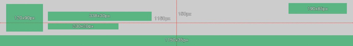
Dave (everyone), all you need to do is to create a concept image based on the overall header dimension.
The green elements give you indication of where JIVE add's elements (I bet they tested these width's for different languages).
So, keep heavy "graphics (dark elements)" out of the green indicators. Let JIVE CSS stylesheet do it's job. The Menu Bar is set to be 30% opacity, so the blending with your Artwork is kinda seamless. (and in my book, looks better). Check other Adobe forums.
Pierre
Copy link to clipboard
Copied
Pierre,
Correct -- Jive adds the gray bar at the bottom, those designing do not need to add any of the Jive UI elements to their designs.
Just design the main graphic elements around the green boxes on the template as those areas will likely be covered by something in Jive.
Nancy,
Thanks for the dimensions adjustment, I've fixed that in the original post
Image dimensions: 1150px ×150px (72dpi)
File size: 30kb or less
File types: .JPG or .PNG
All,
Thanks for the suggestions, I've replaced the broken links with the linked PSD template also in the original post.
I appreciate you pointing out the kinks that needed to be fixed!
Happy editing.
PG
Copy link to clipboard
Copied
I'm tossing my hat into the ring.

Nancy
Copy link to clipboard
Copied
I have one more from my bag of tricks. I'll call it quits now.
Magic:

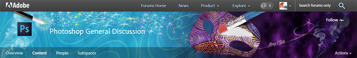
Nancy
Copy link to clipboard
Copied
Nancy OShea wrote:
I have one more from my bag of tricks. I'll call it quits now.
Magic:
Nancy

Oh yes Nancy. I like that a lot. It took me a moment to see and parse the 'magic' angle, but when I caught up, it lifted it from a great graphic to a very clever idea. You have even made your signature into a tiny bit of art all by itself. I'd say you have raised the bar with this one. It's really quite beautiful.
Copy link to clipboard
Copied
Hi
Nancy, sorry for the question. What's that oval shape ? An egg, a rock, an alien face, a painter pallet ... or else ?
I like to understand a concept. Thank's to shed light for me.
Pierre
Copy link to clipboard
Copied
postrophe wrote:
What's that oval shape ? An egg, a rock, an alien face, a painter pallet ... or else ?
You mean the mask?
Copy link to clipboard
Copied
Hi
Lol, I did not thought about that. 
Pierre

Copy link to clipboard
Copied
...ah...mask...now I get it...  That's brilliant. I love puns and double meanings....
Copy link to clipboard
Copied
This thread seems to have gone a bit quiet so I'll pop another in and bump it up a bit  . As normal - click to view full size
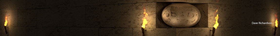
Dave

Copy link to clipboard
Copied

.jpg)

 AdChoices