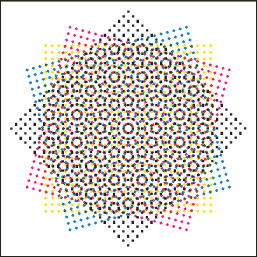
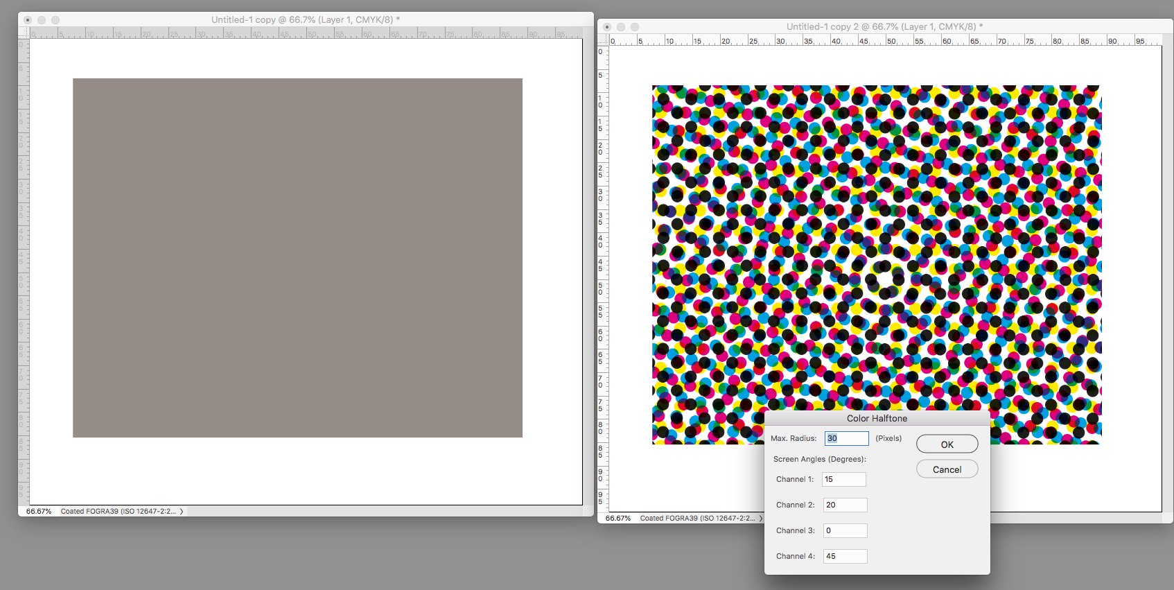
Two key elements enter into assigning halftone screen angles: the moiré that is part of every set of four-color halftones, and our tendency to see a string of vertical and/or horizontal dots in the reproduction as a distracting line.
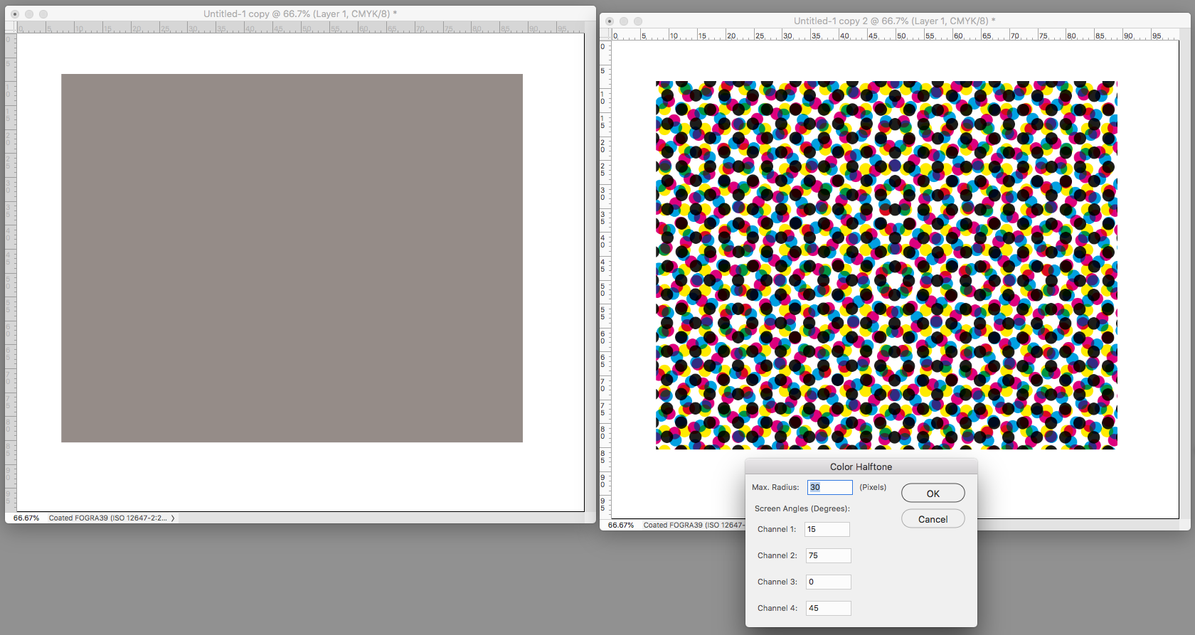
In order to avoid a disturbing visual interference pattern created when sequential halftone dot patterns are overprinted, screen angles should be 30 degrees apart. Unfortunately, since the angle repeats every 90 degrees, we can only provide a 30-degree interval for three of the required four colors (0, 30, 60, for example…90 repeats the pattern). We provide for the fourth color by inserting it midway between the others – a 15 degree interval -- creating a moiré.
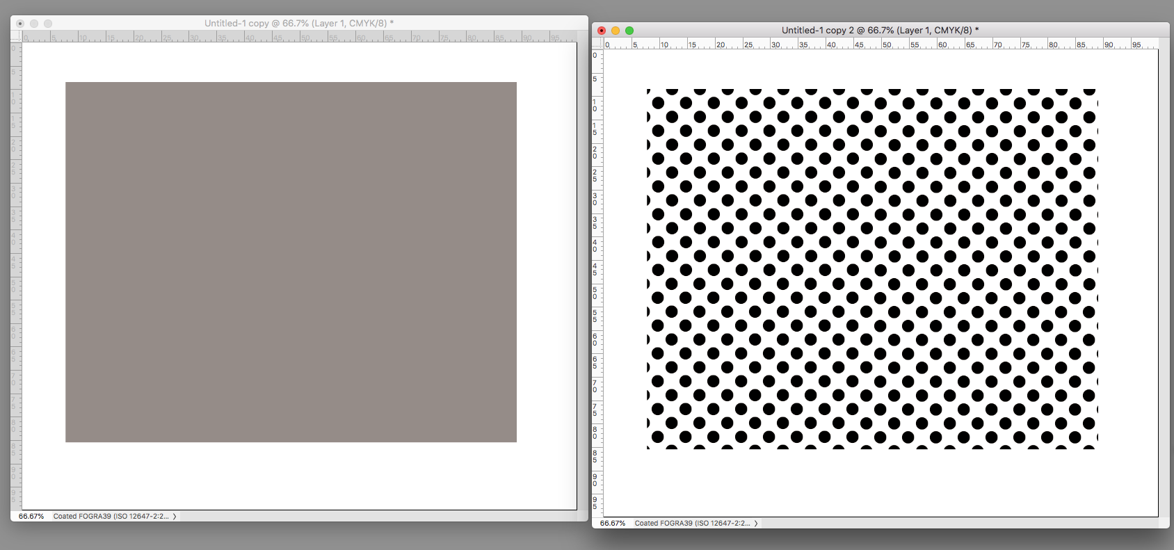
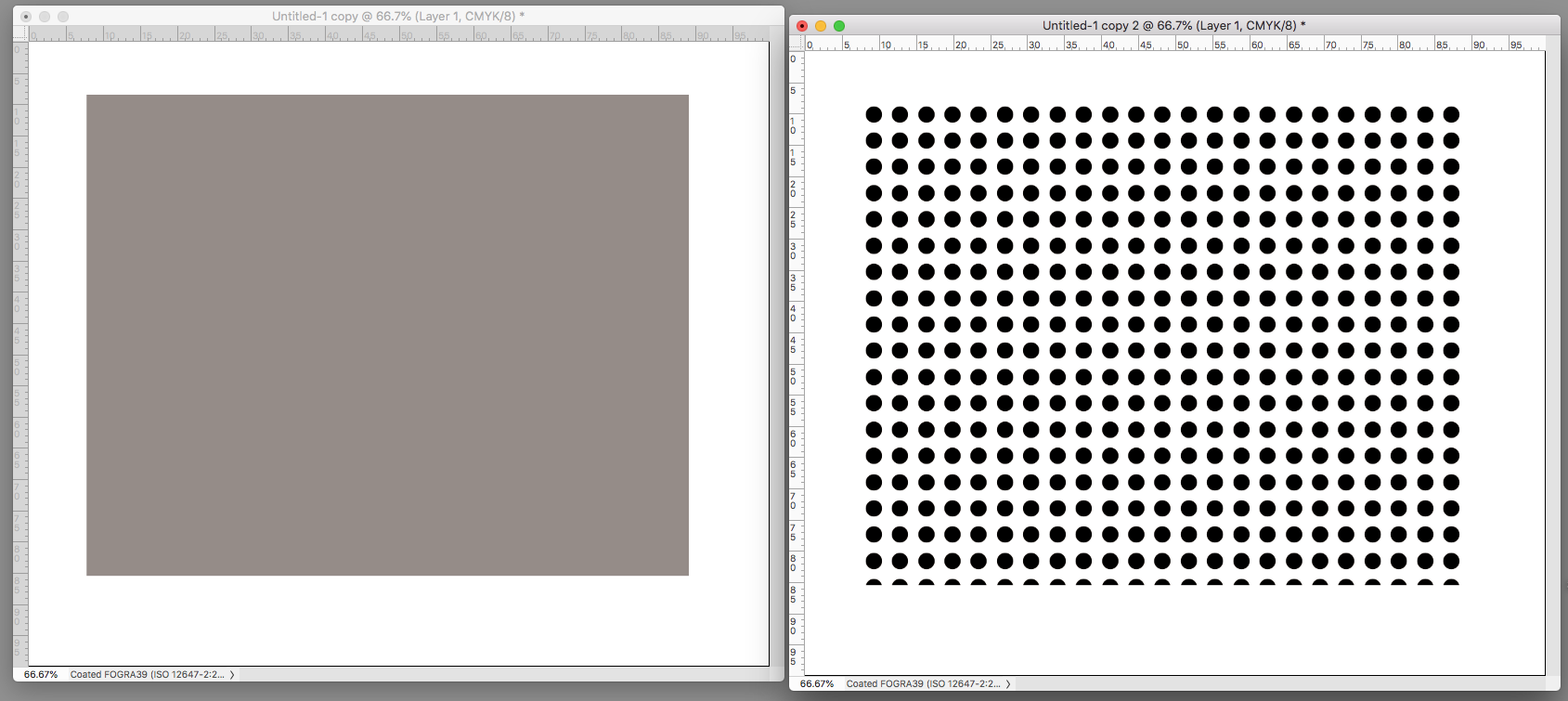
To hide that disturbance we assign hard-to-see Yellow to that spot. So, Yellow is usually angled at 0 or 90. It makes the moiré invisible -- with an important additional benefit: since yellow is difficult to see, we are not aware of the vertical and horizontal line of yellow dots it creates. (When I say hard to see: in some printing plants you will probably find a dark blue glass about the size of an index card on a table at the delivery end of the press. The pressman may hold that to his eyes to increase paper-to-ink contrast when checking the printing of a separate yellow halftone sheet in the set.)
There is no single best assignment of the C, M and K in the set other than the 30-degree spacing although some lithographers prefer a specific one. Here are versions that appear in Wikipedia. Whether there is a significant difference in results that cannot be compensated for on press is open to discussion. (Each ink's transparency, place in the print sequence, and ink density and trap -- all the lithographer's responsibility -- have far greater significance.)


 5
Replies
5
Replies


 AdChoices