 Adobe Community
- Home
- Photoshop ecosystem
- Discussions
- Re: Design the Photoshop Forums Banner challenge (...
- Re: Design the Photoshop Forums Banner challenge (...
Design the Photoshop Forums Banner challenge (on-going)

Copy link to clipboard
Copied
Hi all,
We’d like to start an on-going challenge to share your creative talent with others.
Purpose: Create a Photoshop Forums Banner for the Photoshop forums overview page.
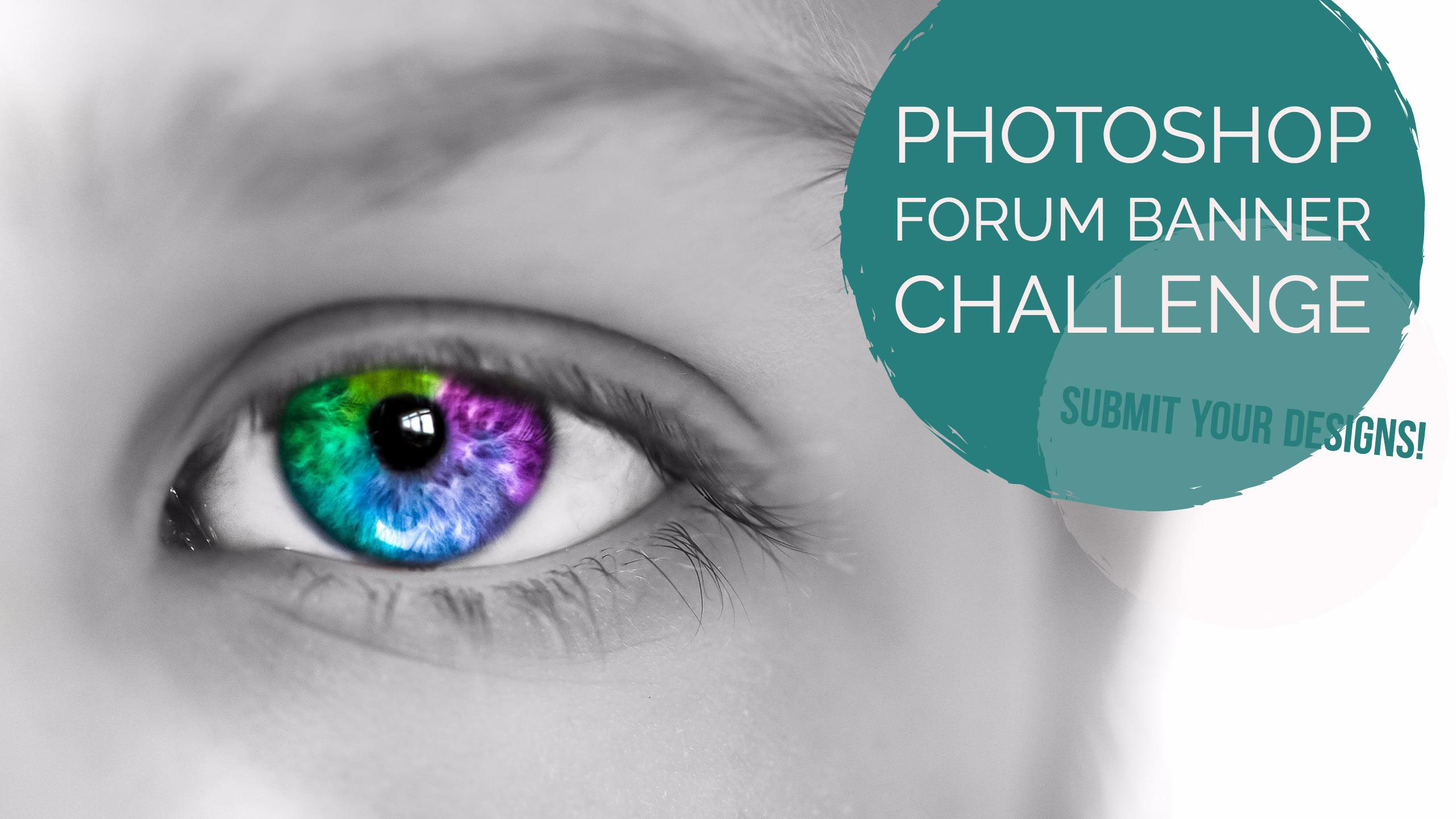
Using the template in this post, submit your Photoshop Forums Banner design by attaching your image in a response to this thread. We’ll then select the best submissions and use them for our Photoshop Forums banner image. A new banner image will be selected by an internal Adobe committee every 3 months and used in the Photoshop forums.
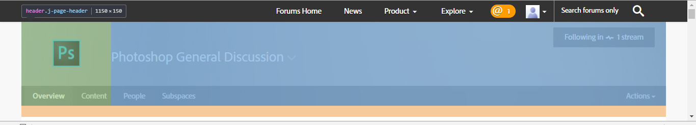
Use the attached banner template design as a starting point for your designs and will help you position your imagery where it won’t be covered:
Here's a link to another template, created by Trevor.Dennis with the PS logo, menu bar and text on a plain background to help with design element placement and help you keep everything within safe bounds.
Image dimensions: 1400px ×150px (72dpi)
File size: 30kb or less
File types: .JPG or .PNG
Please keep all submissions Photoshop-related (Photoshop UI is OK to use), safe for work, and use image content you have the rights to (do not use any copyrighted images).
Post your designs to this thread, and check back every couple of weeks where we’ll feature one of your designs here on the Photoshop Forums which is seen by over 35,000 people each month!
Looking forward to seeing what you can come up with.
Regards
Adobe Social Team


Explore related tutorials & articles
 153
Replies
153
153
Replies
153

Copy link to clipboard
Copied
I shall participate in the one following after this in three months 
Good Luck to everyone who participates !

Copy link to clipboard
Copied
Pete.Green wrote:
Using the template in this post,
Image dimensions: 1400px ×150px (72dpi)
Pete, the template is 1150px x 150px

And the existing banner is 1437px x 188px viewed 1:1 in Firefox.

Copy link to clipboard
Copied
This should be ironed out, it may cause problems with those whom enter the first time around.

Copy link to clipboard
Copied
Hi
The website.
The actual grey background.png image is actually : 2582px X 150px
The actual site container is set to :
#j-basic-wrap, .j-body-place #j-main {
max-width: 1150px;
}
That site is not « responsive » friendly. It look coded some era ago. ( my 2¢ )
Pierre

Copy link to clipboard
Copied
it was useful reading these comments about the dimensions
I use chrome and these are the dimensions I get:
they seem to be inline with the template provided. I would appreciate knowing if there is anything I am missing here as the dimensions you have mentioned in your comment are different?
Copy link to clipboard
Copied
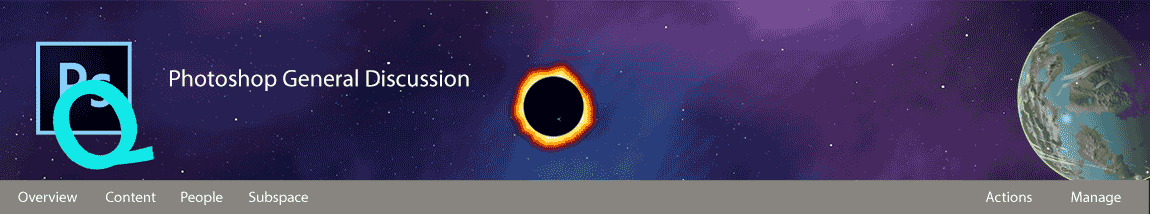
Looks like I'm first. I'm not sure if the whole visiting the site is a game of chance idea will go down, but I liked the dice as a medium for conveying multiple messages. I'm guessing we can have as many goes as we like? Not that I have time to be doing this. 
[EDIT] I've simplified two of the symbols for the sake of readability.

Copy link to clipboard
Copied
Hi
I'm a bit tired of static images (in this context). How about a nice Gif animation of wave bouncing right/left of the header ?
Since we are all surfing with Photoshop, I think the concept could fill the "Blending" ideas of the tools and all people mixing / exchanging ideas in this forum.
I failed to find an example (yet). But some might remember the decorative wave aquarium ??
Pierre
Copy link to clipboard
Copied
Animated GIF for a message header, I disagree keep it a static image; there are many visual reasons why static is better, one is, you think everyone looks at the header, when there concern is seeing the Ps icon and usually letting their frustration of Ps out on the forum
Copy link to clipboard
Copied
It's similar to bill boards on public buses, many people don't even notice them, there concern is, the bus has arrived I need to get to where I'm going.
Copy link to clipboard
Copied
Hi
1) I'v not said to remove the PS icon.
2) I'v been involved in creating interactive boards panels bus and interactive street bus stop cabin, as well at airport or bar clubs WC or websites, etc ....
3) Photoshop is getting better & better for creating animatrix stuff, so, time to show it. No ?
Pierre
Copy link to clipboard
Copied
Photoshop is getting better & better for creating animatrix stuff, so, time to show it. No ?
That is debatable.
Keeping it simple is key especially for a forum; then again, I've seen too simple, there is a threshold which regardless, what experience you have, or no experience you can get your point across, or lose the audience completely. I've seen bill board ads where I live that I found a disgrace selling a product, slogan were horrible etc; there are alot of doctors, many are lousy.

Copy link to clipboard
Copied
postrophe wrote:
I'm a bit tired of static images (in this context). How about a nice Gif animation
Please keep it simple and don't go overboard...
Lots of people are on slow internet connections and load times here are already much too long IMO. This forum is sluggish as it is.
Besides, a simple design usually is the best
Copy link to clipboard
Copied
Hi
You sure are not a webmaster to say this.
Please keep it simple and don't go overboard...
Sure. But I bet Adobe web guys know how to manage this.
Pierre
Copy link to clipboard
Copied
postrophe wrote:
You sure are not a webmaster to say this.
No, that's true. My coding skills wouldn't win me any awards, that's for sure.
I do remember at one time the forum had a fancy background image that they had to take down shortly afterwards, because it sent load times down to a crawl. But it looked gorgeous. That was full page, though.
Still, simple is god in my book, and for my part, I'm grateful for everything that just sits still on the web these days.Too much stuff that moves around and shouts "look at me look at me" already.
Copy link to clipboard
Copied
D Fosse wrote:
postrophe wrote:
I'm a bit tired of static images (in this context). How about a nice Gif animation
Please keep it simple and don't go overboard...
Lots of people are on slow internet connections and load times here are already much too long IMO. This forum is sluggish as it is.
Besides, a simple design usually is the best
I'm with you Dag, but not just because of slow loading times. This entire site is not the fastest, even with a great internet connection — least ways it isn't from anywhere I have tried connecting from NZ. My banner above is already too infinity, with the word 'Solutions' being unreadable, and the little light bulb is not much better, so I shall look again at that. But banners need to be simple, and say what they need to without distracting from the main focus of the page or site. If you go over the top, then the banner becomes the focus, and not the main page content, which is why folk visit the site after all.
Copy link to clipboard
Copied
postrophe wrote:
Hi
I'm a bit tired of static images (in this context). How about a nice Gif animation of wave bouncing right/left of the header ?
Since we are all surfing with Photoshop, I think the concept could fill the "Blending" ideas of the tools and all people mixing / exchanging ideas in this forum
Pierre
This is obviously not serious, but keeping with the questions and answers theme


Copy link to clipboard
Copied
Trevor.Dennis wrote:
postrophe wrote:
Hi
I'm a bit tired of static images (in this context). How about a nice Gif animation of wave bouncing right/left of the header ?
Since we are all surfing with Photoshop, I think the concept could fill the "Blending" ideas of the tools and all people mixing / exchanging ideas in this forum
Pierre
This is obviously not serious, but keeping with the questions and answers theme
Trevor,
Great concept -- questions pouring in, answers flying out. But I hate animated banners. After a while, they make my head hurt.
N
Copy link to clipboard
Copied
Nancy O. wrote:
Trevor.Dennis wrote:
postrophe wrote:
Hi
I'm a bit tired of static images (in this context). How about a nice Gif animation of wave bouncing right/left of the header ?
Since we are all surfing with Photoshop, I think the concept could fill the "Blending" ideas of the tools and all people mixing / exchanging ideas in this forum
Pierre
This is obviously not serious, but keeping with the questions and answers theme
Trevor,
Great concept -- questions pouring in, answers flying out. But I hate animated banners. After a while, they make my head hurt.
N

I couldn't agree more Nancy — it would drive me crazy. Pierre made his wee comment and the idea popped into my head, so I had to make it happen.
I'll tell you all a story. Many years ago I entered a competition to devise an advertising slogan for a certain racing oil company. So I opened up MS Word and typed what I considered relevant words, and hit those words with the thesaurus, which generated more words. With these words spread about the page you start to see links and segues, so I went from oil being slippery to the concept of winning, and won the competition with the phrase 'Ease your way to the front'. The cheapskates gave me a gallon of their precious oil for my trouble, and saved themselves the cost of using an agency.
That's what I did with my first attempt with the dice, although it was maybe a bit of a cop out because the dice idea gave me six faces to play with. Most of my working life was spent as a design engineer at Ford's research facility in the UK, and I used similar tools there. What do I need this device to do? What are the problems? Can I break them down into manageable chunks and solve them individually.
What I am trying to say here, is that most people are seeing this as a chance to put a pretty picture at the top of the page, but I think there needs to be a balance between form and function. I focused on what this, and the other Adobe forums, might use as a mission statement, but you could focus more on Photoshop. Nancy aces it by including the paintbrush in her design, and covers form and function making hers easily the best design so far IMHO.
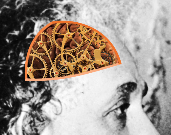
Writing this post has thrown up more ideas. Photoshop lets us make better pictures, so you could use the banner shape to display an evolving picture. Rough pencil lines on the left, through inked lines to progressively more colour and detail. Or all those Photoshop tools — I am thinking of stylised images of the tool icons interwoven across the banner. Or how about a side view of Einstein like head with a cutaway showing an animated clockwork mechanism? That would be really easy to do. There are videos of clockwork machines you could steal enough frames to make your repeating frame animation, and reveal it through the masked head? _Very_ quick and dirty, and it turns out there are actually some coloured pictures of Albert out there, but they are not our pictures. Are we allowed to use stock images?
Copy link to clipboard
Copied
I think Stock images would be fine for this purpose.
Copy link to clipboard
Copied
I like your though processes, Trevor. I really do.
I spend more time doing photo editing in Photoshop than anything else. I rarely get to use the great paint and texture features as much as I'd like to -- curse of the working class. Anyhow, thanks for the kind words. I almost didn't use the paint brush, thinking it was a little too trite.
I'm mulling over another design idea for a horror themed Halloween banner. But that will have to wait. Now it's back to the salt mines.
Nancy O.

Copy link to clipboard
Copied
Any continuous movemement can be really irritating. Think about the gif ads on some websites that make it hard to focus on the main content.
Copy link to clipboard
Copied
Looks really cool Trevor! First submission kudos go to you! (High-Five)
Do you have a version of it that you can attach to this thread without the PS logo, following, or PS general discussion text? Just the background image that you can share, the rest is populated by Jive.
Very nice!
Looking forward to what others come up with as well to make our decision making tough!
PG
Copy link to clipboard
Copied
Congrats Trevor, that was a sweep win
Copy link to clipboard
Copied
Hey StrongBeaver,
No design has been selected yet. I was just saying thank you, and giving a high-five of sorts for having the first submission. (I'll edit my post to take the word "win" out of it for now )
Once we get a good handful of submissions, we'll then do some internal voting and select the first banner to be used.
In a future voting phase, we can revisit all of the banners that have been submitted.
Regards
PG

 AdChoices