 Adobe Community
- Home
- Photoshop ecosystem
- Discussions
- Re: Design the Photoshop Forums Banner challenge (...
- Re: Design the Photoshop Forums Banner challenge (...
Design the Photoshop Forums Banner challenge (on-going)

Copy link to clipboard
Copied
Hi all,
We’d like to start an on-going challenge to share your creative talent with others.
Purpose: Create a Photoshop Forums Banner for the Photoshop forums overview page.
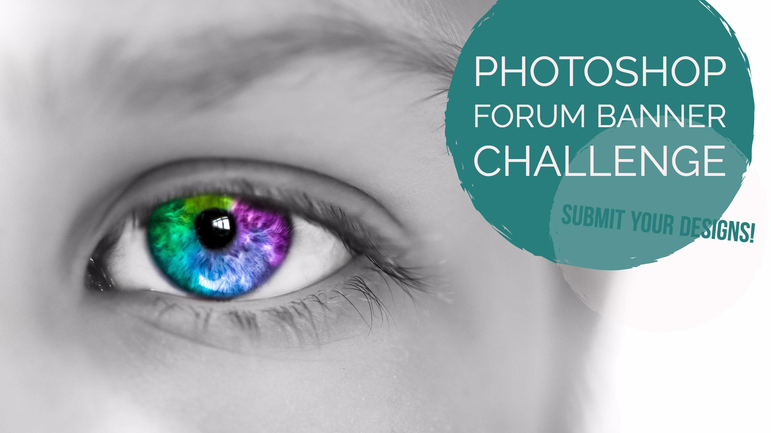
Using the template in this post, submit your Photoshop Forums Banner design by attaching your image in a response to this thread. We’ll then select the best submissions and use them for our Photoshop Forums banner image. A new banner image will be selected by an internal Adobe committee every 3 months and used in the Photoshop forums.
Use the attached banner template design as a starting point for your designs and will help you position your imagery where it won’t be covered:
Here's a link to another template, created by Trevor.Dennis with the PS logo, menu bar and text on a plain background to help with design element placement and help you keep everything within safe bounds.
Image dimensions: 1400px ×150px (72dpi)
File size: 30kb or less
File types: .JPG or .PNG
Please keep all submissions Photoshop-related (Photoshop UI is OK to use), safe for work, and use image content you have the rights to (do not use any copyrighted images).
Post your designs to this thread, and check back every couple of weeks where we’ll feature one of your designs here on the Photoshop Forums which is seen by over 35,000 people each month!
Looking forward to seeing what you can come up with.
Regards
Adobe Social Team


Explore related tutorials & articles
 153
Replies
153
153
Replies
153

Copy link to clipboard
Copied
My second one wasn't necessarily meant to be submitted  But it can be if it is liked

Copy link to clipboard
Copied
Thank you for that Trevor! It is very nice to see the banners together. I look forward to seeing further submissions and hope to submit some more ideas. I feel I am getting more inspired looking at all the latest submissions.

Copy link to clipboard
Copied
It's interesting to note that no one has used an actual photograph as the basic element...
Think of this as your chance to set straight the awful splash screens we've seen

Copy link to clipboard
Copied
Hi
It's interesting to note that no one has used an actual photograph as the basic element...
You mean a wedding photo ? Lol, I could not resist to say this.
Maybe someone can find a wedding photo (Knoll brothers & Adobe girlies) !!!!
Pierre
Agent Provocateur

Copy link to clipboard
Copied
Hey, you gave me an idea.  I'd have used Chris Cox, but I think he is a bit careful about having pictures of himself loose on the Internet.

Copy link to clipboard
Copied
Here ya go Dag.
I used to be a tour guide at an undersea aquarium. Can you tell?
For lack of a better title, I call this Spider Flower. But it could just as easily be a mutant sea creature or whatever you like.

Nancy O.
Alt-Web Design & Publishing ~ Web : Print : Graphics : Media
Copy link to clipboard
Copied
Nancy O. wrote:
Here ya go Dag.
I used to be a tour guide at an undersea aquarium. Can you tell?
For lack of a better title, I call this Spider Flower. But it could just as easily be a mutant sea creature or whatever you like.
Nancy O.
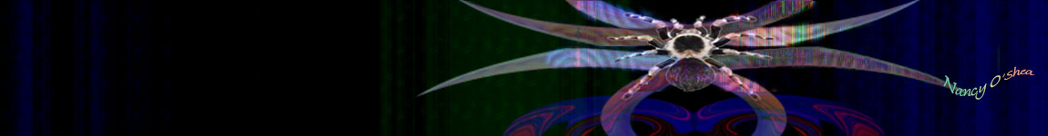
Hah! I love the signature — text on a path _and_ a subtle taper, but what were you saying about guys and dark blue?
This thread has been staying alive without help so far, but if anyone notices it getting well down page two, please bump it back into play.
Copy link to clipboard
Copied
Yes, that's wonderful. Really pops and makes you sit up and notice! My favorite so far.
Is that an interference pattern on it's, er... tentacles? (I'm looking at this on a small laptop). That's one of the things I especially liked about your other one - the texture and tactile quality.
The blue is more or less given - that's the Photoshop color, the color everyone immediately associates with PS. Just like green for DW and magenta for ID and so on.

Copy link to clipboard
Copied

Copy link to clipboard
Copied
Hi
Between or expending on these, see below, I wonder why someone don't try to do better for a header yet.
There's a bunch of teachers around here, have you asked your students to create something ?
What is blowing /slowing the forum is people injecting images into the threads (instead of external links (and) the social links. My 2¢
Pierre
Agent Provocateur
Copy link to clipboard
Copied
What is blowing /slowing the forum is people injecting images into the threads (instead of external links (and) the social links.
Am I missing something? Aren't we supposed to post submissions to this thread? I don't use Behance.
Nancy O.
Alt-Web Design & Publishing ~ Web : Print : Graphics : Media
Copy link to clipboard
Copied
As much as I love Kat's design, I still think a PS banner should stick to the trademark blue color scheme.
Copy link to clipboard
Copied
Hi
I still think a PS banner should stick to the trademark blue color scheme.
Sorry buddy, but I digress. The corporate blue logo could be enhance in an explosion of "Rainbow" color, too. Even if it's subtle.
Pierre
Agent provocateur
Copy link to clipboard
Copied
postrophe wrote:
The corporate blue logo could be enhance in an explosion of "Rainbow" color, too. Even if it's subtle.
OK, fair enough.
But Stock rubs me the wrong way. That makes me think of annual reports and corporate project descriptions...there are plenty of good photographers here.
Copy link to clipboard
Copied
Hi
But Stock rubs me the wrong way.
Same with me. Photographer or else, creativity is absolute here.
I'v seen some great Adobe "web header" over the years, maybe someone will blow my mind before next winter.
Pierre
Agent provocateur
Copy link to clipboard
Copied
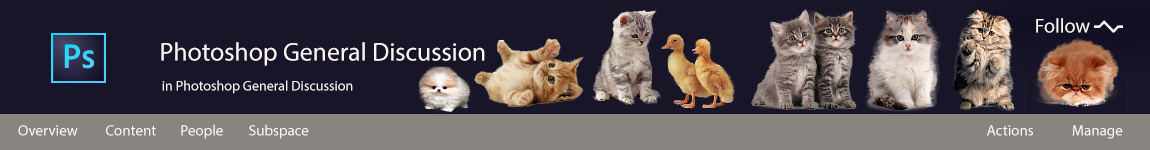
Or we could just go with the fluffy kittens
Copy link to clipboard
Copied
floramc, will like that you've added quackie splashies

Copy link to clipboard
Copied
Like "let's keep it professional?" 
I will try to get with some ideas in the coming days, splashie is very photoshop friendly ...
Copy link to clipboard
Copied
Fluffy kittens and duckies. Excellent!
At the risk of doing something unthinkable like using a real photo with lots of pink in it, 2 more for your consideration. I can't decide which background I like better though -- dark or light.
Bromeliad Dark
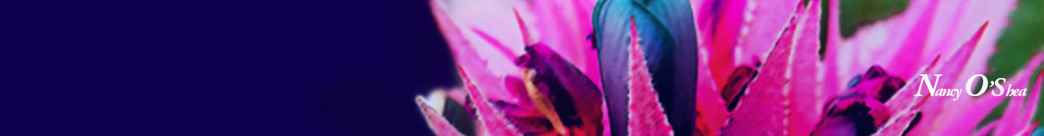
Bromeliad Light

Nancy O.
Alt-Web Design & Publishing ~ Web : Print : Graphics : Media
Copy link to clipboard
Copied
Nancy O. wrote:
I can't decide which background I like better though -- dark or light.
Nancy O.
There's no point asking all all the males in this thread. a) we wouldn't have a clue, and b) we'd all say dark blue.
Right now I am liking Kat's design. It has a modern Splash Screen look and feel, and would go down well with Adobe Evangalists like Julianne Kost, and Rufus Deuchler. But my vote would still go to Nancy's first design, because it is art while still being relevant.

Copy link to clipboard
Copied
Hi
Nancy, Note that Pete started the same at :
Design the Lightroom Forums Banner challenge (on-going)
A bit more targeted to Photography and Photographer, I think.
Pierre
Copy link to clipboard
Copied
Good to know, Pierre. But I don't use LR much & nothing I've submitted so far has been touched by LR.
N
Alt-Web Design & Publishing ~ Web : Print : Graphics : Media
Copy link to clipboard
Copied
Hi
I understand, but no-one have said explicitly that photoshop should be involved for proposing a banner.
Pierre
Copy link to clipboard
Copied
The lighter blue is closer to the Ps logo, so perhaps the lighter one
Copy link to clipboard
Copied
I feel an urge to apologize with Pete, it's a person I like, when I see the enthusiasm around kitties and quackies I feel at least 50% guilty. There was a time this community was all about taking things sharply seriously... I know he summarise the concept of being cool, but I have my wonders if Ps+kitties+quackies is what he would rejoice as a cool banner...
Nevertheless, I'll give this a try, just because it's photoshop  but I am in quite a busy time in my private so can't promise anything. If I make it for the show, I'd be happy to create something splashy. Let's the quackies stay for the connoisseurs

 AdChoices