 Adobe Community
- Home
- Photoshop ecosystem
- Discussions
- Re: Design the Photoshop Forums Banner challenge (...
- Re: Design the Photoshop Forums Banner challenge (...
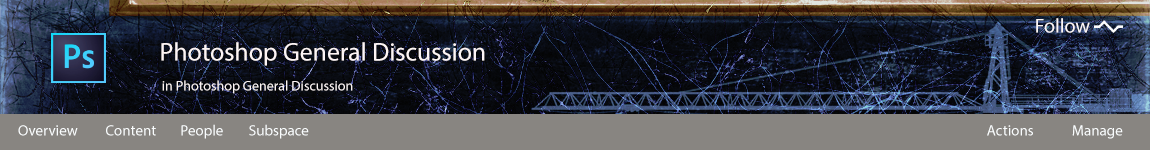
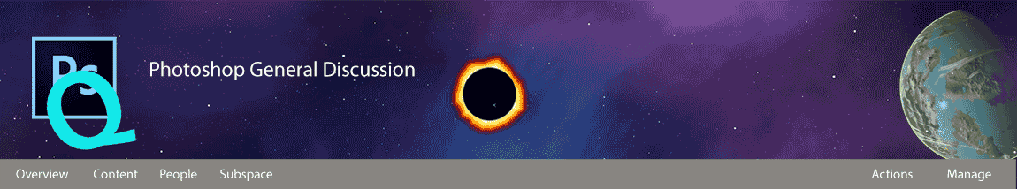
Design the Photoshop Forums Banner challenge (on-going)

Copy link to clipboard
Copied
Hi all,
We’d like to start an on-going challenge to share your creative talent with others.
Purpose: Create a Photoshop Forums Banner for the Photoshop forums overview page.
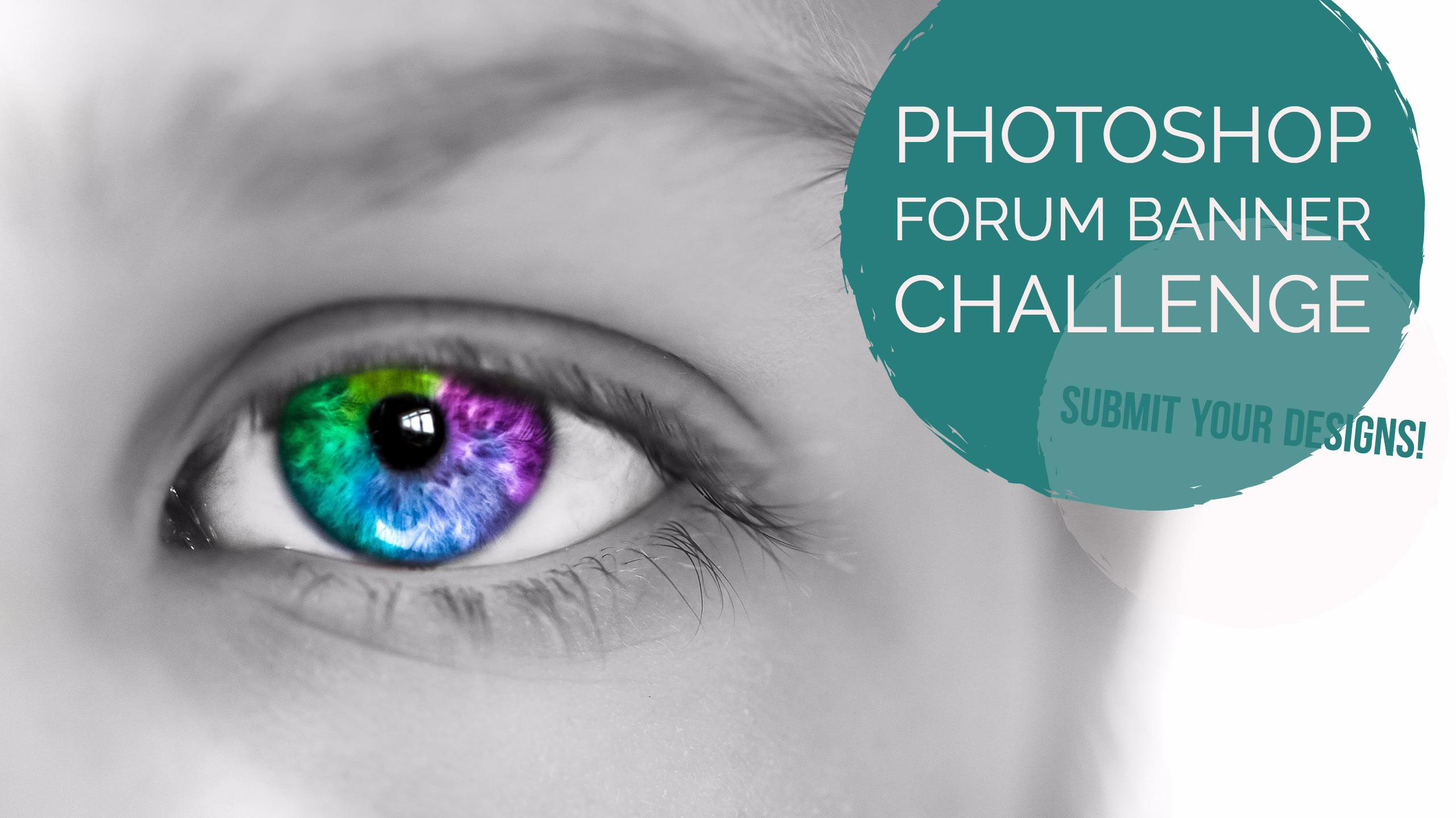
Using the template in this post, submit your Photoshop Forums Banner design by attaching your image in a response to this thread. We’ll then select the best submissions and use them for our Photoshop Forums banner image. A new banner image will be selected by an internal Adobe committee every 3 months and used in the Photoshop forums.
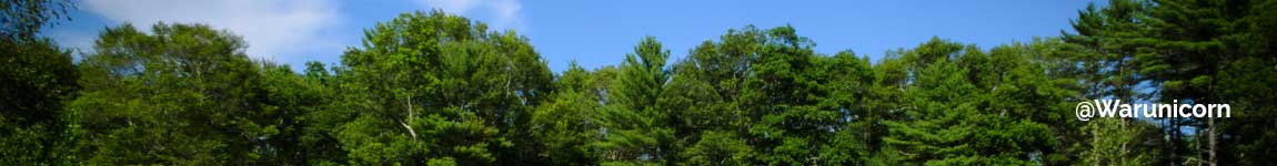
Use the attached banner template design as a starting point for your designs and will help you position your imagery where it won’t be covered:
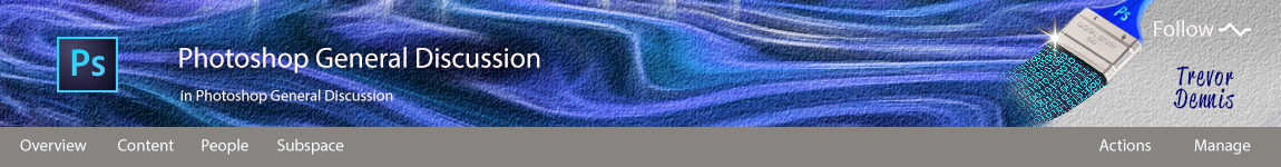
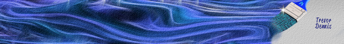
Here's a link to another template, created by Trevor.Dennis with the PS logo, menu bar and text on a plain background to help with design element placement and help you keep everything within safe bounds.
Image dimensions: 1400px ×150px (72dpi)
File size: 30kb or less
File types: .JPG or .PNG
Please keep all submissions Photoshop-related (Photoshop UI is OK to use), safe for work, and use image content you have the rights to (do not use any copyrighted images).
Post your designs to this thread, and check back every couple of weeks where we’ll feature one of your designs here on the Photoshop Forums which is seen by over 35,000 people each month!
Looking forward to seeing what you can come up with.
Regards
Adobe Social Team


Explore related tutorials & articles
 153
Replies
153
153
Replies
153

Copy link to clipboard
Copied
floramc wrote:
I feel an urge to apologize with Pete, it's a person I like, when I see the enthusiasm around kitties and quackies I feel at least 50% guilty. There was a time this community was all about taking things sharply seriously... I know he summarise the concept of being cool, but I have my wonders if Ps+kitties+quackies is what he would rejoice as a cool banner...
Nevertheless, I'll give this a try, just because it's photoshop but I am in quite a busy time in my private so can't promise anything. If I make it for the show, I'd be happy to create something splashy. Let's the quackies stay for the connoisseurs
Oh no! The fluffy kittens was taking the rise out of Dag and Pierre, and not a serious entry. They are not my pictures either, and nore were they stock images.
This idea came while typing out #94 with the splash screens, and is a serious entry.
Pete, are we definitely restricted to having white text on the Jive overlay? It forces us to compromise in order to have some of the text readable — like the right hand end of the above banner, which I would have loved to make a lot lighter, and several other banners have gone right ahead and used black text anyway.

Copy link to clipboard
Copied
Trevor.Dennis wrote:
Oh no! The fluffy kittens was taking the rise out of Dag and Pierre, and not a serious entry. They are not my pictures either, and nore were they stock images.
There are more than a thousands reasons to love this community. A touch of pride for seeing that fluffy kittens taking a rise might touch my achy quacky heart (don't tell my heart, my achy quacky heart, I just don't think it understand, and if you tell this heart, this achy quacky heart, it might blow up and splash the world) (you are welcome, if you had issues with that song before, I ruined it for the most of you, it's open to sue my achy quacky heart  ) - and I am very humbled to hear the quacks and the splashes being called to such high honors.
I still see this wonderful multimillionaire international top of the world company that had the Simpsons to partner with the incredible tools it created, dealing with a 1.63m Italian in Malmö who said quack and splash and few months later professionals call for the quackies on a banner. For Photoshop. The program I married 22 years ago, and surely this won't bring to a divorce with my best half.
It's just a small little woman in an isolated country who made a silly metaphor, I never meant to create such a trend... I feel like the Frodo of the ducks bearing the ring of splashes. I never thought it would go all the way to a banner...

Copy link to clipboard
Copied
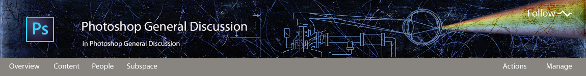
I know grunge is out, but...what the heck. I like things that look a little dirty. I even took the liberty to resurrect the old Photoshop eye:
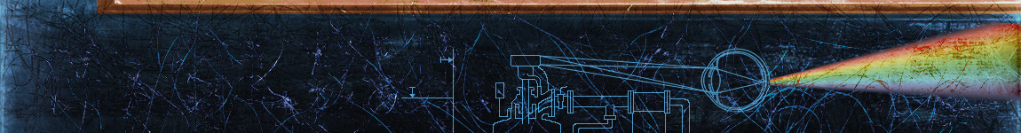
EDIT: shucks!...it's the dark side of the moon...I swear that wasn't intended, I only see it now...
Oh well. Scrap it. Back to the drawing board. Or at least lose the rainbow.
Copy link to clipboard
Copied
So this is it until I can think of something better....
Copy link to clipboard
Copied
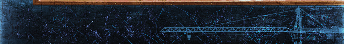
I really like the blueprint idea Dag, but I am not so sure about the heavy grunge treatment, and I wonder if what looks like part of a picture frame at the top of the banner is contributing? The 150 pixel height includes the menu bar, which steals some of your banner when put together.
So, for me, your prism banner is a clear winner, even if it is reminiscent of DSOTM — Pink Floyd didn't invent that experiment. This one has more relevance as well, because the rainbow colours fit nicely with the concept of digital image editing. I nudged this one up a bit which has hidden the picture frame, and place the split light beam in a nicer place. Yes, I think this one is really nice.
Copy link to clipboard
Copied
I 'think' this is where we are up to, but please shout if I have missed you.
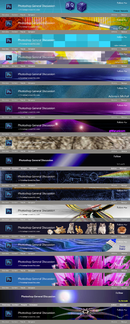
The animated banners were never meant to be serious, but I'll include them anyway.  Twenty one including the animations. That's way more than I expected.

Copy link to clipboard
Copied
Hi
One thing is sure is "photoshop" was influenced by filmmaking (moving images) & photography (static images) of the Knoll Brother work's.
They might even have been influenced by the late 60's ( Kubrick, 2001: A Space Odyssey (film)) ??
A little background for younger folks : Dreams from the Digital Darkroom — 25 Years of Photoshop
The Knoll's are younger than me, I wish I had more "cell/pixel" (mind of a scientist) in my brain, but seem my younger brother got most "scientist" cells. 
Pierre
Agent Provocateur
Copy link to clipboard
Copied
Trevor.Dennis wrote:
I am not so sure about the heavy grunge treatment, and I wonder if what looks like part of a picture frame at the top of the banner is contributing?
OK, you're right about the frame snip. What can I say? It seemed like a good idea at the time. I'll also need to tighten up the diagram a little (it was just a hastily modified version of my profile image).
But the menu bar is supposed to be transparent (a la Multiply), no?
Copy link to clipboard
Copied
Hi
But the menu bar is supposed to be transparent (a la Multiply), no?
Yes, that div is #000 (black) with an opacity: 0.3; (it's a CSS background)
If you reduce it like 0.05, you will see (even more) the Header background under it.
The HTML :
<header class="j-page-header">
<div class="j-placeHdImg">
<div class="j-placeHeaderWrap">
<div class="j-placeNavWrap j-loaded">
</header>
The CSS :
.j-placeNavBg {
background: #000 none repeat scroll 0 0;
bottom: 0;
height: 35px;
left: 0;
opacity: 0.3;
position: absolute;
right: 0;
top: 0;
}
.j-body-place #jive-body .j-page-header {
background-color: transparent;
background-image: url("/resources/statics/1413024/background.png");
background-position: left top;
background-repeat: repeat;
background-size: auto auto;
}
.j-body-place #jive-body .j-page-header {
height: 150px;
margin: 0 0 20px;
padding: 0 0 0 160px;
position: relative;
transition: background-image 0.5s ease-in 0s;
}
So, yes, the menu bar is semi-transparent. But, It's easy to modify the opacity.
Pierre

Copy link to clipboard
Copied
I may be wrong, but doesn't the Follow link have a CSS semi-transparent background, same as menu?
The old JIVE forum had text-shadows around titles which gave it some much needed pop. Sadly, plain white text is lost on anything but a dark ground. As such, I may need to modify my 1st submission.
Nancy O.
Copy link to clipboard
Copied
Hi
I may be wrong, but doesn't the Follow link have a CSS semi-transparent background, same as menu?
Yes, but with a different style : background: rgba(0, 0, 0, .3); with a Hover effect : background: rgba(0, 0, 0, .4);
Pierre
Copy link to clipboard
Copied
Nancy O. wrote:
I may need to modify my 1st submission.
Both times after putting up the grouped composites, I keep coming back to that banner Nancy. It really stands out from the rest.
I am so not into web graphics, so can Nancy or Pierre explain how we can test our designs? At least two of my offerings are going to fail if the menu bar is semi-transparent, so it would be useful to know beforehand what is going to work. At the moment, Kat's design makes best use of that transparency, but I have arbitrarily placed a solid grey menu bar over some of the banners in the composite, which apparently might be doing them an injustice.
So what's skinny? (To you guys who know how it works)
Copy link to clipboard
Copied
Hi
The menu block is Black with an opacity of 30% (or so). The problem is the "opacity: 0.3;" is a block level effect that also affect the white type too (so the type "menu items" are semi-transparent too.)
Plus, the Menu items have also a ruleset of opacity too (80%) :
.j-placeLinks li > a {
color: white;
display: inline-block;
font-size: 14px;
line-height: 18px;
opacity: 0.8;
overflow: hidden;
padding: 9px 15px;
position: relative;
text-overflow: ellipsis;
white-space: nowrap;
}
So, the Header background will affect the lisibility of the type. You can reproduce this in Photoshop.
I would recommend the JIVE coderzz to modify the Menu block to use as the (Follow link) a : background: rgba(0, 0, 0, .3) and remove the menu items opacity.
Some info : CSS3 opacity property
Another reminder, depending of your OS & browser(s) language, the text (and their container) will expand to fit the text. So, don't design too tight based on the english template (text/look).
Pierre

Copy link to clipboard
Copied

Copy link to clipboard
Copied

Copy link to clipboard
Copied
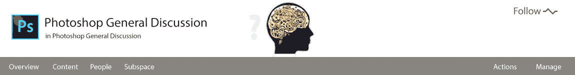
Hi @barzzeb49197134
Is that a representation of a "darkroom" for you ? If so, you are dead wrong. 
If it's a "black hole" or the kind, NASA have better imagery.
Pierre
Agent Provocateur

Copy link to clipboard
Copied
Looks like it's missing your graphics. Your completed banner needs to be submitte, but with no additional text besides your signature...
Copy link to clipboard
Copied
Benjamin Root wrote:
Looks like it's missing your graphics. Your completed banner needs to be submitted, but with no additional text besides your signature...
There are a few missing elements. You reminded me that I hadn't added a version without the overlay in post #100, and Dag's submissions have no signatures, I strongly suspect that the overlaid text can be any colour you like, so long as it is white, which is going to be a problem for Kat's banner. I think the last composite I uploaded has become downsized, so I'll fix that after uploading this.
[EDIT] I tried changing the composite, but the forum downsized it again. I'll leave it for now, and either split it to multiple posts, or leave the downsized composite and link to the full size one on Drop Box when Pete says we are near to the cut off.
Copy link to clipboard
Copied

Copy link to clipboard
Copied

.jpg)
Copy link to clipboard
Copied

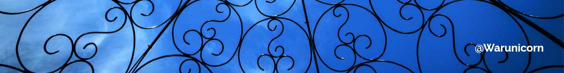
(Decided to go less abstract this time.) 
Copy link to clipboard
Copied
I finally set-up an Adobe Portfolio and Behance page. Still much work to do... But it's a minimal start anyway. You can see my banner submissions (including 1 new one) at links below.
Behance Photoshop Banners
Portfolio Nancy OShea
I think I'm finally done with this challenge .
Copy link to clipboard
Copied
Hi
I finally set-up an Adobe Portfolio and Behance page
Nancy, that's very cool. Let's see if Trevor will follow
Pierre
Copy link to clipboard
Copied
I applaud Nancy for her 'Where form meets function' tagline on her home page. It drives me crazy when that balance becomes skewed, and Adobe are as guilty as anyone when it comes placing more value on a pretty front end, than on making their sites actually useful. Adobe TV was perfectly fine when titles were in a long list with practical sub categories. You could always find a suitable title with minimal effort. After they changed it to make it 'look nice', you could no longer find specific videos that you knew were there, but didn't quite have the title word perfect. Grrrrr... We also see people visit these forums frustrated at going round in circles trying to find specific content. Heck, I have the same problem sometimes.
I'm a bit shy about putting up a Behance page, because there is some incredibly nice work there. Our Chuck has a great page, for instance. I don't do much personal photography nowadays, but I have just completed my registration for Max as a TA, and I can see how having content on Behance would be useful for that. I do occasionally upload to my old flickr page, but I think the majority of my output is spur of the moment visual gags driven by content on photography blogs like PetaPixel. This article is typical. A Darwin Award contender was lucky not have been hurt by an elk that charged her when she got way too close to photograph it, and the comments reflect a desire for to fly through the air, so I made it happen (very near the top of the comments) I'm embarrassed at my lack of attention to detail looking back at it, but I work very quickly, and I do have proper work that has to be done.
Right. Lynda.com has a Behance for Dummies title, which just about perfect for me, so I'll get some content online ASAP.
Copy link to clipboard
Copied
I like them.

 AdChoices