- Home
- Photoshop ecosystem
- Discussions
- Re: Doppler Radar Reflectivity Colors
- Re: Doppler Radar Reflectivity Colors
Copy link to clipboard
Copied
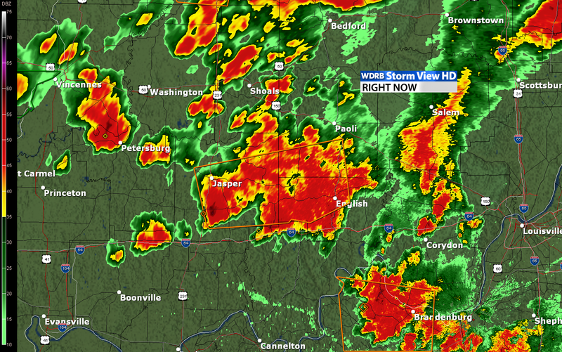
Can someone help me figure out how I could create a doppler radar looking image? I know you could go in with a paint brush and manually do this, but didn't know if there was a quicker way to do it with filters?
 1 Correct answer
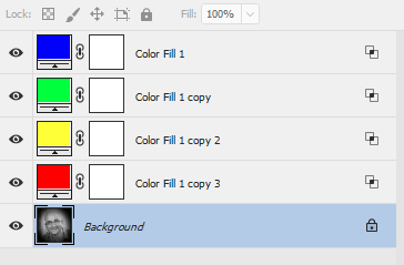
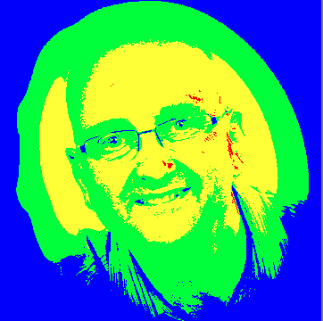
Do you have the Doppler areas as a greyscale. If so you can introduce false colour with Color Fill layers set to "Blend if underlying layer" is gray to a range for each false colour (and Blend if R or G or B to 254 or less to ignore the colour layers below)
Below is an image rather than a map - but hopefully you get the idea
Dave
Explore related tutorials & articles
Copy link to clipboard
Copied
Do you have the Doppler areas as a greyscale. If so you can introduce false colour with Color Fill layers set to "Blend if underlying layer" is gray to a range for each false colour (and Blend if R or G or B to 254 or less to ignore the colour layers below)
Below is an image rather than a map - but hopefully you get the idea


Dave
Copy link to clipboard
Copied
This definitely helps. Thanks Dave!
Copy link to clipboard
Copied
Since you have the scale running along the left side, you could use that to construct a custom gradient, like so:
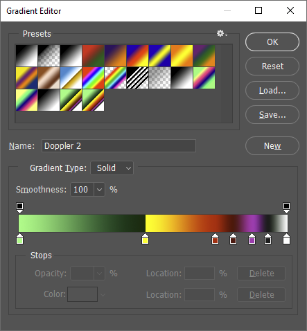
which you can then use as a Gradient Map:
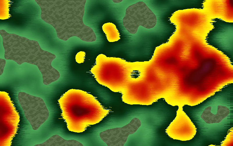
This is over a base of rendered Clouds, with the Wind filter to give it that Doppler/Sonogram look, and a color fill layer with a mask and a Pattern Overlay for the background texture.
Copy link to clipboard
Copied
You know, it never occurred to me to use a custom gradient map - good idea Semaphoric, that gives you just as much control as the fills - but with the ability to have more graduated steps. I like it ! ![]()
Dave
Copy link to clipboard
Copied
Thanks Semaphoric, that looks awesome! However, I'm still confused how you pulled it off haha. I understand how you've rendered the clouds and applied the gradient map layer. But is there a way to have more control over the clouds? I was thinking sliders to control lights and darks and all that stuff. Would you be able to show a screenshot of your layers? Thanks again!
Copy link to clipboard
Copied
This is the Layers Panel:
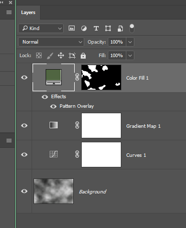
People have been asking for more control over Clouds forever. The "density" of the results depends on the size of the area. At around 500-600 pixels, they look wispy; less than that, it looks Gauzy/Hazy/Smoky; more than that, it looks sort of Nubby/Burled. The colors are controlled by the Foreground and Background colors, and any rectangle side evenly divisible by 128 will tile seamlessly.
Since Clouds is just a type of noise, you can resize an image with it up or down huge amounts with scarce ill effects. So, if you open a new doc the same size as your current doc, you can resize it to the size that would give you the desired "Density", run Clouds, resize the doc back to the original size, and then copy and paste it back into your original doc. If you are using the Legacy New dialog, the sizes of all open docs are available at the bottom of the 'Document Type' drop-down.
If you are just wanting the [resized] clouds in a selection, you can load the selection into the new doc via Select > Load Selection, as long as the docs are the same size, and the selection has been set to Quick Mask mode. You also need to set the loaded selection to Quick Mask while resizing the new doc.
Copy link to clipboard
Copied
I can't seem to edit my previous post, so I'll add here: You can see I've also added a Curves layer above the clouds, to control the contrast of the clouds, which will, in turn, tweak the way the Gradient Map looks.
Copy link to clipboard
Copied
Thank you very much Semaphoric, this is extremely helpful. I really appreciate the time you've put into this. Should definitely get the effect I'm looking for with this information.
