

- Home
- Photoshop ecosystem
- Discussions
- Re: Edited in ACR, Viewed in Bridge, Beautiful - C...
- Re: Edited in ACR, Viewed in Bridge, Beautiful - C...

Copy link to clipboard
Copied
Hello you Good Folk Advisors
I have a new Nikon camera and lens, a new computer and Eizo monitor, and I have taken up a new Adobe Photography CC subscription.
Last week I took some portraits using lighting at a photography show.
I edited them in Adobe Camera Raw and then viewed them through Adobe Bridge.
I was extremely happy with the results and they looked very 'professional'.
(I only take a photograph from ACR to Photoshop if there is a need).
I used Photoshop through Bridge to convert the 40MB Nikon NEF Raw file to a 600 x 400 pixel JPEG for my website.
When viewed in Bridge, this conversion is absolutely fine.
When I view this converted JPEG file through my Windows browser or on my website, it is comparatively poor compared to how it looks in Adobe.
- Dull, less punchy.
- Slightly darker.
- Black and white highlights and shadows are less black and white and photograph looks more dull.
- Colours are not the same and again a bit dull.
- Skin tone colours are redder.
- Less contrast between the background and the subjects hair so the hair blends into the background.
I am hoping that one of you good people may be able to find a solution for me as i am pleased with my images but not when I have to display them on-line!
Is there anything I can do with my Adobe software, my computer or monitor, or my process, so that when i am editing I can actually see what the image will look like when I convert it to a JPEG for viewing on a website.
Thanking you in advance for your anticipated help with this issue.
Kind Regards
Rob


 1 Correct answer
Thank you, that is helpful.
I look forward to hearing what you have to say.
Perhaps you can tell me what that document profile should be.
Explore related tutorials & articles
 30
Replies
30
30
Replies
30

Copy link to clipboard
Copied
It sounds like a ProPhoto file viewed without proper color management, and possibly on a wide gamut monitor. But it's impossible to say without seeing a side-by-side screenshot.
What color space are you working in? With raw files from ACR, this is determined by the "Workflow Options" in ACR. This color profile is preserved in Photoshop.
For web, you should always convert to sRGB before saving out/exporting, and you should always embed the profile. Then it should display roughly right in almost every screnario.
What Eizo model, specifically? Is it one of the wide gamut ones? If it is, you cannot use the native Windows web browsers, or the native Windows "Photos" app. They don't have proper color management, which is an absolute requirement for wide gamut monitors.
In short - you need to keep track of your color profiles, and never trust software that isn't color managed. Most of them aren't.
Copy link to clipboard
Copied
What I'm getting at is that this is all fairly simple - but it's possible that your monitor complicates things a bit. Then you need to take specific extra precautions.
So, screenshot, and which Eizo model.
Copy link to clipboard
Copied
Hello D Fosse
Thank you for your reply.
The monitor is an Eizo CG277
It has 2 colour spaces set up, an Adobe RGB and an sRGB
I am working in the sRGB colour space when creating images for viewing on-line.
When I am converting the edited NEF Raw image to a JPEG I am doing it as an sRGB JPEG.
This conversion looks exactly like the original edited NEF raw when viewing through Bridge.
When I have opened them up in ACR underneath the image it says I am editing in ADOBE RGB (which I have been doing)
When I changed this to sRGB the image did not change at all, well not that I noticed.
I am assuming this is because my monitor is set to an sRGB colour space?
May I ask how I would embed the profile when converting to JPEG.
I assume ticking the box when I open the image processor in Photoshop through bridge.
May I ask what screen shots you want?
I have attached 2 images I have converted to JPEGS that look fine in Bridge but not in Windows/on web.
I have now compared these 2 images on Bridge, on this message and on Windows browser:
The 2 images look better in Bridge than on here.
ALSO, they both look better on here than on Windows browser.
Many thanks again.


Copy link to clipboard
Copied
OK, the CG 277 is a wide gamut model and you need to take some special precautions. I have a CG2730, a CG246 and a CX240, so I'm well acquainted with these monitors.
First of all, these wide gamut models require full color management at all times. You cannot use applications that aren't color managed. Or you can, but then you can't trust what you see. Edge, Internet Explorer, Windows Photos, Windows Explorer - all these are out. Don't use them.
Without color management, sRGB - which is still the agreed-upon standard for file exchange without color management - will always display oversaturated on that monitor.
You could get around that by setting the monitor to the sRGB emulation, in which case it behaves like any standard gamut model. But that's a lot of money thrown out the window! That's not what you paid for. I use the sRGB emulation only when I have to use non-color managed software.
You need to use a color managed web browser. Firefox and Chrome are both fine, but if you use Firefox you should set it to color management mode 1 (google it).
For normal work in Adobe applications, fire up ColorNavigator (an essential component in this system), and create a new monitor profile with the monitor set to native gamut. Don't use any of the presets, not sRGB, not Adobe RGB, nothing. The monitor should be at completely native behavior. Then set the white point, black point etc as desired, and make the profile. This profile will be used by Photoshop etc to remap the data into your Eizo's native color space, and it will display correctly.
----
As for files posted on the web, it's really simple: Convert to sRGB, embed the profile, done. As long as you use a web browser with color management (Firefox, Chrome), this will display correctly, and identical to Photoshop. The browser will do the same remapping into monitor color space as Photoshop does, using your monitor profile.
Copy link to clipboard
Copied
Thank you again.
http://www.dragongraffix.com/PortraitTest/
I have now put both photographs on the web for your reference:
http://www.dragongraffix.com/PortraitTest/http://www.dragongraffix.com/PortraitTest
Currently I have 2 Gamuts set up on my monitor, sRGB and Adobe RGB and always work in sRGB unless i intend to print the photographs and then I work in Adobe RGB gamut.
Are you saying I am throwing my money away by doing this and that is not what I paid for?
How should I be approaching this?
"For normal work in Adobe applications, fire up ColorNavigator (an essential component in this system), and create a new monitor profile with the monitor set to native gamut. Don't use any of the presets, not sRGB, not Adobe RGB, nothing. The monitor should be at completely native behavior. Then set the white point, black point etc as desired, and make the profile. This profile will be used by Photoshop etc to remap the data into your Eizo's native color space, and it will display correctly."
Is this what you do?
Should I now create a third gamut (MONITOR NATIVE) and always work in that?
How does that then create a JPEG for the Internet with the same look as how it looks in Bridge?
Is it just by ticking "Convert Profile to sRGB" in thye image processor when converting?
Please can you explain your last sentence in your paragraph above in a bit more detail so I can understand a bit better.
Thank you once again, you have been absolutely brilliant!
Copy link to clipboard
Copied
You can just forget about Adobe RGB in connection to the monitor. It's irrelevant. Wide gamut monitors are just loosely referred to as "Adobe RGB" to distinguish them from standard gamut monitors. That doesn't mean they "are" Adobe RGB, because they aren't, any more than standard gamut monitors "are" sRGB. They are just fairly close.
The monitor has its own native color space. It doesn't have to match anything, Adobe RGB or otherwise. It is what it is and doesn't need to be anything else for color management to work.
Your monitor profile is a description of the monitor's native color space, just like the sRGB profile is a description of the sRGB color space. And so on. They are all standard icc profiles. It's exactly the same thing.
Here are my calibration targets/profiles at the moment. The first three are different white point and black points - I use this for output to different paper stock, to get an accurate preview on screen. You don't need to bother with that yet - but the fourth is the sRGB emulation that I use for non-color managed applications:

Adobe RGB is nowhere to be seen here. IMO that's a completely useless preset.
Here's one extremely important thing. Each of these has a corresponding profile. As I said, a profile is a description of a color space. In other words - the profile is a description of the monitor in its current, actual state. Every time I switch between these calibration targets, the profile also has to be changed to the one describing that particular behavior.
The ColorNavigator software does that automatically - but there's a catch. Photoshop loads the profile at startup and continues to use that profile until next startup. So every time you change profile, you need to relaunch Photoshop so that it can load the new profile.
Copy link to clipboard
Copied
All in all I have a suspicion you may be in a little over your head with that monitor - for now. You'll learn as you go along - but you really need to understand the basic 101 of color management to use these displays.
Once you do understand what's happening, there are no problems using a wide gamut monitor for everything. Only don't use software that isn't fully color managed - and if you have to; that's when the sRGB preset comes in handy. Not otherwise.
An Eizo CG is an extremely streamlined and labor-saving piece of equipment, quite aside from the high basic quality. You'll appreciate that after a while.

Copy link to clipboard
Copied
That's very comprehensive Dag. You should bookmark the thread for the next person who posts with Eizo related issues. I've done that, for times you are not around. 
Copy link to clipboard
Copied
I used (and have as my second monitor now) an Eizo ColorEdge CG241W but wanted to upgrade the size and quality.
I went for the CG277 rather than the much newer CG2730 and CG247x as it had a good reputation among photographers.
I am learning as I progress, and even Eizo UK have been extremely helpful, I am talking to technicians rather than photographers with the knowledge. Now I am speaking to you, I believe I have that so I thank you as your help has been greatly and gratefully appreciated!
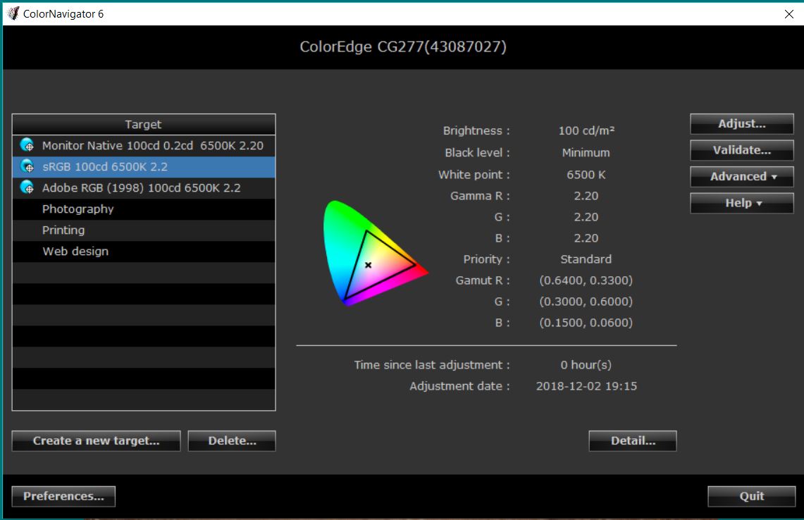
On your instruction I have now created a third native profile / calibrated target.
I have attached 3 screenshots of the Native, Adobe RGB and sRGB profiles created in ColorNavigator.
My observations looking at the 2 photographs I sent you in Bridge are:
- The images in Native and Adobe RGB profiles are very similar.
- In Native and Adobe RGB the images are richer, warmer, and more saturated and the skin tones richer. warmer and much redder in colour.
While in NATIVE I duplicated the image and re edited it again to make it look right.
I then switched the monitor to sRGB profile (which I assume most people have sRGB monitors and this is how it will look to them) and my re edited photograph looked bad. It was too pale and washed out and the skin tones made the subject look not very well.
Please can you throw some light on this for me?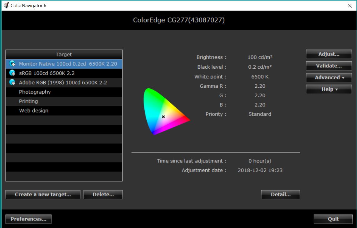

Copy link to clipboard
Copied
IN ADDITION TO THE ABOVE:
I edited the image to look fine in 2 profiles on the Eizo CG277 monitor:
1. NATIVE MONITOR
2. sRGB
I then created JPEGS and uploaded them on my webpage.
I then viewed the webpage on a basic and simple sRGB monitor that most people have (not Eizo).
Like above, It was too pale and washed out and the skin tones made the subject look not very well having been edited in NATIVE profile rather than sRGB.
Dag please help me understand what is going on here???
Many thanks
Copy link to clipboard
Copied
Ok. I need to get really basic here.
Photoshop/Bridge/Lightroom are color managed. That means they perform a profile conversion on everything they send to the monitor. This is a perfectly standard profile conversion from the document profile (sRGB/Adobe RGB/ProPhoto) and into the monitor profile. Just like any other profile conversion. This conversion is performed by the application, on the fly, as you work. It happens continuously the whole time. Change a slider, and a new conversion is performed. These recalculated numbers are sent to the monitor, thus representing the file correctly on screen.
For this to work, the profile has to be an accurate description of the monitor's actual response. The description has been made on the basis of measuring color patches and recording the results. If the description is incorrect, the wrong numbers are sent and the application displays incorrectly.
If you change anything in the monitor, like e.g. from full gamut to sRGB, the current profile is no longer an accurate description. Then you need another profile that reflects the new behavior. This is important! Monitor behavior and corresponding profile. They go hand in hand, one follows the other.
An application without color management doesn't do anything of this. It just sends the document numbers straight through, end of story.
As long as you work within a color managed application (Photoshop, Bridge, Lightroom), and the monitor profile is the correct one, it will always display correctly. This is what color management does. This is the whole purpose, preserving appearance by remapping the numbers.
---
Photoshop/Bridge/Lightroom/color-managed-web-browser - they all load the monitor profile at application startup. They ask the operating system what the default monitor profile is, get it from the OS, and then keep using that profile for the duration of the session. If the profile is changed at system level, the application still keeps using the same profile - which is now wrong. So they display incorrectly. That's why you need to relaunch the application, all of them, if you change monitor profile. If you switch the monitor/ColorNavigator into sRGB mode, relaunch the application, all of them.
Copy link to clipboard
Copied
Thank you for this.
I do fully understand what you are saying here.
Before our conversation I did not realise the application had to be closed down and relaunched in order for colour management to be maintained.
From what you are saying, I am assuming the issues i have described in my previous message is due to this?
I am making the assumption that relaunching the application means closing it down and then double clicking on the icon on the desk top in order to start it up again?
What I shall now do is:
1. Set my monitor to NATIVE.
2. Edit the photograph from scratch within the NATIVE profile.
3. Export the edited NEF Raw image as an sRGB JPEG.
4. Load the image onto a webpage.
5. View the webpage on other monitors on Google Chrome and Mozilla Firefox to check that the image remains the quality I had viewed it in Bridge within a NATIVE profile.
6. Come back to you with my findings.
Many thanks once again!
Copy link to clipboard
Copied
Yes, relaunching means closing down the application and starting it up again. That's the moment the application loads the monitor profile it gets from the operating system.
You're still placing too much significance on the "native" part. This gamut remapping is part of the profile conversion itself - whether you run the monitor at full gamut, or restrict it to Adobe RGB, or restrict it even further to sRGB, it's all routinely handled in the same way.
The monitor's gamut can be whatever it wants to be. As long as the profile describes that gamut - that exact position of the primaries - it's all good to go.
That's why you don't want to limit the gamut to any Adobe RGB preset. There's no use for it. There is a little more use for the sRGB preset, when you need to use the monitor with an application that doesn't do color management.
Copy link to clipboard
Copied
I have to set my monitor to something.
I had 2 profiles set up, Adobe RGB and sRGB and you told me to set up a NATIVE profile which I did.
So by using this profile why am I placing too much significance on the "native part" when it is what you generally use when you use colour managed applications?
Many thanks
Copy link to clipboard
Copied
The point I'm trying to make is that all these presets that emulate any particular color space have one thing in common: They all limit and restrict the monitor's capabilities in some way. Even the Adobe RGB preset limits the monitor's gamut because the monitor isn't an exact match to Adobe RGB. You have to move the primaries a little bit inwards and sideways to match the Adobe RGB gamut boundary.
You don't want - or need - any of that. You want the full capabilities of the monitor, unrestricted.
The only exception is the sRGB preset. You need that for working with non-color managed software. Other than that, you don't need it.
Things are a bit different in the video/cinema world, where standard color management is normally absent. In video, you set the monitor to emulate a certain response and leave it at that. Most of the emulations in ColorNavigator are there for that purpose. Eizos are extensively used for video because of this.
Copy link to clipboard
Copied
I did the following:
1. Set my monitor to NATIVE.
2. Edited the photographs (2) from scratch within the NATIVE profile.
3. Export the edited NEF Raw images as an sRGB JPEGs.
4. Load the images onto a webpage.
5. View the webpage on other monitors on Google Chrome and Mozilla Firefox to check that the image remains the quality I had viewed it in Bridge within a NATIVE profile.
http://www.dragongraffix.com/PortraitTest
v1 is an edit.
v2 has a slightly warmer white balance and a touch more exposure and looks a little more redder.
When viewing the photographs in Bridge and on-line when my monitor is set to NATIVE the images are look virtually the same.
v2 looks a little warmer.
When viewing the on-line images on a different sRGB monitor v2 looks like v1 in Bridge while in NATIVE mode.
I think what I am saying is I am still not getting my head around getting an image edited how I want and then converted to an sRGB JPEG that looks on-line in Chrome (a colour managed browser) the same as my edited photograph in Bridge???
Copy link to clipboard
Copied
OK. Here's one thing you can try if you still can't get a perfect match between Photoshop/Bridge and a color managed web browser (which you should, and which I get here).
Make a new calibration target/profile, and when you get to naming the profile, before the actual measurements start, there's a customize profile-button:
It takes you here, where you set profile policies to Version 2, and Gamma value:

The latter option makes a matrix profile, which is generally a safer option than the rather complex table-based (LUT) profiles that ColorNavigater makes by default. Most other calibrators make matrix profiles by default, but not ColorNavigator. In any case, some applications have problems with LUT profiles and may display incorrectly. In my own experience Photoshop does just fine, but Firefox has had issues with them.
Version 4 may need to be specifically enabled in the browser. There's no particular benefit to v4 over v2 anyway, so just go with v2. That's what most of us do.
Copy link to clipboard
Copied
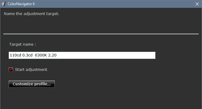
I have set this profile up as you suggested.
I used Monitor Native again so I am using the whole capability of the monitor.
I reduced the colour temperature from 6500 K (recommended by Eizo UK) to 6300 K (recommended by you)
I used Version 2.2 and Gamma Value as you suggested.
I do not know what your 0.3cd value is for as you have 110cd value for monitor brightness.
When I move from the old native profile to this new profile the images do not appear to change at all.
May I kindly ask whether the change I will observe is when I create an sRGB JPEG within this new profile?
Thanks again
Copy link to clipboard
Copied
Dags
In addition to my message above, below an image open in ACR one can change the colour space,
please see the 2 screenshots below.
I can change the colour space that the photograph is being editing in to any profile available to the monitor including the ones I have set up through Color Navigator.
The screenshots show an sRGB, Adobe RGB and the Native profile you encouraged me to set up.
May I kindly ask which one of these I should be editing in? Should it be the one the monitor is set to?Many thanks, again you help is appreciated!


Copy link to clipboard
Copied
No, no, no. You're mixing up document profile and monitor profile. That's the one single thing you must never do!
Don't do anything with the profile from Colornavigator! It's being set up automatically. Never use it as document profile. This is a profile conversion from document profile into monitor profile. You need both in their right places.
I have to go, I'll check in later, just needed to get this straightened right away.
Copy link to clipboard
Copied
Thank you, that is helpful.
I look forward to hearing what you have to say.
Perhaps you can tell me what that document profile should be.
Copy link to clipboard
Copied
This is a lot simpler than you think. You're looking for complicated solutions, but it all basically works out of the box. Just let it. If you have changed any color settings - reset them to the way they were, and don't do anything. Run the ColorNavigator software, let it create the profile, and then don't do anything.
I wrote in a previous post that I think you're in a little over your head with that monitor. I think so even more now. To use these monitors, you absolutely need to understand the basics of color management - not how it works, but what it does. And you also need to know which of your installed application do color management, and which don't, and what the difference is.
So here's from the beginning.
The document profile should always be a standard color space - sRGB, Adobe RGB, ProPhoto. Never anything else; those are the choices. Never use the monitor profile here - that defeats the whole purpose. It effectively disables all color management altogether. If that's what you've been doing, it explains all your problems.
You always need two profiles in all color management. There's a source profile, and a destination profile. Each is a description of its corresponding color space - in this case, the document (source) and the monitor (destination). One single profile doesn't do anything on its own. That's like one hand clapping.
The monitor profile, the one made by Colornavigator, is automatically set up at system level. Photoshop/Bridge/ACR loads that profile when the application starts up. It just asks the operating system what the system default profile is, and uses whatever profile it gets from the OS. That's also why you need to relaunch the application when switching profiles.
This profile is then used in a standard profile conversion, performed by the application on the fly, as you work. All the RGB numbers are continuously converted into the monitor profile, and these recalculated numbers are sent to the monitor. Every time you change a slider, a new conversion is performed and the result sent to the monitor.
If these two profiles are identical, you get a null transform - nothing happens, no numbers are changed. The original numbers just go straight through. That's the very definition of no color management. And remember - with a wide gamut monitor you always need full color management.
When you set a color space in ACR, that profile follows the file into Photoshop, and overrides the working space. That's what "Preserve Embedded Profiles" means. That's the default policy; never change it.
Copy link to clipboard
Copied
Thank you so much for that explanation.
Just as a side note, I think I need to clarify your first couple of paragraphs just so you understand me a bit better. I am not looking for a complicated solution at all, just a solution: How do I get the photograph I am creating for the website look exactly like the one I am editing in ACR and looking at in Bridge?
You thought I am a little over my head with my Eizo CG277 and you think so even more now.
I believe that there are 3 groups of people that would purchase this monitor, knowledgeable specialists like you who would benefit from it, people with loads of money who always buy the top of the range item whether they can use it or not or even care, and then a group that I am in who invest in the monitor for the added benefits it gives and wants to learn what it does so that I can get the best out of it. I would not say that I am over my head, but I would say that I am someone who is trying and keen to learn. By education my specialisms are absolutely not related to this subject area.
I know many photographers and I am part of photographer groups. Not one of them use an Eizo. Many have not ever heard of Eizo. I have no one to talk to about my issues and to help me understand. Those at Eizo UK were fantastic and very helpful, however they are technical staff and not photographers and showed me how to use my monitor but nothing more. They told me (and showed me how) to set up 2 monitor profiles/colour spaces; 1. Adobe RGB, for when I want to edit for photographic prints, and, 2. sRGB for when I want to edit for images for websites.
Dags, you are the only person that I have communicated with that has extended knowledge of using this range of Eizo monitors and uses them as a photographer. I have learned more in this thread from you than anyone else and I cannot thank you enough for this. I have not even been able to find simplified information on the Internet to help me and YouTube videos I have watched do not answer my questions. What would be great from you was if you wrote a simple guide to using an Eizo for photographers. I would buy it straight away!
______________________
Choosing a Colour Space:
Up to now I have had a little knowledge of colour spaces on ACR.
I have generally always used Adobe RGB (1998) and have known I could use sRGB IEC61966-2.1; ColorMatch RGB is similar to Adobe RGB, and ProPhoto RGB has the widest gamut but the images it creates are poor if viewed in non-colour matched applications.
After I set up the Native profile on my monitor as you suggested I noticed that I could choose this as my colour space in ACR and showed you a few screenshots hence asking you the question about using my monitor profile.
Work Flow:
If I now list my work flow (after your input) to get the photograph I am creating for the website look exactly like the one I am editing in ACR and looking at in Bridge would you please comment on any errors in it.
1. I have set my Eizo monitor profile to your suggested Native profile:
Colour Space: Native
Brightness: 100cd
Black Level: Minimum OR 0.2cd (I assume they are the same)
RGB Gamma Value: 2.2
White Point: 6500K
(Through customise profile button: Version 2.2, Gamma Value.)
Question:
a) May I ask why you use 110cd & 0.3cd and a white point of 6300K?
Eizo UK recommended 100cd & minimum (I assume is 0.2cd) & 6500K
2. I edit the photograph in ACR CC in a colour space of either Adobe RGB OR sRGB
Questions:
a) When should I use the Adobe RGB (1998) colour space in ACR and why?
b) When should I use the sRGB IEC61966-2.1 colour space in ACR and why?
In other words what do you do?
3. From Bridge I select Tools -> Photoshop -> Image Processor
I then tick Save as JPEG, tick Convert Profile to sRGB, set the Quality
and set the Pixel Dimensions then click on ‘Run’.
This creates a JPEG or JPEGS for me.
Questions:
a) Is this process fine for creating a JPEG for the web?
b) Are there any other settings I should set up in Bridge, ACR and Photoshop that you believe I should?
Dags, with your help here, I believe we are almost there to answer my original question and I would not have got to
this point without your support!
Thank you!
Copy link to clipboard
Copied
I keep coming back to this single point that is essential for understanding how this works:
The document color space and the monitor color space do not need to match in any way. In principle, they do not need to have anything at all in common. They are completely divorced. What happens when you display an image is a translation from one to the other. This is what color management does: It recalculates all the numbers, and sends those altered numbers to the monitor, in order to preserve color and tone appearance.
For the file to be correctly represented on screen, the numbers have to be recalculated. These two color spaces can be more or less similar, but there's no way they will ever match completely, no matter how much you try to adjust the monitor. If you send the same numbers into a different color space, those numbers take on a different meaning, and the appearance changes.
For the document, you stick to standard color spaces because that makes file interchange possible. The choice depends on gamut coverage. For print you use Adobe RGB because it's large enough to contain all the colors a printer can reproduce.
For web, sRGB is the standard because that looks roughly right even without color management - provided it is viewed on a standard gamut monitor. That's about 99% of all units sold. These monitors have a native color space that is fairly close to sRGB. Not an exact match! But "fairly close" is close enough for many people.
On a wide gamut monitor, sRGB will always look oversaturated. The sRGB numbers balloon up into that larger color space, and the result is oversaturation. That's why you always need full color management with these monitors, and why you cannot use software without color management. You have to remap those numbers into the larger color space.
All this is because sRGB is the accepted standard for file interchange when color management is uncertain or missing. If Adobe RGB was the de facto standard, the situation would be the opposite - then it would look right on wide gamut units and wrong on standard ones. But of course that would lock out 99% of the users instead of 1%. You're in the minority. Take your precautions.
---
So next to the calibration parameters, white point and black point. These define the environment for color management to work within. The profile will just remap document white to monitor white, 255 to 255. It has no concept of what "white" looks like. When you set a white point, that obviously isn't absolute white, it's not the blazing white sun. It has a certain luminance value, measured in candelas per square meter, and it has a color.
Here's the trick: You want monitor white to be a visual match to paper white. You want to "see" paper white on screen. This not only puts all of us on the same page, but it translates directly to a printed image on paper. Obviously paper color varies, some are more yellow, some brighter, etc. If you don't want different targets for different papers (as I do), just settle for a "generic" paper color.
Getting that visual match depends on your whole working environment. Your perception is affected by ambient light, by wall color, even the application interface. And then not to mention what light you're viewing the actual paper in (it should be the light you want the finished print to be seen in). This is why no specific numbers can be given. What works for you won't work for me. Just get that match visually, and let the numbers fall wherever they want.
For "average" conditions, whatever that is, this usually ends up at luminance around 120 cd/m², and a color in the vicinity of 6500K on the blue/yellow axis (D65 pins it on the green/magenta axis as well). But these are average values, a rough starting point. If anyone says you "should" use these numbers, don't listen to them. If you find 100 and 6100K work better, then those are the right numbers for you.
Then to black point. This is very important and underrated. It should be a visual match to maximum ink density for that paper. It can be given as a cd/m² number, or as a contrast range relative to the white point. Just do the math. 100 and 0.5 is a 200:1 contrast ratio.
Now. A top quality inkjet print on top quality high-gloss paper has a contrast range of maximum 300:1. That's the deepest black you get. And yet monitors are sold with 1500:1, or even 2000:1 contrast ratios. You can see what happens: you're in for a massive disappointment when you see the final print. The black point has a huge impact on the final appearance. A weak black gives a generally muddy appearance. Previewing that on screen gives you the possibility to compensate.
The aim is to set white and black points so that what you see is what you get. That's the holy grail. Some people say screen and print can never match. They're wrong. You can get them to match almost to perfection.
This is the longest post I have ever written, and I normally don't have that much time on my hands. Don't expect me to do that again 
-
- 1
- 2

Find more inspiration, events, and resources on the new Adobe Community
Explore Now
 AdChoices