


Copy link to clipboard
Copied
I'm noticing banding is more pronounced in Photoshop CC2019 for some reason. Especially BLACK banding in a gradient, especially when it fades to transparent. Anyone know of any fixes or runarounds of this? Again these seem to be old problems that keep popping up in newer versions of Adobe software that should 'know better'. Thanks!


 1 Correct answer
I haven't had - until now - issues with image quality but the file size difference is immense (24mb vs 95, for just a 10x10 file that is a color layer and a fading gradient on top of it, at 300dpi) as is the noticeable performance issue with huge files (granted not too often but still...) Interestingly, increasing the file to 16 bit, reapplying the gradient, then downsizing back to 8 bit solved the banding problem.
Explore related tutorials & articles
 16
Replies
16
16
Replies
16

Copy link to clipboard
Copied
Hi
I am not seeing any banding difference here between versions.
Are you working in 8 bit or 16 bit?
Has your display profile, set in the operating system, changed?
Do you see a difference switching Preferences-Performance - GPU - Advanced to the basic drawing mode which uses the CPU for color management?
Do you see a difference switch to legacy compositing mode in Preferences Performance which again switches some compositing to the CPU rather than the GPU?
Dave
Copy link to clipboard
Copied
I"m working in 8-bit, not 16.
Copy link to clipboard
Copied
I don't see a difference in any of these changes, even when quitting and restarting PS after every preference change.
Copy link to clipboard
Copied
Nothing has helped - yet.
What are the best settings to use for the Preferences - Performance?

Copy link to clipboard
Copied
First of all, always work in 16 bits.
An 8 bit document will have inherent banding due to having only 256 steps in each channel. As I said above, banding is cumulative. If you then add an 8 bit display path on top, perhaps with some calibration curves in the video card - it all adds up and can become really ugly on screen.
Defective monitor profiles can also introduce banding. Buggy video drivers ditto.
Some displays can add banding by themselves. Most office, gaming and laptop displays use TN technology, which is in fact natively operating at only 6 bit depth. The last two bits are added by temporal dithering - rapid flickering. If this doesn't operate optimally, you have another source of banding.
A special case in Photoshop is shadow banding in ProPhoto files, sometimes with cyan colored bands. This happens even in 16 bit files, but only with GPU set to "Normal" or "Advanced" modes. This is caused by inaccuracies in OpenGL code, most likely outside Adobe's control. It doesn't happen in Adobe RGB or sRGB.
Finally, jpeg compression almost always causes color banding in smooth gradients. Jpeg is 8-bit only, and the color component is much more aggressively compressed than the luminance component.
Copy link to clipboard
Copied
Using 16 bit blows up the file size and uses more memory and hard drive space of course. Quite a bit more.
Copy link to clipboard
Copied
scottmosher wrote
Using 16 bit blows up the file size and uses more memory and hard drive space of course. Quite a bit more.
True. It uses 6 bytes per pixel in RAM rather than three. On disk, the space used depends on file compression. But it is a choice - image quality vs file size. Personally I choose image quality.
Dave
Copy link to clipboard
Copied
I haven't had - until now - issues with image quality but the file size difference is immense (24mb vs 95, for just a 10x10 file that is a color layer and a fading gradient on top of it, at 300dpi) as is the noticeable performance issue with huge files (granted not too often but still...) Interestingly, increasing the file to 16 bit, reapplying the gradient, then downsizing back to 8 bit solved the banding problem.

Copy link to clipboard
Copied
I know this is an old post yet thought the extra information could be useful. I believe you only get the reduction in banding not because of the higher resolution of 16 bit yet rather that when you have the "Use Dither 8-bit/channel images" checkmark on (on by default). This option is described as using dither when moving 8 bit images among RGB color spaces. Turns out, Dither is also applied when you convert from 16 bit images to 8 bit images also specifically to avoid banding. When you turn this checkmark off and rerun the experiment my experience is the the banding is not reduced much. Note Dithering is adding random 1 bit noise to the image. Just and FYI why this approach works and when it won't. FYI


Copy link to clipboard
Copied
If you are working in 8 bit then you are going to get some banding in smooth gradients at the dark end. This be made worse if you apply any adjustments such as curves and also appear worse as the display system converts those 8 bits/channel to the 8 bits for the monitor, introducing further stepping.
Dave
Copy link to clipboard
Copied
If you are working in 16 bit depth, any banding you see on screen is in your display system, not in the data.
Your display system, from video card to panel, only works in 8 bit depth. That's where the banding happens. Common problems are defective monitor profiles and calibration tables in the video card. Banding is cumulative and several factors can contribute.
Even at best you only have 256 discrete steps on screen, in each color channel. With shallow gradients this will result in visible bands - however, they should ideally be perfectly even and equally spaced.
Copy link to clipboard
Copied
I know this may be really simplistic, especially after considering bit depth, etc...
But I notice in many of these applications that if a gradient goes from black to another value (let's say white) but I set the white to a transparency of 0% I will occasionally see more banding/degradation than if both markers were set to the same value and having the secondary black marker as a value of 0%. We see this fairly consistently across many applications because you're converting middle tones for blend as well as introducing transparency/opacity into the math.
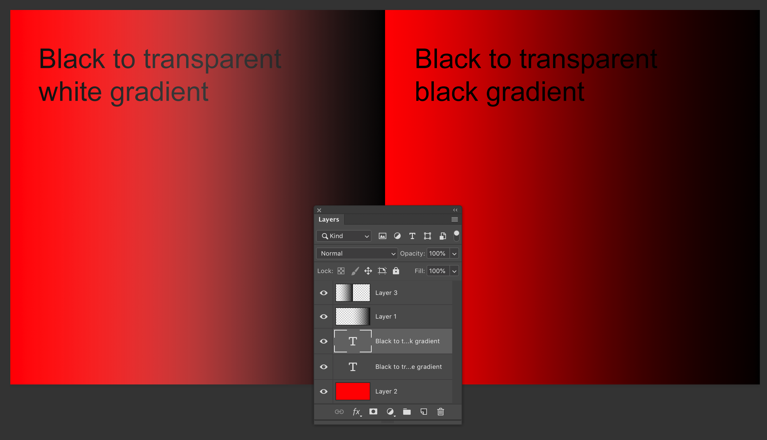
So in the screenshot above you can see the transparent gradient, over the red background layer and the effects make banding more visible. These were both made at 8 bit also.
That may not be the case here, but just throwing it out there as a test.

Copy link to clipboard
Copied
Try to work in 16 bit. this will give you a better results.
Checkout the presentation I just made about colors

Copy link to clipboard
Copied
Gradient are always generated in 8-bit per channel, even when you are working in a 16-bit per channel file.
Just make a gradient and look at the 16-bit values in the info panel.
Copy link to clipboard
Copied
No, that is not correct. 16 bit values are fully resolved in gradients, both as document values and as layer mask.
Selections, however, are always 8 bit depth.
Copy link to clipboard
Copied
I checked again and the gradients in:
- RGB color mode are 15-bit (15-bit +1 bit for white is 16-bit)
- CMYK color mode are 8-bit
- Lab color mode are 12-bit
Thats strange because RGB is mainly used for web content where 8-bit is enough, CMYK is the standard for print where 16-bit is far more usefull but not available. An exception for use of 16-bit in RGB color mode is photography but only for editing in Photoshop or printing 16-bit RGB images with professional RIP's which support 16-bit printing since quite a while (DSLR cameras support 12-bit or 14-bit for raw image data). For digital printing 16-bit is already the standard for many applications. As a consultant for digital printing applications such as textile printing or sign & display I spend a big portion of my time with color management and color calibration. In textile for example it is not unuasual to print gradients from 20% to 30% over a lenght of 10m. We put a lot of effort is stabilizing the production process and averaging measurement data to create high quality color calibrations with very smooth color transitions and precise spot color reproduction. For intrior decoration the DeltaE max of the whole production process is 3 to 5. With 8-bit color depth as input you add a DeltaE of at least 1. Also you can see banding much more easily on printed samples than on a monitor.

 AdChoices