

- Home
- Photoshop ecosystem
- Discussions
- Re: Gradient map on black and white photo to mimic...
- Re: Gradient map on black and white photo to mimic...
Gradient map on black and white photo to mimic illustration
Copy link to clipboard
Copied
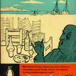
Hi there,
I am trying to create a posetrized / illustration effect based on the illustration that you see on the book cover screenshot below, with the use of gradient maps.
This is how my current gradient looks.
I am not sure that I need the black color stop twice to achieve the look as on the book illustration.
I know that that is an illustration, not a photo, and it's not based on levels unlike gradients.
But hand painting each of my image would take too much time for my workflow, so I am trying to automate it with gradients to achieve something similar as the illustration.
The 3 colors (yellowish, blueish, greenish) naturally distribute on the desaturated high contrast image, so that's fine, it's really similar to the illustration, but there are two caveats:
- how to achieve the black contour lines with the gradient? (I tried to add the black stop twice, still no black contours 😞 )
- how to isolate the blueish and greenish areas on the photo, just like on the illustration are?
(I don't want to really dedicate areas to these colors because the levels do that job, I just want that the black contours define these areas just like on the illustration)
Something I am doing wrong in my gradient map settings because the results are not similar to the illustration, I don't know what exactly, can someone help?
I attached the sample image, the colors screenshot with the HEX codes, and my gradient settings screenshot from PhotoShop.
Can anyone advise some good tricks with the use of the gradient to achieve the look seen on the illustration (almost) perfectly?
Thank you in advance.
Eventually what other tools should I use to achieve the illustration effect seen on the book cover sample?


Explore related tutorials & articles
 15
Replies
15
15
Replies
15

Copy link to clipboard
Copied
Hi. Maybe if you vectorize that photo you can try with Recolor Artwork or Live Paint: https://helpx.adobe.com/illustrator/using/recolor-artwork.html
Copy link to clipboard
Copied
Hi Marlon,
thank you for the idea!

Copy link to clipboard
Copied
Your original is a continuous-tone photo, and there's no way you can get it to look like the cover illustration just by restricting the palette. The result you got is, well, what you get.
You need to put a lot more effort into this and effectively redraw and rebuild the image. Not everything is a magic one-click solution.

Copy link to clipboard
Copied
Hi
I would not do that in Photoshop, I would use illustrator.
In that application you could use Image trace to get the lines and then colour it. You will need to do some editing of the image trace result.
However, when you look at the illustration you want to emulate, there is not a massive amount of linework. So a better way would be to place the photograph on a separate layer in Illustrator and use it as a reference which will be turned off when you finish. Then draw the linework by tracing over the photograph, before colouring. That way, you choose where you want the lines and where you do not. It will give a much better emulation of the book cover than any automated method.
Dave
Copy link to clipboard
Copied
Perfect, thanks!

Copy link to clipboard
Copied
I agree with the others about using Illustrator and have one additional tip: when you put the photograph on a separate layer, convert that layer to a Template layer (double-click, panel menu, or option when placing). By default, a Template layer is locked, non-printable, and the opacity is reduced, which makes it easier to trace on top of it.
Jane
Copy link to clipboard
Copied
Thank you!
Copy link to clipboard
Copied
Just wanted to post this to show why I thought that what I want could be achieved with pure gradient map.
Just a three color gradient mapping, by putting the black in the middle, it creates black lines and isolated colored parts, just like the illustration:

But, once I bring in the dark green in the gradient, it's not this nice anymore.
So I am still busy with the tracing method you recommended.
Copy link to clipboard
Copied
I still don't understand how does this effect work in such a selective coloring way, cause why the blue doesn;t appear in the other multi tone black-ish areas? But I am sure that because the black is placed in the middle, that is what makes the black contour lines, and coloring by curved plus contour lines should yield a nice illustration effect. if this effect is on a portrait, there are very nice black contour lines created. if the black would be the last, then this would be a spotify style multitone image. bu putting the black in the middle i contour lines. by the way i still didnt manage to create the illustration effect with tracing. anyone want to try, wwelcome 🙂 but I am sure it works, as you recommended, just need to try more.
Copy link to clipboard
Copied
I did first a color transfer from book cover and then a style transfer, with neural filters, and this is what I got:

I guess if I try to create an illustration with the neural filters, I should have desaturated the image before I apply the color transfer from the book cover?
Copy link to clipboard
Copied
I had a few minutes tonight so I tried Illustrator's Image Trace then Live Paint on your image

If I was doing this for real I would delete some of the excess paths, and redraw a few where missed, but it hopefully shows the way you could approach this.
Dave
Copy link to clipboard
Copied
Now I start to understand what you mean, with your method should be possible to replicate this "color isolation" style of the illustration.
In the meanwhile I have changed to a more simple red / white / black color scheme for my magazine, because adopting the illustration style and colors seemed to be too difficult across the magazine, so I will have to practice your method to see the overall difficulty level.
But I guess if all images and illustration would be based on this illustration/color scheme, that would be too much. I guess this is only good for the cover. But then, it's difficult to find matching colors for the content, this is a book from the sixties, I think this is only viable of the inner colors of the book are all black and white, including the images, adopting the scheme inside the book could quickly overwhelm it.
So I had to actually abandon this style, because I don't want all my inner content black and white.
Thanks for the sharing the technique, I will try to use it in my designs.
Copy link to clipboard
Copied
By the way this is where I generate the SVG filters if anyone interested:
Svg Multitone Effect (codepen.io)
Copying out the filter from the dev tools, when inspecting the generated image.
Copy link to clipboard
Copied
Now i am looking at Semantic Soft Segmentation:
Semantic Soft Segmentation – Yağız Aksoy (yaksoy.github.io)
Soft Segmentation of Images – Yağız Aksoy (yaksoy.github.io)Soft Segmentation of Images – Yağız Aksoy (yaksoy.github.io)
But if I cannot implement it (not sure if PhotoShop wants to implement this thing in its neural filters)
then I will have to trace and paint manually as you demonstrated.
I wonder if the segmentation described above can be done in SVG, but it seems it's done in Python.
Copy link to clipboard
Copied
There's already good object selection in Photoshop, I assume that selection can be traced, I will try it when I get there.

Find more inspiration, events, and resources on the new Adobe Community
Explore Now
 AdChoices