Exit
  • Global community
    • Language:
      • Deutsch
      • English
      • Español
      • Français
      • Português
  • 日本語コミュニティ
  • 한국 커뮤니티
0

Help | how to create consistent gray scale photos ??

New Here ,
Mar 29, 2019 Mar 29, 2019

Please help me with this, I frequently get request to create people's photographs to convert them into gray scale for our websites  and all has to be consistent, but the problem is, All source files that I received are  contains different native properties means- resolutions, size, colors and lighting, please help me how can I edit them in Photoshop with  perfection... so that they all look consistent.

669
Translate
Report
Community guidelines
Be kind and respectful, give credit to the original source of content, and search for duplicates before posting. Learn more
community guidelines
Adobe
Community Expert ,
Mar 29, 2019 Mar 29, 2019

While Image > Adjustments > Black & White, consistent end-points and Curves may be helpful, sad to say that because of a variety of lighting conditions, you are severely limited. It is simply a case of GIGO. Deal with size/res first. Then move on to the three items mentioned, in the order listed. Finish with Sharpening. Good luck

***

EDIT:  I neglected to mention that it would be helpful if you keep one reference image up on the monitor as you edit each of the others.

Translate
Report
Community guidelines
Be kind and respectful, give credit to the original source of content, and search for duplicates before posting. Learn more
community guidelines
Community Expert ,
Mar 29, 2019 Mar 29, 2019

When talking about image editing it is often helpful to actually show (a sample of) the images in question.

Translate
Report
Community guidelines
Be kind and respectful, give credit to the original source of content, and search for duplicates before posting. Learn more
community guidelines
New Here ,
Apr 01, 2019 Apr 01, 2019

Thank you so much for your reply, i will share images here thanks.  I am uploading two images, one with very low resolution and some background, and another one with good resolution. i am attaching both raw and finish photo, thanks. Oullette - Dan Roberts.jpgCompass - Monica Miller.jpgOullette - Dan Roberts 500x500.pngCompass - Monica Miller500x500.png

Translate
Report
Community guidelines
Be kind and respectful, give credit to the original source of content, and search for duplicates before posting. Learn more
community guidelines
Community Expert ,
Apr 01, 2019 Apr 01, 2019

Thanks.

How did you do the B&W?

Please post screenshots of the layered files with the Layers Panel visible.

If you compare the two images’ histograms you should notice that the image of the woman seems to have been clipped considerably.

That may contribute to her face to appearing flatter.

I think in both cases the resolution should not be a problem.

As for the different lighting (main light source left and right respectively) it does not seem a realistic goal to unitise that with Photoshop as of today.

Translate
Report
Community guidelines
Be kind and respectful, give credit to the original source of content, and search for duplicates before posting. Learn more
community guidelines
Community Expert ,
Apr 01, 2019 Apr 01, 2019

I think It is very useful to work with the RGB data beneath the Adjustment Layer/s of choice (Hue/Saturation, Black & White, …).

That way one can utilise color reliant Adjustment Layers (Selective Color, Hue/Saturation) to address certain issues and even if those don’t suffice still be able to use the color content for masking.

And general brightness corrections would be better done »beneath« the de-colorosing Layers to avoid possible quantisation issues when working in 8bit.

Translate
Report
Community guidelines
Be kind and respectful, give credit to the original source of content, and search for duplicates before posting. Learn more
community guidelines
Community Expert ,
Apr 01, 2019 Apr 01, 2019

Adding to what others have said, it might be helpful to have a copy of the images in question in RAW file format (if possible; this isn't the case some of the time). This requires trust from your clients, of course.

You could then deal with things like blown-out highlights more easily like in the woman's headshot. (Not all the time, like norman said; sometimes the data just isn't there from being too dark or too light.)

Note the two shots presented are pretty disparate; one is in a studio with controlled lighting, while the other is in broad daylight (and looks like it might have had a filter or two added to give a gauzy, dreamlike look). The only way to get straight-up consistency is to have them the same, at least in tone. Don't have any filters applied, especially.

Translate
Report
Community guidelines
Be kind and respectful, give credit to the original source of content, and search for duplicates before posting. Learn more
community guidelines
Community Expert ,
Apr 01, 2019 Apr 01, 2019
LATEST

comp4.png

   1. Color image.

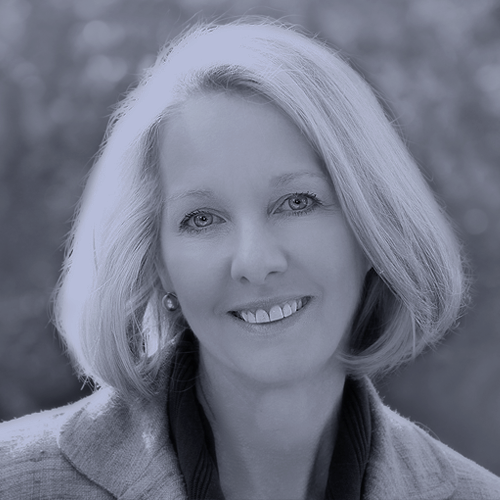
   2. OP conversion changed to neutral black

   3. Conversion from color and adjusted.

The objective of obtaining a similar contrast and range.

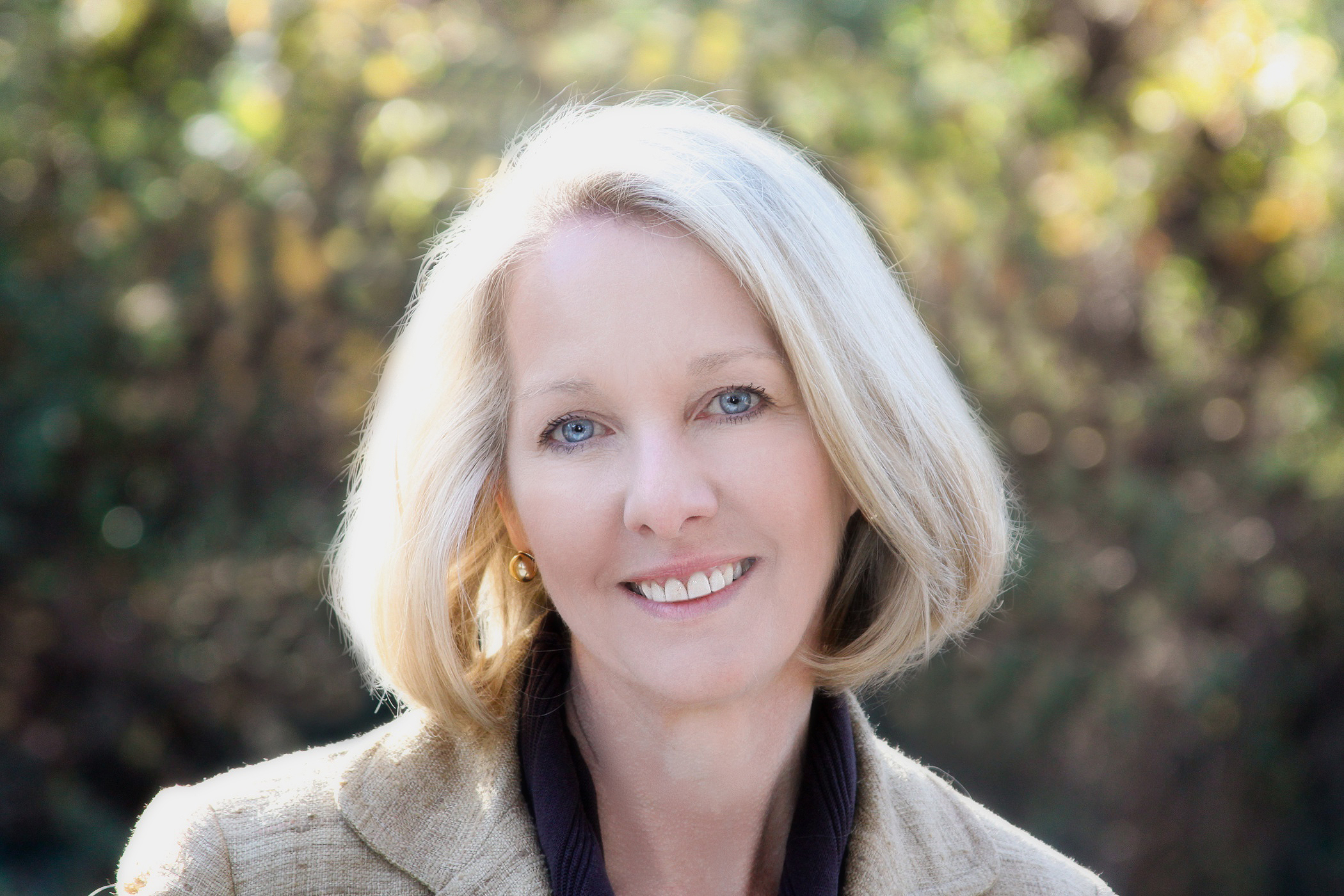
Woman:   Used Image > Apply image to color image, yellow channel (because it. had the most modeling) set to normal. Followed up with adjustment in Curves.

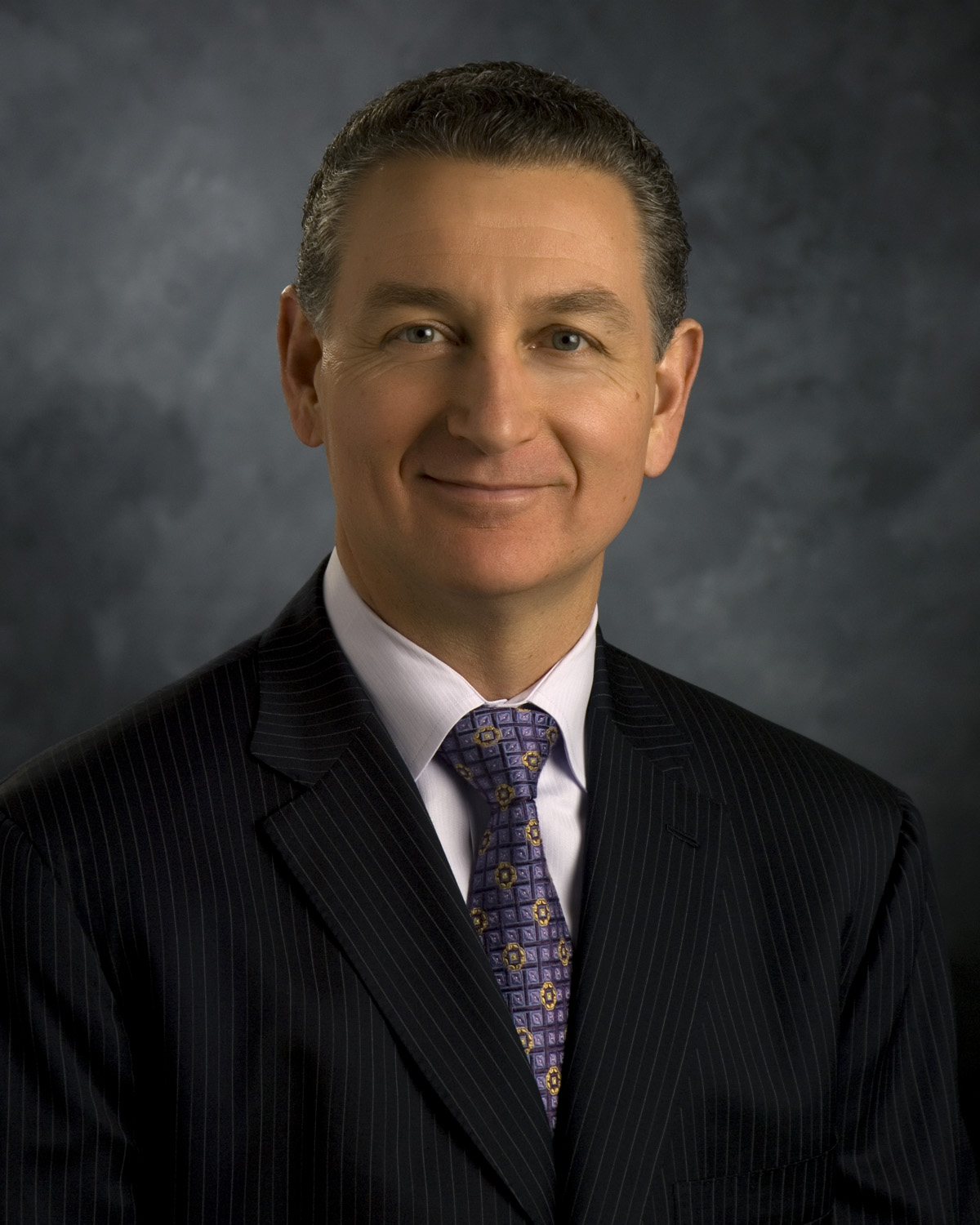
Man:  Image > Adjustments > Black & White and a Curves adjustment to tone down contrast. I would prefer greater contrast but compromised to approach. the contrast of the Woman image flesh tone.

If this is a sample of the variety of images, there is no one-size-fits-all approach to matching the contrast and range of the images.  In the images above, they both could benefit from a contrast boost at the expense of the Woman image.

Translate
Report
Community guidelines
Be kind and respectful, give credit to the original source of content, and search for duplicates before posting. Learn more
community guidelines