Exit
  • Global community
    • Language:
      • Deutsch
      • English
      • Español
      • Français
      • Português
  • 日本語コミュニティ
  • 한국 커뮤니티
0

Help! Resizing for web with an HD monitor

Guest
Aug 19, 2019 Aug 19, 2019

Hi all,

This problem has been brought up multiple times, but no one has yet offered a solution that seems to work for me. I'm an email manager, and ever since upgrading to an HD monitor, all the images I resize for use in emails and on the web have looked like crap.

First off, here are the display settings for my desktop:

display-500.jpg

And the settings for Photoshop CC

phothsop-settings.jpg

As you can see, even in these screenshots, everything is fuzzy and basically unreadable.

I took a screenshot of CNN.com, and resized it to 300pixels wide and viewed at 100% in Photoshop. Then I saved the image and uploaded it to the email client I use. Here is what they look like side by side:

cnn-screen.jpg

As you can see, 300 pixels in Photoshop =/= 300 pixels for the web. I'm sure this is some scaling issue, but I really have no clue how to fix it??? Changing the UI scaling on either my desktop or on Photoshop renders them both almost impossible to use (either way too big or way too small). Help please???

671
Translate
Report
Community guidelines
Be kind and respectful, give credit to the original source of content, and search for duplicates before posting. Learn more
community guidelines
Adobe
Community Expert ,
Aug 19, 2019 Aug 19, 2019

Which operating system?

See this related discussion.

It's 2019: any fix for high resolution displays?

Nancy O'Shea— Product User, Community Expert & Moderator
Translate
Report
Community guidelines
Be kind and respectful, give credit to the original source of content, and search for duplicates before posting. Learn more
community guidelines
Community Expert ,
Aug 19, 2019 Aug 19, 2019

Sorry, this is long...

One aspect of this is that every setting you're looking at, and most discussions about this including the one linked in the earlier reply, are all about UI resolution. That's it. Just the UI.

You're asking about a related, but separate subject: The apparent dimensions of the content in a Photoshop document.

When UI resolution is adjusted, the only thing that changes is the UI: The size of the text and controls in the application. This does not in any way affect the apparent dimensions of content in the Photoshop document window.

The way that both Windows (HiDPI) and Mac (Retina) handle 4K+ screens, UI scaling is separated from content scaling. In Photoshop and and many other applications, what's called "100% magnification" means one content pixel maps to one screen pixel. As display resolution goes up, the size of 100% goes down. That's what you see in Photoshop: 100% is a lot smaller on a 4K display than on an older, lower resolution display.

This would normally be a major problem for web browsing because all of the graphics we made 300 pixels wide on old monitors would show up half as large on HiDPI/Retina displays. The reason that does not happen in web browsers is that they take into account the scaling factor of a display. A 4K desktop display typically has a scaling factor of 2x. If a web browser detects this, they will automatically enlarge a 300px wide image to 600px wide on a 4K display. This is where the difference comes from, why a web page graphic looks the same size on an old display and a current high resolution display, and why the 300px wide graphic looks blurry on HiDPI. Some phones now have display resolutions of 300 ppi or more; these have a 3x scaling factor.

From a web development point of view, the way this gets solved is that all HTML/CSS pixel dimensions are expressed using what's called a "CSS pixel," a device-independent unit adjusted for the scaling factor. This lets a 300-pixel-wide image appear at the same size on displays of different resolutions. If you save your screen shot at 600 (image) pixels wide, and in the web page code you tell it to display at 300 (CSS) pixels wide, it will appear at the same size in web browsers on different displays of different resolutions:

  • On a 1x display, the 600px wide image displays 300 CSS pixels wide, but only half the pixels are used.
  • On a 2x display, the 600px wide image displays 300 CSS pixels wide, and all 600 pixels are used, so it appears twice as sharp as on the 1x display.

(What some web sites do is keep 1x and 2x versions of the same image, and the code serves up the one that matches the viewer's resolution. That way, 1x viewers don't have to download twice as much data than their displays can show.)

In Photoshop, I remapped the keyboard shortcut for View > 100% to View > 200%, so I could preview how a document will look at 100% in a web browser.

Another option is to set the display resolution to half the native resolution. Then it would work like like we are used to on older displays. But then you'd lose all the benefits of 4K resolution detail. Separating the scaling of the UI from the content is how Microsoft and Apple let use see all the detail of a 4K display while also being able to scale up the UI so that it isn't too small.

Translate
Report
Community guidelines
Be kind and respectful, give credit to the original source of content, and search for duplicates before posting. Learn more
community guidelines
Guest
Aug 20, 2019 Aug 20, 2019

Thank you Conrad! If I'm understanding correctly - the reason the images would still appear blurry in the email client I'm using is that they're the correct size, but since I'm viewing it on an HD monitor the browser is automatically scaling them? And it should appear normal were I to view it on a non-HD device?

How would I start resizing images with CSS pixels? (Apologies, I'm not very versed in the technological aspects of this)

Translate
Report
Community guidelines
Be kind and respectful, give credit to the original source of content, and search for duplicates before posting. Learn more
community guidelines
Community Expert ,
Aug 20, 2019 Aug 20, 2019
LATEST

This may be relatively easy to solve. You may not have to think in CSS pixels if you’re laying out your emails in an application that already thinks in CSS pixels for you — many do. When you design for a desktop HiDPI/Retina display using a consumer application, just remember two steps:

  1. In Photoshop, make the pixel dimensions 2x what they would normally be, because a desktop HiDPI/Retina display is considered a 2x display.
  2. Then, in the application where you're designing an email or a web page, set the pixel dimensions to what you would normally expect (same as CSS pixels).

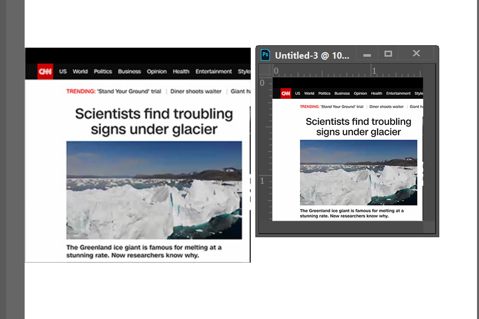
It’s easy to get confused about this, so let's look at an example. In the following image, on a HiDPI/Retina display, I set up two images in Adobe Portfolio, which is the Adobe web-browser application you can use to design a website. (In your case, it would be the application you use to create emails.) The two images are set to be 300px wide in the application. The top image is blurry, the bottom image is sharp. This is what you are seeing.

(If the right side of the image is cut off on this page, click to see it larger)

Adobe-Portfolio-image-size+info+callout.jpg

The only difference is that the actual image files are 300 pixels wide and 600 pixels wide. Also, I tried this in Wordpress and the way the dimensions is measured is the same in both applications: They use CSS pixels, not device or image file pixels.

The 300-pixel-wide image file is set up to be 300 (CSS) pixels wide on the layout, but because the HiDPI/Retina display has 2x resolution, this image has only half the pixels of the display across the same distance, so the image looks blurry.

The 600-pixel-wide image file is set up to be 300 (CSS) pixels wide on the layout, so it has enough pixels to fill out 2x resolution across its width, using all the pixels in the display, so it looks sharp.

Notice what happens in the example: The design application says the image is 300 (CSS) pixels wide, but if you take a screen shot and open it an image editor like Photoshop, that will say it’s 600px wide, because that’s how many device pixels are used by 300 CSS pixels on a 2x display.

That's how I hope it will work in the application you use to lay out your emails: Feed it a 600px wide image file, and set it to be 300px wide in the application. That should make it have enough pixels to fill out a 2x HiDPI/Retina display.

The reason these web design principles affect emails is because many email clients now use CSS and HTML to render the layout of an email. It will work most reliably on newer email clients; older ones were notoriously inconsistent in how your code would look.

(Final nitpicky note: The title of this thread  says “HD”, but a 4K display is considered UHD (Ultra HD), not HD. HD is just 1920 x 1080, so it’s is considered 1x, not 2x. More confusion! )

Translate
Report
Community guidelines
Be kind and respectful, give credit to the original source of content, and search for duplicates before posting. Learn more
community guidelines
Community Expert ,
Aug 19, 2019 Aug 19, 2019

On web pages, you should serve different sized images to different sized devices with the SRCSET property.

Responsive images - Learn web development | MDN

Also keep in mind that not everyone is on 4-5K displays.  Lots of people work from smart phones and tablets.  So you must test your projects on various devices to ensure you're giving a good user experience to everyone.

Nancy O'Shea— Product User, Community Expert & Moderator
Translate
Report
Community guidelines
Be kind and respectful, give credit to the original source of content, and search for duplicates before posting. Learn more
community guidelines