

- Home
- Photoshop ecosystem
- Discussions
- Re: Help sharpening and brightening this image
- Re: Help sharpening and brightening this image
Help sharpening and brightening this image

Copy link to clipboard
Copied
Hello everyone,
I have a project that a client wants me to do to sharpen this image that I have shown down below. I used the bright/contrast, levels, and curves option to get the picture more sharp and crisp but some parts just seem really too bright and have lost detail. Also I wanted to know if there was a way to make the title at the top less pixelated. I think the just made this image with text and blew it up so it ended up looking really pixelated. Any help is appreciated. Thank you.
Brian


Explore related tutorials & articles
 18
Replies
18
18
Replies
18

Copy link to clipboard
Copied
For sharpening the image (i.e. the photograph) you can use Clarity in the Camera raw filter which uses local contrast to give the impression of sharpness and also the sharpen tool. Don't overdo it though - over-sharpening looks awful.
For the logo and text - you need to obtain a vector version of the logo, or recreate it using text layers where you can find the font and as vector drawing for the tap and "Superior" element.
Dave

Copy link to clipboard
Copied
If you have InDesign and you create this in it, you'll get a much better and more professional output.

Copy link to clipboard
Copied
To address your overly bright areas of the image, you may find that excluding the brightness/contrast and levels, and doing it all in Curves may be a better choice. In Brightness/Contrast, you really only have the choice of more or less. If you lighten the image, you're bound to clip some of the more subtle detail in the highlights. Similarly, with Levels, you only really have control over the lightest, darkest and middle range pixels - so if you move the highlight slider inwards, you're again going to clip away some detail in the highlights.
With Curves, you can choose to brighten only certain ranges of tones - and if you watch to make sure the white point doesn't get moved (or that the curve doesn't touch a side), you can retain quite a bit of the detail in that area, while still brightening the light parts.
Sometimes, I'll even make multiple curves adjustment layers with masks, so that different areas can have different amounts of adjustment.
As for the uglification of the pixels on that logo - it appears the client stole it from his/her own website to put it into print. I see this all the time. They let their "original designer" keep the image, and just have their website copy (low resolution, compressed). They'd want to get the original from whoever has it. OR, you can tell them you'll fix it - recreate it, and then make more money? 
Adobe Community Expert / Adobe Certified Instructor
Copy link to clipboard
Copied
I used the pen tool around the letter and S in the name of the logo with the plan to make this all vector and now I can't seem to get the stroke color to show up. Can someone help me figure out what the problem is? I made a new layer and every time I select the S it says there is nothing on the layer and stroke can't me done.


Copy link to clipboard
Copied
I think you have your pen tool set to Path instead of Shape.
Path gives you a vector for clipping - Shape gives you vectors on a layer that can have fill and stroke applied.


Copy link to clipboard
Copied


I thought that I was making these letters into vector but the bottom Sup is the new layer and it is just looking pixelated versus the top on that is all red. How would I also make the color in the text like the color of the text in the original. I thought I knew how to make this vector but I am lost.

Copy link to clipboard
Copied
I'm kind of overlapping other posts here, but it looks like they gave you a flattened JPG to work on. Apart from the fact that is terrible way to output the graphic, (although I don't know if it is for print or screen) the damage is already done, and you would be trying to make the proverbial silk purse out of a pigs ear if you try to fix it. It would be easy to remove all the text and graphics from the photograph, after which you can rebuild it and do a proper job of it.
There are a ton of tap silhouettes on Google, and the fonts shouldn't be hard to find.
Copy link to clipboard
Copied
If you're doing this as paths, as above, you are definitely making it vector. However, I'm not sure we're seeing everything we should be seeing to make a determination. Would you please show us your Layers panel as well? And, the settings on your pen tool? I just tried it on your very low-rez original post's image, and it's coming out cleanly for me (considering I'm at 500% zoom). Here's a screenshot of my pen tool settings and my window with layers:
Adobe Community Expert / Adobe Certified Instructor
Copy link to clipboard
Copied
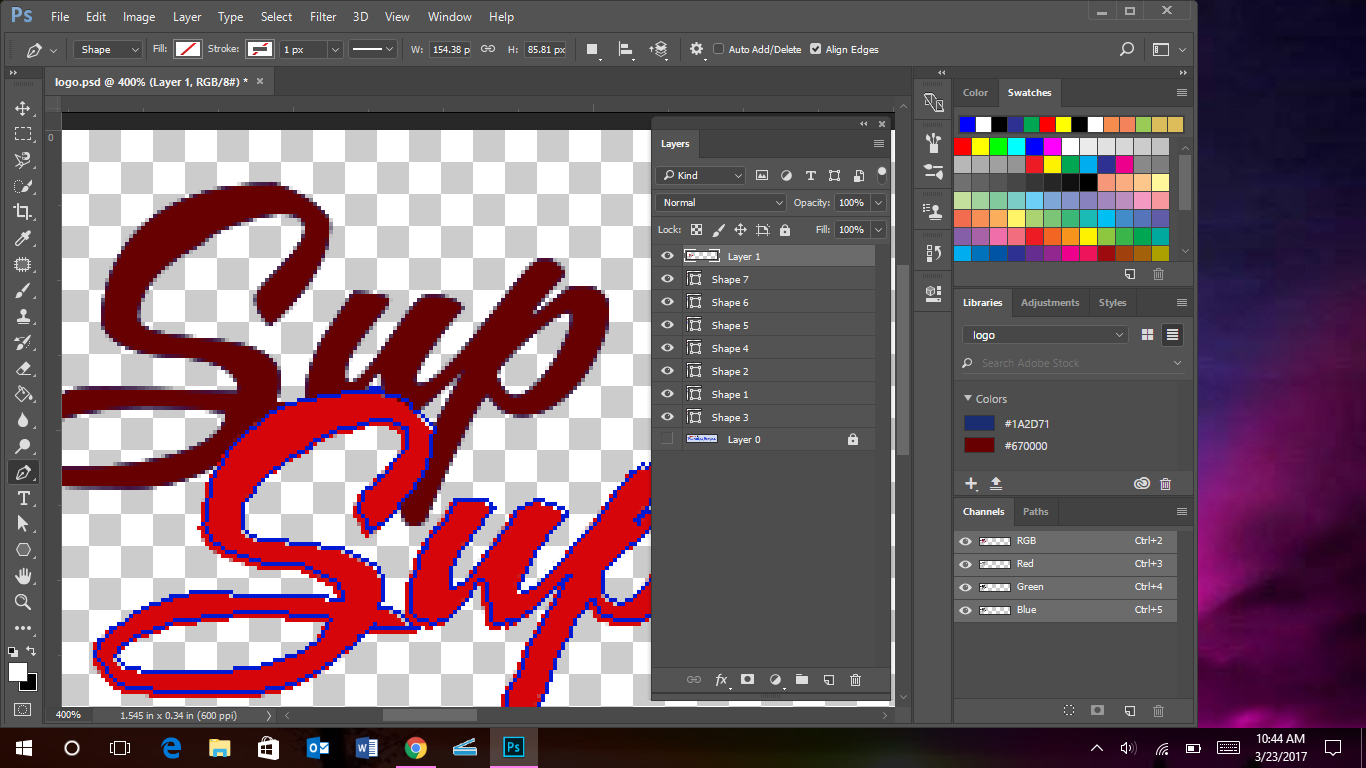
I made print screen shots of each look for each layer below. It looks like I have my pen tool set to shape but it's making all those extra shape layers and I don't want that. I just don't understand why the edges still look pixelated even on the vector text I am creating with the pen tool. What should I do to just make the vector layer?


Copy link to clipboard
Copied
Hi
Your screenshot shows you are zoomed in to 400%
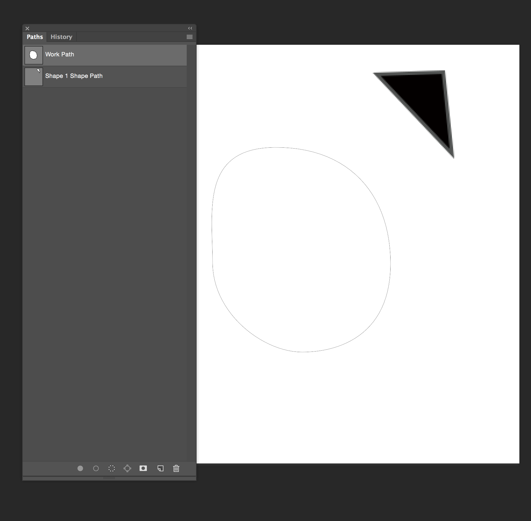
At that zoom you are going to see pixels even on a vector based layer. To display, Photoshop has to convert your shape to pixels at the current resolution of the image. (Example below at 400%)

The advantage of the vector shape is that you can transform it (e.g. increase the resolution of your image) and it will then display at the new resolution.
Dave
Copy link to clipboard
Copied
Y'know - that was going to be my first response to diggdug39 as well, but I deleted it when I realized my screenshot was taken at 500% zoom... so I'm still working on figuring this one out a bit more...
Adobe Community Expert / Adobe Certified Instructor
Copy link to clipboard
Copied
Okay - I'm still working on the pixellation thing - but one thing I wanted to point out about why you're getting so many layers - I'm thinking you're missing the Path Operations options in the menu, as you use the pen tool. For example, to remove the circle from the middle of the S and the P, I used "Exclude Overlapping Shapes". To get all drawn paths on the same layer, I use "Combine Shapes". Unfortunately, they're all looking so clean on mine, I'm still working on figuring out why yours look so pixellated.
Adobe Community Expert / Adobe Certified Instructor
Copy link to clipboard
Copied
Oh - HECK! I forgot to add the screenshot on where to find the Path Operations!!! Here it is:
Adobe Community Expert / Adobe Certified Instructor
Copy link to clipboard
Copied
hi S Gans and thanks for being persistent on this inquiry. Here is the setting my Preferences>Performance screen
Also how would I take the word plumping and make it so that the top letters are not making it hard for me to use the pen tool to vectorize that?

Copy link to clipboard
Copied
I'm afraid that's almost impossible to do with a jpeg image, since it's flat and there're no layers to juggle. The way I'd have suggested would have been to trace their edges as closely as possible with the pen tool - which, as you mention, is quite difficult.
IF you can find out at least what font was used in the original logo, you might be able to typeset it... but otherwise, I think it's going to be just as difficult and annoying as it seems. I'm sorry. 
Adobe Community Expert / Adobe Certified Instructor
Copy link to clipboard
Copied
By the way - the Performance screen isn't showing for me... I'm referring to the one from the Preferences menu - at the bottom of the Edit menu, if I wasn't clear...
Adobe Community Expert / Adobe Certified Instructor
Copy link to clipboard
Copied

Copy link to clipboard
Copied
So, after trying everything I could - I started wondering about the Graphics Processor options. Now... it doesn't seem to change anything for me, but it might, for you. Can you please show us a screenshot of your Preferences>Performance screen?
Also - let me ask - is this something that seems to happen in ALL of your images when you use the Pen tool, or is it specific to this image?
Adobe Community Expert / Adobe Certified Instructor

Find more inspiration, events, and resources on the new Adobe Community
Explore Now
 AdChoices