- Home
- Photoshop ecosystem
- Discussions
- Re: how to achieve this background effect with pho...
- Re: how to achieve this background effect with pho...
how to achieve this background effect with photoshop
Copy link to clipboard
Copied
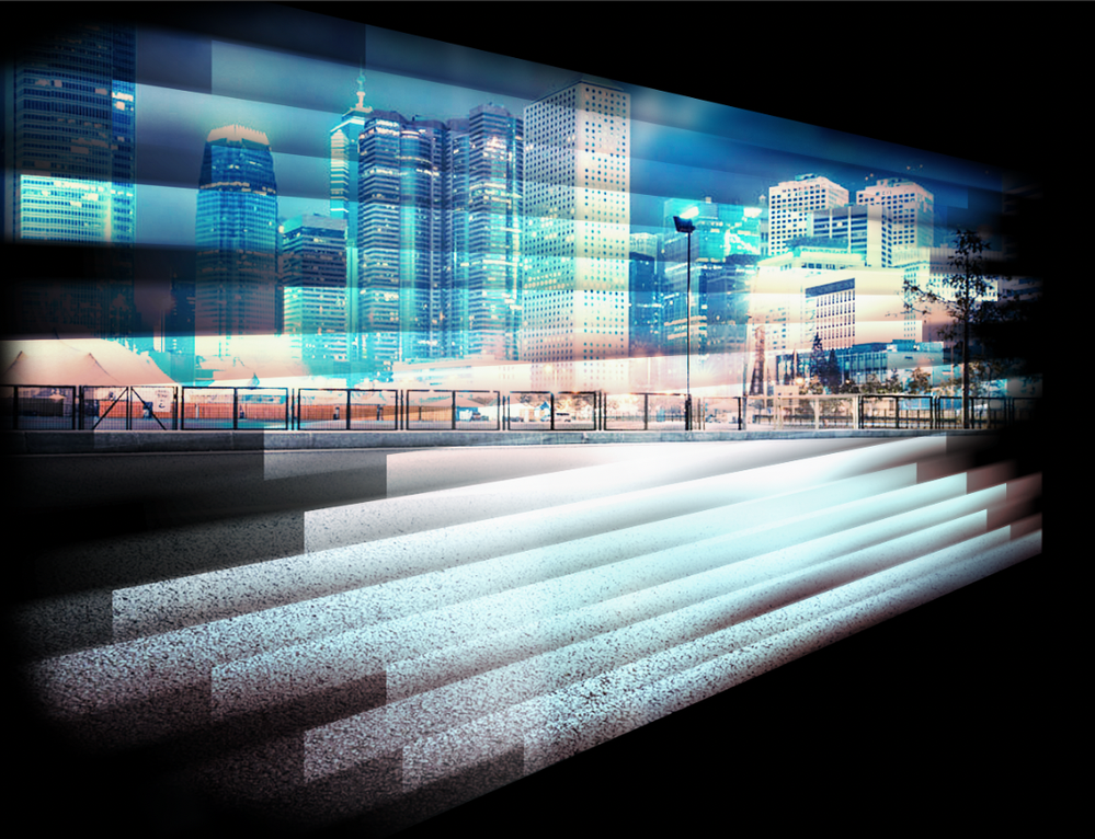
Hi there, does anyone know how to achieve this background effect? what sort of filters are being used here?
I really like this effect, and wondering how it was created.
Explore related tutorials & articles
Copy link to clipboard
Copied
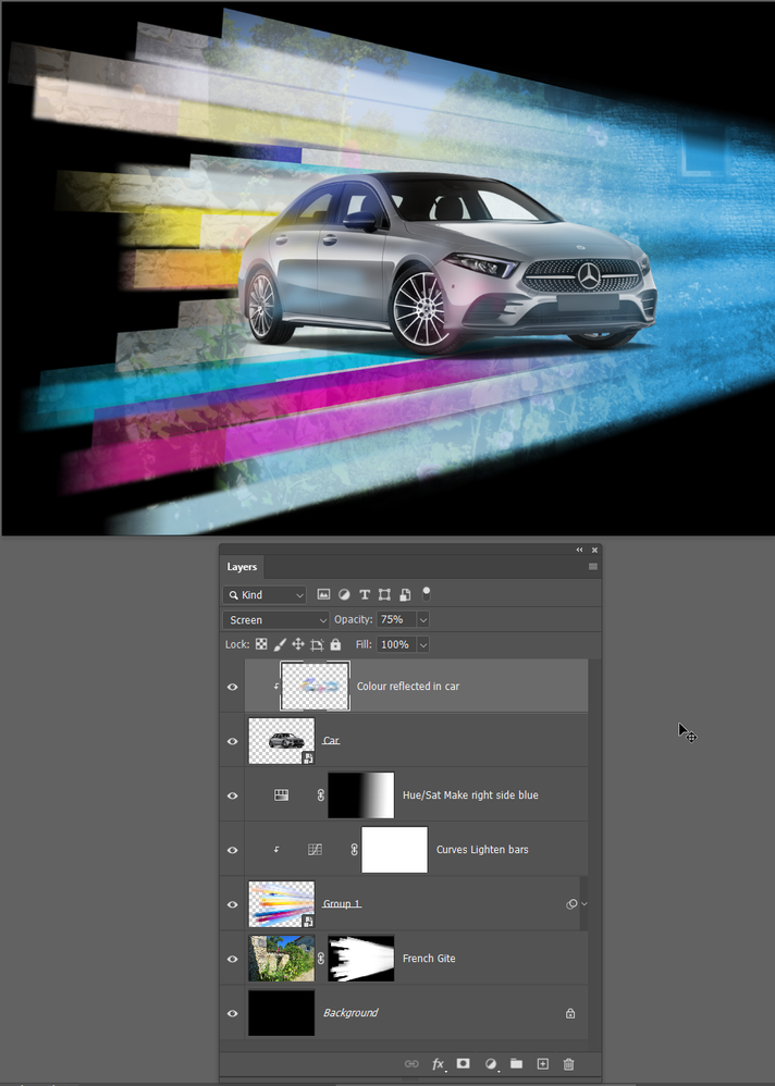
Blimey, you don't ask much. Not really any filters as such, but a lot of work, use of blend modes and careful placement of the bars. There are some tricks to make it easier though. As it usually the way with Photoshop projects, when you have converging shapes, it's best to make them parallel, then group them as a Smart Object and Transform the Smart Object to produce the convergence.
This took me 15 minutes, and the above design will have taken much longer thhan that. Possibly hours.
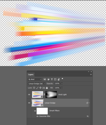
If I double click the coloured bars, you'll see there are two layers both nest Smart Objects, and set to different blend modes.
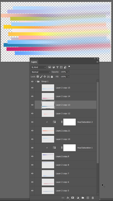
If I double click one of the coloured bars, you can see they are still layered and still parallel. This allowed me to move them around (Holding down the Ctrl key to autoselect the layers. There are a couple of Hue/Sat layers to change the colours of those layers. I used motion blur on the right side by selecting about half of their width, and feathering the selection with a high value.
Your example appears to have an old house in the background, so I found a French Gite witch had the right look and placed that above the background. I then Ctrl Clicked the coloured bars to load them as a selection, and added layer mask to the old building layer to let thhe black background show through.
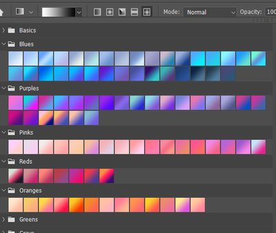
To do this properly you'd take a lot of care with each bar. What I did was make one bar and copied it a bunch of times. The I ctrl clicked to select each layer in turn, and ran coloured gradients along them.
So no magic, and definitely no single click filters. I can already think of things that would have made my quick and dirty version better like increasing contrast of the bar colours, and maybe adding noise before I did the motion blur. That's another reason you use Smart Objects. You can step back and make those changes because none of it is hard baked in. It's non-destructive.
Copy link to clipboard
Copied
Nice job Trevor
Dave
Copy link to clipboard
Copied
Thank you so much Trevor for your advice, I will give it a try right away. Sorry for not writing much, I am not so good with words. Thanks again!
Copy link to clipboard
Copied
Hi Trevor, I tried one with your advice. It really helped me out. Thank you so much! But I am not sure how to get the end of the strips to look like the reference one. I used motion blur and some gaussian blur.
Terence
Copy link to clipboard
Copied
It might be worth looking into a 3D solution, but transformed Smart Objects with Motion Blurred rectangles might provide some approximation.
Edit: I had missed Trevor’s post, good illustration.
