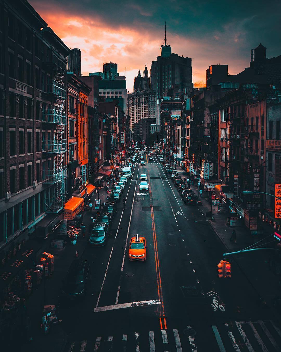
It may help to deconstruct the image -- return it to its pre-manipulation state and note the steps required to get there. Then reconstruct it. In the sample below, done very quickly, it became evident that local work was done by first changing the mode to Lab Color (the home of super saturation).
Then, in Fig 2, adjusting the L curve to modify the tonal curve without changing colors.
Next, in Fig 3, neutralizing the magenta/green with a 0 setting to return to a usual yellow taxi
Last, in Fig 4, adjusting the blue/yellow curve for a gray roadway, which indicated that, in addition to the curve, masked local work (which I did. not do) was required.
This is not the complete solution, which would require more time, but I hope it suggests a practical approach, beginning with the city on an overcast, dreary day.
Here is a shameless attempt to have you experiment with RGB Curves:
.and if gray balance is critical, the following are examples of what Lab can produce with straight-line curves. Each took under a. minute. Notice that the sphere in each one remains neutral gray. Masking will allow you to combine image sections. The possibilities are endless.
Hue/Saturation allows to edit color ranges (Red, Yellow, Green, Cyan, Blue, Magenta) separately, so that might also be helpful here.
And if a satisfactory combination of Adjustment Layers has been found one can try to consolidate the effect into one Color Lookup Table to apply more easily to other images.
I must say, I am quite overwhelmed by your responses, frankly I never expected to get one . This truly is an amazing community!
To be honest with you, I am an amateur artist and two years ago I started learning 3d and texturing in the context of making a small level for my game. I've made quite a significant progress over these two years and now I want to post a few screenshots of my work. However, talking with my artist friend, who works at an AAA company, I received quite a harsh (yet deserved) criticism, which is mostly related to my lack of understanding of colors and art in general. He said I lack style. Therefore, I started searching the web for "moody street photos" and one of them is posted in this thread . Here are the screenshots which I ultimately want to change, if I will be able to understand how to change them in Photoshop and, most importantly, what style to pursue, I will then be able to implement it in shader code in my game.
My friend basically criticized my extreme colors, so following his advice, I toned down my lighting:
I would love to receive any advice about the style (or lack of thereof) and general tips on improving my work
Hi! I think it's not bad your work, and maybe you friend is really influenced by being a pro. I think the only lack is high frequency texture, some parts are too flat, try to add more variation and detail to materials. Another thing is that you need to stick to a palette, I can't tell if there are difference in time, like is it evening or sunset? Try to get shadows, light a particular colour and experiment with them. I hope this helps
some basic color and contrast manipulations seem to have been applied, (best done by applying a curves adjustment layer) and above that some color replacement, e.g. Perhaps yellow (taxi) has been changed to orange , which would affect all pixels with simiilar values by replacing them with the new color.
if so, please do mark my reply as "helpful" and if you're OK now, please mark it as "correct" below, so others who have similar issues can see the solution