- Home
- Photoshop ecosystem
- Discussions
- Re: How to have such a perfect typography ?
- Re: How to have such a perfect typography ?
How to have such a perfect typography ?
Copy link to clipboard
Copied
Greetings,
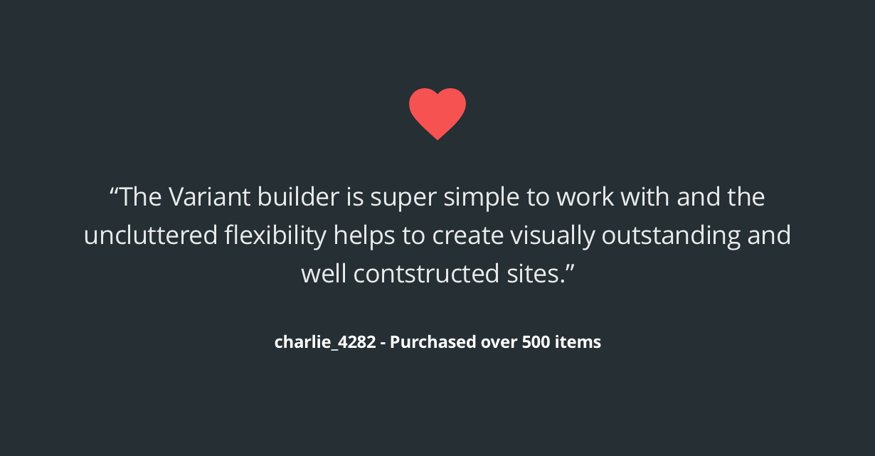
I was wondering how professional designers were having such a perfect typography, just as if it wasn't even an image but an actuel text ?
Example:
Any idea ?
Thanks.
Explore related tutorials & articles
Copy link to clipboard
Copied
This looks like HTML 5 not an image... can you send a link to where this came from.
Copy link to clipboard
Copied
This is really an image. Here's the source, where you can find other images that are similar.
Copy link to clipboard
Copied
With Photoshop you would use actual text layers and alignment from your layerd document save out image files the size you need. You cam also save stuff fron the web
Here an image I save from your linked image it a png file could have transparency.

Copy link to clipboard
Copied
Adobe CC have sooo many possibilities to make things look just amasing. Of course skills and experience of a designer is important as well.
For the cool types check the TypeKit Adobe Originals | Typekit
Copy link to clipboard
Copied
Thanks olga.dav, didn't know about this ! ![]()
Copy link to clipboard
Copied
At 1230 pixels this png translates well across multiple devices. Results can vary greatly according to the size of the image.
Copy link to clipboard
Copied
For printing and things like digital books use InDesign for text (Placing images in InDesign that may have been optimised in Photoshop).
For websites ensure you have licensed web fonts.
Copy link to clipboard
Copied
For easy, individual, stunning, free social media graphics with cool typography check Adobe Spark. ![]()
Make Images, Videos and Web Stories for Free in Minutes | Adobe Spark
Copy link to clipboard
Copied
Thanks everyone for your replies.
Will check out Adobe Spark in a minute, thanks for the share !
Copy link to clipboard
Copied
"Professional Designers" and "Perfect Typography" don't really apply to this example since they have a glaring typo.
They misspelled the word "constructed"
Copy link to clipboard
Copied
lol - good spotting Bo
Find more inspiration, events, and resources on the new Adobe Community
Explore Now

