Good Venture
Known Participant
April 4, 2020
Question

How to obtain poster effect

  • April 4, 2020
  • 5 replies
  • 1406 views

Hi everyone, 


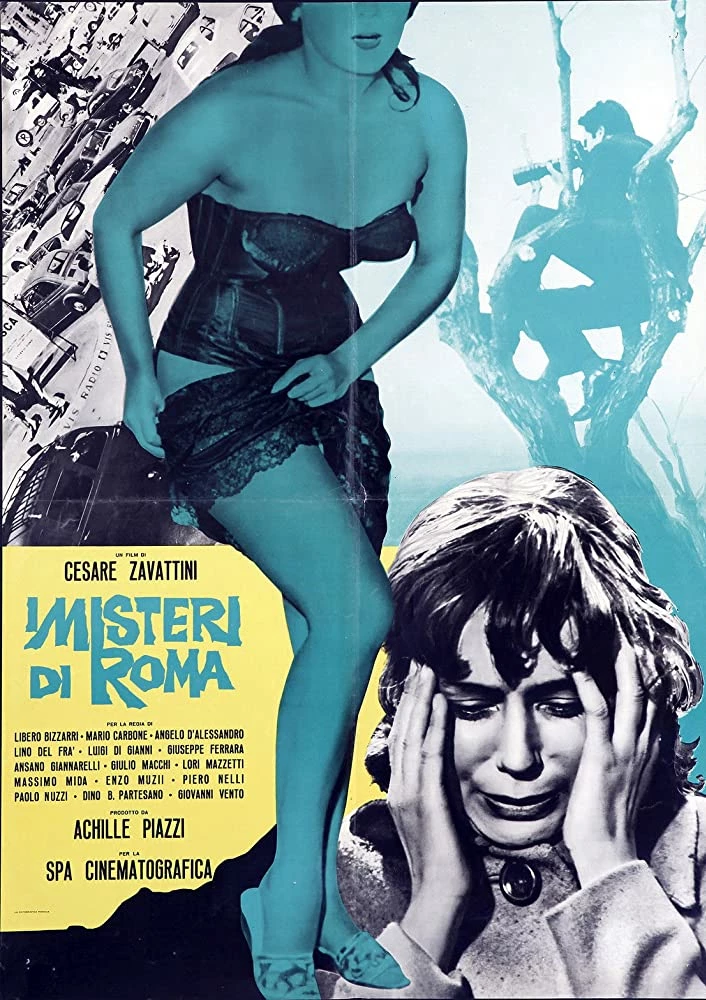
I am trying to realise a poster similar to this one and I was wondering if any you know how to get as close as possible to the result of the attached picture.   I'm mainly working with Image -> Layer Styles ... and Blending Mode of each level. 


What I love from this example and would like to reproduce: 

- The general b/w 1960s look with the glossy black and white

- The colour palette is amazing, yellow and cyan.

- The different kind of blendings: foreground woman silhouette with flat b/w and cyan tone, background image of the man taking picture light cyan tone. The highly saturated/contrast black and white woman in the right corner. 


I'm struggling especially to achieve the foreground woman effect, what do you think is the best process to use? 


This topic has been closed for replies.

5 replies

didiermazier
Community Expert
Community Expert
April 13, 2020

I have been thinking about this very interesting topic.

At the time in the 60s quadricolor printing was very expensive and designers used to work a lot with 2 or 3 colors and using screens to combine them…

So what it is important always use the same matching colors. Here apparently they used Black /Blue/Yellow. It was not actual Cyan or real Yellow…  It could have been other inks.

So consider the use of Photoshop Bichromy feature… I mad a video (in french but you can see what i did anyhow) in this way.

Keep safe y'all!

It is on YT : https://youtu.be/rw-4G6pgJio


Good Venture
Known Participant
April 13, 2020

Thanks everyone for responding! 


Although the final piece really depends on what images one is sourcing, I believe @didiermazier latest post is really getting close to the original example, especially in achieving the central character hue. 

I've found the use of gradient helpful as well. 


Here is my final result


didiermazier
Community Expert
Community Expert
April 5, 2020

For the foreground woman, I would :

  1. On smart Object A > filter camera raw > textures to 0
  2. New smart object by copying layer A to a new layer B (same content new SO)
  3. Filter Highpass on layer B
  4. Play with layer B blending modes…


c.pfaffenbichler
Community Expert
Community Expert
April 4, 2020

To desaturate the individual Layers one can use Hue/Saturation or Black & White Adjustments on the Smart Objects. 

Then Solid Color Layers (or Color Overlay Layer Style) can be used set to Screen (to make the black a color) or Multiply (to make the white a color). 

Good Venture
Known Participant
April 4, 2020

Thanks everyone for the help!! Very much appreciated so far. I didn't think about using the gradient adjustment layers at the beginning. 


Here is the work in process: 

I'm not yet satisfied with blacks, but maybe could they be corrected as the last step? 


c.pfaffenbichler
Community Expert
Community Expert
April 4, 2020

I see some Smart Objects but several plain pixel Layers without Layer Masks and with the effects applied destructively apparently. 

And as far as I am concerned that’s not good. 


As for the »blacks« you can use Curves Layers for example to esit each Layers’ contrast. 

didiermazier
Community Expert
Community Expert
April 4, 2020

Post the pics you want use for this poster and we will check waht we can do…

c.pfaffenbichler
Community Expert
Community Expert
April 4, 2020

Indeed … 

davescm
Community Expert
Community Expert
April 4, 2020

Try splitting each section into separate layers (for different treatments on each) then use a gradient adjustment layer on each.


Dave