- Home
- Photoshop ecosystem
- Discussions
- Re: How to resize an image from vertical to horizo...
- Re: How to resize an image from vertical to horizo...
How to resize an image from vertical to horizontal?
Copy link to clipboard
Copied
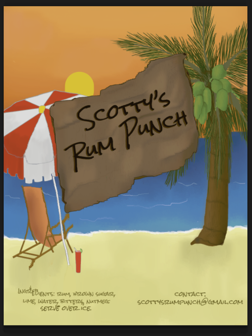
I'm doing a bottle label for a friend who wants to start selling his homemade rum punch. We agreed on a basic design and when I asked him for the dimensions, he said he wanted 3 x 4 inches. The original design that we agreed on was lengthwise (or rather, 3 inches height, 4 inches width). As I was working on it, I was sending him progress photos.
However now I'm nearly done and I sent it to him, he said that he had actually wanted it to be a tall rectangle standing up, instead of lying down on the side. He wants it to be 4 inches height by 3 inches. However he never mentioned this during the drawing process, and we had initially agreed on the other format, which I then proceeded to follow. This is the image that I did.
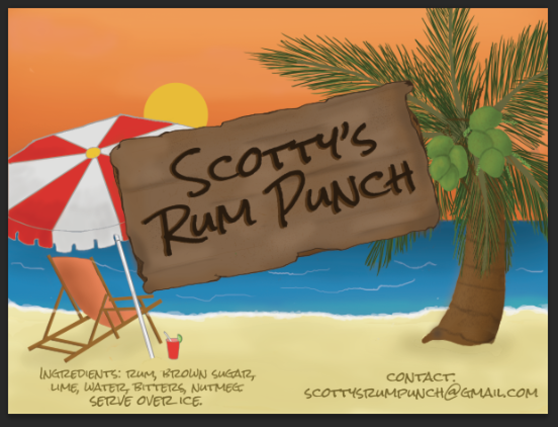
So basically, he wants the design to now be 4 inches in height, with 3 inches width. Is there any way that i can resize the image without losing a lot of the work I did? I know that at the top and bottom there will be some white space, so I don't mind colouring back in those areas, but I'm more worried about the items on the beach, like the tree, umbrella and chair.
I figure if anything I'll have to put the chair next to the tree, and i'll lose half the beach. The plank of wood with the name is on a separate layer (I've put everything on separate layers) so I'm not worried about resizing that.
Thanks in advance.
Explore related tutorials & articles
Copy link to clipboard
Copied
If you crop you will lose some content however there will be no distortion. If you use content aware resize there will be distortion. So try both methods and see which one you prefer for this image.
If every item is one its own layer you can change the canvas and transform each layer as needed. Scale and position for the composition you want.
Copy link to clipboard
Copied
Hi JJMack, I did what you said, and I was able to eventually resize and reposition everything, so I didn't lose too much of the original work. Thanks so much for the advice! I learned from early that when doing digital drawings, most things should have their own layers, and I'm glad that I still do it!
Copy link to clipboard
Copied
Increase the beach by adding to the bottom and then increase the size of the text and/or move it down a bit.
Copy link to clipboard
Copied
Yep! I was able to add to the beach and to the sky. thanks!
Copy link to clipboard
Copied
Oh dear, I realized I mixed up the words in the title of the discussion. I meant to say "from horizontal to vertical". Sorry about that.
Copy link to clipboard
Copied
I really like it - except the "plank" as you call it. It gets in my way. It's a bit like a no trespassing sign. Nice beach, but no, not you, buddy.
I know it's somewhat "dull" and traditional, but I'd just extend the sky and put the name up there. Close the gap a bit between the palm and the chair. Open and inviting, but not empty.
Other than that, fresh and catchy. Good colors.
Copy link to clipboard
Copied
Hi D Fosse,
True, I get where you're coming from. I had also suggested it to my friend, but he said he liked the idea of a wooden plank to give a "rustic" beachy feel if that makes sense.
Thanks for the comment however! I appreciate it.
Copy link to clipboard
Copied
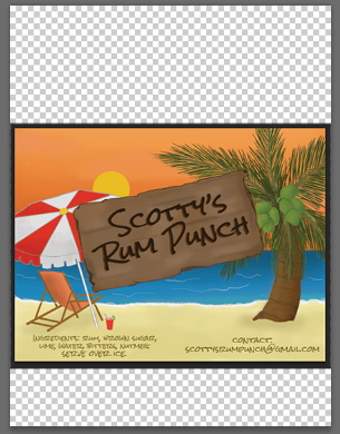
This should give you an idea of the magnitude of the problem.
It looks as though you have a major redesign on your hands.

Copy link to clipboard
Copied
Sometimes I better choose to make the background again like using the stamps tool, brush, and whatever it needed to keep the proportion of the image is original, so it will more look like natural.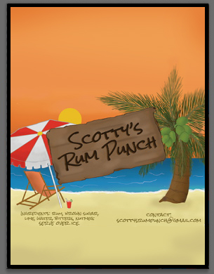
For my opinion, the image will look great if it's look like that. But, that's only my opinion, hope it will give a little more idea better than distort it and ruin the proportion / ratio
Copy link to clipboard
Copied
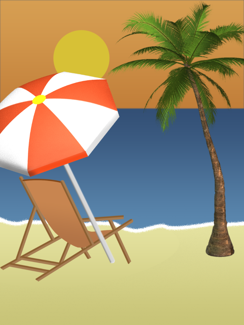
I got started, but ran out of steam. Dave will be proud of me for doing the umbrella as a 3D object, even if I didn't finish the extrusion.
Copy link to clipboard
Copied
Content Aware Scale is the tool for this. I did this without anything Protected, but you can select and save areas you don't want to be distorted.
Start with the crop tool set to ratio, and type in a 3 and a 4, and stretch the canvas to the required aspect ratio.
Then Select all, and use Edit > Content Aware Scale.
Copy link to clipboard
Copied
That really puts the "long" into "long drink" ![]()
![]()
Copy link to clipboard
Copied
Hello everyone, thank you all so much for taking the time to reply, and kudos especially to you all who redesigned the label! they all look fantastic!
I was able to resize and finish the label, and my friend is happy with it, however when I went to save it to send to him, that's where the problem started. The print shop told him to use an image with 300 DPI, PNG format and in CMYK mode as it will be printed and made into stickers. So naturally I followed these guildelines However Photoshop isn't letting me save it as a PNG format (I googled this and found out it's because it's in CMYK mode..forgive me, I'm still learning ![]() ) but I was able to save it as a TIFF and a JPEG file. When i went to send it to him, I saw that the colours are now kind of gray and not as bright as they are in the original file. I've put screenshots of the two as a comparison below. The left side is what the colours should be:
) but I was able to save it as a TIFF and a JPEG file. When i went to send it to him, I saw that the colours are now kind of gray and not as bright as they are in the original file. I've put screenshots of the two as a comparison below. The left side is what the colours should be:
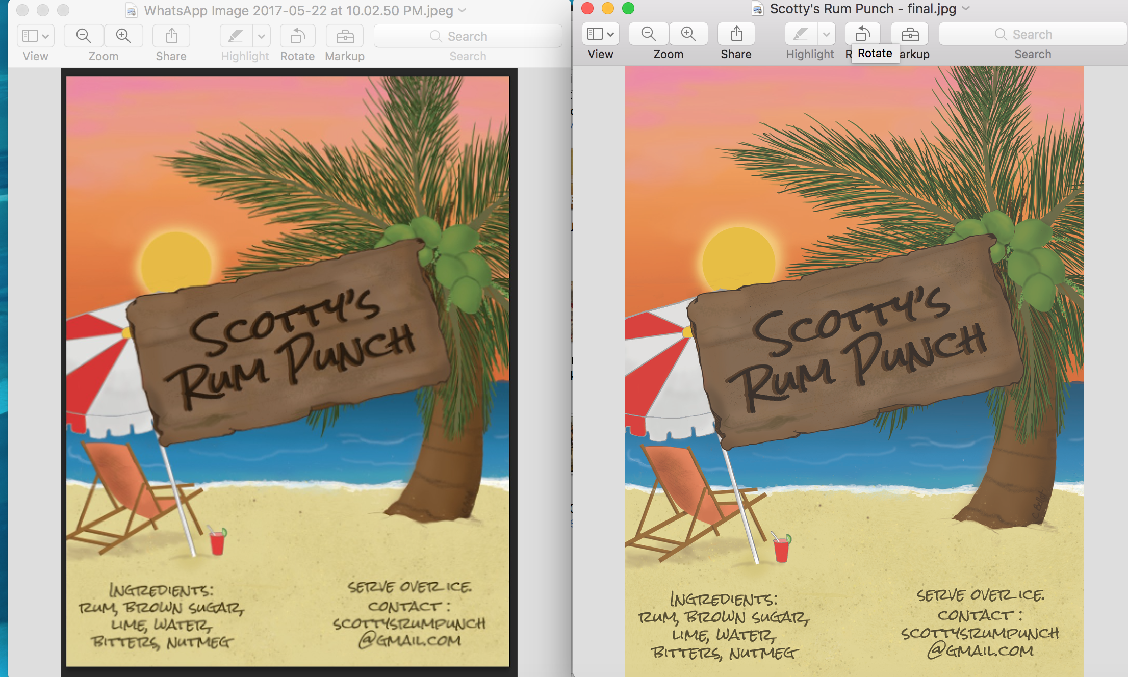
Could someone tell me what went wrong and more importantly how to fix it? I'm intermediate when it comes to Photoshop, but I'm still learning about the different modes. Thank you in advance!!
Find more inspiration, events, and resources on the new Adobe Community
Explore Now


