

- Home
- Photoshop ecosystem
- Discussions
- Re: How to restore faded ink on Antique Marriage C...
- Re: How to restore faded ink on Antique Marriage C...
How to restore faded ink on Antique Marriage Certificate?

Copy link to clipboard
Copied
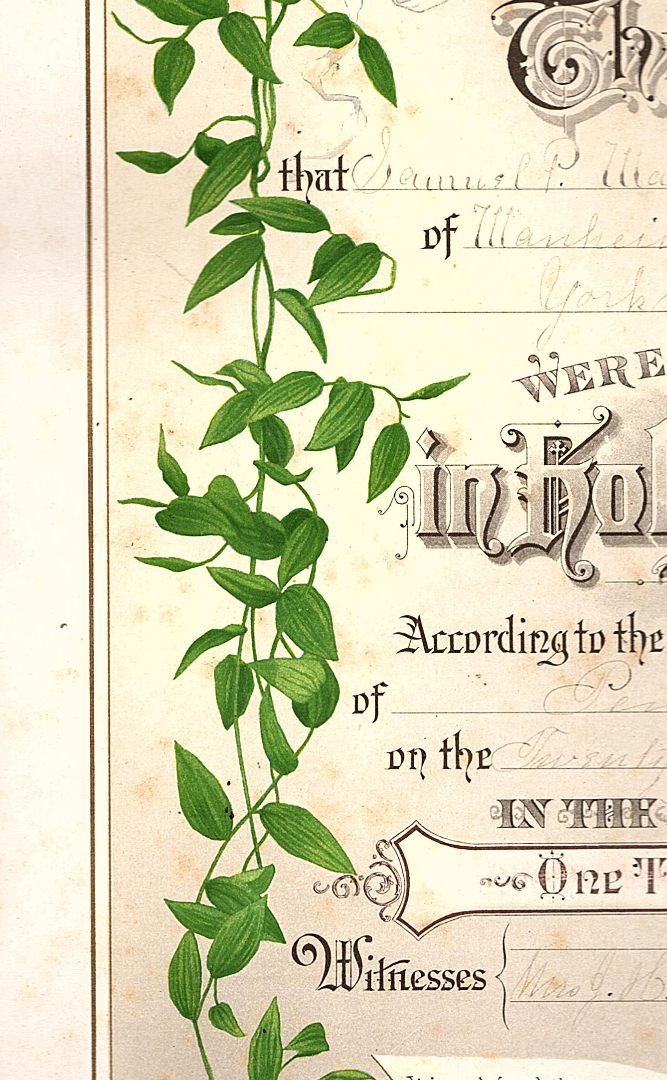
I have my Grandparents Marriage Certificate and the ink writing on it is faded and barely readable. What can do to darken the ink? I am a novice at Photoshop So keep your replies simple. Thank you


Explore related tutorials & articles
 21
Replies
21
21
Replies
21

Copy link to clipboard
Copied
Hi
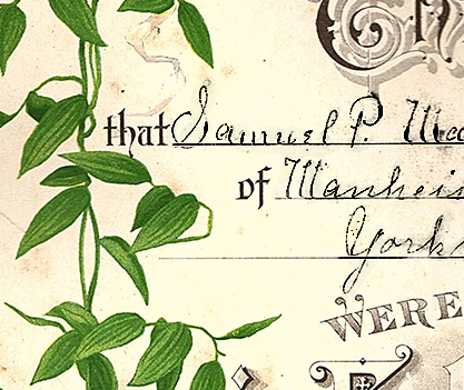
it depends on the colours and the amount of fade. Are you able to post a small cropped section that won't identify the people but that we can see the issue to advise you (i.e no names but maybe just the occupation or similar)
Dave

Copy link to clipboard
Copied
Dave, I hope this came through for you,. It's a link to Google Drive. the file was to big to attach.
https://drive.google.com/open?id=1NjWhWJuUbdMoE7K-pXwNjmCY_hx162dc
Copy link to clipboard
Copied
Hi Jeffrey
The link did not work for me. Can you copy just a small section and paste it directly into a post here. We don't need to see teh whole thing - in fact it would be better not post an entire certificate on this public forum. Just a small part so we can see the colour difference that you are trying to recover.
Dave
Copy link to clipboard
Copied
Copy link to clipboard
Copied
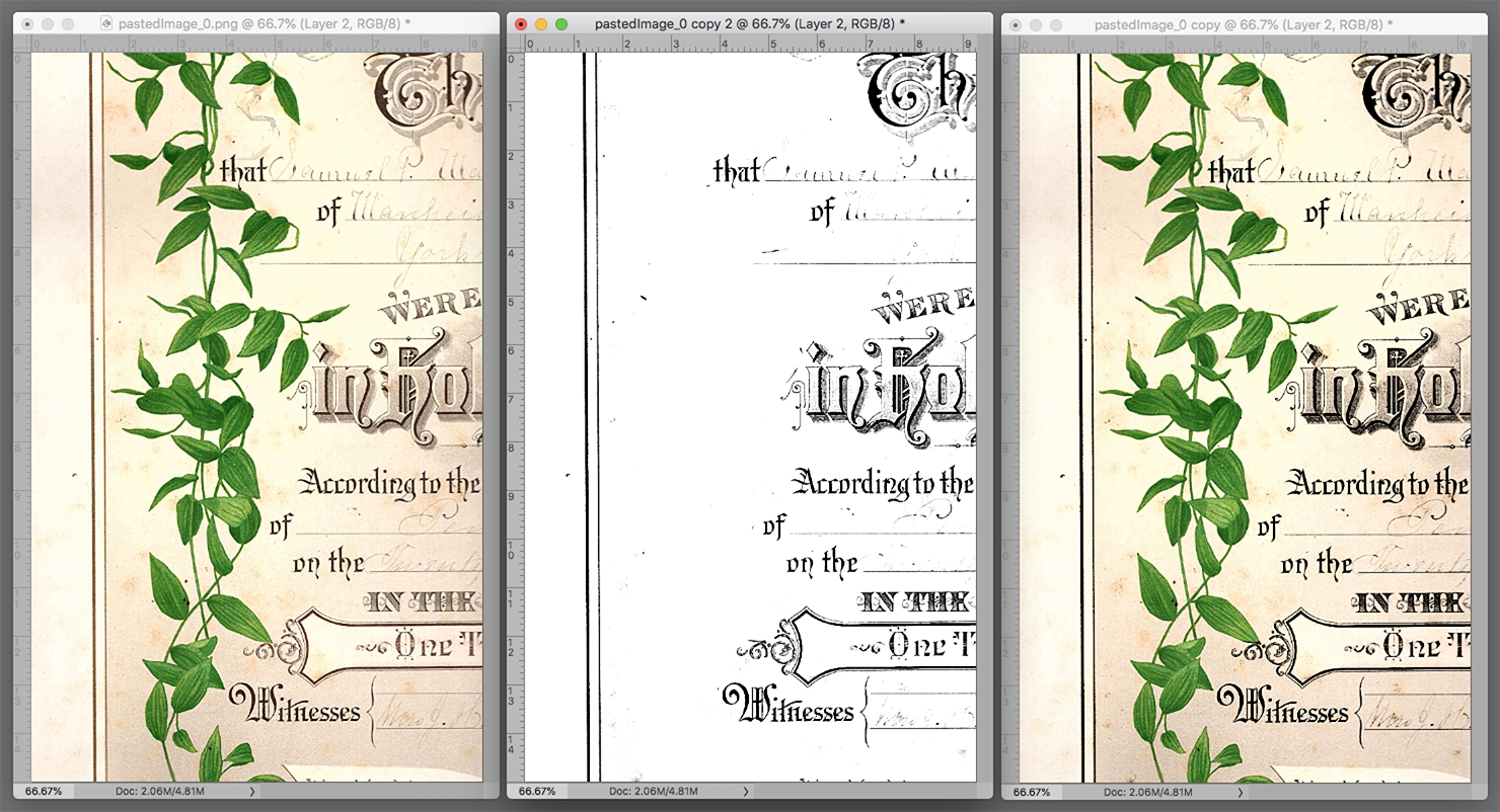
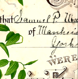
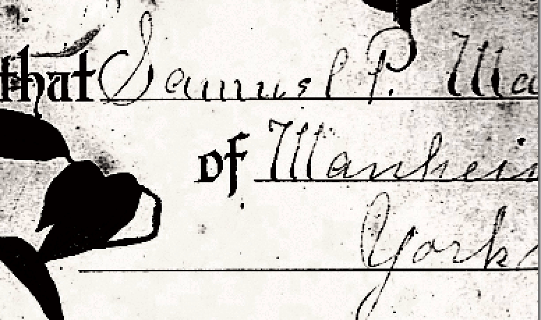
I did make a duplicate layer and multiplied it. It didn't get much darker I can read it if I zoom on it. Here is a copy of it. You can't really tell the difference between the two on here but on PS you have more of a saturation of color.

Copy link to clipboard
Copied
Hi
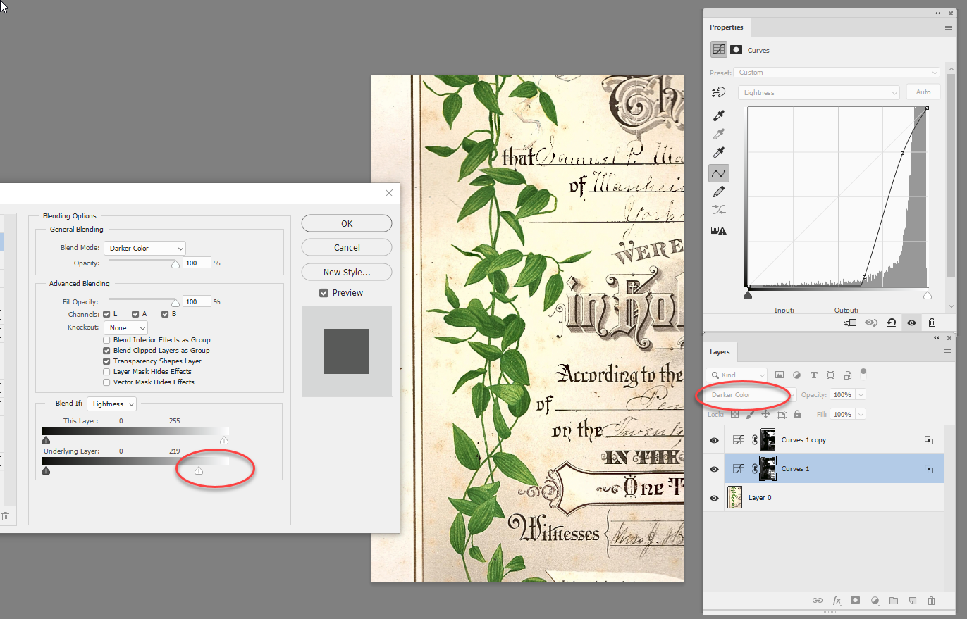
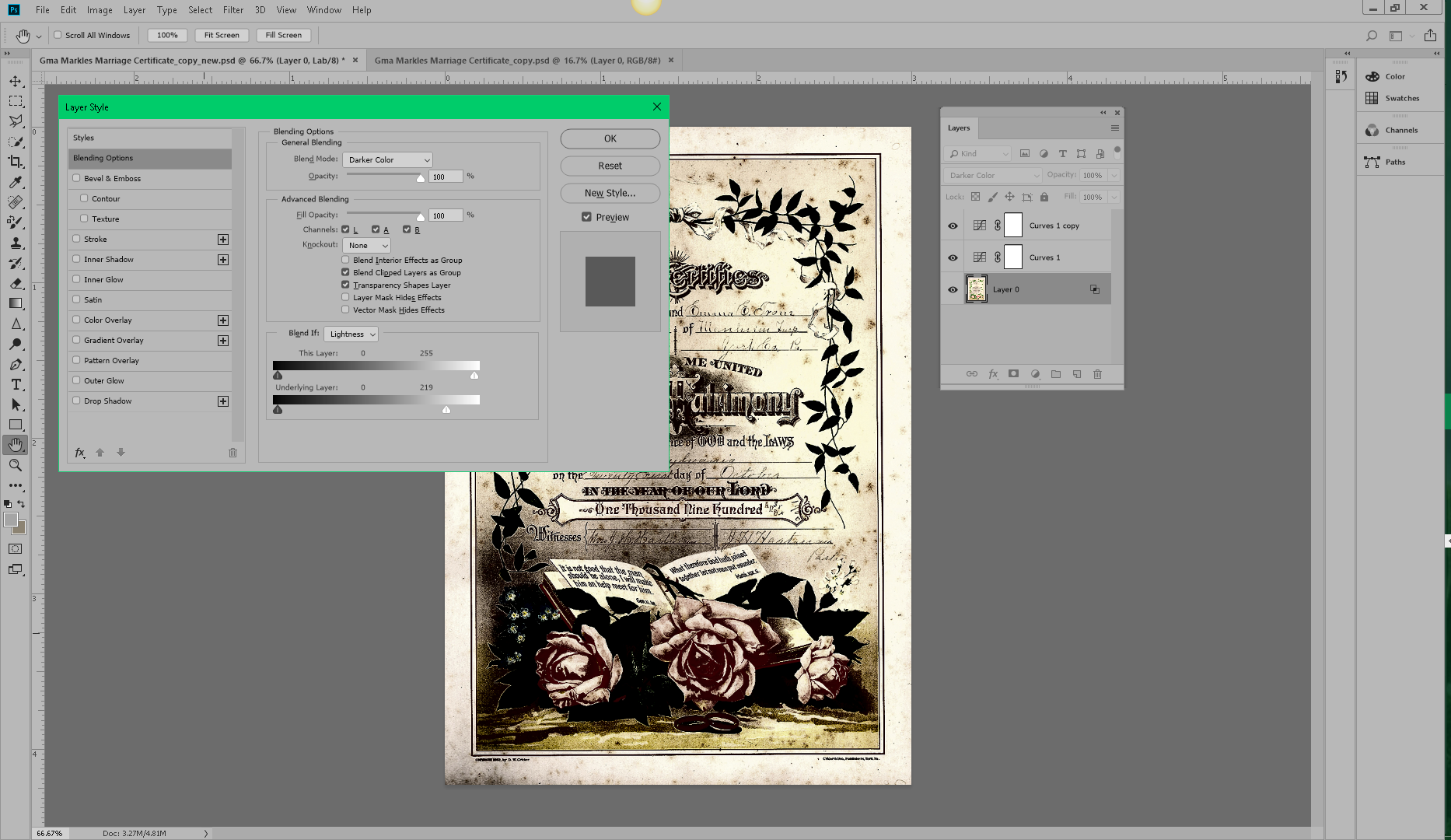
You could try switching to Lab mode (Image >Image Mode Lab)
Add a curve adjustment layer and use quite an extreme curve setting on the lightness and set the blending mode to darker colour.
Right click the adjustment layer and in Blending options set the Blend If slider to remove the effect from the lighter areas
Click on the mask (next to the adjustment layer in the layers panel) and paint with black where you don't want the curve to impact (and white where you do)
I duplicated this layer (Ctrl+J)
Dave
Copy link to clipboard
Copied
Dave,
Ok I will work on this and see if I can get it to work for me. I'll be in touch. Could be tomorrow. Thanks for the help!
Get Outlook for Android [link removed by moderator]
Copy link to clipboard
Copied
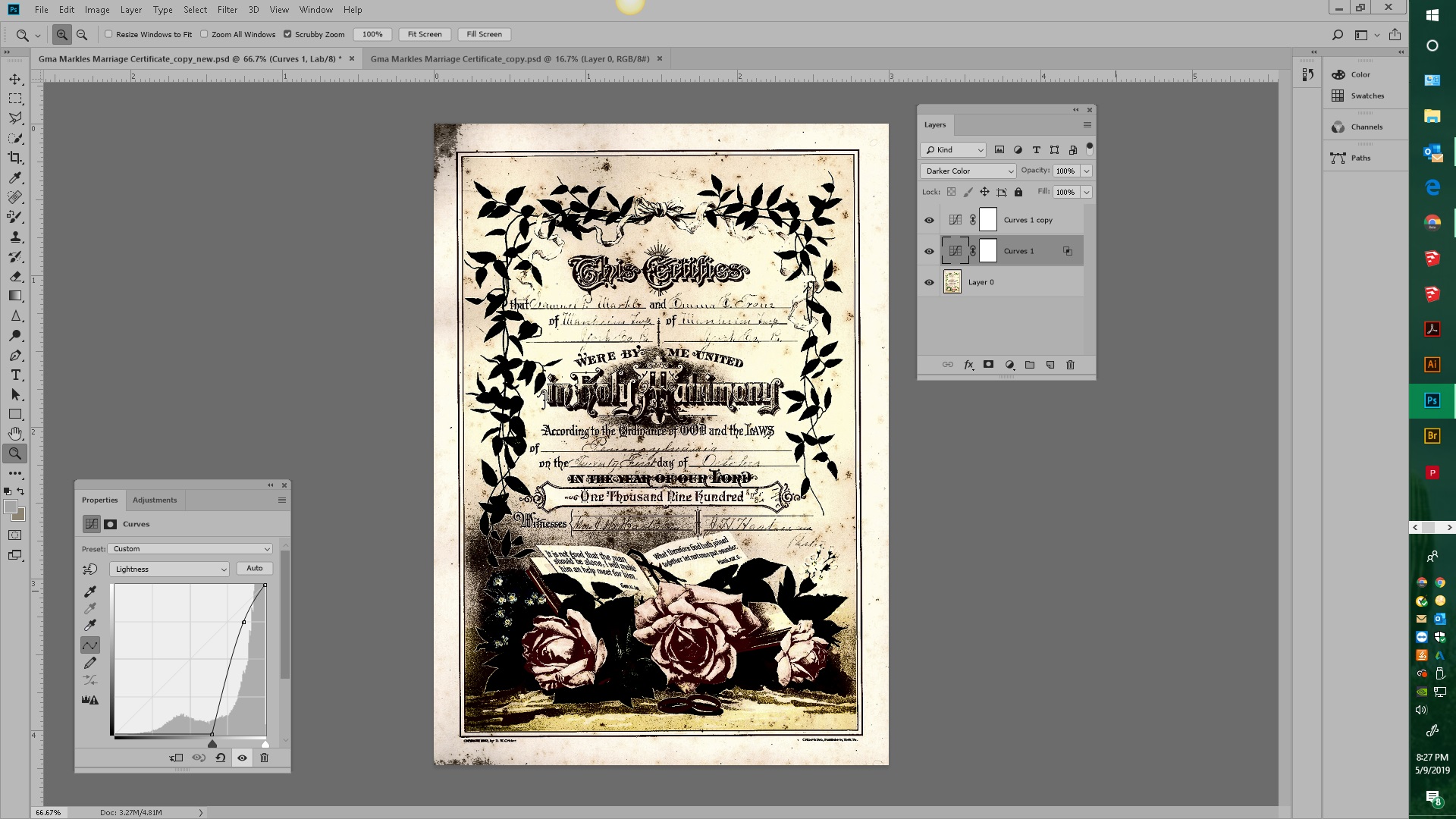
Dave here's what I got I'm sure I missed something.
Copy link to clipboard
Copied
Hi
You missed painting on the mask to hide the impact where it is not wanted.
Dave
Copy link to clipboard
Copied
Sorry for taking so long to get back to you Dave. I got pulled away from this for a while. I’m not sure I understand your answer. Do I make a clipping mask of the lettering??? I’m going to read some of the other posts here and see if I can make any sense out of them.

Copy link to clipboard
Copied
For starters, try making a duplicate layer of it, and set the Blending Mode to Multiply.
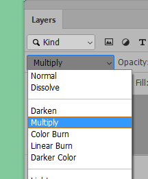

Copy link to clipboard
Copied
(Click on image to enlarge)
To maintain the character of the type, consider using a specially created K of the CMYK set and using that as Layer in the RGB file, as follows.
1. Duplicate the file. In the Duplicate:
2. Choose Edit > Color Settings > CMYK > Custom (at the top)
3. In the drop-down panel Black Generation change Medium to Maximum (note the effect in the ramp. )
4. In Channels add an alpha channel of the black, then Select All of this channel and Edit > Copy
Move to the RGB file and Paste this special K as a layer above the Background layer.
1. Use Curves to create a white surround and crisp dense black. (Paint away the leaves.)
2. Change the Blending Mode to Multiply. (Not shown: If desired, add a second Multiply layer of low opacity to add density. Dona't overdo it. We don't want to plug the drop shadows.)
Last: Return your CMYK Color Settings to their original settings.
(Building the handwritten elements is a separate challenge.)

Copy link to clipboard
Copied
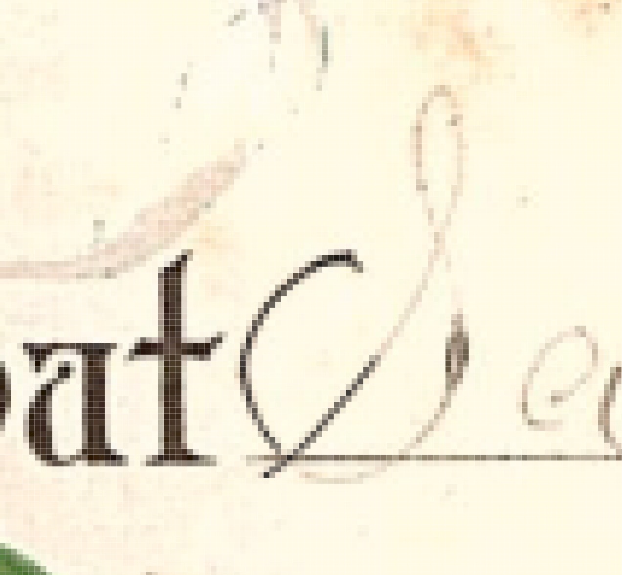
I tried both calculations and curves layers. Neither gave me much to work with. Maybe the green channel has a slight edge over the blue channel. I settled on a combination of curves and B&W, and copy merged that to a new layer. I used the brush set to Overlay to firm up the blacks, and reduce the background, and set that layer to Multiply. I then added a 'hide all' mask, and painted the text back in.
The result is a bit clunky, but more readable
I tried smoothing out the text by copy merging again, and adding a tiny blur (0.7) and then firming back up with a levels layer
Copy link to clipboard
Copied
Thank you Norman!
Being that I am pretty much a novice on PS it's going to take me a while to translate your methods. I'm going to try everything. It looks like you are on the right track. I may want to go with a lighter black or a less opaque one to give the appearance of being old and faded.
Thanks for your help and timely response!
Get Outlook for Android<https://aka.ms/ghei36>
Copy link to clipboard
Copied
In Post 9 I numbered the steps required to produce the sample I posted. If any particular step is difficult to understand, let me know and I will provide a more detailed description.
Regarding the particular version of Photoshop that I used, it was 20.0.4, but don't attribute any special significance to that. I would provide the very same instructions even if you used a pre-CC version.
In Post 11 I referred to Lab Color and, as a novice, you may not be familiar with that Mode, particularly the a and b. channels in Curves. I wrote "...using the a and b channels to eliminate the color (a zero, b zero) and contrast was increased using Curves...". In that regard a zero value in those two channels reads 50 here:
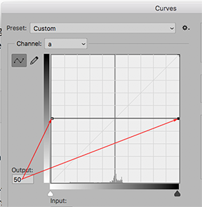
Note that the a and b curves bisect the graph. The 50 reading here is equivalent to zero in in the Info Panel when referring to color values. Just drag the end-points of the curve vertically until each displays 50, as shown here.
Next, contrast is increased by choosing the Lightness curve and increasing the slope of the curve much the same as you would handle an RGB curve. I hope this explanation is helpful.
Copy link to clipboard
Copied
Ok I got it. Once I get to color settings elaborate on CMYL>custom (see attachment) It’s a little confusing all the choices.
I suppose I picked the hardest project to learn here?
Copy link to clipboard
Copied
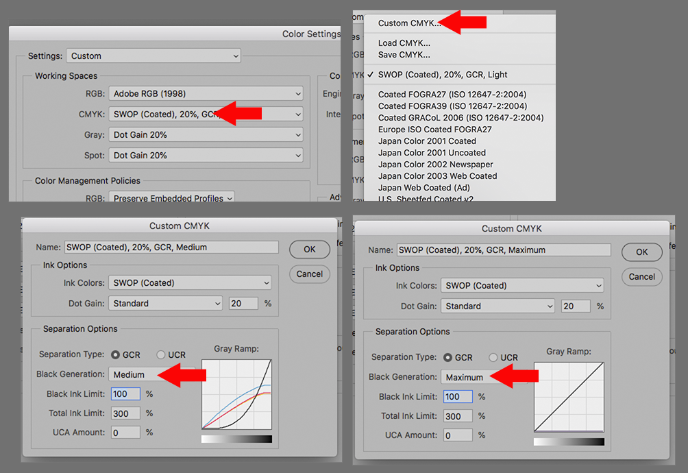
When you click on Edit > Color Settings you will see Color Settings of which Fig 1 is a part.
Click the choice shown by the arrow, It will display a list of which Custom CMYK is an option. Click on it.
It will dis[play Fig 3. Note that Black Generation probably reads Medium.
Change Medium to Maximum as shown in Fig 4 and ok
Important: When you have completed this project be sure to return the Black Generation to its previous setting.
Copy link to clipboard
Copied
Norm,
I thank you for your reply. Being that I am a novice with Photoshop I am having difficulty understanding your instructions. I am working at your instructions but I am still not seeing any results. Must be overlooking something.
Jeffs
Copy link to clipboard
Copied
Recovering the handwriting:
Once again the black was recovered from the modified K of CMYK set to Maximum Black Generation brought into the RGB file. This time the file was changed to Lab Color, using the a. and b channels to eliminate the color (a zero, b zero) and contrast was increased using Curves. The image above is the result. It should be taken to pure white, retouched and used in the image with its Blending Mode set to Multiply at which time the the white will disappear. The pen stroke remains thin and maintains its character.
.
Copy link to clipboard
Copied
Hello Norm,
What version of Photoshop do you have because I'm not seeing things the way you are describing them. It seems that my version is different from all the respondents on this thread. I have the Photoshop CC 2019 version.

Copy link to clipboard
Copied
honestly the best result will be a manual one, brushing each letter pixel depth. You would need a good scan of the document to start too.

Get ready! An upgraded Adobe Community experience is coming in January.
Learn more
 AdChoices