

Illustration advice ..?

Copy link to clipboard
Copied
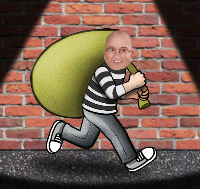
Hi,, photoshop/illustration noob here!
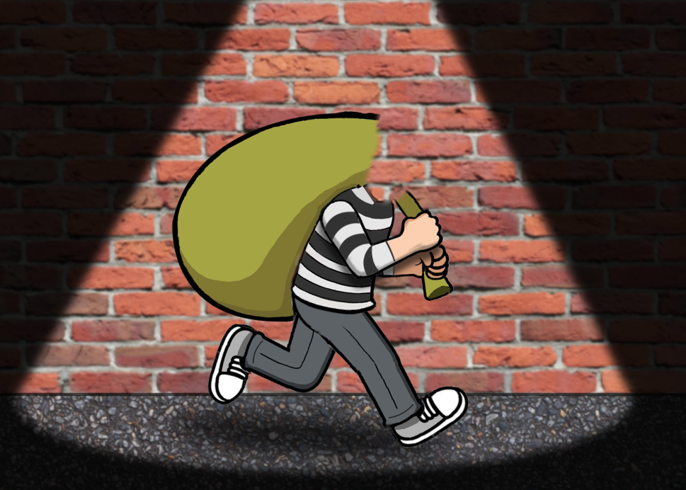
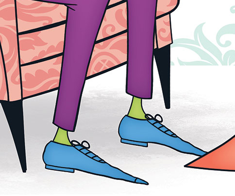
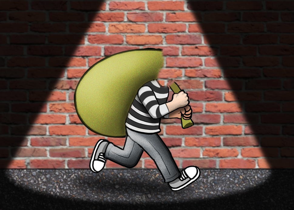
In regards to stuff like shadows/highlights/gradients/textures etc, I'd like to make this bland/flat-looking figure (the first image) look a bit more interesting/stylistic (like the images below it), but I don't really know where (or how) to start.. Can anybody give me advice on what to put where? Thnx!


Explore related tutorials & articles
 17
Replies
17
17
Replies
17

Copy link to clipboard
Copied
If you created these images, you're no noob!
Copy link to clipboard
Copied
I only semi-created the first image; the rest of the images (by artist Marcus Allen) are the ones I'd like to imitate 
Copy link to clipboard
Copied
His look to me like they might be done in Illustrator, but if it's Photoshop, I think he's applying an inner glow and inner shadow to achieve some of the effects.
Copy link to clipboard
Copied
What about them looks like they were done in Illustrator (instead of Photoshop)? thnx
Copy link to clipboard
Copied
Well I should specify that I don't work in AI, but to my eye, vectors have more of a smooth look with a thicker and more uniform line. However, just because it looks like a vector to me doesn't mean it is one haha!
Your illustration looks good. For the shadow on his bag, you can make it more subtle by adjusting the transparency; however, having said that, the look you have can also be a good one depending on what you're going for. Also, FYI he appears to have two right feet. You can still duplicate and flip the right shoe you've already drawn, but there should be slight adjustments made to make it look like the left foot. You can do this by indicating the arch of the foot, which would show on the inward-facing foot.
Like this:

Copy link to clipboard
Copied
Hi
A few soft highlights and shadows (using screen and multiply blend modes) add a bit of depth.
Dave

Copy link to clipboard
Copied
Illustrator is a better tool for this type of work than Photoshop.
Illustrator tutorials | Learn how to use Illustrator CC

Copy link to clipboard
Copied
Hi,
Here is a tutorial that might help you gain the look your after: Tutorial: Basic Photoshop/Drawing + Kirby Tutorial [PS CS6] - YouTube
Sim

Copy link to clipboard
Copied
In my opinion, use dodge and burn and respect the light source
Regards
E
Copy link to clipboard
Copied
If you’re going to use these two tools, I’d suggest you create a 50% grey layer above the image to use dodge and burn non-destructively.

Copy link to clipboard
Copied
https://forums.adobe.com/people/Derek+Cross wrote
If you’re going to use these two tools, I’d suggest you create a 50% grey layer above the image to use dodge and burn non-destructively.
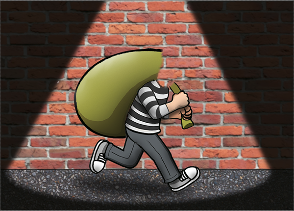
Derek, out of interest, are you are photographer? The non destructive approach to dodge and burn is useful for working on photographs, but not so good for illustration. Dodge & Burn's ability to target tonal range gives you a different effect and control, but only when applied directly. The example below shows, from left to right, the Burn tool set to Shadows, Midtones and Highlights, and then the Burn tool set to Shadows, Midtones and Highlights. You could simulate this non destructively using blend modes, but only locally. The advantage of using D&B directly is that you target where the effect is strongest, and how much it affects saturation
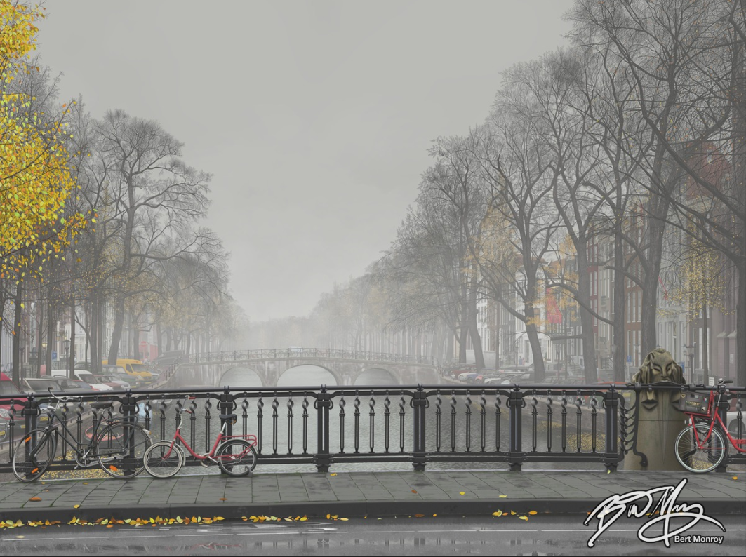
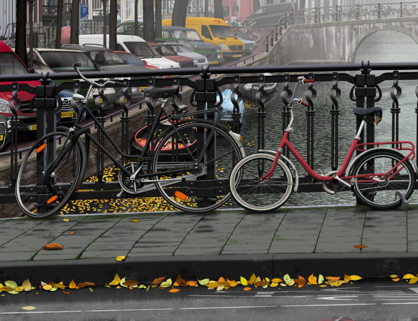
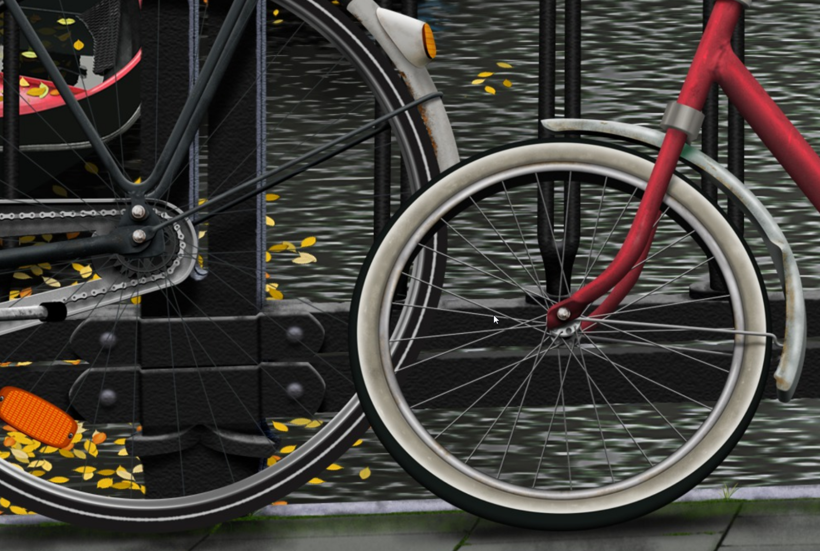
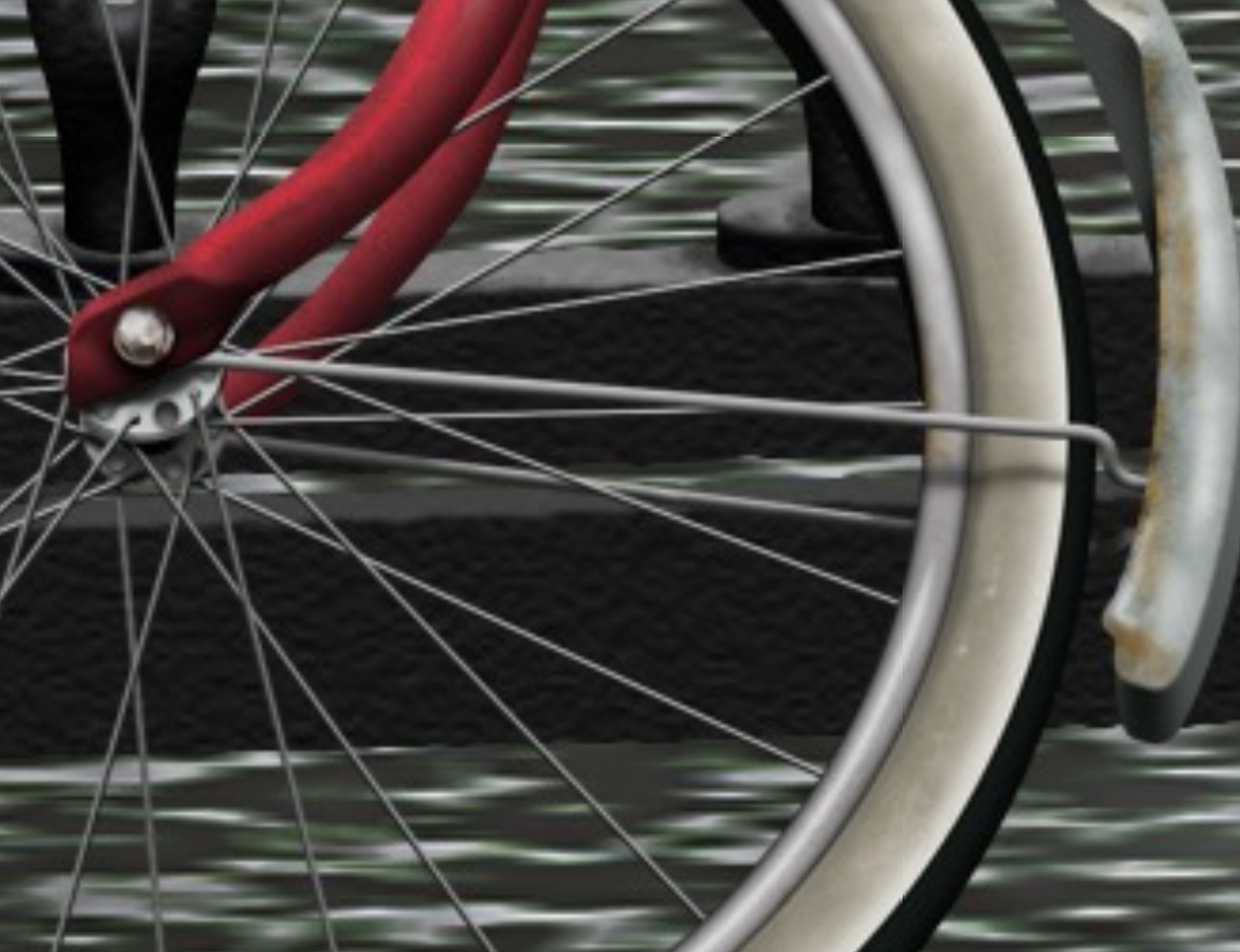
I missed this trick for a long time before learning the truth of it from Bert Monroy's tutorials on how he made his Times Square, and Amsterdam Mist illustrations. People tend to talk about the Times Square illustration when discussing Bert, but the later illustration is so much better. It's not until you zoom right into the image that it starts to look less like a photograph, and even then it looks like a photograph that has had a Topaz or similar effect applied. Amazing stuff, and all the more so for being explained in Bert's Lynda.com tuts.
Copy link to clipboard
Copied
Fair enough!
Copy link to clipboard
Copied
Wow Trevor! I'd never thought if this. It's a great one to know. I was duplicating the layer so as to leave it intact in case I made a mess of things (in photography, not illo).
As to using these tools on illustrations, often (and in my case, nearly always), illustration for clients requires that each element be on its own separate layer. Line art on one layer, the color for each separate element on another. I have illos which have hundreds of layers sometimes. I do apply layer styles such as inner glow, inner shadow, etc (which replicate dodge and burn), and I do it this way because they can be disabled and then re-enabled as needed by the printer. It isn't like photography.
Copy link to clipboard
Copied
thought *of* this
Copy link to clipboard
Copied
ponytail1414 wrote
As to using these tools on illustrations, often (and in my case, nearly always), illustration for clients requires that each element be on its own separate layer.
I did have a play with the image at the top of this thread, and the first thing I did was select each element and copy to a new layer. Then lock its opacity. Dave covered what my approach would be though, so I did not duplicate the information. I would have used texture, and with maybe a hint of irony, I just might have done this non-destructively with a 50% grey layer.
I might as well do it after saying that.
I routinely keep image elements on separate layers. This gives us a lot of advantages.
- You can lock the opacity to prevent over spill. If it is a plain colour, I might blur before locking to smooth the outline.
- You can Ctrl click to reload the selection.
- Clip additional layers — warping a texture would be a good example. It might be difficult to exactly the match the shape and outline, but with a clipped layer we can overlap a wee bit and not worry about being too precise.
- We can use Layer Styles layer by layer.
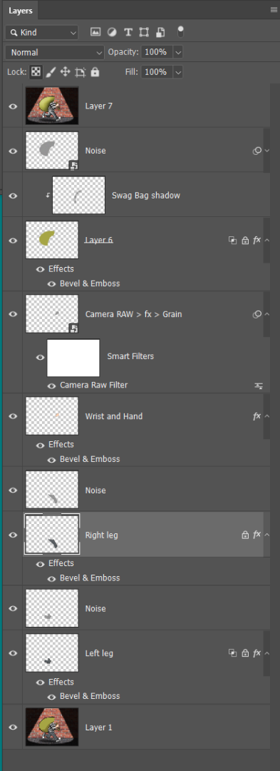
- Click to load the selection and add layer masks. This might be useful if a Layer Style is affecting parts of the layer that we don't want. So we set Layer mask hides effect in Layer Styles, and add pixels to the layer. They won't show because of the mask, but they will prevent issues with layer styles. Bevel & Emboss is a good example. In the case of the right leg, I was able to fix that with the shading angle set to 170°. A steeper angle would cause the highlight to run across the top of the trousers (pants) and mess things up.
For the sake of agreeing with Derek's non-destructive approach, I used 50% grey layers set to Overlay to add the texture. I Ctrl clicked the image element layer to load as a selection, and filled a layer above with 50% grey. The wrist layer was a bit too light in tone for textures to work well, and I usually use Camera RAW ? fx > Grain for skin texture, so I just went crazy with the settings to make it show.
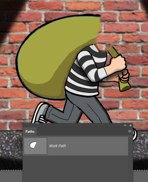
The original has nice curved lines in the burglar's top, and they are are perfect for showing depth. If not already there I would have used FT > Warp to create the curves, and probably shading and noise. With the high values required, I find that monochromatic Gaussian works best.
My hand is not as steady as someone like Leslie's, so I tend to use a lot of stroked paths to keep my inking nice. So if I wanted to apply shading to the swag bag I'd stroke > center with a black brush. Blur the stroke, and clip to the swag bag template layer. I use the Smudge tool a lot to drag shading etc. into place.
I wish I had a profile of Dave's head to add to this illustration. LOL By heck I have had good value out the time it took to do the front view. Hmmm... it does 'kind' of work. I'm thinking of Heather's video animation now. There a few songs that would work well.
Copy link to clipboard
Copied
Hahaha Trevor! And an interesting way to go in addition to the humor. I'm so used to keeping things on separate layers that this makes sense to me.

Copy link to clipboard
Copied
First... Consider Illustrator instead.
Then when creating graphics thing of a graffiti artist that somewhat works in reverse.
First draw your line art (this will be your top layer). Make sure all lines are expanded after. Lock it.
Second duplicate that layer (this will be your bottom layer). Select all the lines in this layer... and make them clear. Then go to Object and Make Live Paint. Fill in the shapes for your base colors.
Now all layers in between these two layers will be your shading and highlights.
I do this all the time. You can see tons of examples in my Adobe Portfolio!

 AdChoices