Participating Frequently
May 20, 2019
Frage

Insane Color Management Issues Photoshop CC + DisplayCal

  • May 20, 2019
  • 12 Antworten
  • 4177 Ansichten

I've been researching this for tens of hours, but something is severely wrong.

Goal

My ultimate goal is to have calibrated and consistent colors across all hardware and software on my Windows 10 machine. This includes a calibrated monitor using an i1 Display Pro + DisplayCal, correct color management in Photoshop, and all images should appear with correct colors across Windows, browsers, and Photoshop. I don't want the situation where an image imported into Photoshop doesn't look anywhere remotely near the original or an image exported from Photoshop doesn't look anywhere remotely near the preview.

Alas, these are the issues I've been having.

Specs & Versions

Windows 10 Pro 64-bit 10.0.17763

Adobe Creative Cloud 4.8.1.435

Adobe Photoshop CC 20.0.4

DisplayCal 3.8.1

ArgyllCMS 2.1.1

i1 Display Pro

ImageGlass 6.0.12.29 (Color-Managed Image Viewer)

QuickLook 3.6.4 (Another Color-Managed Image Viewer)

Firefox Nightly 64-bit 68.0a1

Google Chrome Canary 76.0.3799.0

Monitor Profile: VG248 #1 2019-05-19 18-16 D7500 2.2 VF-S XYZLUT+MTX.icm

Symptoms

I've been having various issues with color in PS for a while now, but now I've identified that it's not because of the way I'm viewing the images or the way my monitor is calibrated. It has to be something with PS.

Sometimes opening images or PS documents yields a document preview that looks awful and doesn't represent the original file at all. Other times the preview is perfect, but the exported file doesn't represent the preview in PS at all. I can't seem to find a combination that keeps the colors correct and consistent.

I've conducted a few practical tests and listed the results below. I created a standard rainbow gradient on a new 1000x1000px RGB file, compared the preview to a reference, and compared the exported PNG to the preview. Restarting PS after changing settings.

RGB Working SpacePS Preview
Exported File
Export Size
sRGB IEC61966-2.1Awful preview (Not accurate)Correct Colors (accurate)Small file size
Monitor ProfilePerfect Preview (Accurate)Totally Wrong Colors (How?)Huge file size from embedded profile

Screenshots

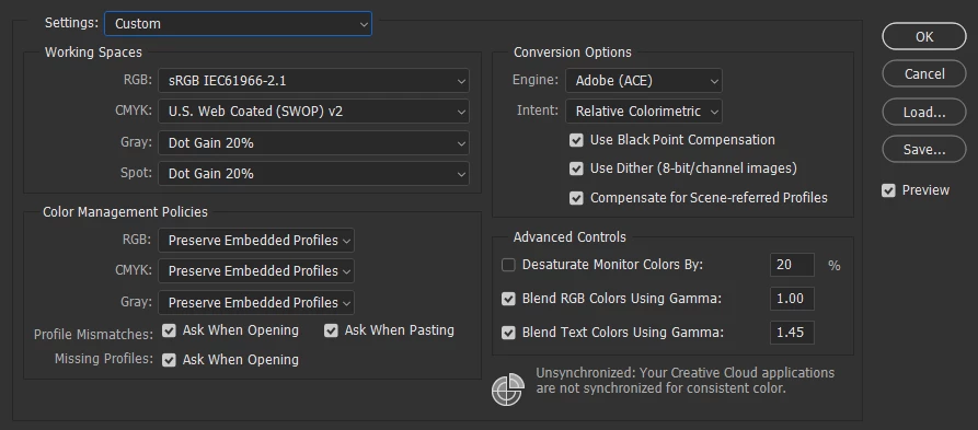
Here are my Color Settings for the most part. I've been playing around with different Working Spaces and RGB Policies. I would like to keep everything else.

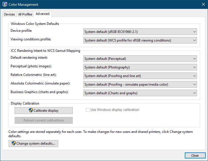
Here are the Color Management settings in Windows. I'm letting the DisplayCal app load the profile automatically.

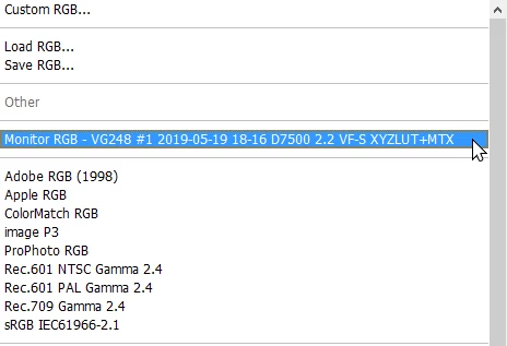
The monitor profile is recognized in Photoshop

Color-Managed Viewers

Both ImageGlass and QuickLook are color-managed and load embedded color profiles. I tested this with the WhackedRGB test images. Also - to a lesser degree - both Firefox and Chrome can load color profiles embedded in images, but images with missing profiles can still be problematic. The stock image-viewer in Windows is NOT color-managed.

Things I've tried

  • Restarted
  • Re-calibrated display using DisplayCal
  • Dumping profile, embedding, and converting profiles with varying degrees of failure
  • Re-installed PS
  • Changed some settings in DisplayCal
  • Using the Proof Colors with the Proof Setup on Monitor RGB fixes the wonky preview with the sRGB Working Space; however, this is not a permanent solution.

What it could be

I have a feeling that DisplayCal or Argyll updated in such a way that PS can't automatically load the display profile and display a proper preview. Or perhaps PS is having a hard time with the .icm file compared to a regular .icc?

Being able to import, preview, and export images with consistent and accurate colors in Photoshop must be possible. Something must be broken here and I don't know exactly what. If you have any suggestions for things you'd like me to try, I'll be watching this thread. Don't hesitate to ask if you need any more information either.

Many other people have run into issues similar to this with varying effectiveness of solutions. Let's get this solved for good.

Dieses Thema wurde für Antworten geschlossen.

12 Antworten

D Fosse
Community Expert
Community Expert
May 25, 2019

Dave and I posted simultaneously. Between us you should be able to figure this out

Participating Frequently
May 25, 2019

Ayy I'm back. Sorry I've been away for a few days. I was focusing on finals, finishing my college career, and yesterday was the last day of my most-recent internship.

I've read through the entire thread again and did some more research on the side. I would like to clear a few things up:

  • The image viewers I'm using pass the WhackedRGB tests. WhackedRGB is a color space that is intentionally sabotaged so that the image looks like garbage (really blue-purple) instead of normal when it's opened in a viewer that doesn't honor the embedded profile. I'm assuming that there's not much else to it, but let me know if that's wrong.
  • I don't really expect non-color-managed viewers to display colors 100% correctly, but if they're treating the color space as sRGB and the image was created/edited/exported with sRGB as the working space, then surely the image would be represented somewhat accurately. Let me know if that's entirely wrong. This might not apply to other color-spaces.
  • For my purposes I only really care about working in the sRGB space because it's standard, popular and my monitor covers close to 100%, compared to other spaces.
  • I took those screenshots using ShareX, I don't know why one would have the profile and the other wouldn't. I took them the same way.
  • sRGB IS a standardized color space. The S literally stands for standard.
  • I truly desire being able to view an image - for example - with a solid color red (255,0,0 #FF0000) and the pixels on my monitor to display 100% red sub-pixels and 0% green/blue, plus the additional correction applied when the monitor was calibrated and profiled. I want this to apply to viewing images with a color-managed viewer, when editing in photoshop, and when exporting a final product. In my 'dream' workflow there should be no visual discrepancies. I feel like this is actually supposed to be normal and it shouldn't be a 'dream,' but alas, for whatever reason I can view an image using a color-managed viewer and open it in Photohsop with the recommended color settings and they are far from similar. There's no comparison. Since color is mathematical at a point, there's really no reason in my mind that they can't be exactly the same.

I've made and uploaded a video showcasing the inconsistencies (Sorry, It somehow came out to 29 mins): Color Management Issues In Photoshop CC 2019 - YouTube


Also here's a fantastic - albeit 1hr long video - from a video editor regarding lots of color correction issues and questions. I heavily relate to the way he feels in this video: How the hell does color correction work?? Mega reverse tutorial - YouTube

Although initially I assumed that the issue was localized within PS, I'm starting to question the settings I'm using to correct and profile the display with.

I have a feeling that DisplayCal is creating a correction and a profile properly, but something about it doesn't work with Photoshop. It works everywhere else though. As far as I can tell, the colors in just about everything else like After Effects, Bridge, my image-viewers, the desktop, everything (except some places in Firefox Chrome and the default Windows 10 image viewer) look amazing on this Asus VG248QE look amazing, especially when calibrated.

There's also a possibility that from the research I've done and the discussion in this thread, that I've completely misunderstood what 'Color Management' really means. Perhaps it's an additional layer above using a color calibrated monitor and embedded color profiles, and it's actually for additional accuracy that only works with color-managed applications (which might actually be rare contrary to my assumptions). In which case, 'color management' might not be right for me. I want my images to look similar/ the same on as many other devices as possible without assuming that my audience uses rare color-managed image viewers. Most newer monitors are being calibrated in-factory before QC and before they reach the customer. so as long as my monitor has an updated correction, then surely any image I create and send out to the world will look relatively similar.

I'm going crazy.

davescm
Community Expert
Community Expert
May 25, 2019

Hi

I'm sorry , I don't have time right now to watch a 30 minute video but I do have a few comments on your assumptions.

1. Whacked RGB. That test shows whether the colour profile in the document is being honoured in the browser, which is the first half of colour management. It does not test whether the monitor profile is being used correctly and whether it actually describes the behaviour of your monitor.

2. None colour managed viewers just send the numbers direct to the screen regardless of document or monitor profile. If the screen happens to match the sRGB colour co-ordinates and gamma then it would display correctly. If it does not it will not display correctly.
I notice in your first post that you appear to have set up your screen with a white point of D7500 which is a long way off the sRGB standard of D65 (6500k). When using colour managed browsers that would not matter as the profile will describe the calibrated state of your monitor. When not using colour management colours will take on a cooler i.e bluer look.
3. You may only care about the sRGB space , but if you have moved your monitor controls during the calibration process to get near your target D7500 then your monitor is not set up as sRGB.

4. Don't assume your monitor is calibrated and profiled out of the factory - it is not. Even high end monitors require calibration and profiling.

5. You mention video - do not go down that rabbit hole. Video does not use ICC profile based colour management. In video systems they rely on the video content and the monitor being calibrated to a video standard (e.g. REC709), that means white point, colour co-ordinates and gamma all meeting the standard. Video monitors allow direct access to adjustment of the colours and the grayscale tracking. There is no color profile to allow correction and conversion between color spaces.

My advice would be start again:

1. Use Displaycal to first calibrate your monitor. Use D65 as the target whitepoint (there are good reasons when matching to print to change this but in your case keep it simple). First use the monitor controls to get close. The aim being to get your monitor control adjustmets close to the sRGB standard although the gamma will still probably be off. Then use DisplayCal calibration to build a calibration LUT which takes it closer still.
2. Use DisplayCal to profile your calibrated monitor. This is the final stage and tells colour managed applications how your monitor will display the colours. As Dag advised in post 5 make the profle a simple matrix version 2 profile which can be used by any colour managed application.

Dave

D Fosse
Community Expert
Community Expert
May 21, 2019

I'm fairly confident that all of this is just the normal difference between color managed software and non color managed software. The apps that Chillstice assumes are color managed probably aren't, or they aren't properly configured to be.

Assuming you have a valid monitor profile, and assuming the file has an embedded document profile, Photoshop is right. That's what the file really looks like. Other applications that don't agree are wrong, because they don't color manage correctly.

The original RGB numbers need to be remapped into the monitor color space to display correctly. If that doesn't happen, the file displays incorrectly. This remapping requires a) an embedded document profile, b) a valid monitor profile, and c) a color managed application that converts from one into the other.

That's color management summed up. It's not difficult, it just has to be there.

davescm
Community Expert
Community Expert
May 21, 2019

Hi

https://forums.adobe.com/people/D%20Fosse

Dag, there is another possibility that may be going on here. I would welcome your view. Your advice not to touch the Advanced section of Windows colour management is normally sound. But...

As we know there are two stages of calibrate and profiling. The calibration to produce the (Look up table) LUT to be loaded into the GPU card and the profile to describe the behaviour of the monitor in that calibrated state. Both are normally held in the single icc file.

The calibration data needs to be loaded to the GPU LUT on startup or on switching profiles. This needs either a loader utility, such as that provided by Xrite (CalibrationLoader)  and is usually run in the Windows startup folder, or it can be loaded by Windows but Windows needs to be set to do so. That is what I do here.

So my advice would be to get the OP to check his Windows startup folder (accesible via task manager) and check if any calibration loader utility is in place. If there is stop there. If there is not , then you can get Windows to load the LUTs on start up by :

Going to the Windows Colour management Advanced tab.
Click the "Change system defaults" button
In the window that opens click the  Advanced tab

Check "Use Windows display calibration"

This will get Windows to load the GPU LUTs from the default profiles so that the profile being used matches the monitor with the LUT loaded.

OP - Wait till we get Dag's view before doing anything here.

Dave

D Fosse
Community Expert
Community Expert
May 21, 2019

Well, possibly. I've used hardware calibrated monitors for a long time (directly to monitor LUT), so I don't have any firsthand recent experience with LUT loaders of any kind.

Still - this affects the calibration part only. The LUT is a global adjustment, equivalent to tweaking the monitor's OSD controls. It doesn't discriminate between color managed or not. Even if the LUTs failed to load, you wouldn't see any differences in behavior between applications. It would just all be slightly off.

Legend
May 20, 2019

> If my assumption that color correcting a monitor brings it within a standardized specification and that images should appear similar across color-accurate devices is wrong, then what are we even doing?

That's pretty much exactly what it's for. But you have made a huge leap to expecting non-colour managed apps to work as well. This is the point at which we are so much in disagreement, and it's in trying to reach this that everything is going to the dogs.

> I still can't fathom why I can't achieve this anymore.

Did you buy a new monitor (or laptop)?

> Shouldn't all designers that do color work strive for consistency?

Yes, and they get it, where it is expected to work (colour managed apps. Only).

> Let me know if I'm wrong, but I feel as if I'm being talked-down to in this thread

Well, we know that colour management works, and we often hear from people who assert it doesn't. So it does come down to technicalities, but we need - I'm afraid to sound patronising - to find exactly what you are doing wrong, because the alternative is to say that colour management doesn't work and the industry and ourselves have been imagining things. And indeed, the person seeking colour accuracy by and large stays in Photoshop, because it shows what is right, rather than working through a catalog of other viewers: if the viewer looks like a correctly set up Photoshop it's right, and if it doesn't it's wrong.

Here's something: You write

> Using the preset rainbow gradient, apply the gradient from corner to corner and look at the preview:

>     Here's what the preview looks like (accurate):

What is this "preview" of which you speak? The accurate colour is what you see when you edit in Photoshop, which isn't a preview, it's the thing itself. Do you mean something else by "preview" (this might be getting us somewhere)?

Participating Frequently
May 20, 2019

All I really want is the old Photoshop experience, before I even started looking into color correction and color management. A time where I could drop images in Photoshop, the preview is identical to the input, and the export is exactly as the preview. Ever since I started down the rabbit hole it's been causing me issues.

If my assumption that color correcting a monitor brings it within a standardized specification and that images should appear similar across color-accurate devices is wrong, then what are we even doing?

If an sRGB image that's just 100% Red 255,0,0 #FF0000 can't appear the same between color managed image viewers and Photoshop, then although something might not be 'broken', something is really truly broken.

I still can't fathom why I can't achieve this anymore. Before, when I was ignorant of color correction and color-management - although the colors might not have been accurate - at least they were consistent and I knew what I was getting.

Shouldn't all designers that do color work strive for consistency? Isn't that why web-designers still use sRGB religiously, because it's the lowest-common denominator between browsers and devices?

Let me know if I'm wrong, but I feel as if I'm being talked-down to in this thread. I'm understanding what everyone's trying to say, but I'm struggling with the technicalities.

Per Berntsen
Community Expert
Community Expert
May 20, 2019

Chillstice wrote

ImageGlass 6.0.12.29 (Color-Managed Image Viewer)

QuickLook 3.6.4 (Another Color-Managed Image Viewer)

I am not familiar with any of these viewers, but I suspect that they may not be color managed. (although they may claim to be)

I have seen other image viewers that claim to be color managed, but in reality, they're not. They are aware of the image's embedded profile, but fail to convert to the monitor profile, just like Internet Explorer, and probably the Edge browser.

The conversion to the monitor profile is required for color management to work.

I suggest that you try a truly color managed viewer, like FastStone, which is free for personal use.

Make sure that the CMS settings are set like below.

Any changes to these settings require a restart of the application. (the second checkbox may not be checked by default)

Participating Frequently
May 20, 2019

Here's an experiment I'm running:

1. Open PS and create a new 1000x1000px RGB document using the following color settings:

2. Using the preset rainbow gradient, apply the gradient from corner to corner and look at the preview:

     Here's what the preview looks like (accurate):

3. Save the image as a PNG with default settings and medium compression (my normal workflow with pngs)

     Here's what the final image looks like (accurate):

From this test I gleam that the saved file has the intended, standardized colors and they're displayed properly in un-color-managed and color-managed programs alike, however; the preview in PS is vastly different which is dangerous. Using the Proof colors set to Monitor RGB does somewhat make it look like the output, but not exactly.

I would like to use these settings and use this workflow for the most part, but I still don't understand why the preview in PS is so vastly different.

I understand the theory behind color-correcting a monitor, and I somewhat understand the color-management theory, but this is just beyond me. Does anyone know what's happening here and possibly how to alleviate it?

Am I messing something up big-time?

D Fosse
Community Expert
Community Expert
May 20, 2019

Your assumptions are still wrong. There is no such thing as "standardized" color. The color is only defined in a color space. No exceptions! The profile has to be embedded in the file, and the application has to honor that profile. Failing those two premises, the result is random, according to your display's idiosyncrasies.

What happens next is a standard profile conversion, from the document profile and into your monitor profile. This is a remapping of the RGB numbers from one color space (document) into another color space (monitor). This is necessary to preserve color appearance and represent the color correctly on screen. Effectively, it takes the monitor out of the equation.

This conversion is what separates color managed from non-color managed applications. The latter just send the original RGB numbers straight through, without remapping into monitor color space.

Participating Frequently
May 20, 2019

Here's my Devices tab for reference:

From what I'm understanding by reading through this thread: The color management in Photoshop is operating as intended and my color management workflow - for the most part - is correct.

I have a hard time understanding this because it seems extremely counter-intuitive that during the process of importing, editing, and saving an image through PS, the colors can appear dramatically different.

With sRGB set as the working profile and opening an untagged image, I can literally open the image, make absolutely no changes, save it to the same file format, and the two images look nothing alike when viewed in a color-managed viewer.

Is this intentional or am I still missing something?

Would anybody recommend a workflow that works with my initial goal in-mind.

Otherwise would it be better to go back to the days before color management when at least the colors were consistent?

Logically, I just can't work knowing that either the preview, or the final saved file/ export won't appear as originally intended. That seems like a nightmare and I have a hard time believing that's intentional at all.

Thanks for all your help.

D Fosse
Community Expert
Community Expert
May 20, 2019

Getting a bit more specific: I see your monitor profile name ends with "LUT+MTX" (look-up tables + matrix). I'd suggest making a simpler profile, this sound needlessly heavy and complicated. LUT profiles in particular are known to cause problems in many scenarios.

As long as you have a reasonably well-behaved monitor, a simple matrix is more than good enough.

Important: Proof to Monitor RGB disables all display color management. That can be useful for diagnostic purposes, but it's wrong and not to be used in any other situation.

It needs to be repeated (Dave mentioned it): Export has all color management disabled at default settings. It strips the document profile, and doesn't display using the monitor profile. You need to enable all of this manually (don't ask me why someone thought that was a good idea).

In Firefox you need to enable color management for untagged files. This is known as "mode 1". With this setting, Firefox assigns sRGB to all untagged material including html - allowing the normal color management chain to operate.

Another important point: the working space isn't important. The embedded profile is - it should always override the working space.

Summing up: there are no color management problems in Photoshop. But there may well be in other applications. As Chris Cox, former PS senior engineer, said it: "Color management isn't difficult. Other applications breaking it, that gets difficult".

D Fosse
Community Expert
Community Expert
May 20, 2019

Oh, BTW: never touch anything in the Windows color management "Advanced" tab. There's nothing useful there. Everything relevant for practical color management is in the "Devices" tab.

D Fosse
Community Expert
Community Expert
May 20, 2019

Just to be clear, the calibration part of this is not part of the color management chain. The calibration gets loaded into the video card LUT (or in high-end monitors, the monitor LUT) - and this obviously alters the monitor's characteristics globally, affecting everything.

The profile lives a separate life. It doesn't adjust anything, it's a description of the monitor in its calibrated state - used by color managed applications so that they can adjust the data they're sending out. It's a standard icc profile, used in a standard profile conversion.

The reason we're having these two separate processes, is that calibration, while a convenient and simple solution, has very low precision. You can't correct for irregularities in the monitor's tone response curve. You can't account for the position of the primaries - the size and shape of the monitor's native color space.

Theoretically, you could skip monitor calibration and just profile it. But calibration performs one very important function: it sets the environment for color management to work within. It defines what's white and what's black. Within that context, the profile just remaps document white to monitor white, without regard for what that white actually looks like.