- Home
- Photoshop ecosystem
- Discussions
- Re: Iridescent Sea Shell Texture
- Re: Iridescent Sea Shell Texture
Iridescent Sea Shell Texture
Copy link to clipboard
Copied
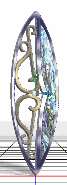
This is what we call Paua shell in NZ, and is known as Abalone in Oz. The polished shells are used a lot in jewellery and all sorts of decorative inlays.


I have used a downloaded Paua texture in a project that is otherwise 100% Photoshop down to the last pixel. and I'd like to keep it that way, but short of building the texture manually layer by layer to give me the laminated effect. I have not got there yet.
I have tried combinations of blend mode and opacity using multiple layers with:
Render clouds and render fibers
Eye Candy 7's Marble and Noise textures
Plastic Wrap, and Glowing Edges
None of these has given me a decent Paua/Abalone shell texture. My gut tells me that I will have to build it layer by layer, but I thought I'd try the forum for ideas.
Explore related tutorials & articles
Copy link to clipboard
Copied
I'll try bumping this just the once. ???
Copy link to clipboard
Copied
I don't have any ideas for you, just wanted to say I think it looks great and this is quite the challenge you have set for yourself! Ok, maybe one idea. Try playing with the satin layer style, it's pretty weird and might help with the shiny bits.
Copy link to clipboard
Copied
Hi Trevor
Had a bit of a play with this tonight. Something along these lines might get you close
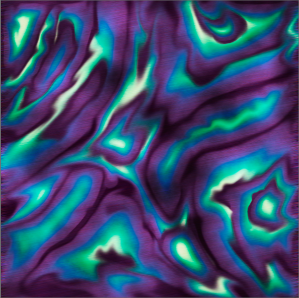
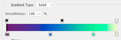
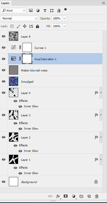
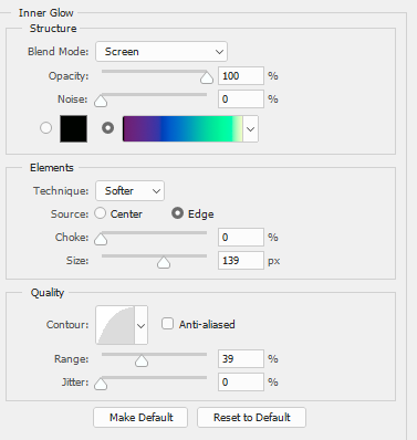
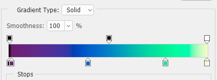
Several plain black and transparent layers each with an inner glow style based ona gradient like this
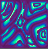
Then a healthy dose of the smudge tool
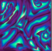
A layers of noise with motion blur applied to create the surface scratches (blending mode overlay)
Then a bit of curves and saturation adjustment and a clouds layer set to Overlay
Finally on top a gray clouds layer set to overlay
As I said - not there yet but getting closer
Dave
Copy link to clipboard
Copied
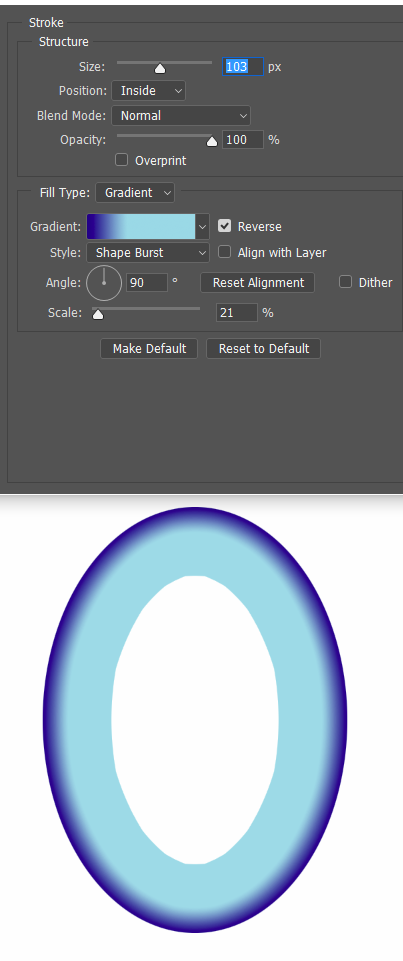
That's great Dave. Thanks. I had been thinking along similar lines regards Layer Style Stroke set to Gradient, but I don't know how to make it feather the stroke other than Create layer > Gaussian Blur. I use Layer Styles a LOT, but I still have to think about some of them, like Inner and outer glow, where the interrelationship between all the sliders can be a bit finicky.
At the moment, my free time is going into learning the 3D tools (also thanks to you) but I'll get back to this ASAP.
Copy link to clipboard
Copied
The feathering was in the gradient It went from opaque in the mid blues to transparent in the yellows
This was the inner glow setting
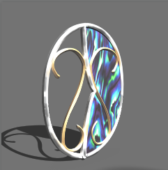
I tried dropping it in as a texture on a simplified version of your earring model just to see how it looked :
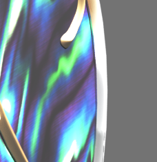
100% section :
Dave
Copy link to clipboard
Copied
davescm wrote:
The feathering was in the gradient
Dave
Ahhhh... I like your thinking. It's little lateral approaches like that, that make this forum so good. Workflows that are obvious when pointed out to you, but in this case, had never occurred to me in the 20 odd years I have been doing this stuff.
What I really like about this forum is seeing questions that I don't have an answer for, because we have to think how to do it, which gives us new skills, and with some very capable people posting here, it happens all the time.
Thanks again Dave, and thank you Melissa. I'm getting back to Deke McClelland's 3D tutorials on Lynda.com ![]()
![]() It's also proving to be good therapy towards forgetting the worrying long term affects of our earthquake.
It's also proving to be good therapy towards forgetting the worrying long term affects of our earthquake.
Copy link to clipboard
Copied
Stay safe. Big earthquakes suck. I was the San Francisco one in 1987 - convinced the earth was going to open me up and swallow me, or the powerlines were going to electrocute me. I was 10 miles from the epicenter.
I think you have a fabulous direction to go in! I love to see the creative mind at work when tackling a challenge.
Copy link to clipboard
Copied
Thanks Melissa. A slightly bizarre regards the quake... People we know who live much closer to the epicenter, had scientists from GNS visit them yesterday, and while the locals were all struggling to come to terms with their ruined houses, the scientists could apparently hardly contain their excitement. I should update the other thread with details though.
With help and ideas from this thread, I have got the Abalone texture reasonably good using Layer Style > Stroke set to Gradient (Shape burst) with some custom gradients. It's funny how little details pass us by. I've never thought to set the end of a custom gradient to transparent, for instance, but that is key to getting a good merge with underlying layers. So I am drawing a random shape with the freehand pen tool, setting fill to zero, and using the above layer style. Actually I am using two strokes one set to outside, and a much smaller one set to inside, and reversing that from shape to shape depending.
I'm still working through the Deke McClelland 3D tutorials on Lynda — it takes me longer to hammer new stuff into my brain nowadays, and I am itching to progress my digital portrait. I probably shouldn't say at this early stage, but my long term plan is to produce digital portraits for some of the forum regulars, and host them on Behance, but very early days, and there's never enough time.
