• Global community
    • Language:
      • Deutsch
      • English
      • Español
      • Français
      • Português
  • 日本語コミュニティ
    Dedicated community for Japanese speakers
  • 한국 커뮤니티
    Dedicated community for Korean speakers
Exit
0

Isolate/Extract text from background

Community Beginner ,
Apr 12, 2018 Apr 12, 2018

Copy link to clipboard

Copied

Hello,

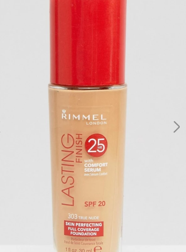
please help me. I need to isolate or extract the text on this makeup flask. Lets say I need the white text on a separated layer, red colored text on a separated layer and so on.. Using pen around every letter is not an option and not even magic wand on those little letters at the very bottom of the flask.

Anyone knows how to achieve this task?
D.jpg

Views

14.4K

Translate

Translate

Report

Report
Community guidelines
Be kind and respectful, give credit to the original source of content, and search for duplicates before posting. Learn more
community guidelines

correct answers 1 Correct answer

Community Expert , Apr 12, 2018 Apr 12, 2018

Hi

You could try this

To select the red : Make a copy of the blue channel, invert it and  use a curves adjustment to increase contrast, finally brush with a black/white brush at 50% opacity and set to overlay blending mode to sharpen the edges. Paint over the unwanted red selection from the bottle top with black. Make a selection from the channel

For the White :

Make a copy of the green channel and do the same steps as above (apart from inverting it).

Dave

Votes

Translate

Translate
Adobe
Community Expert ,
Apr 12, 2018 Apr 12, 2018

Copy link to clipboard

Copied

real final.png

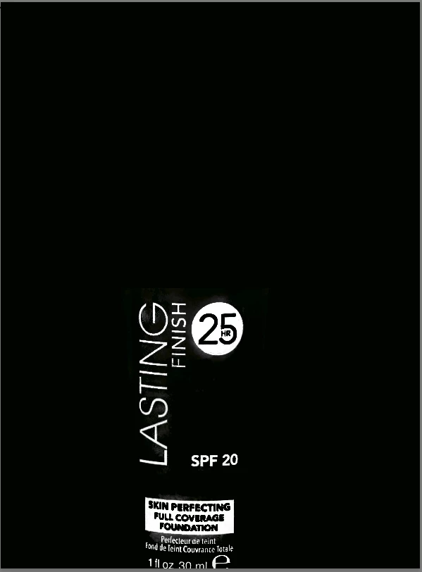
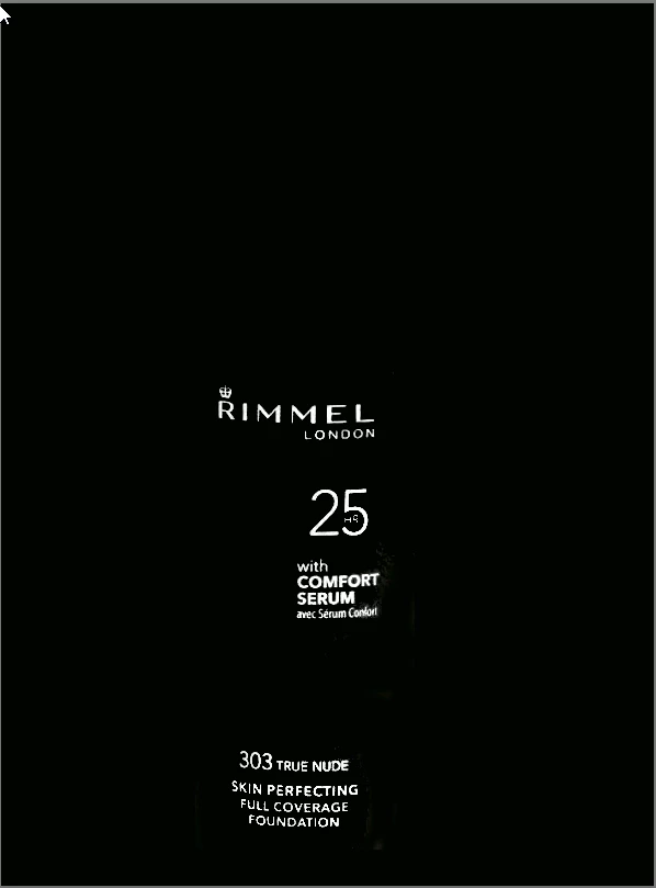
To get the red portion of the label (ignoring the white for the moment) convert the Mode to Lab Color and distort the  a  channel as shown to separate the red from the tan. The increased red saturation made the next step, Select > Color Range, more efficient in separating the red from the background. No concern for the type in the red panel a the bottom. It could be a solid panel with a type dropout.

The white type: Lab Color. Zero the  a  and  b channels to create gray, then use the L channel to produce the left image. Move into RGB. Curves to darken the area surrounding the type. I overdid that step and sacrificed the clarity.  The RGB step should be redone,

Votes

Translate

Translate

Report

Report
Community guidelines
Be kind and respectful, give credit to the original source of content, and search for duplicates before posting. Learn more
community guidelines
Community Expert ,
Apr 12, 2018 Apr 12, 2018

Copy link to clipboard

Copied

Hi

You could try this

To select the red : Make a copy of the blue channel, invert it and  use a curves adjustment to increase contrast, finally brush with a black/white brush at 50% opacity and set to overlay blending mode to sharpen the edges. Paint over the unwanted red selection from the bottle top with black. Make a selection from the channel

For the White :

Make a copy of the green channel and do the same steps as above (apart from inverting it).

Dave

Votes

Translate

Translate

Report

Report
Community guidelines
Be kind and respectful, give credit to the original source of content, and search for duplicates before posting. Learn more
community guidelines
Community Beginner ,
Apr 13, 2018 Apr 13, 2018

Copy link to clipboard

Copied

Thank you both, very helpful advices.

But one additional question, how do you determine which channel use for individual colors? How do you know that channel blue for red text or channel geen for the white?

Thanks

Votes

Translate

Translate

Report

Report
Community guidelines
Be kind and respectful, give credit to the original source of content, and search for duplicates before posting. Learn more
community guidelines
Community Expert ,
Apr 13, 2018 Apr 13, 2018

Copy link to clipboard

Copied

Hi

It's a case of looking for the best contrast in the area/colour you are looking to select. Sometimes an individual channel works well, sometimes a combination of channels which is where calculations comes in.

Dave

Votes

Translate

Translate

Report

Report
Community guidelines
Be kind and respectful, give credit to the original source of content, and search for duplicates before posting. Learn more
community guidelines
Community Beginner ,
Apr 13, 2018 Apr 13, 2018

Copy link to clipboard

Copied

Thanks man 🙂

Especially for you advice. Even though I must say it si a little bit hard to do the contrast of that small text below the white rectangle as nice as you did it.

This is my result so far:

ff.jpg

Votes

Translate

Translate

Report

Report
Community guidelines
Be kind and respectful, give credit to the original source of content, and search for duplicates before posting. Learn more
community guidelines
Community Expert ,
Apr 13, 2018 Apr 13, 2018

Copy link to clipboard

Copied

LATEST

When you make your initial curve (prior to using the overlay brush) make sure you have not lost any detail in the lettering (some may still be light grey on darker grey. After that switching the overlay brush (at 50% opacity)  between black and white should allow to bring out the edge detail without wiping out any lettering.

Dave

Votes

Translate

Translate

Report

Report
Community guidelines
Be kind and respectful, give credit to the original source of content, and search for duplicates before posting. Learn more
community guidelines