- Home
- Photoshop ecosystem
- Discussions
- Re: Neon light makes ugly halo outline when conver...
- Re: Neon light makes ugly halo outline when conver...
Neon light makes ugly halo outline when converted to CMYK printer's profile
Copy link to clipboard
Copied
Hi guys,
I have kind of an urgent question:
I'm working on a newspaper-style exhibition brochure (final version due this Friday, omg!!!). The InDesign document is going to be exported in the specific newspaper color profile (named "WAN-IFRAnewspaper26v5"). I have no problems working with this so far, except with one picture.
It's a neon sign. Whereas in the original profile, there is a very nice color / light gradient into "the dark", when converted to the printer's profile, there is a very ugly outline-kind-of-thing in the halo of the neon sign. It almost looks like it's a solid surface around the sign. See here:
Original:
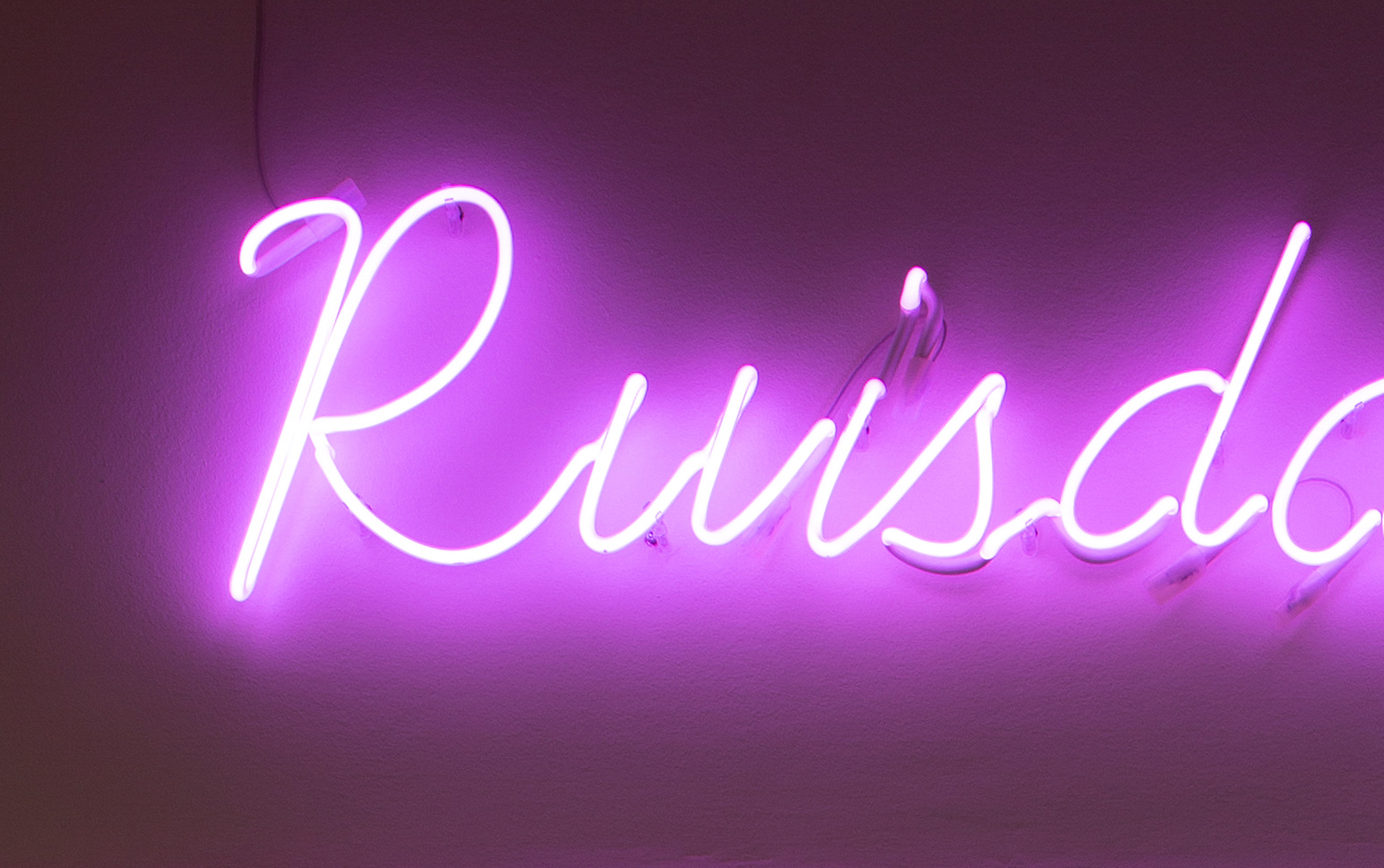
Converted version:
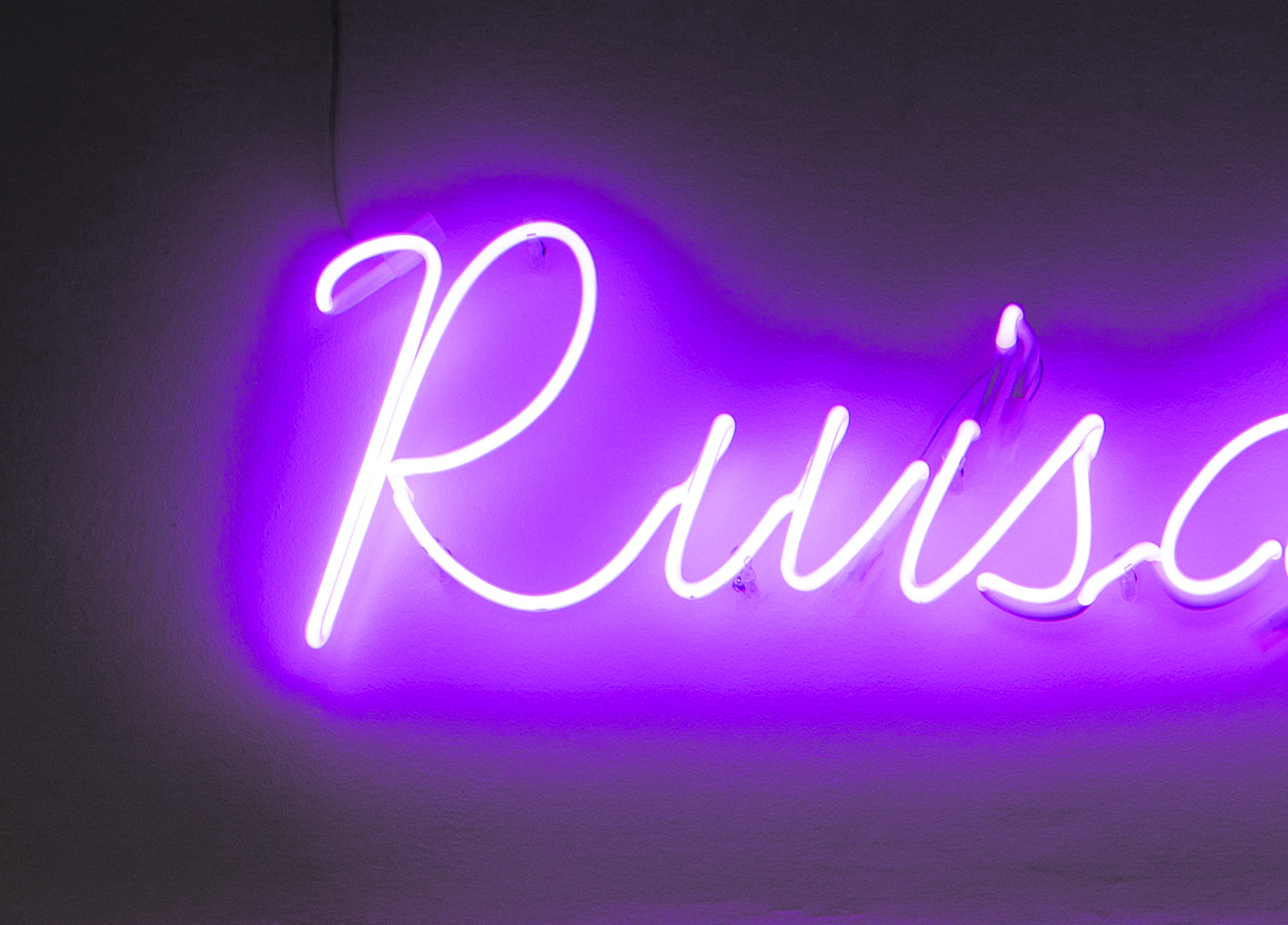
Can you help me to make that look at least a little more decent?
I tried using different converting options, and tried to mess with color saturation, lighting etc., but it won't help.
Would be awesome!
Thank you so much,
Tobi
Explore related tutorials & articles
Copy link to clipboard
Copied
What Render Intent did you use?
Have you tried »Perceptual«? (One can set that for single images in Indesign under Object > Image Color Settings)
Copy link to clipboard
Copied
Yes, as I said I tried different converting options. It doesn't help – that's why I'm asking ![]() ...
...
Copy link to clipboard
Copied
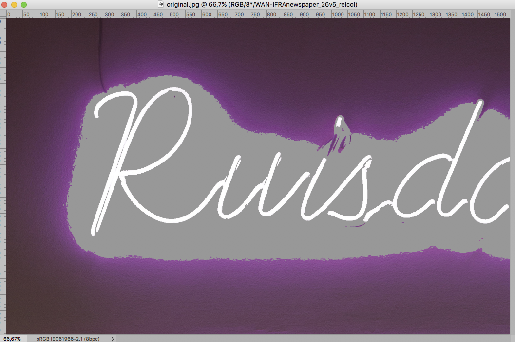
»original.jpg« has banding issues as it is – was that (a part of) the original at full resolution?
Do you have the layered file? Is it 16bit yet?
And much of the magenta »center« is simply out of gamut for that CMYK Space (see screenshot, View > Gamut Warning).
Copy link to clipboard
Copied
Hey, thanks for your help, I really appreciate it!
Interesting!
Well, that's the only image I got, at least. I'll see if I can get a raw file from the photographer (it is an actual photo, so no layers).
If so, would there be a way around these banding issues?
It doesn't matter so much that the magenta is looking correct, it's really about the strange outline-thing.
Thanks again!
Copy link to clipboard
Copied
This is the original file I got, by the way:
.jpg)
Copy link to clipboard
Copied
There is a chance that a 16bit version created from the RAW image might separate better, but no guarantees.
Copy link to clipboard
Copied
Okay let's wait and see if I can get the RAW. Thanks!
Copy link to clipboard
Copied
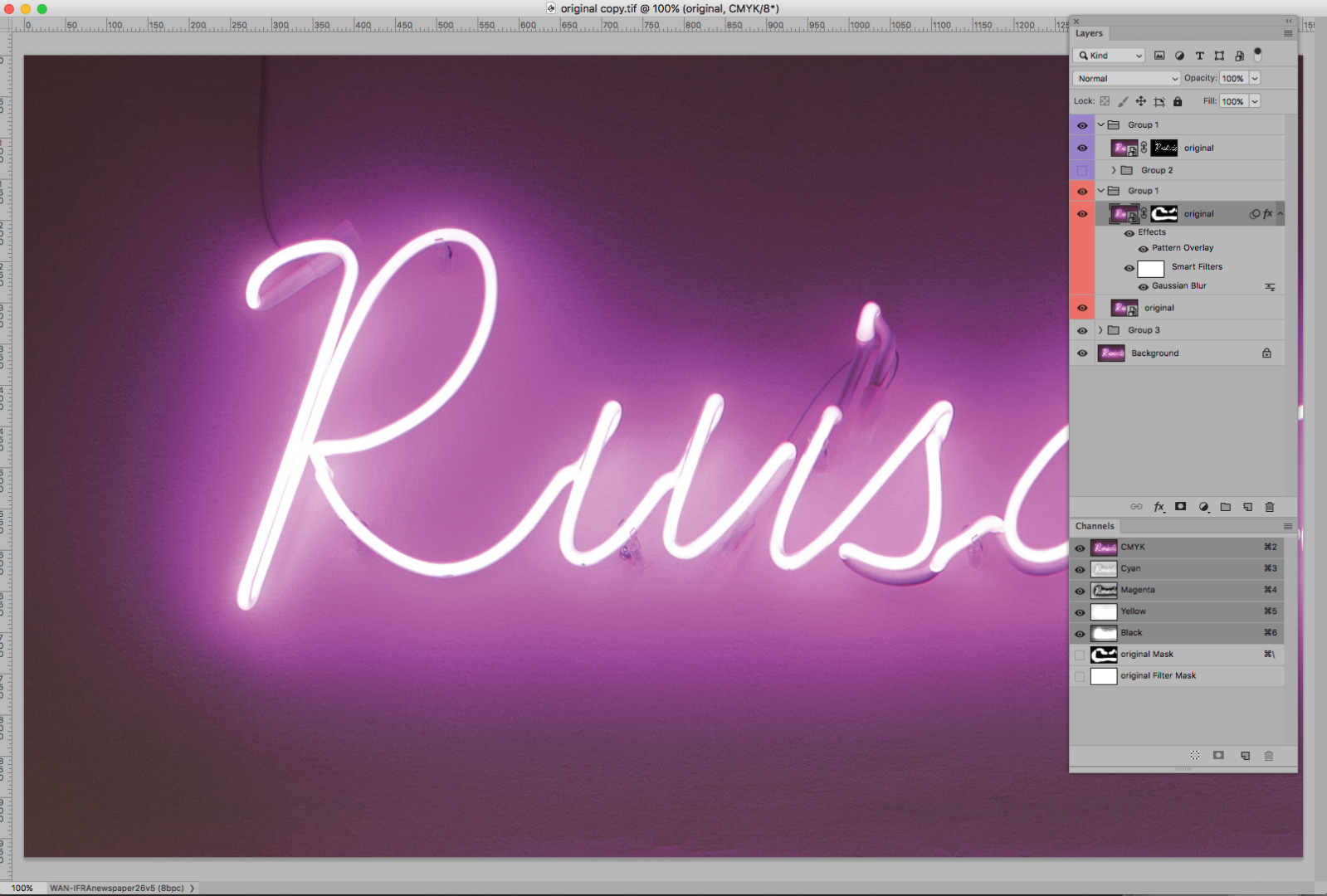
If nothing comes of that it might be an option to blur in the CMYK file with some masking and a Pattern Overlay.
Copy link to clipboard
Copied
Hey c.pfaffenbichler, that's actually a really good idea ![]() !
!
Also, I've got the RAW now so lets see how that works out...
Copy link to clipboard
Copied
Fudging around in CMYK images is usually not a great idea but if other approaches don’t yield decent results one may have to resort to that.
Copy link to clipboard
Copied
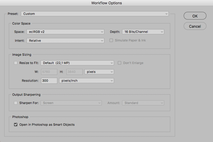
Okay now, just importing the RAW as 16bit and then converting it to the CYMK newspaper profile won't work. Is there something to look out for when importing from RAW?
Copy link to clipboard
Copied
In this case the primary concern would seem to be whether the development settings are the same ones used so far, so that the image ultimately looks the same as the original 8bit version.
I prefer to »Open in Photoshop as Smart Objects« and save the layered image as psd (or tif or psb if necessary).
Copy link to clipboard
Copied
Okay thats what I did. Well, I think I will have to stick with the blur version of the halo. Thanks a lot for the tip, that was a very good idea!
I still don't get what exactly you did there with the pattern overlay etc., but I managed to separate the neon tube itself from the halo by color selection (the halo quite broad). Then applied a blur to the halo and put the neon tubes on top to make them stick out clearly.
Copy link to clipboard
Copied
I still don't get what exactly you did there with the pattern overlay
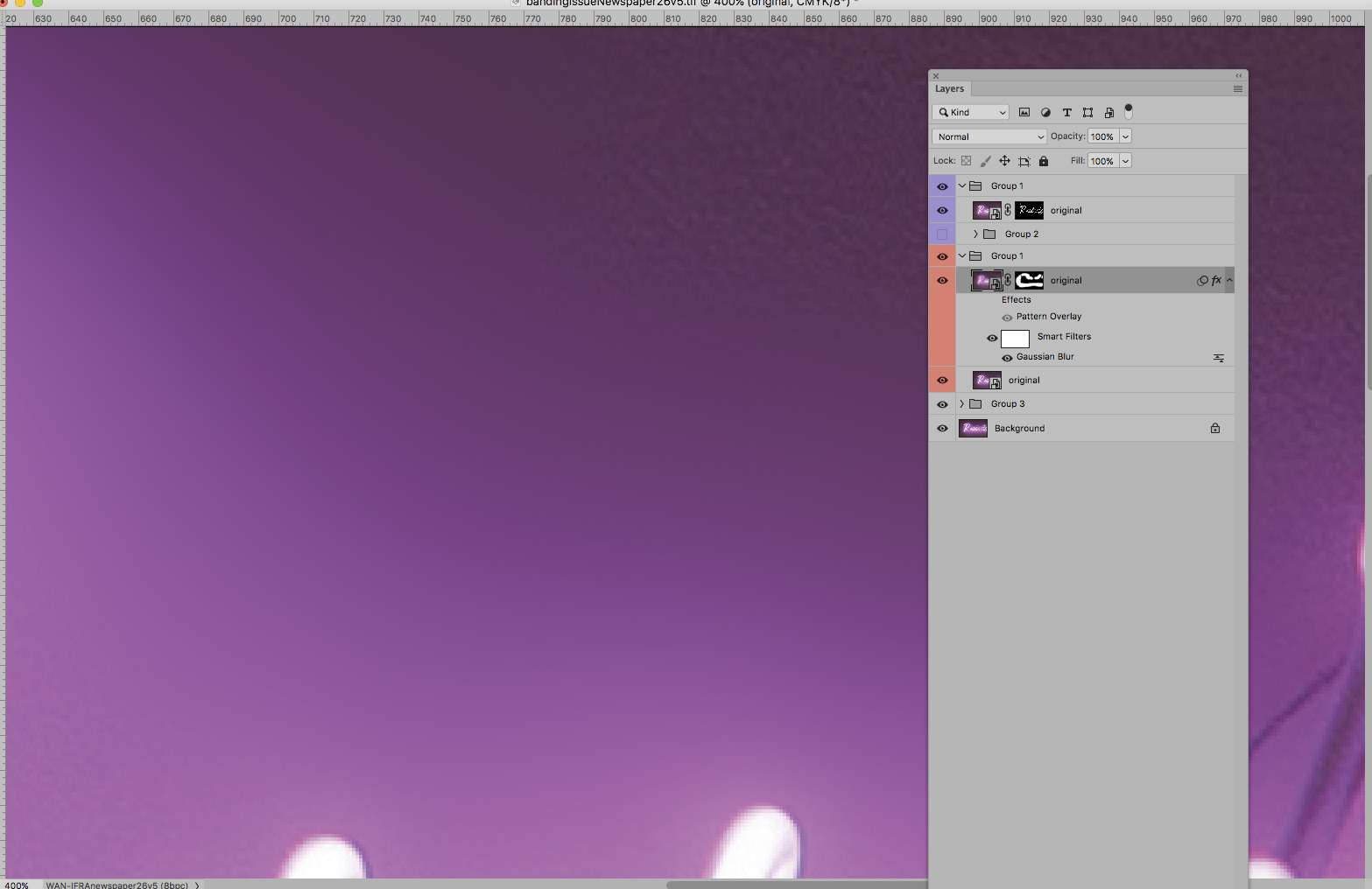
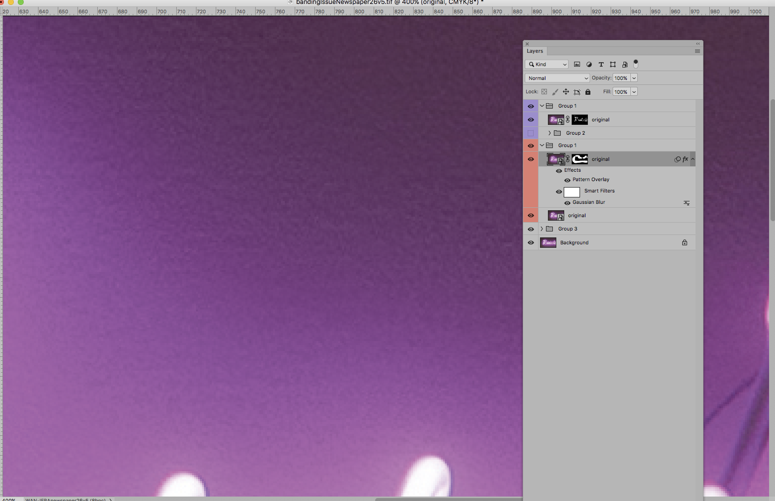
I created a neutral Pattern based on the background – neutral in that the average of each Channel is 50% gray, which can be achieved with the Filter High Pass (and a Channel Mixer) for example.
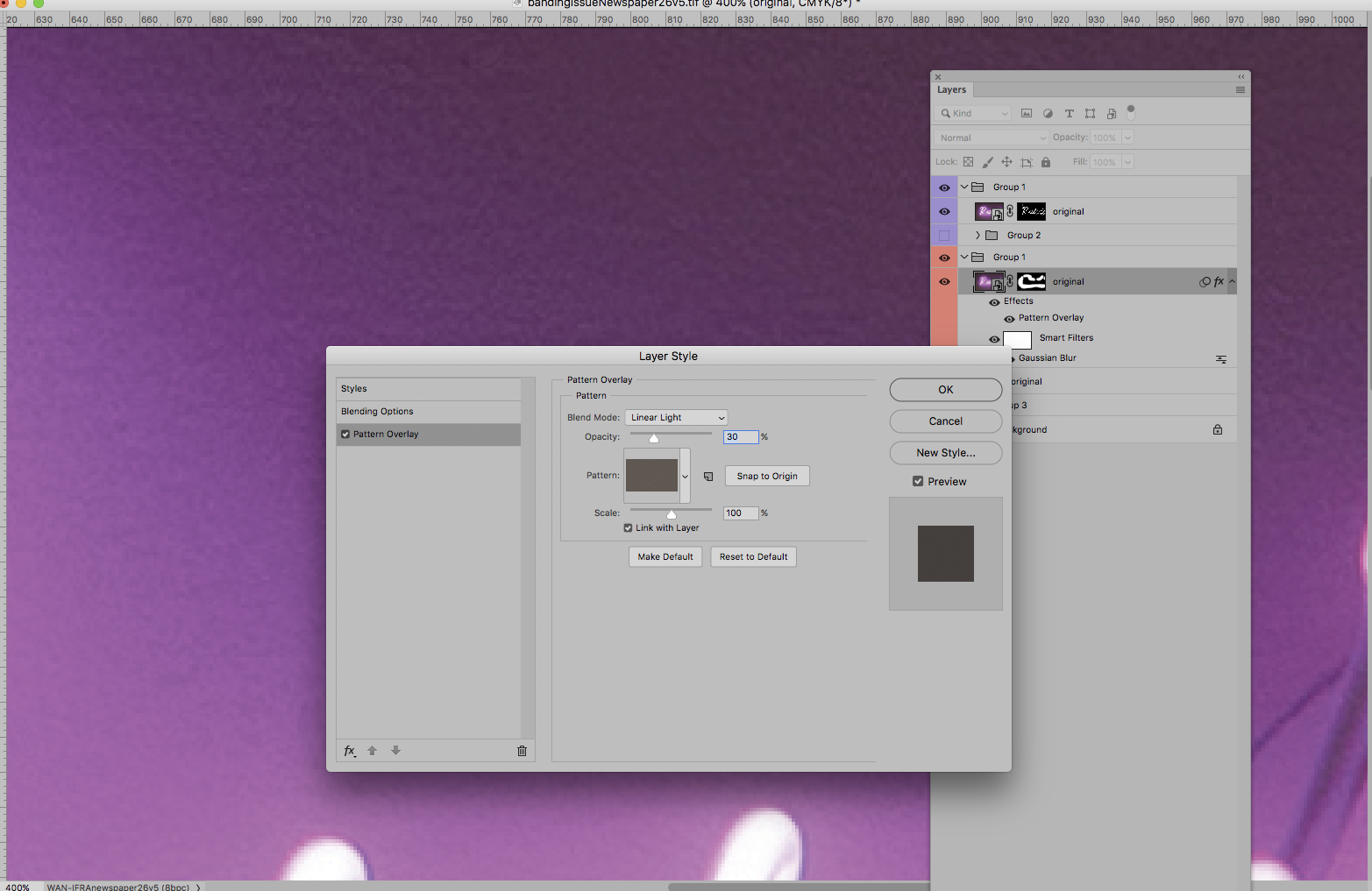
Then I applied that as a Pattern Overlay with the Blend Mode »Linear Light« to emulate the structure.
Blurred:
With Pattern Overlay:
The Layer Style Settings:
Copy link to clipboard
Copied
This is the image in #5, after the application of softproofing for CMYK UnCoated-FOGRA29: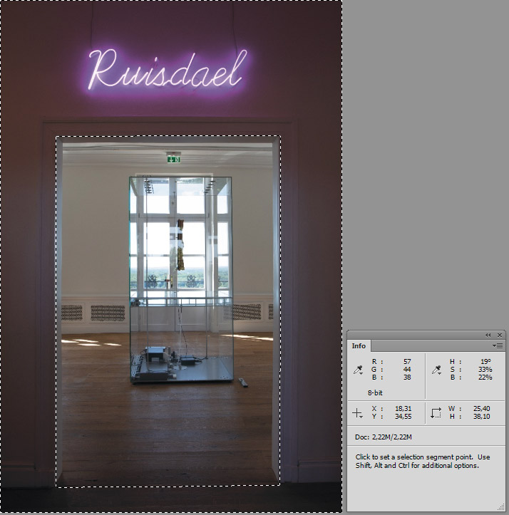
Then a modification, still softproofing – essentially a hue rotation by 30° from 290° to 320°, as
indicated by a sample in the magenta area:
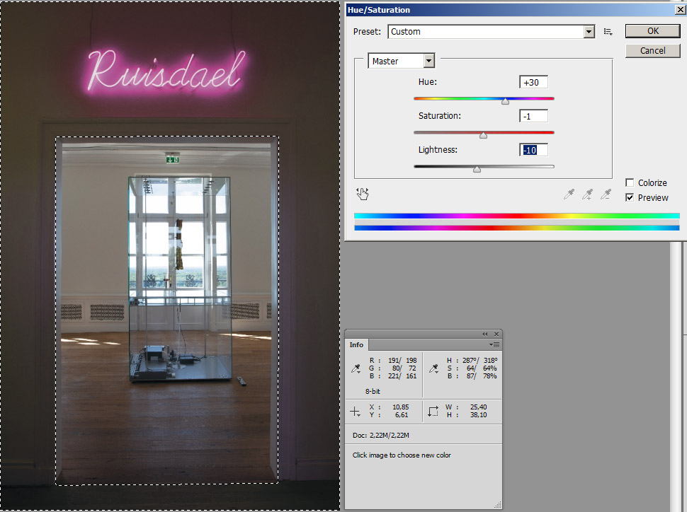
For my taste the result is not bad. Of course it's not possible to reproduce such a brilliant magenta
as in #0 or #5 by uncoated CMYK.
Best regards --Gernot Hoffmann
P.S.: the modification is applied to the selected area, which excludes the interior, the next room,
and in mode "Master", which means "for all hues".
It's as well possible to choose "Magenta" instead of "Master" with practically the same result.
Copy link to clipboard
Copied
I'm now going to explain the Hue-rotation as used in #17 by me and in #19 by Rob Day:
The graphic shows the plane L*=50 in Lab (CIELab). The black contour, not the colored area,
is the gamut boundary for sRGB. The round dots, filled and stroked are printable colors in the
range of L*=49 to L*=51 for the CMYK profile ISOCoated-v2-eci, because so far I didn't prepare
this diagram for an Uncoated Profile. The example is nevertheless sufficient for the explanation.
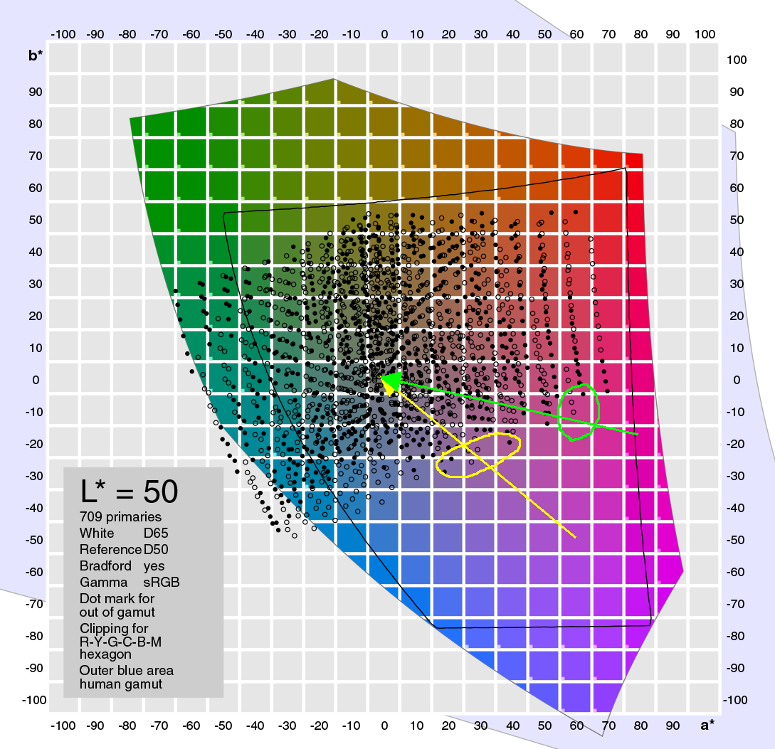
Typical magentas in the RGB image are at about 50L 60a -50b, the starting point of the yellow
arrow which is in sRGB but out of gamut for CMYK (obviously no need to use a wider gamut!).
Mapping this point by rendering intent Relative Colorimetric to the CMYK gamut boundary is not
a unique procedure. Most likely the path as indicated by the yellow arrow is applied: in a plane of
constant Lab-Hue (b:a) towards somewhere near to 50L 0a 0b. That is to say: not to the nearest
printable Lab color!
The first printable colors are in the yellow "ellipse", rather dull colors, as we can see immediately.
Then comes the Hue-rotation. New starting point is the green arrow, again directed towards
50L 0a 0b. The first printable colors appear in the green "ellipse", obviously resulting in much
more vibrant colors (the Lab-Saturation, lenght of the radius, is greater).
It's rather impressive to demonstrate this by soft proofing (same profiles, out of CMYK gamut
indicated by alarm color cyan):
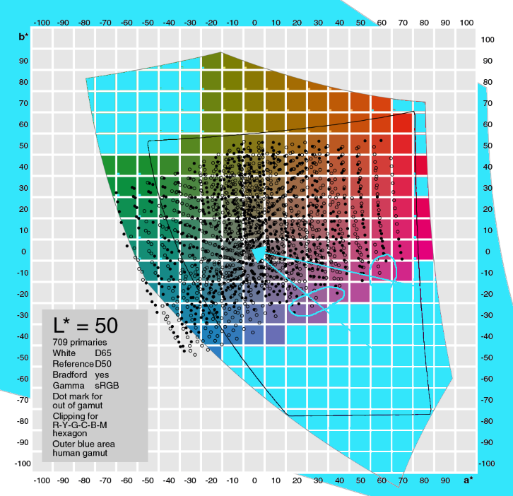
This may explain the strange phenomenon, that an RGB magenta cannot be easily reproduced by
CMYK magenta.
Finally some information about the question, whether a Total ink limit of 220% could be prohibitive.
No, it isn't – for my example #17 we need typically 18C 85M 0Y 0K (info bottom right).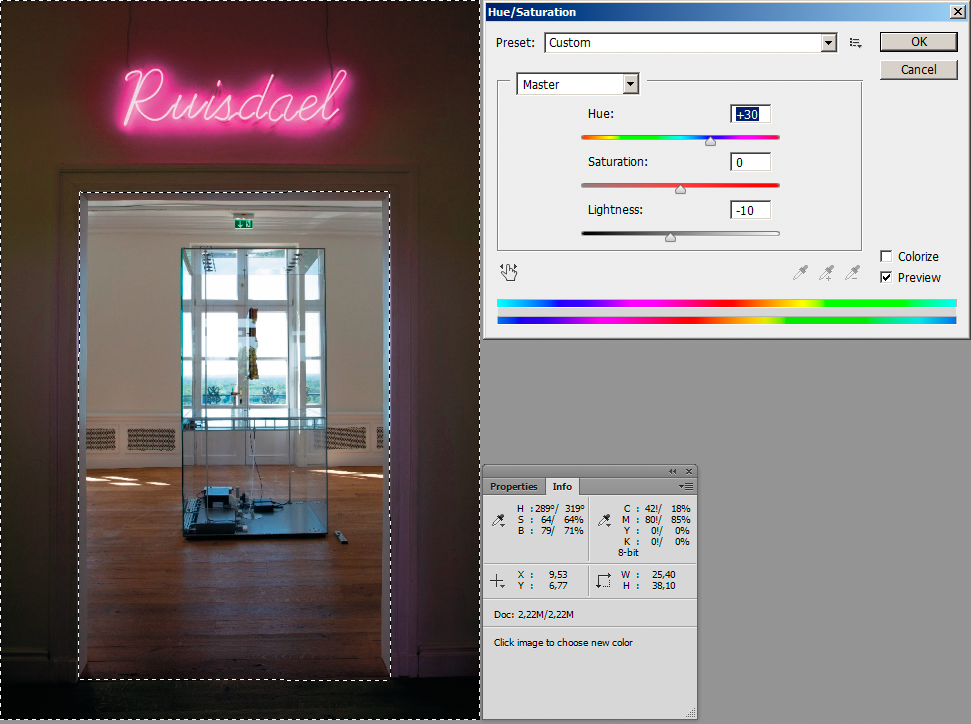
So far for ISOCoated-v2-eci. For an Uncoated profile the effects would be similar but more drastic.
Best regards --Gernot Hoffmann
P.S.: The same situation, a couple of planes L*=const on one page:
Page 17 here:
Copy link to clipboard
Copied
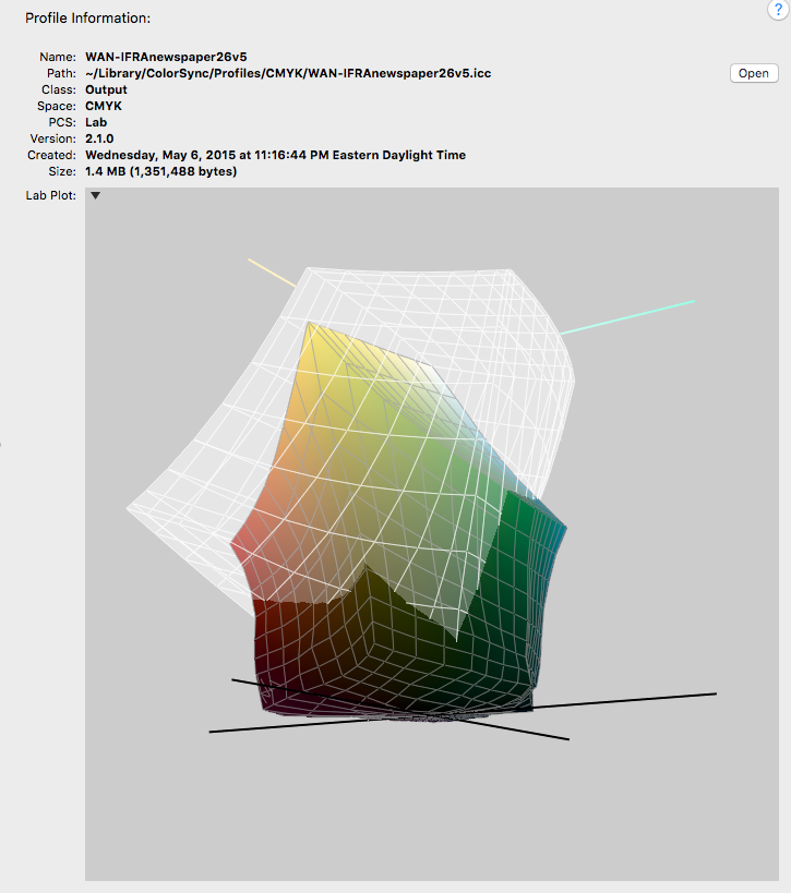
Apple's Color Sync utility gives a helpful 3d visualization of the intersecting color spaces—it shows that parts of even a relatively smaller gamut newsprint CMYK space are outside of the sRGB gamut—colors that can be printed but not displayed with sRGB.
The white plot is sRGB, which also has significant color that can be displayed, but not printed. So on a conversion from sRGB to WAN-IFRAnewspaper, the converted CMYK values will be forced into the smaller intersecting gamut exacerbating the gamut problem.
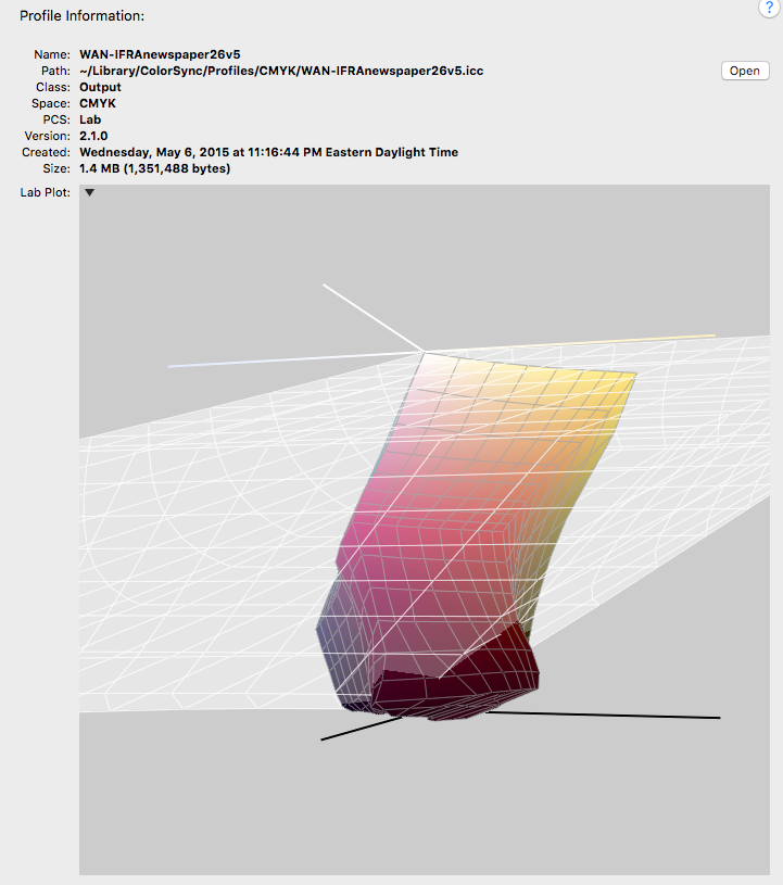
More of the CMYK space is available on a conversion when the source space is a large RGB space like ProPhoto. So editing in ProPhoto might make it easier to find a transition from the fully saturated magentas and reds into the neutral shadows without getting posterization—obviously there's nothing that can be done about the fully saturated out-of-gamut magentas:
Copy link to clipboard
Copied
It can be rough trying to get the colors to print nicely on newsprint. When I'm designing for newsprint I start by creating a 12% grey layer that I will later erase, but gives me a better onscreen visual representation of the whites achievable on a large web press running newsprint. I used to do work for a large national jewelry chain and getting diamonds and gold to shine was not easy.
If your client is new to newspaper advertising you might want to carefully temper their expectations.
Copy link to clipboard
Copied
You also have a lot more leeway if you use a RAW file to do color adjustment at the beginning because you get extra color sliders. Unfortunately, I'm the guy who gets sent all these transparency over pms images with RGB and CMYK design elements and I get to figure out how to print it right.
Copy link to clipboard
Copied
Newsprint profiles are often challenging, particularly so when coming from a much wider gamut RGB original. Sometimes it can help to convert to a wider gamut intermediate CMYK that provides a "cleaner" conversion, and then convert a second time to the newsprint profile (experiment with all available conversion options and profiles). This goes against "conventional wisdom" to avoid multiple conversions and CMYK to CMYK conversions.
Copy link to clipboard
Copied
Ok I did experiment with converting in another CMYK profile first (or even two or three)... sometimes it changes the color a little bit, but every time the halo stays almost exactly the same ![]()
Copy link to clipboard
Copied
Hey guys,
I can't thank you enough!
The thing is – I can get really surprisingly good results with the above methods, but it always starts having too much ink coverage (I'm only allowed to have 220%). So basically all I could do was very subtly smooth out the halo, everything else (changing colors, trying to get it more vibrant) is impossible to achieve. Unfortunately.
Anyways, thanks again, it was at least fun and a learning experience.
Also, I'm amazed how much effort you guys put in helping me!
Copy link to clipboard
Copied
Can you help me to make that look at least a little more decent?
As others have noted you will have to make a compromise with the neon colors because they are so far out of gamut to the newsprint profile you need to use. There are some other things you can try:
The WAN-IFRAnewspaper profile also includes saturated dark colors that are outside of the sRGB gamut—the gamuts intersect, and the newsprint CMYK space isn't entirely inside of the sRGB space. So maybe try and convert the sRGB original into a larger RGB space before you attempt to color correct so you can get at the saturated blacks on the conversion.
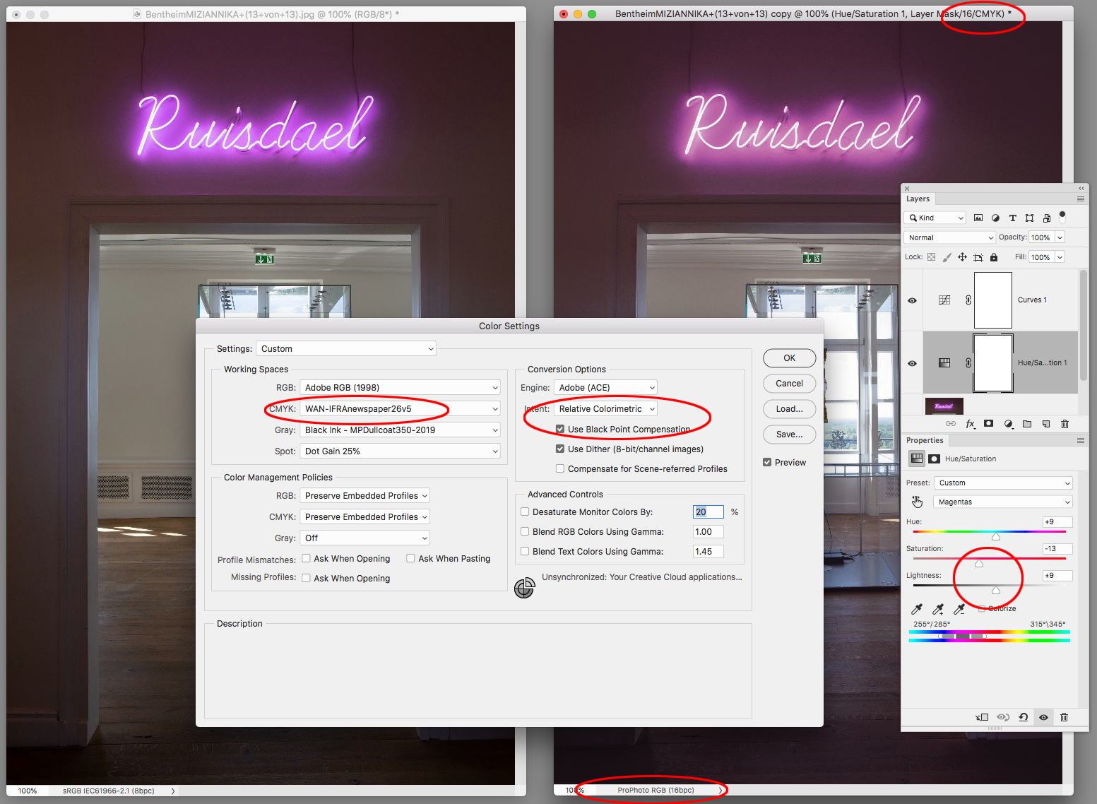
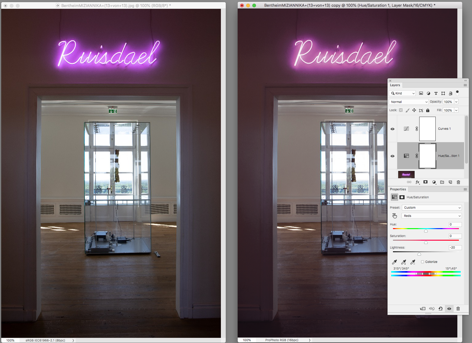
If you set your Color Settings CMYK Working Space to the intended output, you can color correct in RGB and see what the conversion to CMYK will look like by setting the Proof Setup to Working CMYK and turning on Proof Colors. Here I've converted your original to ProPhoto 16-bit, set the Color Settings Intent to Relative Colorimetric, and turned on Proof Colors.
I'm color correcting with a Hue/Saturation layer Magenta channel, where I'm shifting the hue toward red (which is less out-of-gamut), lowering the saturation, and increasing the lightness—watching for the best break from the magenta into the shadows:
I'm also lowering the Lightness of the Reds:
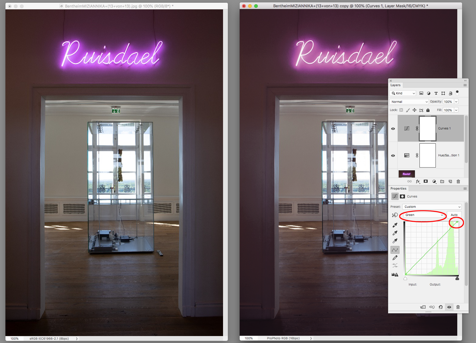
And adding a Curve layer to darken and add some red back into the background via the Green channel:
Copy link to clipboard
Copied
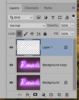
Consider this alternate approach: Increasing the vignette so that it becomes smoother will tolerate the conversion to CMYK
1. Change Mode to Lab Color
2. Choose the L channel and drag down to make an Alpha Channel
3, Use Curves to create a solid black/solid white Alpha
4. Invert to black type on white
5. Select the entire Alpha and Copy
6, Move to Layers and Paste an additional layerl: the Alpha
7. Use the Magic Wand to produce black type on transparent surround
8. Lock the transparent area and fill the type with white (asshowb above
9. Choose the image Layer and add a Gaussian Blur for a smoother vignette
10. Change mode to CMYK using your lithographer's supplied restricted range profile (choice fo color is another matter)
-
- 1
- 2


