

- Home
- Photoshop ecosystem
- Discussions
- Photoshop 100% 72dpi is too small on Mac Retina Di...
- Photoshop 100% 72dpi is too small on Mac Retina Di...

Copy link to clipboard
Copied
I see a lot of threads about this.
Well, the other day I actually had a tech from Adobe on the line, and after much wailing and gnashing of teeth, he admitted, "It's a Photoshop issue".
Apparently they are looking into it, just not quick enough. It is unfortunate because it seriously affects our ability to work effectively in Photoshop as you don't get the mostly accurate visual sizing.
We can only hope... Come on Adobe, FIX IT!!!


 1 Correct answer

The image is not "too small" - your screen has more pixels, therefore smaller pixels, therefore higher resolution. That's the whole point of a Retina display!
100% simply means that one image pixel is represented by one screen pixel. 1:1. Now consider what that means.
UI scaling, however, is a different matter. But that doesn't affect the image display.
Explore related tutorials & articles
 66
Replies
66
66
Replies
66

Copy link to clipboard
Copied
Adobe is not taking it serious ... they must need provide solution ASAP.
The development of hi res screens and Google's preference for mobile friendly responsive web sites have made the 1:1 view pretty much useless for screen design. Designers are now force to create responsive sites so the majority of images are being scaled as needed to fit the screen size. In that case it would be impossible to predict what the image pixel to monitor pixel ratio will be when the image is scaled and displayed in a modern browser.

Copy link to clipboard
Copied
Are the interpolation methods the browsers employ known to the public at least or are they the various companies’ secrets?
Copy link to clipboard
Copied
Are the interpolation methods the browsers employ known to the public
Does it matter? In all of the sites I design, the images in the browser are constantly scaling in response to the browser widow size—it would be incredibly rare for them to be at an exact 1:1 ratio. So basically the 1:1 view or any other view in Photoshop no longer has the importance it did 10 years ago where I might have been placing an image at 100% into a static HTML page and expecting all of the visitors to be viewing on displays somewhere between 72 and 110 ppi—where the quality or strength of the anti-aliasing might matter. Now the decision is how large the pixel dimensions should be to accommodate the largest possible scale.
Copy link to clipboard
Copied
Does it matter?
I suppose it would if Adobe should be moved by the »complaints« of the people who think that their browsers represent an image’s »reality« while Photoshop is doing bad stuff when displaying their images.

Copy link to clipboard
Copied
except when the other apps do it without telling you, all their fonts don't look like junk. All I'm asking is that Adobe provide a solution which isn't "welcome to fuzz-town". Even if they gave me a giant warning box that I had to click "OK" to everytime I wanted to view the pixels at the size a web browser would display it at, I would happily click OK, if they just gave me the preview mode I need so I know that the websites I'm building will actually look correct for 90% of people who will be viewing them non-retina
Copy link to clipboard
Copied
auxiliaryjoel wrote
except when the other apps do it without telling you, all their fonts don't look like junk.
Again, this is perfectly logical. As a raster image editor, Photoshop displays fonts as raster, not vector. It has to; that's what Photoshop does.
This is Photoshop vs. Illustrator at 400% view. Nothing unexpected here:
Copy link to clipboard
Copied
If Photoshop were to display type and vector elements at more than the image resolution (depending on on-screen magnification) I can imagine the complaining when people realise that in jpg, png etc. the effect would not and could not persist, no matter if they had clicked away a warning.
Copy link to clipboard
Copied
Yep, precisely. That's why Photoshop has to do it this way.
Copy link to clipboard
Copied
I"m not disputing that but what is the work around here? If I output something / view something at 100% it gives me a very false indication of what everyone on a desktop browser will see.
So.... how do I view their viewing experience, without doing something crappy like Get Info / Low Resolution Mode which causes everything to display at the "right size for desktop browsers @ 100% view / 100% output" but at the same time makes all the fonts and edges foz fuzzy that ig gives me a head-ache?
Again, I'm not arguing that I need to develop for mobile. I do it on every build. But there are many ways I was able to handle that effectively in the past without also having this workflow destryoing situation happen for desktops.
Copy link to clipboard
Copied
I"m not disputing that but what is the work around here?
Address the problem from the browser side with CSS media queries.
Copy link to clipboard
Copied
I don't care about retina, 72pixels at 100% screen view is what matters for web developers
But you should care about mobile screens. Modern sites have to be mobile friendly and responsive otherwise Google will penalize them. That means you have to do media queries in your CSS and images need to be dynamically scaled and rarely display at a 1:1 image to display pixel ratio (100%) anymore.
See my #34.
Copy link to clipboard
Copied
So, Photoshop is the issue.
No, you seem to be mistaken.
If the browsers’ makers have decided to upsamle images automatically that is their thing, to Photoshop a screen pixel is still a screen pixel.

Copy link to clipboard
Copied
I feel like nobody is getting your point/problem.
We design FOR WEB - so the Output is a WEBbrowser. So the Programm we use for creating WEB-Images has to show me the images in a size a WEBbrowser does ... whats so difficult to understand?
Copy link to clipboard
Copied
Here's the key to the whole thing:
Web browsers automatically scale up images when they detect a 4K/retina screen. They use 4 - four - screen pixels to represent one image pixel. Consumer-oriented image viewers will do the same thing.
This is the industry standard workaround to ensure the same material can be used whatever screen technology the user happens to have.
Photoshop is used by a whole lot of people who do not design for web! In fact, web designers are probably a minority. Photographers, prepress, print designers, medical and forensic workers, etc, all need Photoshop to display correctly - one image pixel represented by exactly one physical screen pixel.
In short: Photoshop does it correctly. Web browsers do it incorrectly and scaled up.
If you want to see the image as it looks in a web browser, with a 4k screen, set View > 200%. Then Photoshop will also use 4 screen pixels to represent 1 image pixel. Then it matches your web browser.

Copy link to clipboard
Copied
And you can create a custom keyboard shortcut for View > 200%.

Copy link to clipboard
Copied
I just upgraded to a new MBP retina and was kinda blown away by the photoshop issue. My question is why does Illustrator display accurate sizing? When you view a 500x500 pixel image in Illustrator its true to size as what the rest of the world sees online (but not photoshop)?
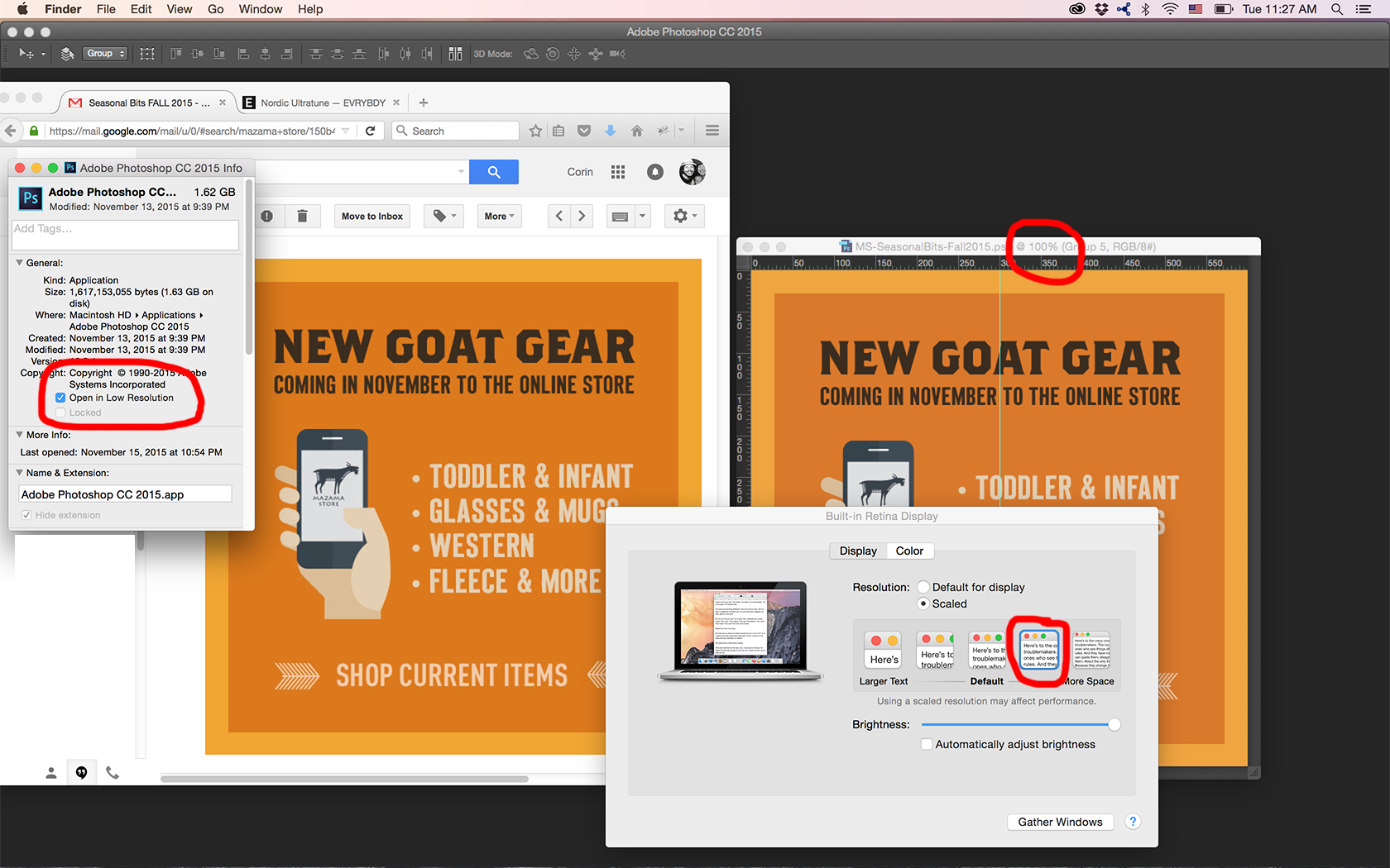
Here's what seems to work for me until things get resolved from Adobe. See screen capture. Funny thought that when I open a screen grab now that is taken on a retina, the image opens up as 144dpi.
I totally hear the frustration and its VALID. Until we move on from a 72dpi world, don't EFF with it...Apple and Adobe.
Copy link to clipboard
Copied
Move this solution to the top of the replies so people don't have to read one hundred responces befor finding this solution.

Copy link to clipboard
Copied
I have contacted ADOBE, (August 10) and yes they are working on the problem, they said, will be cleared by next update. reveeryrugby i'm having the same problem, tech said to work at 200% for now. It does not help but we need to keep on working.
If you found a work around let me know. If not let us just wait.

Copy link to clipboard
Copied
I don't understand why 200% isn't the solution, the complete solution. I don't on this occasion want to get into an argument, I'd just like to understand why working at 200% is any kind of issue.
Copy link to clipboard
Copied
Test Screen Name wrote:
I don't understand why 200% isn't the solution, the complete solution. I don't on this occasion want to get into an argument, I'd just like to understand why working at 200% is any kind of issue.
There's nothing to understand. 200% is the solution, the full and complete solution - if you want to see it as people with traditional displays see it. It effectively turns a 3840 x 2160 display into a 1920 x 1080 one.
This is how it will be for the foreseeable future. Of course, when we all have UHD displays, web designers will just start to design with more pixels, and thus the whole issue would seem to disappear. Except - what about all the existing web pages designed for 1920 x 1080? So it'll be with us for a while.
The big mystery to me is this: Why is the simple relationship between screen pixels and display size so hard to grasp, for so many people? It's so obvious and intuitive. More pixels per square unit = smaller display size. What's so difficult? I don't get it.
Copy link to clipboard
Copied
There's nothing to understand. 200% is the solution, the full and complete solution
But it's a solution to a 1999 problem. Then all sites were static, unresponsive, and displaying on similar resolution monitors, where matching HTML's 100% to Photoshop's 100% actually mattered because we were designing to the pixel in a set grid. Now, unless you want to be penalized by Google's mobile friendly directive, the images have to dynamically change to fit the client's screen and will rarely display at any predetermined scale or pixel dimension.
Copy link to clipboard
Copied
rob day wrote:
the images have to dynamically change to fit the client's screen and will rarely display at any predetermined scale or pixel dimension.
Yeah, and I really hate this adaptive web design because it turns images to mush. I say that as a photographer providing images for several sites. The scaling algorithms used are all cr*p.
Give me a fixed pixel size, and I can put up images that really pop, instead of looking as if they are out of focus.
Anyway, we're discussing Photoshop here, and why 100% on a UHD screen is half the size, and why people can't wrap their heads around this simple fact.
Copy link to clipboard
Copied
I say that as a photographer providing images for several sites. The scaling algorithms used are all cr*p.
If you want to be fussy about how the image scales on an HDPI device browser it's up to the coder to provide a media query that loads an alternate image (search for HDPI CSS media queries)
Copy link to clipboard
Copied
What's so difficult?
Employing one’s mental capabilities is an energy-consuming process so various people may at various times try to limit their efforts in certain such areas, I guess.

Copy link to clipboard
Copied
i've found a simple solution that helped me.
go to Edit > Keyboard shortcuts
and replace Cmnd + 1 to apply Zoom 200% instead of 100%.

Find more inspiration, events, and resources on the new Adobe Community
Explore Now
 AdChoices