• Global community
    • Language:
      • Deutsch
      • English
      • Español
      • Français
      • Português
  • 日本語コミュニティ
    Dedicated community for Japanese speakers
  • 한국 커뮤니티
    Dedicated community for Korean speakers
Exit
0

Photoshop 2017 Prints Too Dark - Which Setting To Use In Printing?

Participant ,
Nov 26, 2016 Nov 26, 2016

Copy link to clipboard

Copied

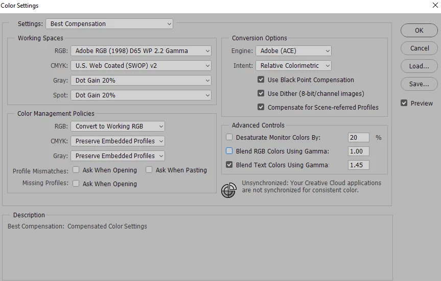
Which color profile should I use if the prints come out too dark?  I don't think the problem is in Photoshop because my 3 monitors have been calibrated. I have checked around to find out about the Output Color Profile but all looks like the settings are correct.  Here is a color panel showing the original and a scan of the printed.  The dark region is affecting the overall image where a bright red comes out like maroon. 

I would appreciate any suggestions because I am running out of photo paper.  😉2016-11-26 19_20_38-IMG_162.bmp @ 95.2% (PRINTED, RGB_8) _.png

2016-11-26 19_37_52-Photoshop Print Settings.png

2016-11-26 19_24_09-Color Settings.png

Views

9.8K

Translate

Translate

Report

Report
Community guidelines
Be kind and respectful, give credit to the original source of content, and search for duplicates before posting. Learn more
community guidelines

correct answers 1 Correct answer

Community Expert , Nov 27, 2016 Nov 27, 2016

Here you show Your Photoshop print setting you have it set so Photoshop managers colors.  There is also a Warning reminder to you to set your Printer Drivers not to manage colors.  You do not show your Printers settings.  You should show us them.  Also Normally you should use a printer/paper profile also when printing on paper not a standard color space profile.  The paper paper you use should be a high grade photo paper.  Also the print preview in your Photoshop dialog is not set to match print

...

Votes

Translate

Translate
Adobe
Community Expert ,
Nov 27, 2016 Nov 27, 2016

Copy link to clipboard

Copied

Here you show Your Photoshop print setting you have it set so Photoshop managers colors.  There is also a Warning reminder to you to set your Printer Drivers not to manage colors.  You do not show your Printers settings.  You should show us them.  Also Normally you should use a printer/paper profile also when printing on paper not a standard color space profile.  The paper paper you use should be a high grade photo paper.  Also the print preview in your Photoshop dialog is not set to match print colors. So we have no idea of what you should expect the print to look like. There of course is not way you can show us your print. So I have no idea of what your thinking is with what you posted as your print colors. Your not showing us your print colors we would need to see your print.

2016-11-26+19_37_52-Photoshop+Print+Settings.png

JJMack

Votes

Translate

Translate

Report

Report
Community guidelines
Be kind and respectful, give credit to the original source of content, and search for duplicates before posting. Learn more
community guidelines
Participant ,
Nov 27, 2016 Nov 27, 2016

Copy link to clipboard

Copied

Thank you JJMack, for your input.  I had just gone back to letting the printer handle the colors and I, again, used the proper paper and settings.  I think I got thrown off because printing to glossy photo paper was off and I watched several YouTube videos that had me trying a plethora of different settings.  In addition, the warning that comes up on the Print dialog made me wonder if I was getting the best match.  It turned out that it didn't.

Things are pretty much back to normal.  I turned settings back to the printer and reset everything.  They are a tad dark still but I will tweak it some as I go along. This chaotic episode is nothing compared to the "Three Day Why Won't It Print Black?" issue.  That was frustrating.

Thank you for your advice.  It has been nice to have your support.  You get a thumbs up and Correct Answer from me. 😄

Rick

Votes

Translate

Translate

Report

Report
Community guidelines
Be kind and respectful, give credit to the original source of content, and search for duplicates before posting. Learn more
community guidelines
Community Expert ,
Nov 27, 2016 Nov 27, 2016

Copy link to clipboard

Copied

No wonder. You have this as completely wrong as it's possible to get. You really need to stop everything you're doing and go back to the beginning. Reset everything to default settings and don't touch them until you understand what they do.

  • You don't use your monitor profile as document profile/working space. Ever. The document profile should always be a standard color space - sRGB, Adobe RGB (1998) or ProPhoto RGB.
  • Don't use "Convert to Working RGB"! Keep it at the default "Preserve Embedded Profiles": Any other setting is for special purposes where you understand the implications.
  • The monitor profile is set up at system level, by your calibrator, and you don't need to do anything more. Photoshop will find the profile by itself and use it to color manage your display.
  • The printer profile needs to be one specific for your printer, paper and ink combination. These profiles will be installed along your printer driver.
  • And finally - Adobe RGB gamma 1.4 - ??? Where on earth did you get that? Gamma 1.4 has no place in any of this. Throw that profile away. Again, use the correct printer/paper/ink profile.

Summing up: document profile, monitor profile and print profile are three different things and you can't mix them up like you do. And you can't "experiment" - each profile has to be the correct one. A profile is a description of a color space, and the description has to be correct for this to work.

Votes

Translate

Translate

Report

Report
Community guidelines
Be kind and respectful, give credit to the original source of content, and search for duplicates before posting. Learn more
community guidelines
Participant ,
Nov 27, 2016 Nov 27, 2016

Copy link to clipboard

Copied

All I did was ask a question about ICC profiles and your reply was insulting, demeaning, and totally out of line.  I am not ignorant.  I have no idea how you got to be an Adobe MVP or ACP with your attitude and rudeness.  Your reply reveals that you are not on this site and forum to help but only to belittle people.  You need to check yourself.

I'll never give a positive review of your posts.

Votes

Translate

Translate

Report

Report
Community guidelines
Be kind and respectful, give credit to the original source of content, and search for duplicates before posting. Learn more
community guidelines
Community Expert ,
Nov 27, 2016 Nov 27, 2016

Copy link to clipboard

Copied

OK. I'm sorry. You're right, I might have toned down my response. Apologies for that. But everything I said is in fact true. So how do we do this? I can't pretend those settings are fine when they're not.

I don't know who told you to use those settings, but whoever it was is the one you should feel insulted by.

So if we can get past this, let's get down to business and look at these settings one by one.

Votes

Translate

Translate

Report

Report
Community guidelines
Be kind and respectful, give credit to the original source of content, and search for duplicates before posting. Learn more
community guidelines
Community Expert ,
Nov 27, 2016 Nov 27, 2016

Copy link to clipboard

Copied

I suppose we won't see the OP again - yes, I know; I was in a hurry and didn't have time to think about how it came across. Anyway, let me just add a general comment.

For some reason, color management has this reputation for being difficult and complicated. This turns into a self-fulfilling prophecy, because it makes people look for difficult and complicated solutions - and then they really get into trouble, and off we go.

The fact is that if everybody just left all color settings at default and did nothing - it would just work. If everybody just looked for the simple solutions, the straightforward ones, it would just work. But so many people overcomplicate it, and that really doesn't help.

(With one single exception: The Lightroom default for "edit in" Photoshop. It's set to ProPhoto, but should have been sRGB as it is in ACR).

Keep it simple, because it really is. You have a source profile, and you have a destination profile. One is remapped into the other. That's all there is to it.

Votes

Translate

Translate

Report

Report
Community guidelines
Be kind and respectful, give credit to the original source of content, and search for duplicates before posting. Learn more
community guidelines
Community Expert ,
May 05, 2019 May 05, 2019

Copy link to clipboard

Copied

Phew. This old thread from 2016 came back up on the front page for some reason - and a useful reminder it was indeed. The OP was entirely right, I did come across as a real piece of work (even though that wasn't intended; I was just in a hurry).

Anyway, note to self - take two seconds, sit back and read again

Votes

Translate

Translate

Report

Report
Community guidelines
Be kind and respectful, give credit to the original source of content, and search for duplicates before posting. Learn more
community guidelines
New Here ,
Oct 14, 2019 Oct 14, 2019

Copy link to clipboard

Copied

I tend to listen to what people say and not pay a lot of attention to how they say it.

So, in any way you like, is there a resource around that helps me reset everything? Even better, learn about this colour stuff? I have a gizmo that sets my screen and it's awesome. Something I scan looks exactly like that on the screen. But when I print it, it's darker and redder. I can mess with it all I want on the screen and it comes out the original way on the printer.

Thanks!

Votes

Translate

Translate

Report

Report
Community guidelines
Be kind and respectful, give credit to the original source of content, and search for duplicates before posting. Learn more
community guidelines
Community Expert ,
Oct 14, 2019 Oct 14, 2019

Copy link to clipboard

Copied

Hi

You need to get the right profile for your printer, Ink and paper combination. Then use your calibration device to profile your monitor using a white point and brightness that matches your paper white when the paper is viewed under your intended light. Colour management will take of the rest.

See below for a bit more explanation:

Colour Management simple explanation

Digital images are made up of numbers. In RGB mode, each pixel has a number representing Red, a number representing Green and a Number representing Blue. The problem comes in that different devices can be sent those same numbers but will show different colours. To see a demonstration of this, walk into your local T.V. shop and look at the different coloured pictures – all from the same material.

To ensure the output device is showing the correct colours then a colour management system needs to know two things.

1. What colours do the numbers in the document represent? 
This is the job of the document profile which describes the exact colour to be shown when Red=255 and what colour of white is meant when Red=255, Green = 255 and Blue =255. It also describes how the intermediate values move from 0 through to 255 – known as the tone response curve (or sometimes “gamma”).
Examples of colour spaces are (Adobe RGB1998, sRGB IEC61966-2.1)
With the information from the document profile, the colour management system knows what colour is actually represented by the pixel values in the document.

  1. What colour will be displayed on the printer/monitor if it is sent certain pixel values?
    This is the job of the monitor/printer&paper profile. It should describe exactly what colours the device is capable of showing and, how the device will respond when sent certain values.
    So with a monitor profile that is built to represent the specific monitor (or a printer profile built to represent the specific printer, ink and paper combination) then the colour management system can predict exactly what colours will be shown if it sends specific pixel values to that device.

    So armed with those two profiles, the colour management system will convert the numbers in the document to the numbers that must be sent to the device in order that the correct colours are displayed.

So what can go wrong :

  1. The colours look different in Photoshop, which is colour managed, to the colours in a different application which is not colour managed.
    This is not actually fault, but it is a commonly raised issue. It is the colour managed version which is correct – the none colour managed application is just sending the document RGB numbers to the output device regardless without any conversion regardless of what they represent in the document and the way they will be displayed on the output device.

  2. The colour settings are changed in Photoshop without understanding what they are for.
    This results in the wrong profiles being used and therefore the wrong conversions and the wrong colours.
    If Photoshop is set to Preserve embedded profiles – it will use the colour profile within the document.

  3. The profile for the output device is incorrect.
    The profile should represent the behaviour of the device exactly. If the wrong profile is used it will not. Equally if the settings on the device are changed in comparison to those settings when the profile was made, then the profile can no longer describe the behaviour of the device. Two examples would be using a printer profile designed for one paper, with a different paper. A second example would be using a monitor profile but changing the colour/contrast etc settings on the monitor.
    The monitor profile is set in the operating system (in Windows 10 that is under Settings>System>Display >Advanced) which leads to a potential further issue. Operating system updates can sometimes load a different monitor profile, or a broken profile, which no longer represents the actual monitor.


Colour management is simple to use provided the document profile is correct, always save or export with an embedded profile, and the monitor/printer profile is correct. All the math is done in the background.


I hope that helps


Dave

Votes

Translate

Translate

Report

Report
Community guidelines
Be kind and respectful, give credit to the original source of content, and search for duplicates before posting. Learn more
community guidelines
New Here ,
Oct 14, 2019 Oct 14, 2019

Copy link to clipboard

Copied

LATEST
Woah! Awesome! Thanks for taking the time, Dave, I appreciate it.

Votes

Translate

Translate

Report

Report
Community guidelines
Be kind and respectful, give credit to the original source of content, and search for duplicates before posting. Learn more
community guidelines