- Home
- Photoshop ecosystem
- Discussions
- Re: Photoshop CC: difficult to see marching ants ...
- Re: Photoshop CC: difficult to see marching ants ...
Photoshop CC: difficult to see marching ants when making selections. [Was: New Photoshop]
Copy link to clipboard
Copied
Hi, I've been using Photoshop CS6 to create composite images for a long time by using the Direct Selection tool and doing:-
1. Quick selection
2. Refine Edge
Fine that's not been a problem. I have one problem with the new Photoshop CC version though. I find it very hard to see the 'marching ants line' that you have always created using that tool as the first step. I've tried increasing the font size but that doesn't seem to have any effect - otherwise apart from that the way you go on from creating your selection to then create a mask is great. Am I doing something wrong which is making it difficult for me to see the line of 'marching ants that you create with the first step? I have tried to increase the tool size to no effect.
I have always been able to see the full image in CS6 so I don't think zooming in is the answer because it is better to create the 'marching ants' line in one hit and if I zoomed in I would not be able to see the full image on my screen. I just want to have a thicker, more visible selection line at the start - maybe this has been modified as a start point for reducing the 'halo effect' you get with bad composite images, I don't know. Anybody got any advice/tips please?
Explore related tutorials & articles
Copy link to clipboard
Copied
I don't think the visibility of the marching ants has changed since day one. It alternates black and white at one pixel line width.
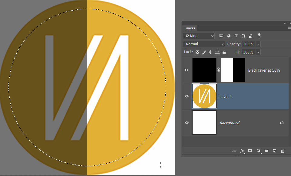
There's a trick that works with work paths, and that's to add a layer filled with black with it's opacity set to 50%, which is usually going to provide better contrast. It seems to work with the marching ants, but it would also reduce image contrast making the selection a problem, so I doubt it would be useful.

You have the alternative ways of looking at the selection when in Select & Mask. The Black & White option is going to be fully visible. If you use your selection with a layer mask, then you can Alt click the layer mask to view it full size on the screen in black & white.
I don't know if this helps, but I don't think I am fully grasping your issue.
Copy link to clipboard
Copied
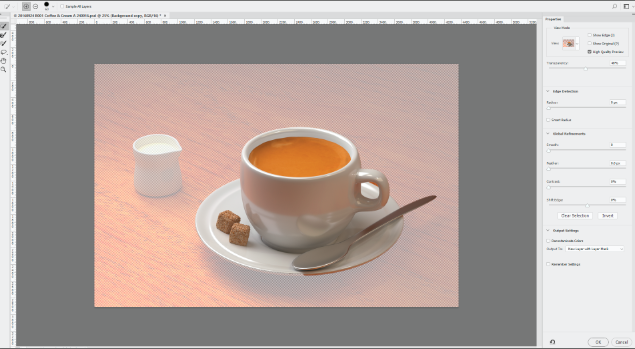
Try using the onion skin mode, in Select and Mask, instead of marching ants. It is much clearer as to what is selected and what is not.
With a select tool , selected on the toolbar, go to the options bar at the top and click on Select and Mask

The quick select tool is then the top tool at the left tool bar in select and mask

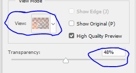
Before using it though go to the top right - click on view and select "Onion Skin" and turn transparency down to around 50%

If you now use the quick select tool - you will have a much clearer view of what is selected and what is not, than you get with marching ants

You can check the actual mask by going back to view and selecting black on white or one of the other options as below

You can then go on to use refine edge if required (2nd tool down)

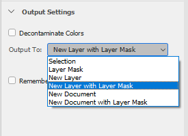
When finished don't forget to choose what you want as an output (i.e. selection, new layer with mask etc - then click OK

Hope that helps
Dave
Copy link to clipboard
Copied
Hi Dave, thanks for that. That sound like a great idea. As I said before the rest of the new version of Photoshop is great - maybe its my eyesight failing!!
John
Copy link to clipboard
Copied
You're welcome.
It may not just be eyesight. As our screens become higher resolution, pixels are getting smaller on them (i.e. more densely packed). That makes it harder to see a 1px wide line - even if it is flashing ![]()
Dave
Copy link to clipboard
Copied
Can you upload a screen shot of a selection showing what you are describing?
Copy link to clipboard
Copied
One thing I stupidly forgot to mention is that the background I am trying to remove is of a creased white muslin sheet which was put up in someone's apartment to make a simple background to remove so I don't think that helps the solution. Is it possible to change the colour of the line produces by the Direct Selection tool maybe? Otherwise its back to the Onion skin
Copy link to clipboard
Copied
If there is a way to change the colour of a path, or a marching ants selection, I've never found it.
In S&M , you can also view your selection against black or white or against a background layer if that makes it easier.
Dave
Copy link to clipboard
Copied
Yeah, I've seen the later stages Dave and I'm fine with those. I think that you're right about the resolution thing - bigger screen at higher resolution equals more pixels so a selection line of 1 pixel width is going to be smaller. I've just had a try with the image in Photoshop in my office where I have a much bigger monitor and I think you're spot on.
Get ready! An upgraded Adobe Community experience is coming in January.
Learn more