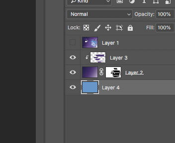
Copy link to clipboard
Copied
hello,
i don't have the original art files for a cover. I just have the .pdf the agency sent. i need to make a new cover in the same style and i don't know how to make the new image look like previous ones.
these are the covers from past jobs:

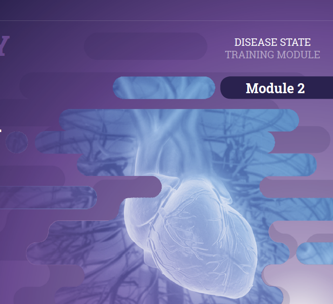
and this is the new image they want me to use:
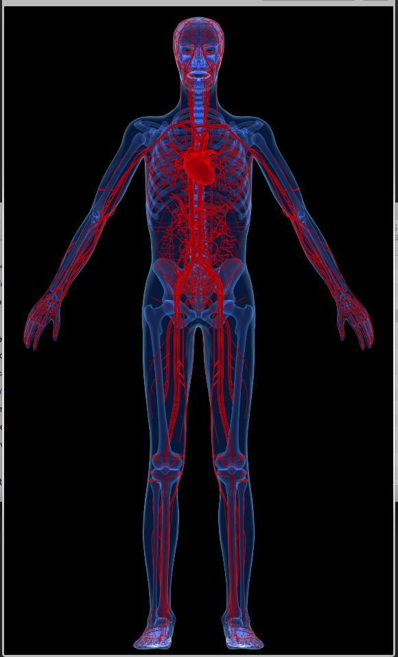
how can i make the new image look in the same style as previous? i like working with mart objects and layers so everything is super editable so an approach that help me keep things super editable for changes from the client is best.
thanks
jonathan
 1 Correct answer
Ah - I hadn't realised your were working in CMYK - I should have looked closer ![]()
Turn the curve the other way :

Dave
Explore related tutorials & articles
Copy link to clipboard
Copied
I would lay down a gradient above your illustration, draw your shapes with the rounded rectangle tool and mask on the gradient to reveal the illustration below. Let me know if I need to go more in depth. Will happily write a tutorial up.
Copy link to clipboard
Copied
That's what I would do. I actually just did that for a design project not too long ago
Copy link to clipboard
Copied
its the making the human figure look all white what i am not sure about. i did a color range selection on the black. but i did not like that. than i went back and forth on layer effects, but i i am in doubt as to how this goes.
Copy link to clipboard
Copied
Hi Jonathan
Did the luminosity blending mode and the use of a curve not give you what you wanted? To brighten further just adjust the curve

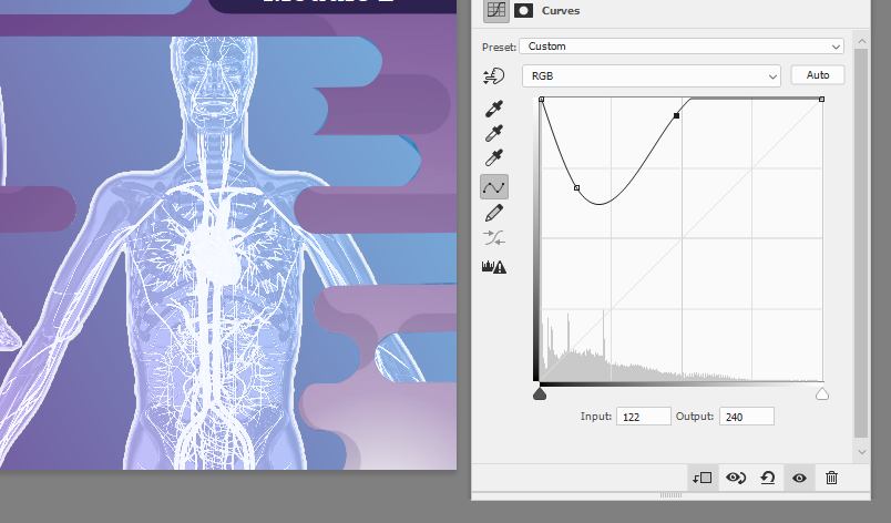
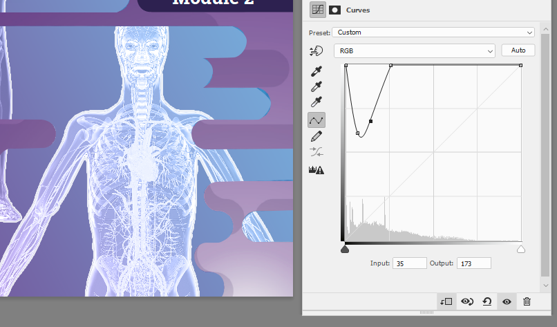
Dave
Copy link to clipboard
Copied
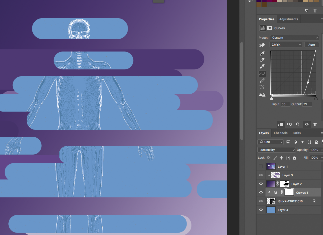
i am not getting the desired result, i loose detail
Copy link to clipboard
Copied
Hi
You need to bring up the black point vertically (to make it lighter) rather than sliding it to the right which will make sections darker In my first example it is around 40% up the side and in the last two 100%
Dave
Copy link to clipboard
Copied
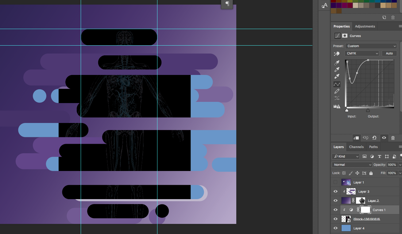
I am not following you. see below.
Copy link to clipboard
Copied
is it because you are working of the screenshot of the photo an i have CMYK purchased image. would my color adjustment not be different?
Copy link to clipboard
Copied
Ah - I hadn't realised your were working in CMYK - I should have looked closer ![]()
Turn the curve the other way :

Dave
Copy link to clipboard
Copied
no, its my fault, i did not say that in my comments till later. its me. Late in the afternoon my brain becomes jello. ![]() Side effect of drinking a gallon of coffee a day.
Side effect of drinking a gallon of coffee a day.
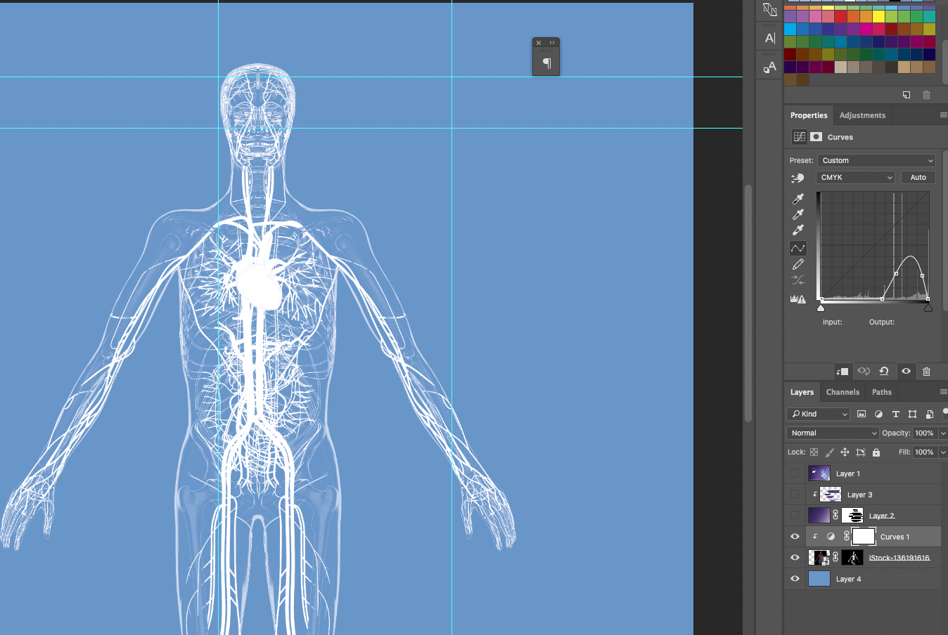
Now it looks good. see below. i was even able to get a much better mask our of it. love it. thanks Dave.
Copy link to clipboard
Copied
Is this document for print? Looks like your color space is in CMYK
Copy link to clipboard
Copied
yes, they will print this and the image purchased is on CMYK
Copy link to clipboard
Copied
thank you wildcat ![]()
Copy link to clipboard
Copied
Hi Jonathan
Something like this:
Bottom layer a gradient fill
Next the body masked (select subject in Select and Mask worked for this) - changed to luminosity blending mode and a curve added to brighten it. Also a white stroke added in layer effects.
Next the same again but the layer moved
At the top one of your original images with a vector mask added

Hopefully that gets you started
Dave
Copy link to clipboard
Copied
sorry sorry. yes i got everything but how to make the human figure go from what it looks like how to the way they have it.
i do have the below already going.
