Copy link to clipboard
Copied
I am not a Photoshop pro by any means so this will be probably easy to answer.
I turned my logo into a vector, then exported it as a PDF for my printer to run the job. The colors in my exported PDF are much more dull than the Photoshop artwork.
I tried exporting in both RGB and CMYK and this didn't change it. I also clicked "view" and checked "proof colors" to see what the export would look like, and of course its dull. How do I get my export to stay true to color?
See images below:
ARTWORK
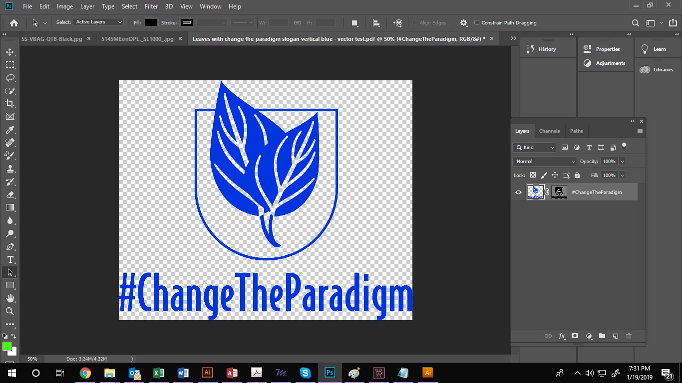
EXPORT

And what color space are you exporting to? If you are working in RGB, then exporting to CMYK, you are going to lose your colors. The B (blue) in RGB is very different than the C (cyan) in CMYK. You will never get a vibrant blue like that in CMYK. Close, but not al the way to that brilliant color. You should try working as Barbara suggested and work on the original in CMYK. That will help you make the colors work better for you instead of converting when dumping to a pdf. Also, ask your printer i
...Copy link to clipboard
Copied
A good blue is one of the most difficult colors to produce in CMYK, which is what is usually required for print. Since your logo is only one color, it could be printed with a lovely blue if you use a Pantone Solid color, also called PMS. Photoshop is not the best application for using Pantone Solid colors. Illustrator would be a much better choice. But if you must use Photoshop, you could set up the logo in pure black (C 0%, M 0%, Y 0%, K 100%), and instruct the print vendor to print in a nice Pantone Solid blue, like #300 for instance.
Copy link to clipboard
Copied
Hi Barbara, I did it in illustrator. I vectorized it and exported to PDF and the same thing happened
Top is illustrator file, bottom is PDF. I need it exported it the bright blue

Copy link to clipboard
Copied
I suggested Illustrator because it is easier to apply spot colors.
When creating the Illustrator file, it should be CMYK for Color Mode.

In the Swatches panel menu, choose Open Swatch Library > Color Books > Pantone - Solid Coated or Pantone - Solid Uncoated (depending on whether you are printing on coated or uncoated paper stock).

That will open the Pantone Solid panel where you can select the blue fill color that you want.

Note that Illustrator will simulate what the color will look like when printed, and there may be some difference in the printed color, depending on the paper stock and other conditions, but the on-screen simulation is fairly accurate if you have a calibrated monitor.
When saving as PDF, Output should be set to No Conversion for Color Conversion, and the best preset for print is PDF/X-4.

When comparing the Illustrator file and the PDF, the blue should look nearly identical.
Copy link to clipboard
Copied
This worked! Thank you!!!
Copy link to clipboard
Copied
You're welcome
Copy link to clipboard
Copied
glad we could help. ![]()
Copy link to clipboard
Copied
And what color space are you exporting to? If you are working in RGB, then exporting to CMYK, you are going to lose your colors. The B (blue) in RGB is very different than the C (cyan) in CMYK. You will never get a vibrant blue like that in CMYK. Close, but not al the way to that brilliant color. You should try working as Barbara suggested and work on the original in CMYK. That will help you make the colors work better for you instead of converting when dumping to a pdf. Also, ask your printer if they can just accept an .AI file instead. Most printers I've worked with would prefer the original illustrator file instead of a pdf. Cleaner images, no compression, easier if they need to manipulate the file for it all to work for them.
Copy link to clipboard
Copied
Yes, spot color it is, if this blue color is ever going to get reproduced in print. CMYK inks just can't get anywhere near.
Here's how that original blue converts to some common CMYK profiles. This is where they hit their gamut boundaries:

Note that the two Coated profiles also shift towards purple. This is a side effect of color spaces not being perceptually uniform - a very technical business that I've never understood completely. Gernot Hoffman probably does if he reads this.
It's a bit odd, because it's possible to bring ISO Coated a lot closer with some tweaking, but still remaining within gamut:

Copy link to clipboard
Copied
https://forums.adobe.com/people/Lauren+uns wrote
I am not a Photoshop pro by any means so this will be probably easy to answer.
I turned my logo into a vector, then exported it as a PDF for my printer to run the job. The colors in my exported PDF are much more dull than the Photoshop artwork.
I tried exporting in both RGB and CMYK and this didn't change it. I also clicked "view" and checked "proof colors" to see what the export would look like, and of course its dull. How do I get my export to stay true to color?
See images below:
ARTWORK
EXPORT
Note that the two Coated profiles also shift towards purple.
I second D Fosse's warning about the shift towards purple. Sometimes it is hard to detect on screen. That's why having printed swatch books are handy when color is critical.
Find more inspiration, events, and resources on the new Adobe Community
Explore Now