• Global community
    • Language:
      • Deutsch
      • English
      • Español
      • Français
      • Português
  • 日本語コミュニティ
    Dedicated community for Japanese speakers
  • 한국 커뮤니티
    Dedicated community for Korean speakers
Exit
0

red appearing a bit orange

Participant ,
Jan 22, 2018 Jan 22, 2018

Copy link to clipboard

Copied

I searched the former questions on this topic where the color red is appearing more orange toned-most people say it is a monitor in need of calibration. I have checked with others using photoshop using the same picture and theirs looks orange too in photoshop when the color is registering as a truer  red. My monitor is calibrated and reds are the only thing i have any problem with-all the others are exactly as i see on my monitor. My question is why does the same picture look like the red it actually is when I open it in other programs like IrfanView -if it were monitor calibration, it should look the same no matter where i open it i assume.Am posting some samples of what i am seeing -they look pretty dull here but the one on the left is photoshop-right irfanview
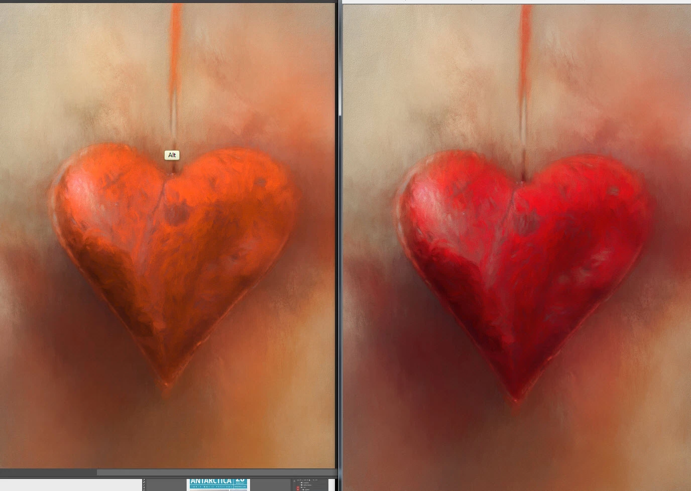
red comparisons.jpg

this shows you the actual color reading in photoshop
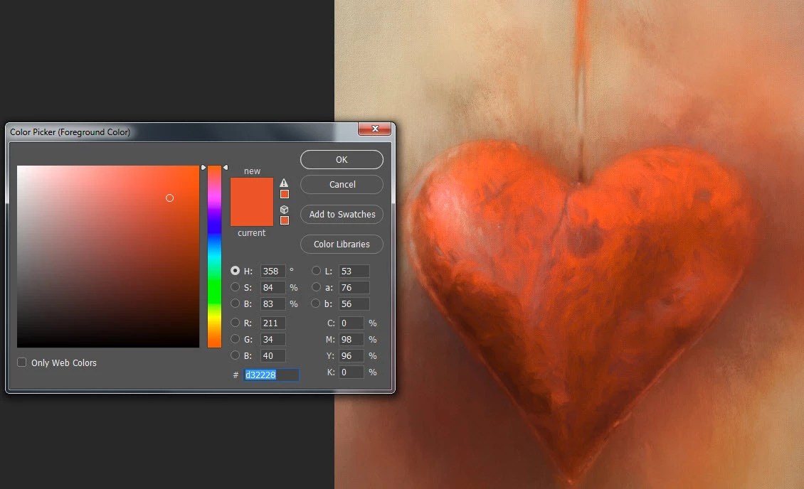
red ps color.jpg

any thoughts on this?

Views

6.1K

Translate

Translate

Report

Report
Community guidelines
Be kind and respectful, give credit to the original source of content, and search for duplicates before posting. Learn more
community guidelines
Adobe
Community Expert ,
Jan 22, 2018 Jan 22, 2018

Copy link to clipboard

Copied

willowtreestudio  wrote

if it were monitor calibration, it should look the same no matter where i open it

That's not how it works. A monitor profile is a standard icc profile, used in a standard profile conversion from document to monitor. Only color managed applications do this conversion. The others just pass the document RGB numbers straight through uncorrected.

So there will always be a difference between color managed and non-color managed applications. How big that difference is, depends on how different the monitor's native color space is from the document's color space.

Photoshop relies on an accurate monitor profile to display correctly. An accurate monitor profile is one that describes the monitor's actual, current response. This is why people use calibrators - it measures the monitor's behavior and writes a profile describing that behavior.

Calibration and profiling are two different processes, performed one after the other. The profile describes the monitor in its calibrated state.

With that said, your PS color picker doesn't look quite right. The red does indeed look too orange. So yes, I'd suspect a defective monitor profile here. If you're not using a calibrator, defective manufacturer profiles are often distributed through Windows Update. If so, go into Windows Color Management > Devices, and replace the current default profile with sRGB IEC61966-2.1. Just use that until you decide to get a calibrator.

Votes

Translate

Translate

Report

Report
Community guidelines
Be kind and respectful, give credit to the original source of content, and search for duplicates before posting. Learn more
community guidelines
Participant ,
Jan 23, 2018 Jan 23, 2018

Copy link to clipboard

Copied

thank you for that explanation -i have an eye-one display 2 but it is old and probably not working as well as it should. am thinking of renting one to see if it makes a difference. any recommendations?

Votes

Translate

Translate

Report

Report
Community guidelines
Be kind and respectful, give credit to the original source of content, and search for duplicates before posting. Learn more
community guidelines
Community Expert ,
Jan 23, 2018 Jan 23, 2018

Copy link to clipboard

Copied

The i1D2 was a top notch instrument for its day, but that generation of sensors weren't made for LED (or wide gamut) displays. They often don't perform well with modern displays. It also had plastic filters and they may have faded.

The current generation, i1 Display Pro (aka i1D3) is generally regarded today as the best mainstream sensor on the market. It has dichroic glass filters that don't fade, and inter-unit consistency is reported to be remarkable. I have one myself, although I'm using it with Eizo ColorNavigator software, not the x-rite software:

cal_2.jpg

So an i1 Display Pro would be my recommendation. B+H sells it for $246:   https://www.bhphotovideo.com/c/product/798930-REG/X_Rite_EODIS3_i1Display_Pro.html

When an individual color is off like this, it's usually because the profile reports the wrong coordinates for one of the primaries. That can well happen with a sensor that doesn't work properly.

Votes

Translate

Translate

Report

Report
Community guidelines
Be kind and respectful, give credit to the original source of content, and search for duplicates before posting. Learn more
community guidelines
Participant ,
Jan 23, 2018 Jan 23, 2018

Copy link to clipboard

Copied

LATEST

thank you again-interesting that a sensor on mine is not working correctly but most likely what is going on. I am going to see if iIcan rent the display pro first just to see how much difference that makes

Votes

Translate

Translate

Report

Report
Community guidelines
Be kind and respectful, give credit to the original source of content, and search for duplicates before posting. Learn more
community guidelines