Copy link to clipboard
Copied
Using Rotatable Patterns in Photoshop
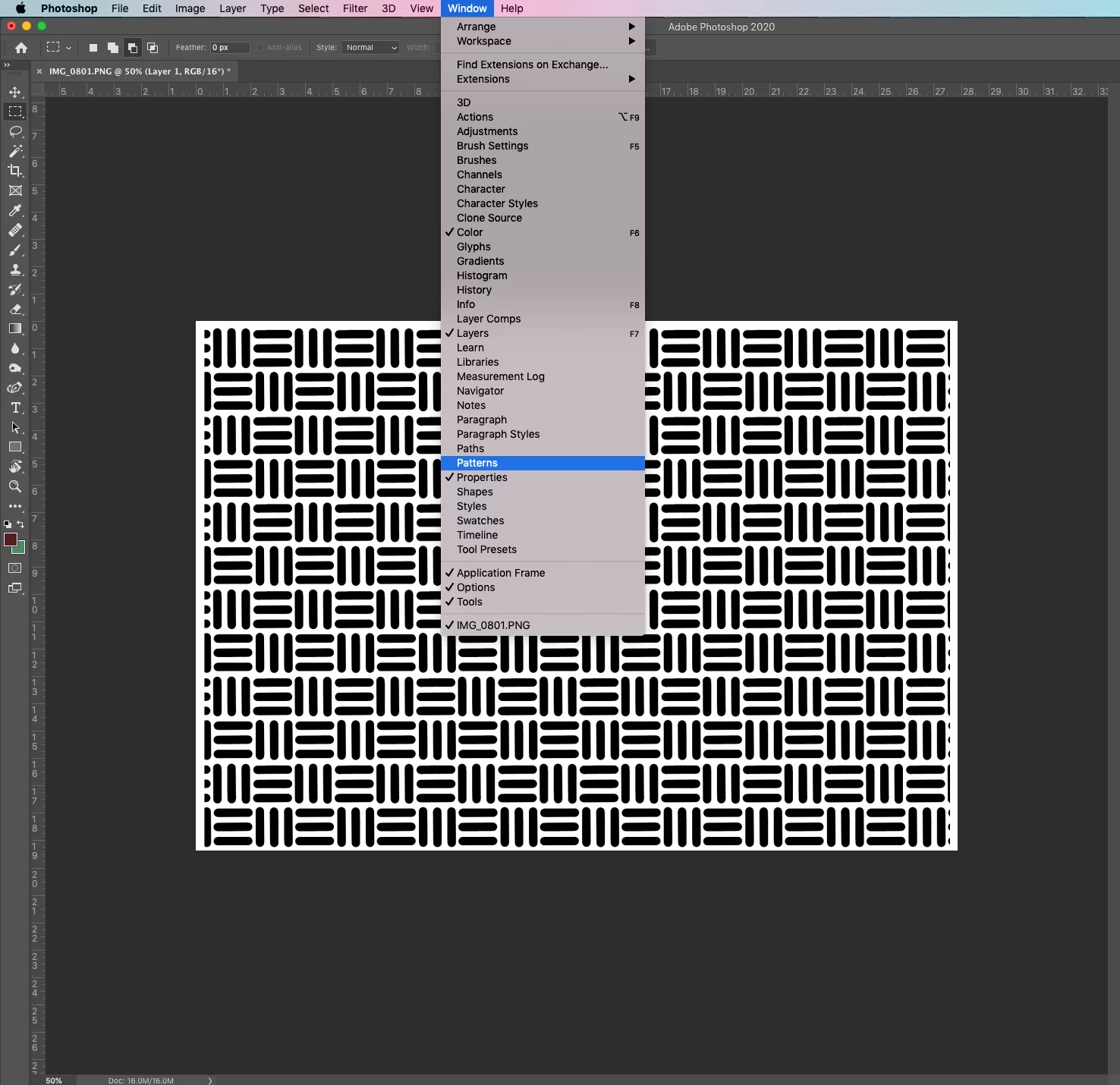
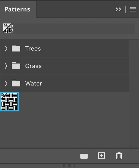
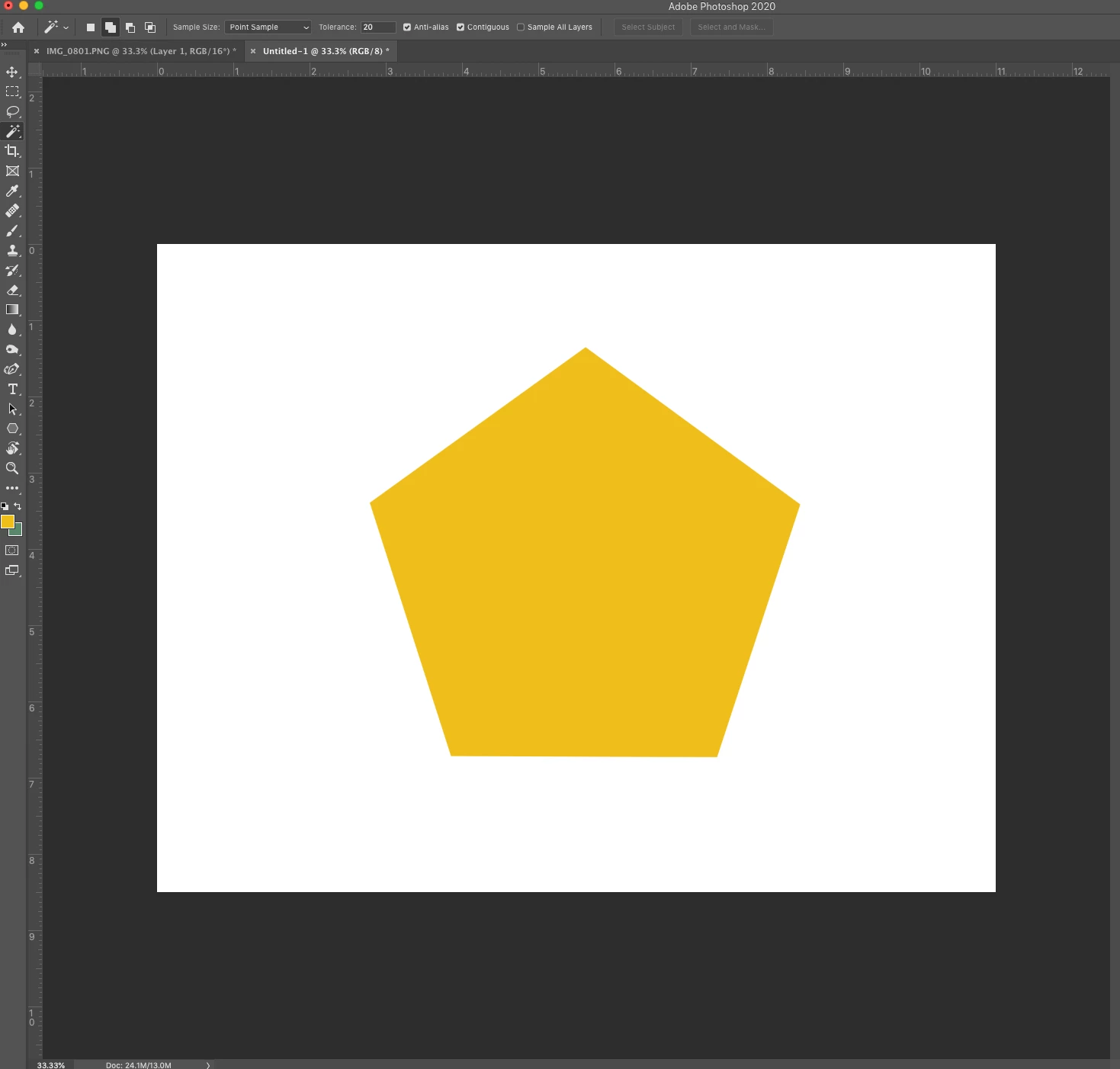
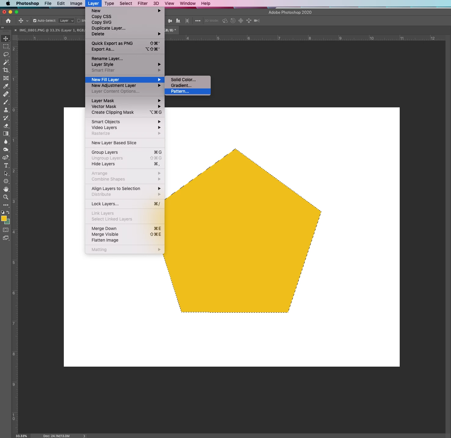
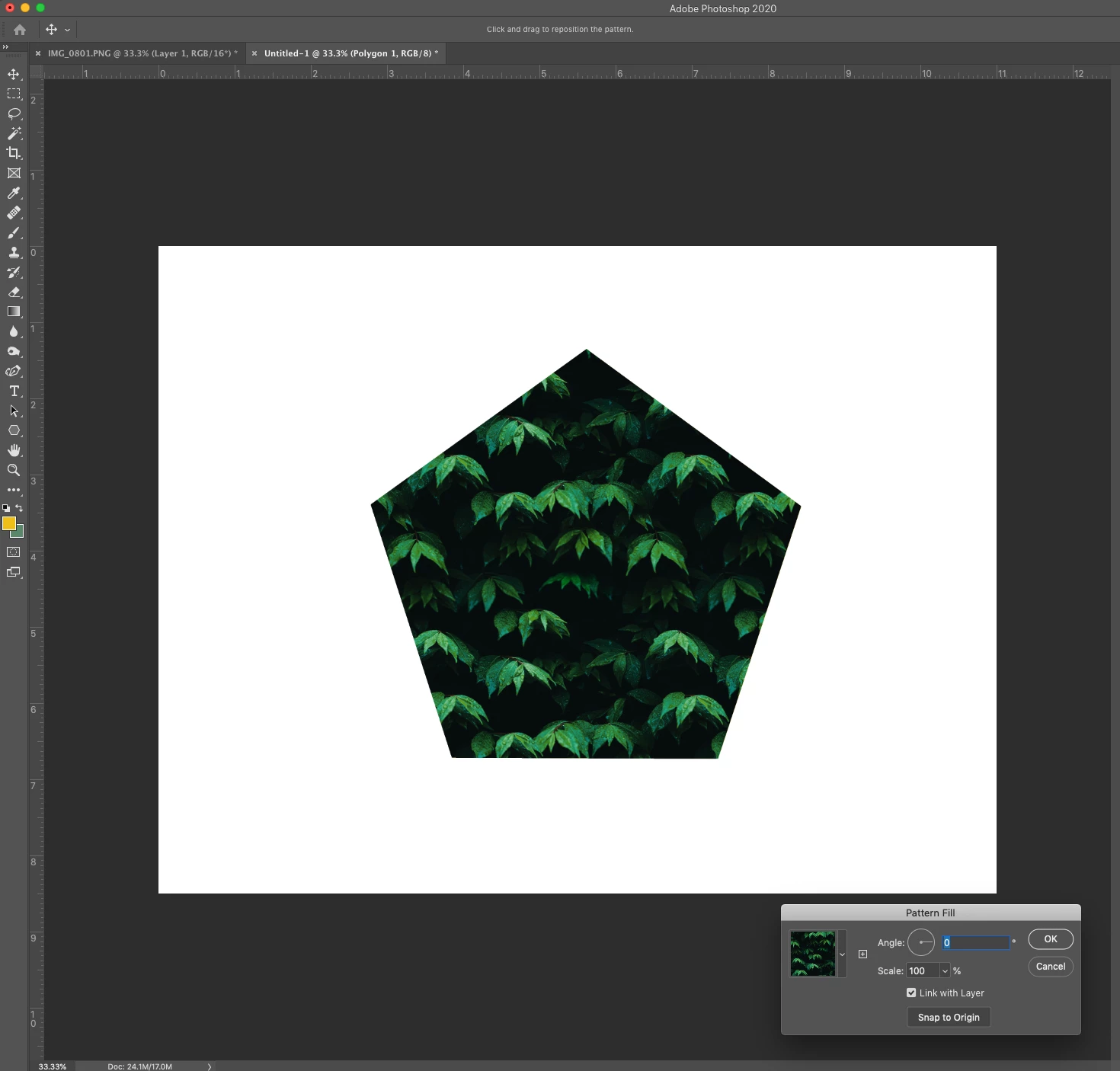
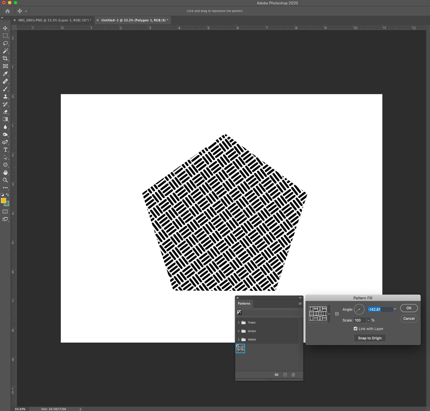
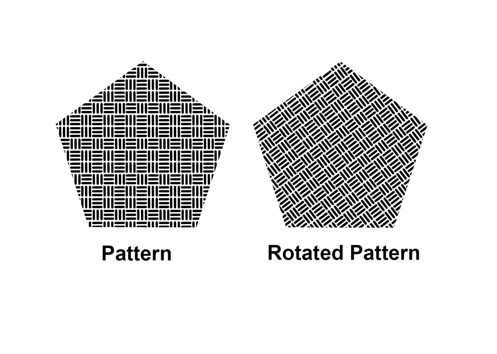
One of the cool new features found in the June 2020 release of Photoshop is rotatable patterns. This feature allows you to rotate patterns (non-destructively) to change the angle of the pattern. You can change the orientation of any pattern in Pattern Overlays, Pattern Strokes, and Pattern Fill Layers. For this tutorial, I will rotate a pattern fill layer.
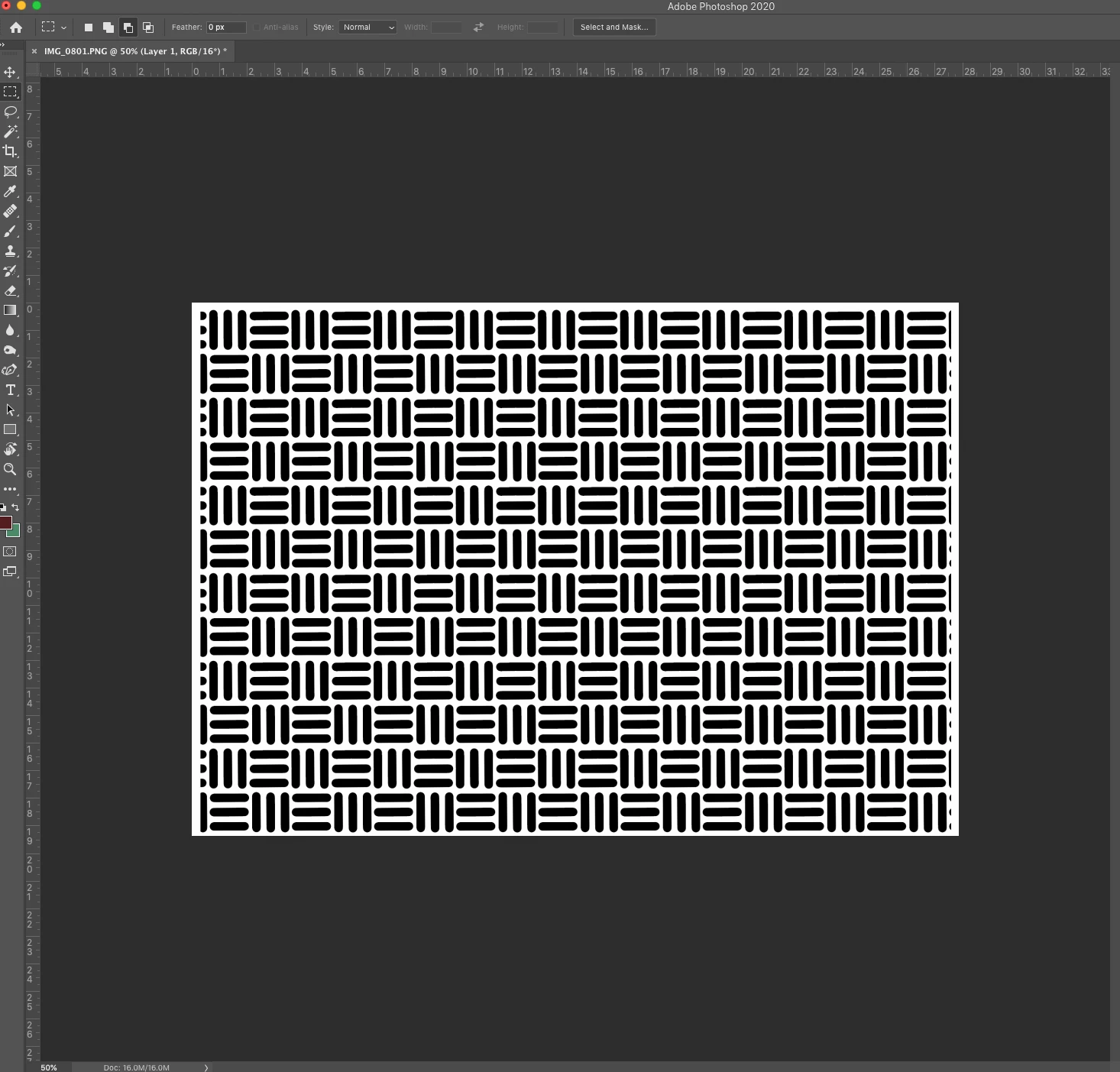
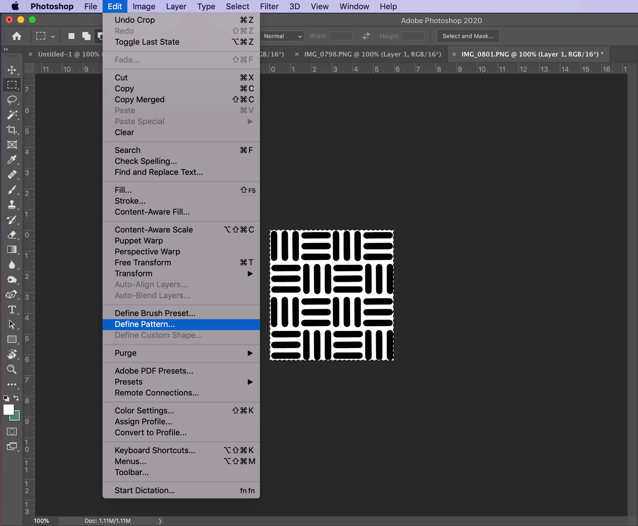
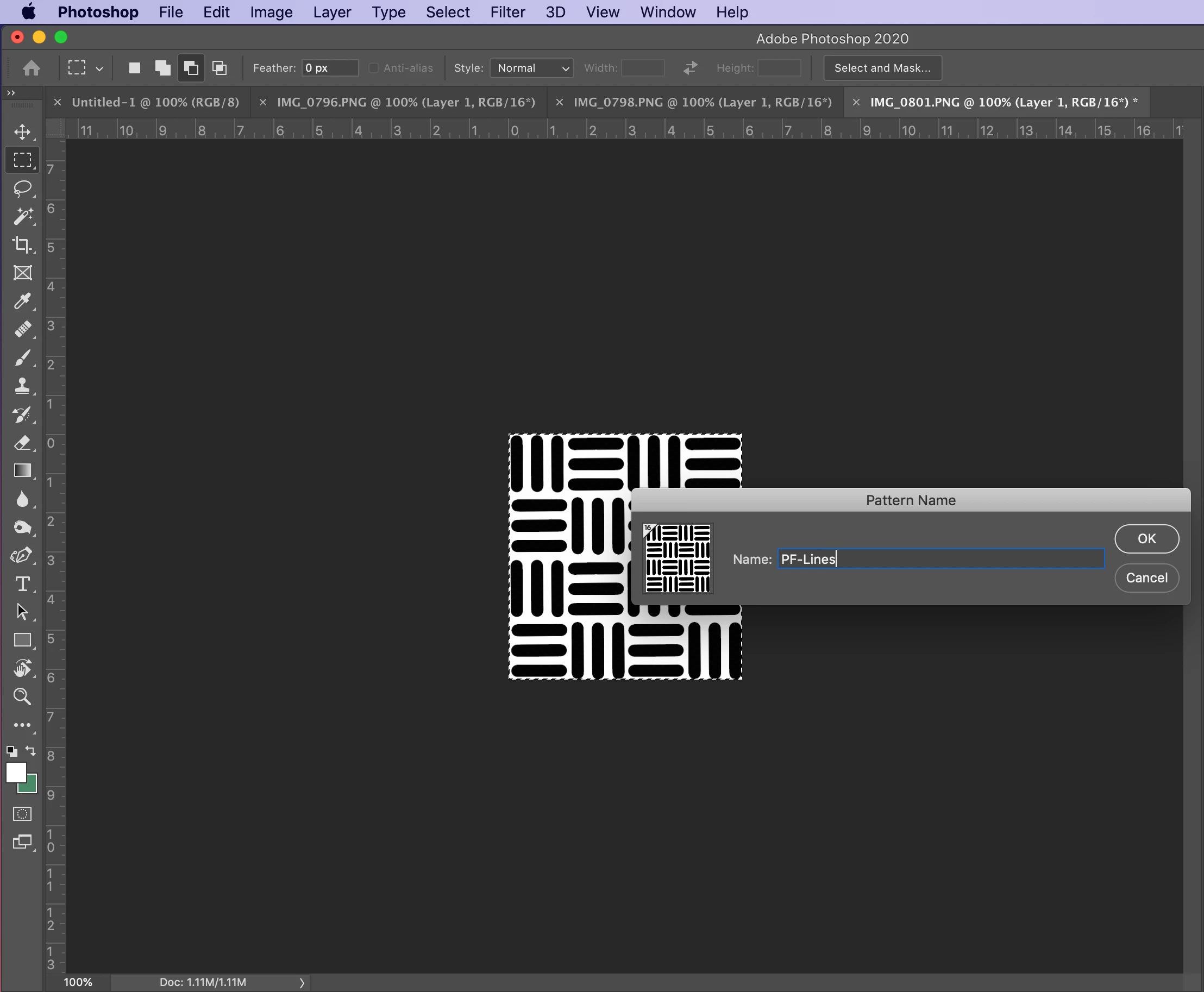
❶ Create a pattern (or use an existing one)
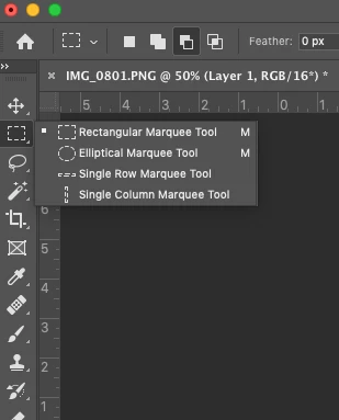
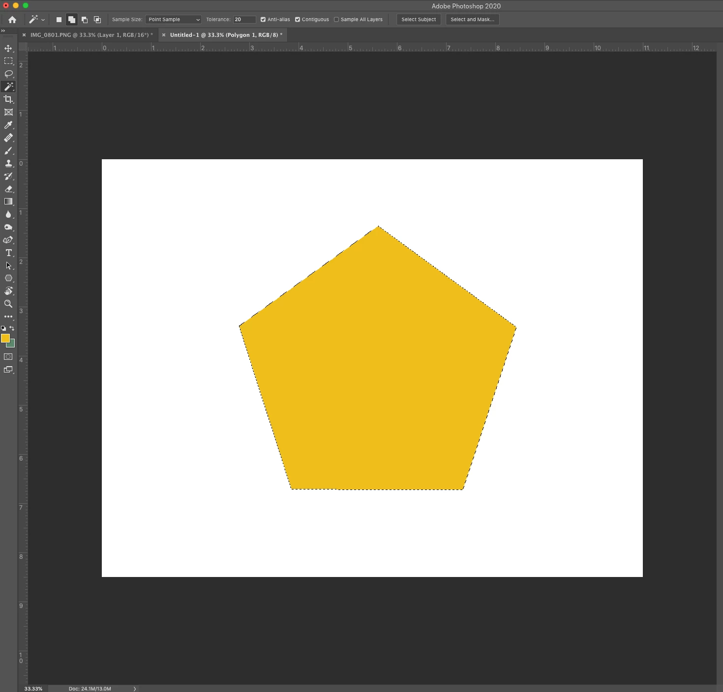
❸ Select an area to fill
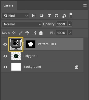
❹ Fill the selection with a pattern
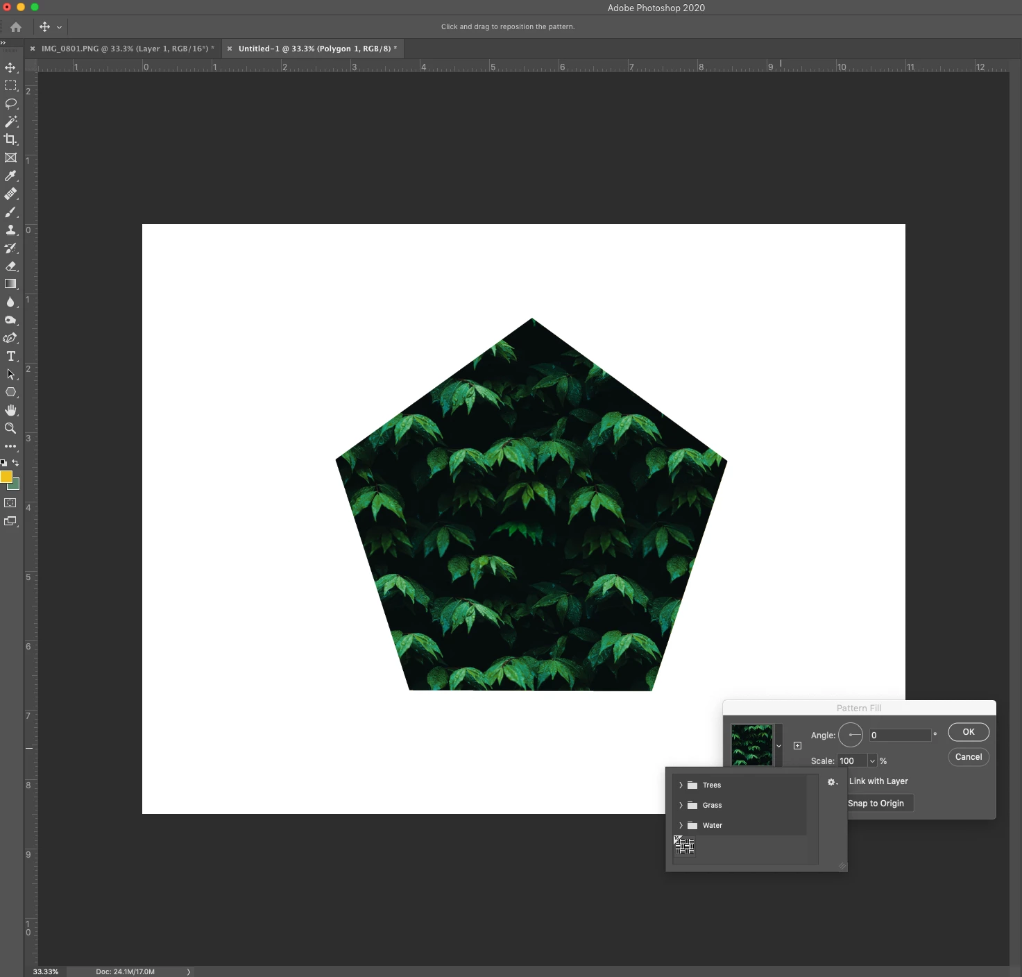
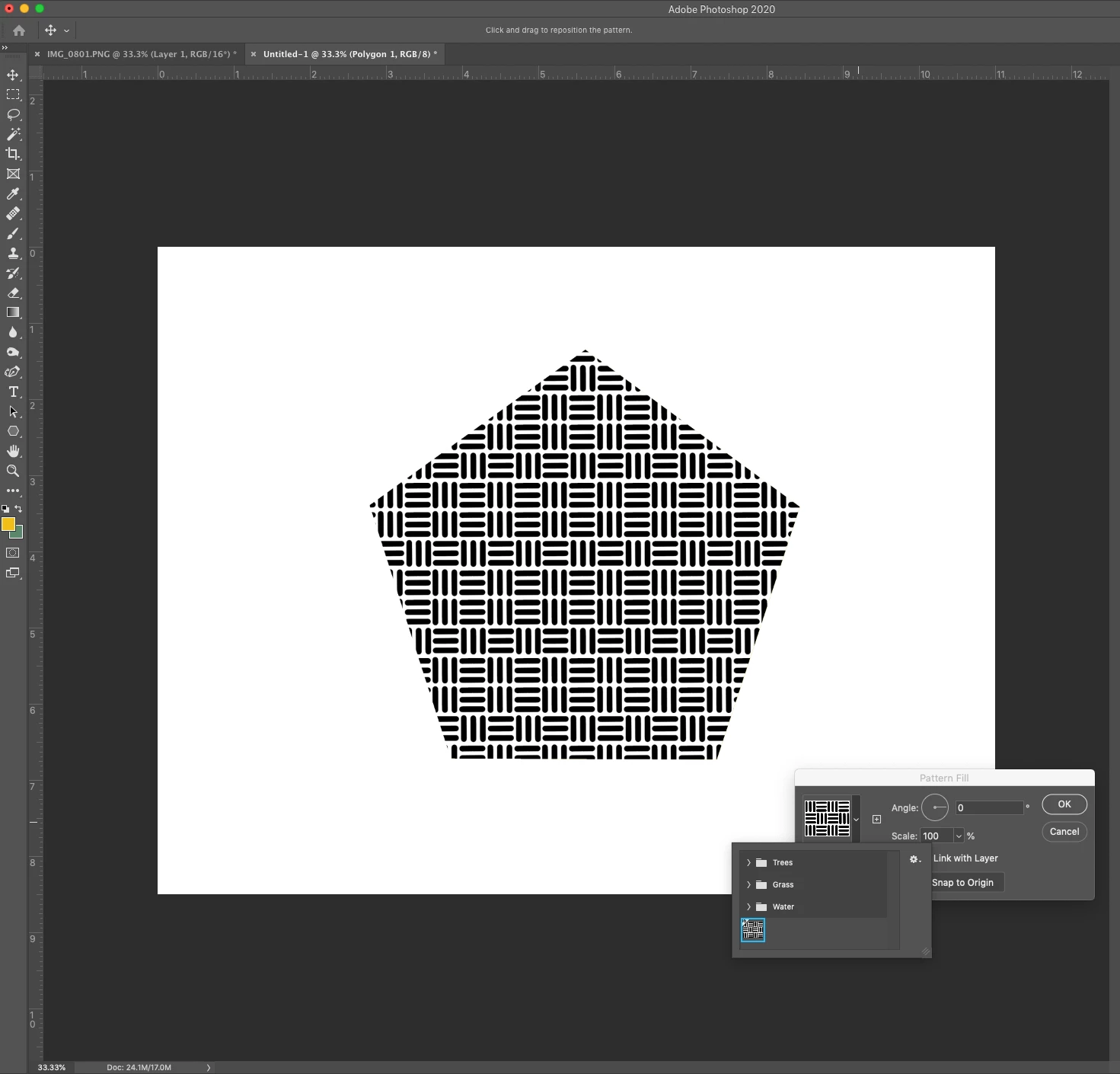
❺ Rotate the pattern
Note: The pattern angle selector can be accessed from these locations in the user interface:
Layers |
|
Shapes |
|
Frames |
|
Related links:
Create patterns in Adobe Photoshop
Copy link to clipboard
Copied
Too bad the feature uses such a bad resample method … compare a rotated Smart Object with the Pattern to the rotated Pattern in the screenshots:
Edit: I appreciate that »bad« is an ambiguous term here but I think the undesirability of the result in the example should be evident.
Copy link to clipboard
Copied
And to make sure that the transparency in the Pattern was not the problem here a screenshot with a Pattern that has no transparent pixels (unrotated, rotated Pattern, rotated SO):
Copy link to clipboard
Copied
It seems that the pattern tiles are not antialiased when rotated, so that of you have a pattern that is same colour on both edges it will tile better… having seen this the pattern example you have is the worst case scenario… yes it needs to be fixed. Hope it can be reproted in a good way.
Copy link to clipboard
Copied
And another thing:
Why are the rotation angle vaues negative compared to rotating Layers?
The Smart Object is roated 12˚, the Pattern -12˚.
Copy link to clipboard
Copied
What users need more then cool new features is a more reliable Photoshop. There are too many reported and acknowledged bugs in Photoshop that Adobe does not seem to care to fix. Bugs reported in CS2 version 9 of Photoshop are still in version 21.2 of Photoshop. With every new version of Photoshop Adobe add new bugs and feature. Photoshop is a mind field Photoshop that is impacting their users work. User need a more reliable Photoshop. Adobe need to fix bug not add new buggy features that really is not cool. However, I'll would bet that Adobe will continue to break features and not fix them in the future enlarge their mine field.
Copy link to clipboard
Copied
What I find particularly annoying is when Feature Requests are »implemented« but in an obviously unsatisfactory manner.
Apart from the rotatable Patterns the additional Warp-grid-lines come to my mind – one can add them, sure, but the bezier handles of non-corner-points snap to 90˚ angles on editing. What good is that supposed to be?
Copy link to clipboard
Copied
I agree. Instead of implementing a LONG TIME requested function like this one in a more usable way and taking this opportunity to rethink the incredibly archaic pattern controls GUI, the PS developers implement pattern rotation in the worst way possible. And with anti-aliasing issues, it seems.
Heck, even the defunct Fireworks offered a more interactive interface to deal with this.
For comparison PhotoLine implemented a very usable and intuitive pattern widget to control patterns.
This widget allows for quick scaling (proportional and non-proportional), rotation, skewing (both x and y axes), and repositioning.
Why the Photoshop dev team seems content (even celebratory) touting a half-baked and poorly implemented feature is past me. Adobe seems to be stuck in the dark ages instead of checking out the competition that does a far better job with far less resources! Why not at least attempt to do better and be more forward-thinking?
It boggles the mind. It really does. I do hope the responses to this thread will wake them up a bit. Sigh.
Copy link to clipboard
Copied
And in this case one could really get to wonder: What Patterns were actually used for testing the improved feature?
Only photographic imagery where the interpolation issues are less noticable?
Copy link to clipboard
Copied
The pattern scaling control still allows for only integers in percentage, so there's fewer values available for reduction, but, hey — you can enlarge your pattern to ONE THOUSAND PERCENT! Looks super good.
Copy link to clipboard
Copied
Only 1000%? Why not more? I don't understand these limitations.
Copy link to clipboard
Copied
Upsampling images by that much usually leads to pretty poor image quality.
And as the interpolation method employed for Patterns seems to be on the »economic« side to begin with the results for even bigger scaling are likely to be sub-optimal.
Copy link to clipboard
Copied
I absolutely agree with you. It is an obstacle for me too whenever I am working on my website.
Copy link to clipboard
Copied
you seem to be a pattern user. I am too. Do you know why a pattern will be applied at various scales when applied as a layer style? I need patterns to be applied at exactly 100% only. Sometimes, when applying patterns as a layer style/pattern overlay- even in the Photoshop 21, patterns are applied at a variety of scales. I cannot see the scale without clicking out of the window because the dialog box covers the %.
It is easy to fix, but would like to know how to avoid? Any ideas? I thrown this to the wider community, got only one bite, and that one told me he couldn't reproduce it - and lost interest.
Copy link to clipboard
Copied
chet_60, do all the files have the exact same resolution as the image you used to create the Pattern?
Copy link to clipboard
Copied
interesting.
not always.....but I can test this out. (may sound sloppy.) May account for why this occurs "sometimes".
will reply after I test.
Copy link to clipboard
Copied
Patterns we make are usually very small, 2x2, ... 8 x 8 px. sometimes 16 x16 - not ever really very much larger.
we apply them to images that have been resized to a resolution that relates to the desired outcome- weaving on a digital loom. those resolutions range from 45 - 105 p/i .
Once the draft is defined as a pattern- I don't know how to tell what resolution it was when it was drafted.
For sure, at 100% it is crispy pixels.
the test I just did- the pattern came in at 104%.
Not sure what this is a result of.
Copy link to clipboard
Copied
What are the resolutions of the original Pattern File and the File you used the Pattern in?
Copy link to clipboard
Copied
Also what was the resolution of the image in which you defined the Style?
Copy link to clipboard
Copied
I tested and retested. creating patterns that matched the resolution of the image.
pattern @ 75 ppi and image at 75 ppi
Same results.
when I apply the layer style- the pattern comes in intially at 104%. in this case...other times at other scales like 64%, 97%......would like to know what causes this.
if I change that scale on the first pattern application, all other patterns I apply to the rest of the layers will come in correctly.
How to make the first one a default setting of 100% or...to create the perimeters so that it does.
again...easy to change but why the variations?
Copy link to clipboard
Copied
Can you provide
• the Pattern File,
• the File you used to define the Style
• and the File in which you applied the Style with the peculiar result?
Copy link to clipboard
Copied
Here is a screen shot of a pattern applied using the new pattern panel. Comes in at 100% with a layer mask.
Why dont i like this? preview is not helpful...and maybe I don't want a layer mask - maybe I'd like a style.
Here is a screen shot of pattern applied as a layer style. Coming in at 104%.
yes I can change it.....what is causing this difference?
Afraid I do not know how to put patterns and files here...only images.
Although I am new here....I am not new to photoshop.
This is an issue I have been trying to resolve for SEVERAL YEARS.
I have had many files behave this way so, also I have had many student files behave this way,
it is not limited to this file and this pattern.
if you can tell me how to share files......i'l do it. thanks for being curious enough to step into this.
Copy link to clipboard
Copied
You show two screen captures one has a Pattern Fill layer clipped to a layer some blend if gray and the other a layer style effect pattern overlay added to a layer. Neither show the Image windows at 100% Zoom so we can see what you see for the two different images.
What do you want from us??? Adam Lambert to sing to you What do you want from me!
If the Bar is the two layer at 100% zoom the pattern is tool small for my old eyes. How was the clipped layer removed or merged?
Copy link to clipboard
Copied
not sure how to respond to this question: "what do you want from us???" extra ???? because????
I will assume you are trying to be funny and not patronizing.
Here are 2 new larger screen shots.
Top one shows: a single layer of color with a layer style /pattern overlay.
The pattern overlay comes in at 104%. Why?
This screen shot- below- shows the same file with a pattern applied via the new pattern panel.
I looked at the blending option to see the scale of the pattern. It comes in at 100%.
I do not use any of the blending options. The pattern should completely fill content in the layer at 100% with 100% opacity.
What I was hoping (repeating here....) was a reason WHY SOMETIMES the pattern overlay comes in at more or less than 100% and what workflow needs to be used to ensure that it does.
This clipping mask thing feels borrowed from Photoshop elements- this is how this same process used to have to be applied. I will get used to it, but there are times I do not want it....that are not relevant to this thread.
I do not know how to attach files not images in this forum.
Copy link to clipboard
Copied
Your canvas is small and pattern have few pixels what do you expect to see? scaled do to 2/3 size.