- Home
- Photoshop ecosystem
- Discussions
- Re: Save for Web PNG-24 = Soft/Blurry Fonts
- Re: Save for Web PNG-24 = Soft/Blurry Fonts
Save for Web PNG-24 = Soft/Blurry Fonts
Copy link to clipboard
Copied
Hey everyone,
This one is driving me nuts. I'm trying to export a simple graphic for my website with a final display size of 360x125px.
But when I export at this size, the fonts in my graphic look terrible. Particularly on Retina screens.
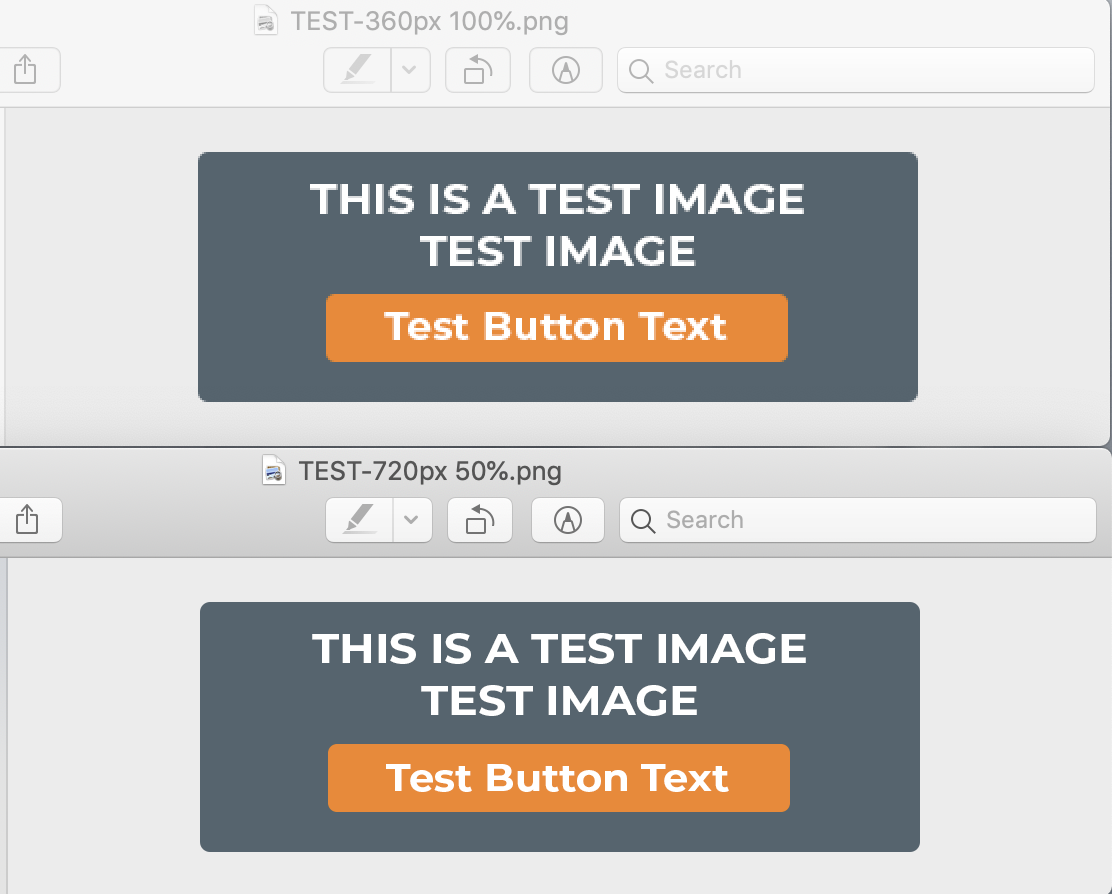
The only way I've found to get it as clean as I want, is to export at 2x the dimensions (720x250px) and view at 50%. The problem is, this technique isn't practical for use on the web. I need to be able to upload the final size for a variety of reasons, and I need it to look sharp.
I've tried GIF, PNG-8, and PNG-24 (as there's a small transparent background), and cannot get the font to look sharp no matter what I do.
Any other ideas?
Thanks in advance,
KV
Photoshop CC 2019
TOP: 360px 100% (looks blurry, especially on my Apple devices)
BOTTOM: 720px 50% (looks sharp)

Explore related tutorials & articles
Copy link to clipboard
Copied
Hi
The problem is, this technique isn't practical for use on the web.
Why, I do it all the time for websites (if there are some text), just wrap it in a div with a max-width intent in your CSS.
Then, it could be save as a SVG from PS or Illustrator, you would still need some CSS control.
Pierre
Copy link to clipboard
Copied
Hi Pierre,
Thanks for the response.
The only problem I can foresee in this case is that we will have between 30-40 different graphics that all have to be populated into specific categories on our Wordpress site. We are currently using a plugin to load images (hence my efforts) into categories that we designate. But I will definitely run this by our developer to see if it's possible.
To be clear, would you upload the 720px version in this case, then use CSS to scale it down for the viewport size?
In the meantime, still interested in hearing if anyone else has any export tips that might help clean this font up.
Thanks in advance,
KV
Copy link to clipboard
Copied
Hi
Be aware that Wordpress compress JPEG images to 82% quality.
It's not clear the intent of your example.
Does the dark background is an image or a solid color ? with the "button" being an <a> tag with an action ?
Wordpress can automatically create divers size of images (for mobile display and/or site width)
What theme are you using and version of WP ?
To be clear, would you upload the 720px version in this case, then use CSS to scale it down for the viewport size?
Of course, but my WP Skin/Theme auto-manage sizing, sometime with the help of a general Class selector added to all similar elements.
Pierre
Copy link to clipboard
Copied
christianv58609219 wrote
Hey everyone,
This one is driving me nuts. I'm trying to export a simple graphic for my website with a final display size of 360x125px.
But when I export at this size, the fonts in my graphic look terrible. Particularly on Retina screens.
360x125 Pixels are not the many pixels to have a lot of fine detail. The just to few pixels. Nether the 360x125 or 720x250 pixel image shoul look awful on a retina display both should display well. However, the 360x125 size one will be very small on a retina display. On the display its size will be aroundc 1" by 1/3" Three line of extreamly small text. Retnia display have a resolition in the 326 PPI range what size is 125px/326ppi 0.3834355828220859" in height text will be around 0.1" tall

iPhones
- iPhone, iPhone 3G and iPhone 3GS: non-Retina
- iPhone 4: Retina (960 x 640, 326ppi)
- iPhone 4s: Retina (960 x 640, 326ppi)
- iPhone 5: Retina (1136 x 640, 326ppi)
- iPhone 5c: Retina (1136 x 640, 326ppi)
- iPhone 5s: Retina (1136 x 640, 326ppi)
- iPhone 6: Retina HD (1334 x 750, 326ppi)
- iPhone 6 Plus: Retina HD (1920 x 1080, 401ppi)
- iPhone 6s: Retina HD (1334 x 750, 326ppi)
- iPhone 6s Plus: Retina HD (1920 x 1080, 401ppi)
- iPhone SE: Retina (1,136 x 640 pixels, 326ppi)
- iPhone 7: Retina HD (1334 x 750, 326ppi)
- iPhone 7 Plus: Retina HD (1920 x 1080, 401ppi)
- iPhone 8: Retina HD (1334 x 750, 326ppi)
- iPhone 8 Plus: Retina HD (1920 x 1080, 401ppi)
- iPhone X: Super Retina HD (2436 x 1125, 458ppi)
- iPhone XR: Liquid Retina HD (1792x828, 326ppi)
- iPhone XS: Super Retina HD (2436 x 1125, 458ppi)
- iPhone XS Max: Super Retina HD (2688 x 1242, 458ppi)
iPads
- iPad and iPad 2: non-Retina
- iPad 3: Retina (2048 x 1536, 264ppi)
- iPad 4: Retina (2048 x 1536, 264ppi)
- iPad Air 1: Retina (2048 x 1536, 264ppi)
- iPad Air 2: Retina (2048 x 1536, 264ppi)
- iPad Pro 12.9in (2015): Retina (2732 x 2048, 264ppi)
- iPad Pro 9.7in (2016): Retina (2048 x 1536, 264ppi)
- iPad 9.7in (2017): Retina (2048 x 1536, 264ppi)
- iPad Pro 10.5in (2017): Retina (2224 x 1668, 264ppi)
- iPad Pro 12.9in (2017): Retina (2732 x 2048, 264ppi)
- iPad mini 1: non-Retina
- iPad mini 2: Retina (2048 x 1536, 326ppi)
- iPad mini 3: Retina (2048 x 1536, 326ppi)
- iPad mini 4: Retina (2048 x 1536, 326ppi)
iPod touch
- 1st, 2nd and 3rd generation: non-Retina
- 4th gen: Retina (960 x 640, 326ppi)
- 5th gen: Retina (1136 x 640, 326ppi)
- 6th gen: Retina (1136 x 640, 326ppi)
Copy link to clipboard
Copied
What pixel dimensions is your master file, or do you have two, one for each final size? Photoshop has different text rendering options which are useful when working at final size.
Copy link to clipboard
Copied
Thanks Stephen.
I have a master file for each size, one at 360px and one at 720px.
I'd be interested to know some more about any rendering options I can play with. For what it's worth, I've already tried the presets for "Sharp", "Crisp", "Strong", "Smooth", etc. to no avail.
Copy link to clipboard
Copied
Three line of text in an rectangle that that has a height of 125 pixels on a retina display that means a text character will have height that is around 40Px high on a retina display the characters will have a height around 0.1" very small text. But you text is even smaller for you image has much white space between lines and has top and bottoms borders. You need to use larger text. Doubling the image size used 4 times the pixels for a retina display you need to use more pixels the image needs to be increased in size.

Displays do not play the resolution game they have only one size of pixels they can only display images using manufactured PPI resolution. Retina displays have small size pixels they have a high PPI resolution. You need to use more pixels to increase the size your image will dplay on a retinia display
Copy link to clipboard
Copied
I'd be interested to know some more about any rendering options I can play with. For what it's worth, I've already tried the presets for "Sharp", "Crisp", "Strong", "Smooth", etc. to no avail.
Unfortunately, these are the text options that I was referring to if you are setting the text at final size on two separate files.
Another option is to look into different interpolation options if you are resizing from a larger file to a smaller file, which I would not recommend.
I also agree with the comments regarding making this a native HTML object rather than an image.
Copy link to clipboard
Copied
On the web, real text is essential for screen readers, language translators, search engines and humans with less than 20/20 vision. Images of text are not "readable or searchable." What you have here can be created very easily with ordinary HTML and CSS code. Or with SVG code.
I'm signing off now because it's my dinner time. If you want me to provide a code example, I can do that tomorrow.
Copy link to clipboard
Copied
Thank you so much everybody for your input.
It sounds like I either need to use a higher-res file and let Wordpress deliver the correct size for the device, or I need to work with our developer to create these graphics using HTML and CSS as proposed by pierrec86934804 and Nancy OShea .
Nancy, it would be extremely helpful if you had time to provide a simple code example that I could forward to our developer. I don't have the knowledge to point him in the right direction.
Thank you again everyone
Copy link to clipboard
Copied
Hi
Nancy is right all the way. I'v been helping people for 12 years with their wordpress sites (using Thesis as the framework)
If it's all solid graphics, all is needed is some HTML & CSS.
On the link I provided, your Dev. will see how it's working.
But, you did not responded to my basic questions.
Pierre
Copy link to clipboard
Copied
christianv58609219 wrote
Nancy, it would be extremely helpful if you had time to provide a simple code example that I could forward to our developer. I don't have the knowledge to point him in the right direction.
Sure. I've posted a working demo (plain HTML & CSS) on JS Fiddle.
https://jsfiddle.net/NancyO/1cym907p/8/
Copy link to clipboard
Copied
Just a small point to clarify what everybody here is saying:
Photoshop always renders text as pixels, at the base document resolution. The final exported file from Photoshop is always a raster image.
This matters very much on a retina screen, where your browser scales images up to 2x, thus effectively halving the on-screen resolution. HTML, on the other hand, is still rendered at native screen resolution, even when scaled to 2x screen size. Hence the difference.
Copy link to clipboard
Copied
Thank you for summing this up, that makes sense. It sounds like at a minimum, I'll need to create the graphics at 2x my original size in order to account for higher-res screens. That is, if I do not pursue the HTML/CSS route using the others' suggestions.
Sorry I forgot to respond to your other questions. The blue background is simply a solid color with slightly rounded edges. The same for the orange button. Originally, the whole graphic was going to be clickable (an image). But if our developer can create these with HTML/CSS, etc., then only the orange button would be clickable.
I believe we are currently on Wordpress 5.1.x and we are using Elegant Themes Divi theme.
Thank you again, this has been very educational for me.
Copy link to clipboard
Copied
Since you are working in WordPress, in principle you only need to feed WP one image prepared for the highest resolution @X requirement. @4 will cover all hardware cases. @3 will be more lightweight, though, and more than suffice for most. At the very least a @2 image should be uploaded.
That means your original 360x125 image should be exported at 1080x375 (@3) (or 1440x500 if you intend to include very high ppi devices, see this list: Device Metrics - Material Design) .
Key thing to know here is that WordPress has had built-in responsive images support since 2015 and generates appropriately sized images for various devices, and will display the image that makes most sense at that size and the device it is displayed on. You can check this yourself by inspecting an image tag in a browser with the inspect element option: on a @1 screen the lower resolution version will be served, while on a screen with a DPR higher than 1 a higher resolution version will be displayed. This only works if you uploaded a sufficiently high resolution image in the first place, of course.
There's a little more to it, though, and your developer should probably create the required image size cases in the theme's functions code.
Refer to:
Responsive Images in WordPress 4.4 – Make WordPress Core
Article on this: https://alexwright.net/web-design-secrets/responsive-images-wordpress/
PS I test in Firefox Developer to check if the right image resolutions are loading up. The device preview includes a DPR setting which is quite handy, and will emulate very high ppi density screens (even if your own screen can't hope to match these values).
PPS to view/check WP's generated versions, open the uploads folder: a minimum of 9 versions will be created, I believe. It becomes important to install a good image optimization plugin, such as the ones listed here: https://www.wpbeginner.com/plugins/best-wordpress-image-compression-plugins-compared/
Copy link to clipboard
Copied
And another option is to save an SVG image instead of a bitmap, as Nancy suggested, but I think that bit of info got overwhelmed by the noise in this thread. Your example image is a prime example of SVG rather than a bitmap.
Just be careful to convert the text to vectors before doing this, otherwise there is a chance the typeface won't display properly.
Copy link to clipboard
Copied
Thanks again for everyone's input on this.
I'm working with our developer now on using SVG to display these, as I think it's a more elegant solution. The only complication in our case is that we have ~50 different versions of these buttons (different text, same colors) that are delivered to certain categories of our Wordpress site using a plugin. So I'm working with him to make this work instead of using individually-uploaded button images, which are not optimal for reasons pointed out in this thread.
I'll report back once we settle on a solution.


