- Home
- Photoshop ecosystem
- Discussions
- Re: Script/Cursive Font - some letters will not me...
- Re: Script/Cursive Font - some letters will not me...
Script/Cursive Font - some letters will not merge together
Copy link to clipboard
Copied
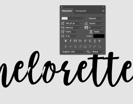
I'm attempting to use a downloaded script-style font in photohop and some of the letters will not merge together, creating gaps (please see photo for example.)
Weirdly, it seems to only happen with certain letters. I've tried going to the character window to see if there are options but when I do, many of the options are grayed out so I can't choose them.
Hoping someone can help, thanks!
Explore related tutorials & articles
Copy link to clipboard
Copied
When the options are grayed out, it means the type designer did not include them when designing the typeface. What is the name of the typeface and where did you get it?
It would help us if you could post another screenshot with an insertion point in the text and the Character panel showing. Use the Insert image icon (mountain and sun).
~ Jane
Copy link to clipboard
Copied
Thanks Jane! I bought the font off CreativeMarket, it's called "Salma" I'm wondering if maybe I have the ttf version, instead of the otf, would that make a difference?
Copy link to clipboard
Copied
One thing you can try is to select the text and see if "Optical" instead of "Metrics" helps. Also, for testing purposes, see if you get the same results at 72 pts.
If you purchased from this website, then you might try the email address at the site for support.
https://creativemarket.com/genesislab/908598-Salma-Desire
~ Jane
Copy link to clipboard
Copied
Thank you! Optical didn't seem to work but when I decreased the font size to 72, everything connected just fine with no blank spots in the connections....weird.
I will email the font shop and see if maybe they have suggestions. thanks!
Copy link to clipboard
Copied
You're welcome, @BirdGray
It's very odd indeed. I tested the typeface at their site and noticed that 72 was the largest size available for testing. It was just a hunch that the size made the typeface fall apart because I didn't see anything else it could be. Not all typefaces are well-designed.
One other thing to try, though: what if you kern the letter pairs closer together? Does that close the gap?
~ Jane
Copy link to clipboard
Copied
I came here to say what @jane-e said - kerning. I see you have it set to 0. I'd try selecting just the ones that aren't connecting and set them to -5, then -10 etc until they join (you might not want to set the whole rest of it that way, just the offending letters. It looks like the white spaces are in the exact shape of the end of the previous letter). Though I must say that if you paid for it, you shouldn't have to go through these machinations. Come to think of it though, I've had kerning issues with ones I've bought too.
Copy link to clipboard
Copied
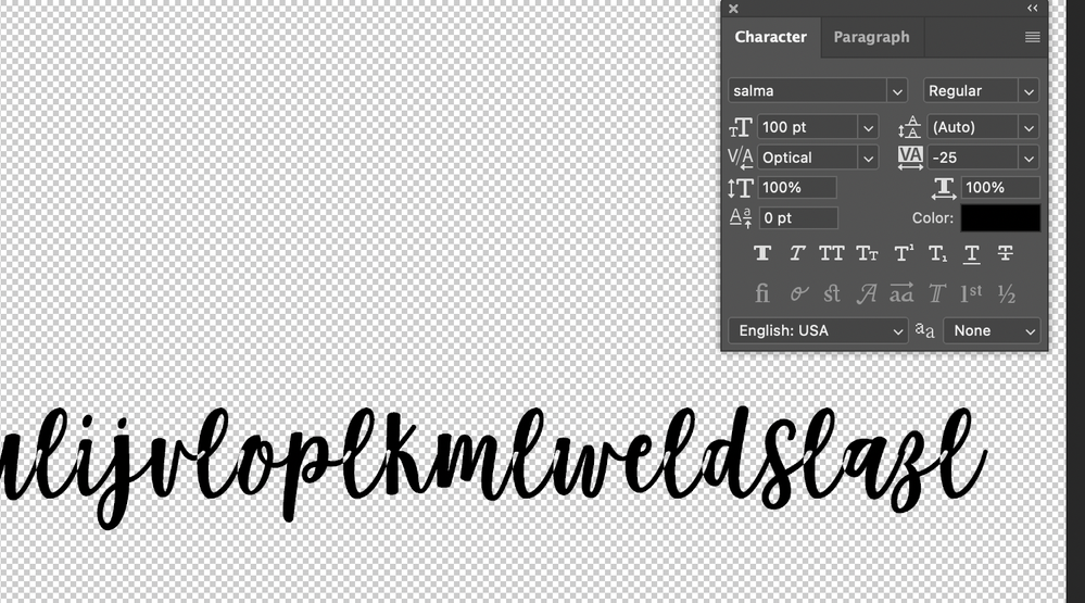
Thanks all. Tried kerning, still the same issue. Also, per the other advice below, I don't want to convert the text to paths/shapes each time because I'm using this in a template, so the words are changed for every version (for customization).
After even further investigation, it appears that this only seems to be happening with the letter "l" - all other letters will merge together just fine (see screenshot). I've emailed the font shop to see if there's a solution.... It's also odd because this does not happen when I use this font in any other design program - Pixlr or Photopea.
Copy link to clipboard
Copied
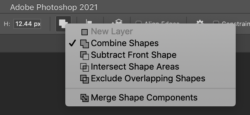
What if you try Type > Create Work Path, and use that path as a mask for a Color Fill Layer. Then try various Path Operations, and see if you can find one that won't give the white gaps. Of course, it will no longer be editable type.
Copy link to clipboard
Copied
Are you having the problem with live text or have you converted it into a series of vector shapes? If you have converted, there is a Path Operations menu that could explain and correct this odd result. I'm happy to explain further if this isn't detailed enough.
Find more inspiration, events, and resources on the new Adobe Community
Explore Now


