- Home
- Photoshop ecosystem
- Discussions
- Re: Something for the weekend - Part 18 - The cloc...
- Re: Something for the weekend - Part 18 - The cloc...
Something for the weekend - Part 18 - The clock tower.
Copy link to clipboard
Copied
Hi
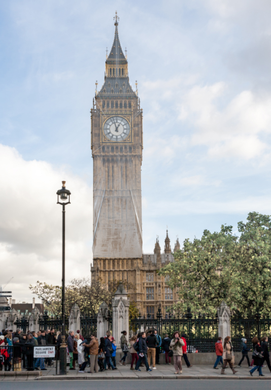
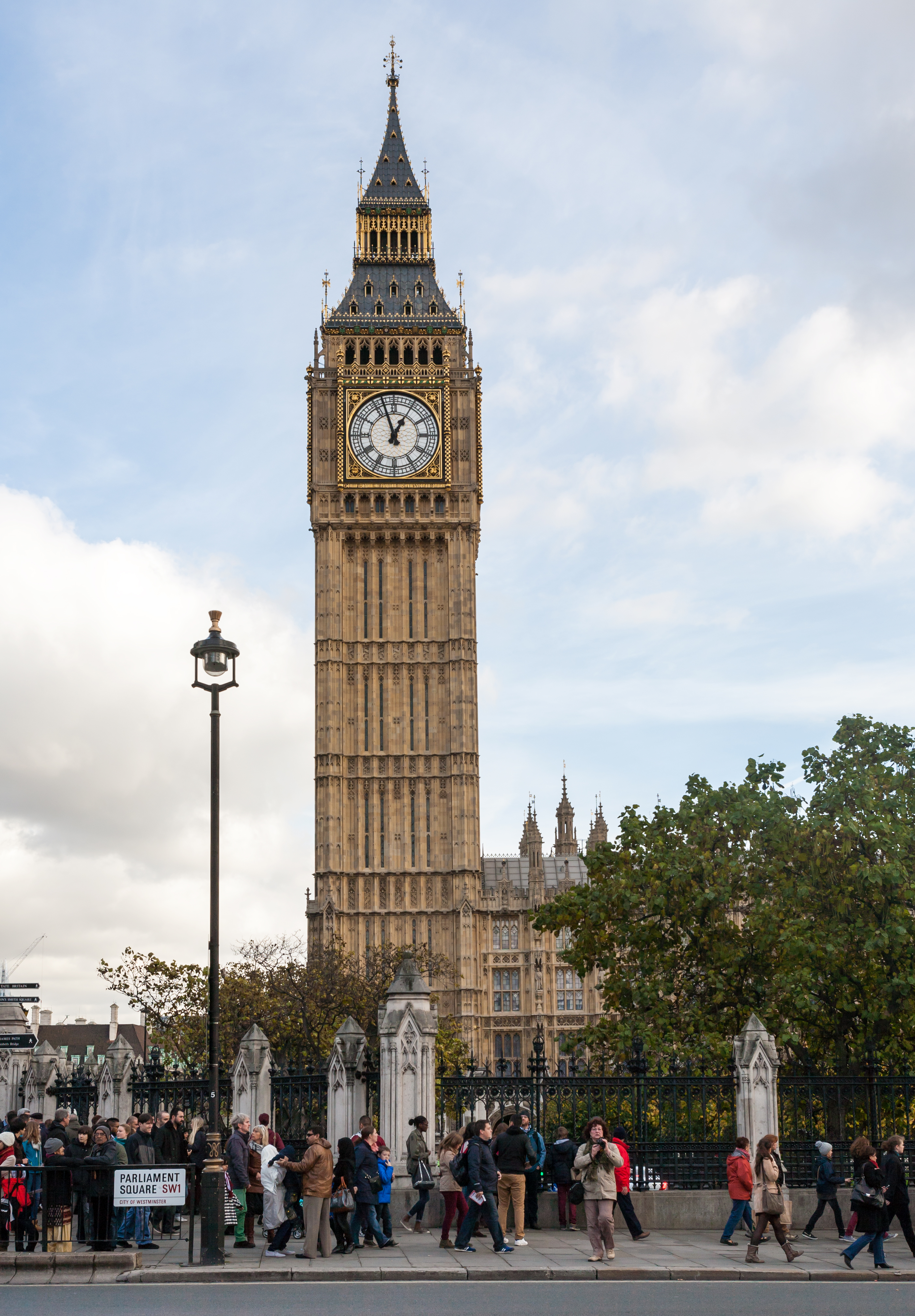
This weeks image is the famous clock tower, known as Elizabeth's Tower, at the Palace of Westminster in London which houses the UK parliament. The tower was built between 1843 and 1859 and contains the "Great Clock" and "Big Ben" which is the large bell for the clock chimes.
At the moment visitors will not see the full tower as both the tower and the clock are undergoing renovation and so the tower is surrounded by scaffold.
I am sure the renovations will be true to the original but I wondered what "improvements" our Photoshop users would make to the tower. So this weekends challenge is simple - show us what changes you can make to the tower.
Anything goes as long as it meets the forum rules on decency, copyright etc.
Anyone is welcome to have a go - whether you are a complete beginner or a Photoshop expert.
There are no prizes - just the chance to practice, show off, or bring a bit of humour and fun.
When posting back your edited images please use jpeg and downsize to 1200px on the long side.
To download the image below without the forum scaling artefacts, right click and then use Save Image As / Save Picture As (or similar depending on your browser).
Have fun
Dave
Explore related tutorials & articles
Copy link to clipboard
Copied
I wonder why she stays. It may be for her son, but more likely for her parents, who depend on her.

Copy link to clipboard
Copied
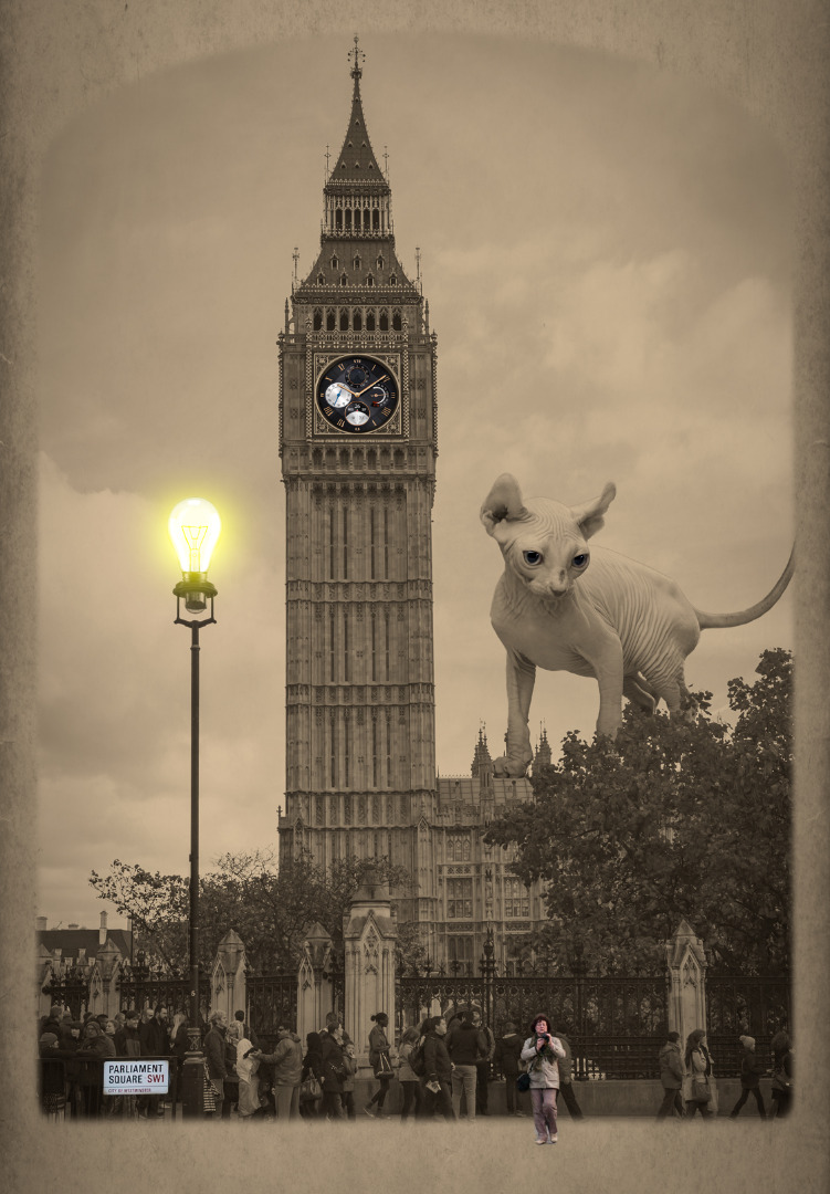
Sorry guys it was my fault, a little blip in the radar
Here you go
Copy link to clipboard
Copied
https://forums.adobe.com/people/Ged+Traynor wrote
Sorry guys it was my fault, a little blip in the radar
You took the cat away to feed it didn't you ....![]()
Dave
Copy link to clipboard
Copied
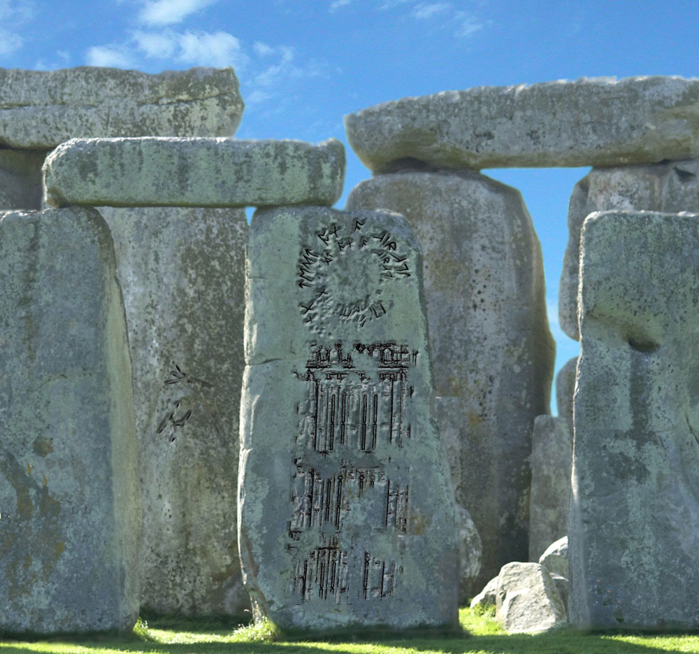
Seems to remind me of something.
Copy link to clipboard
Copied
More nice entries. Just waiting for the lightning HothWampa ![]() .
.
Very subtle Rista ![]()
Keep them coming - all are welcome to join in
Dave
Copy link to clipboard
Copied
Sunny old England

Copy link to clipboard
Copied
Haha - The plastic raincoat will be used more times than the sun protection ![]()
Dave

Copy link to clipboard
Copied
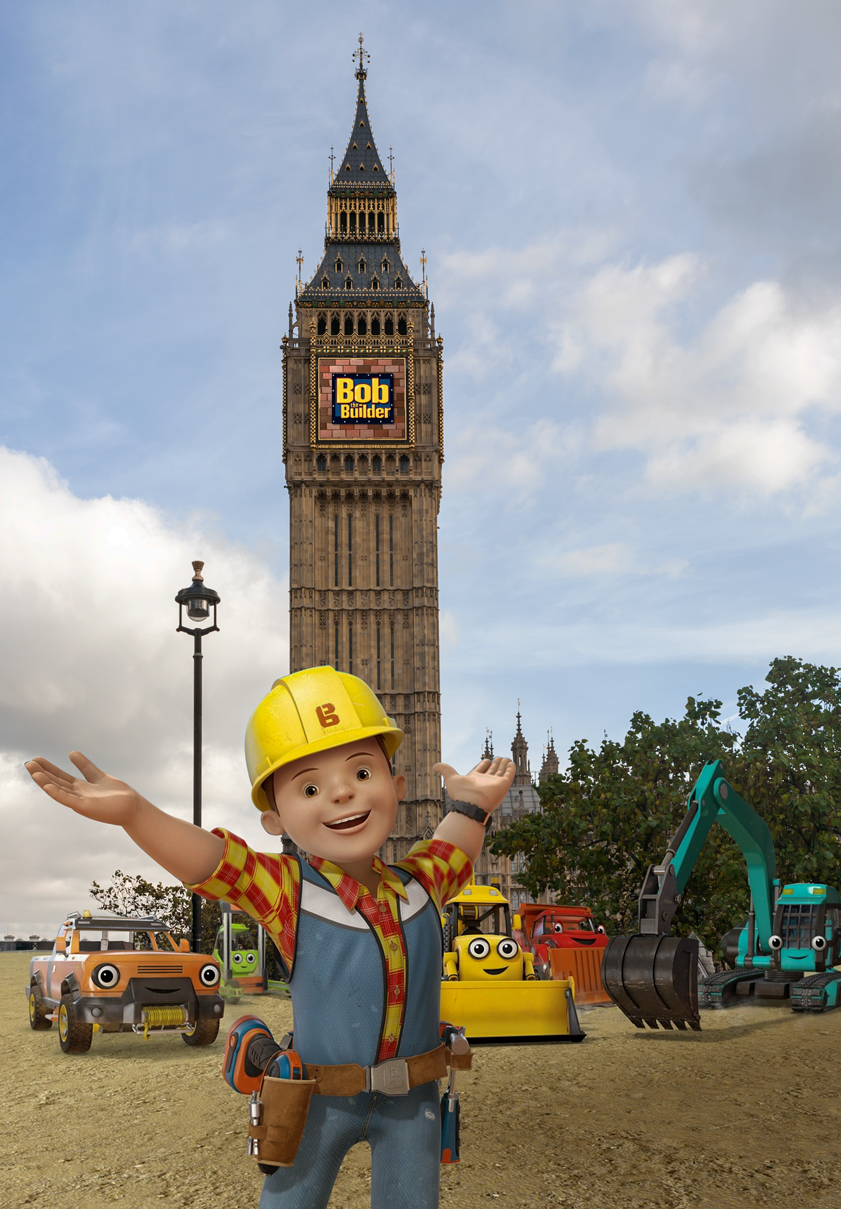
Well it looks like the workers are ready to make a start ![]()

Copy link to clipboard
Copied
Needs more more cones, safety barriers and those yellow floor things, although I'm starting to think those are actually street art constructions by some crazy artist because they always just sit there with no workmen ![]()
Copy link to clipboard
Copied
Nice work Ged - the perspective there is spot on. !
Dave

Copy link to clipboard
Copied
davescm wrote
Nice work Ged - the perspective there is spot on. !
Dave
I had a little help from Bob the Photoshopper ![]()
Copy link to clipboard
Copied
davescm wrote
Nice work Ged - the perspective there is spot on. !
Ah, so that's why I liked it. It's true, it is. I see now that Ged used a 35mm lens ![]()
I should start pushing the "like"-button more often, I know. But I'm not on facebook or any other social medium, so I never got in the habit. But I like this one, as well as Dave's Trump Tower.
Copy link to clipboard
Copied
Realistic perspective is one of those things that is often missed in a composite, with concentration on matching colour and lighting. But when it's "right" it adds a lot.
When adding elements in 3D layers, you can match the physical dimensions as well as focal length and depth of focus on the camera. Photoshop also allows you to use the Vanishing point filter to set the ground-plane in the 3D layer.
Blender is very good for this, allowing you to specify the dimension units for the object and scene. For the camera, you can set the focal length, the sensor/film plane dimensions and the iris settings - for depth of focus. By doing that it is relatively easy to produce a 3D element that fits well into a 2D composite.
Dave
Copy link to clipboard
Copied
yes fyi my image is a 3d layer rendored on top [in Dimension]... Photoshop made the 3d extrusion and re-coloured the trees
Copy link to clipboard
Copied
Ussnorway wrote
He'd probably turn that into a <nudge, nudge> about the size of...I mean, you've seen his ties, everybody? That's subtlety, Trump style.
Copy link to clipboard
Copied
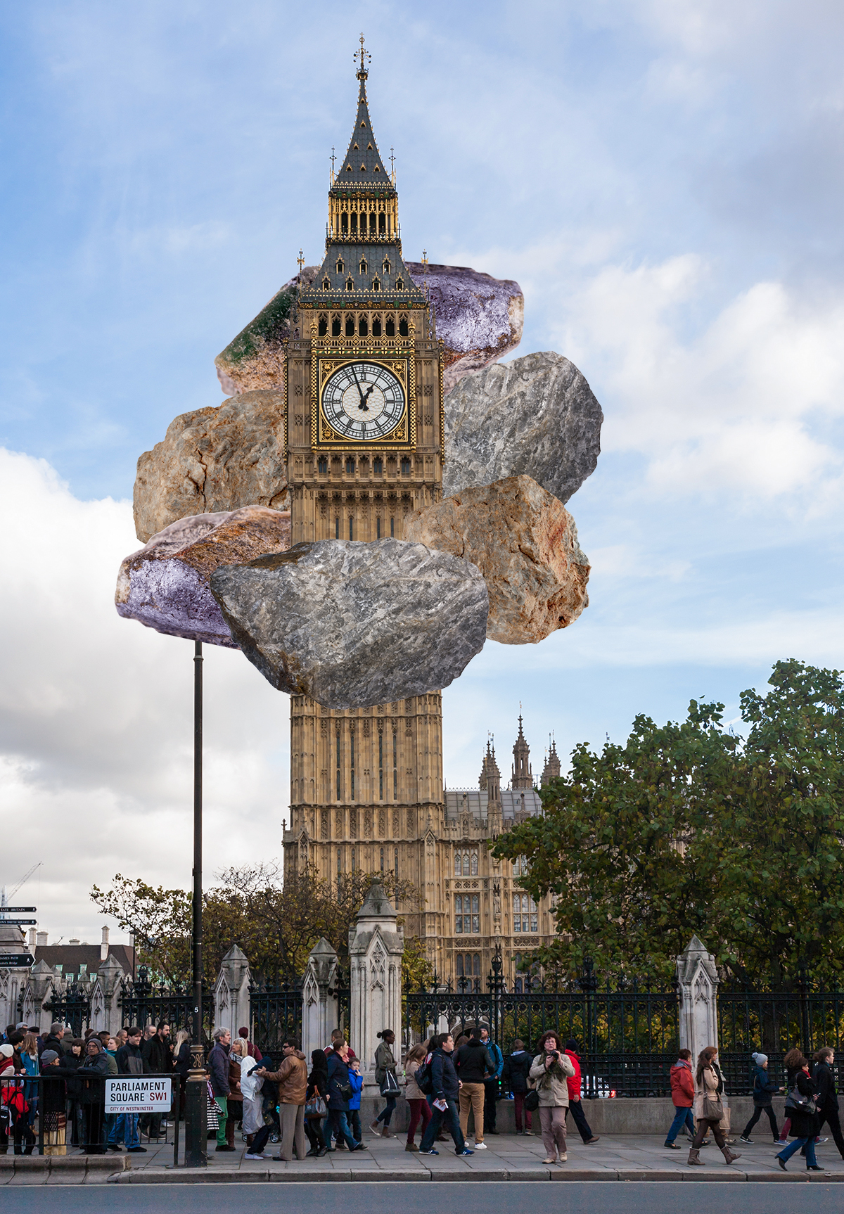
Rocking Around the Clock!
Copy link to clipboard
Copied
Jane - with all that heavy rock I'm afraid the tower will soon look like Dag's image from post 2 !
SMOk3420 - Fred Dibnah - a real character. ![]()
Dave
Copy link to clipboard
Copied
Interesting, had a crash and a spinning peach ball of death when trying to select and mask the tower, will report in the appropriate channels
Copy link to clipboard
Copied
Crashes in Select and Mask are often GPU related. I went through a period where it would crasj on the AMD drivers with Open CL checked - unchecking OpenCL temporarily resolved it. Later a driver updated cured it completely.
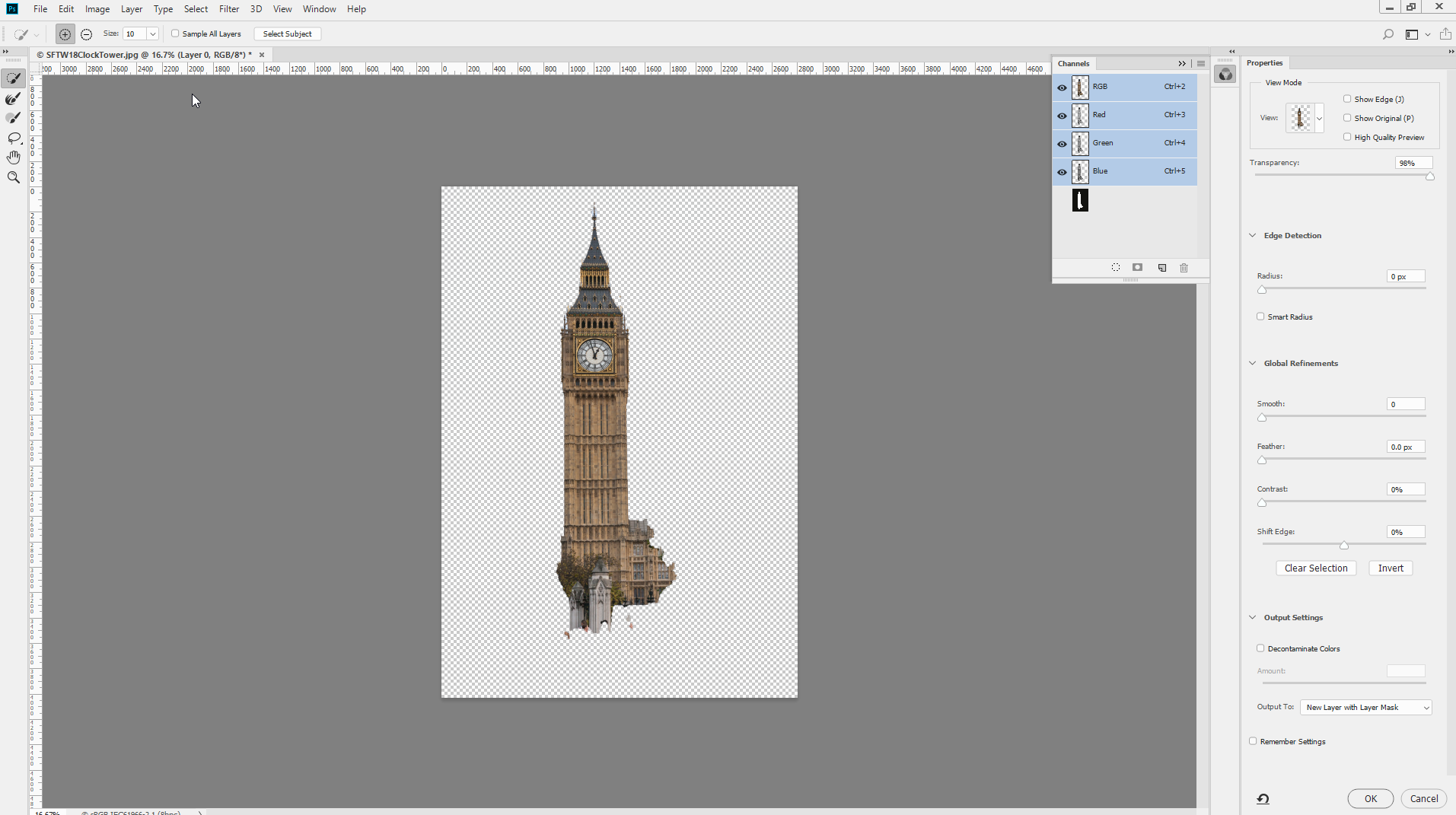
Incidentally I just tried Select Subject within S&M and got this : not perfect but quite good for a single button press :
Dave
Copy link to clipboard
Copied
davescm wrote
Incidentally I just tried Select Subject within S&M and got this : not perfect but quite good for a single button press :
I used Select Subject first, followed by Select and Mask to clean up a few edges. It was quick and pretty clean. I used Select Subject for the rocks, then cleaned up the drop shadows. They are scaled to about 25%, so they are not as "heavy" as they might have been, hahaha!
Copy link to clipboard
Copied
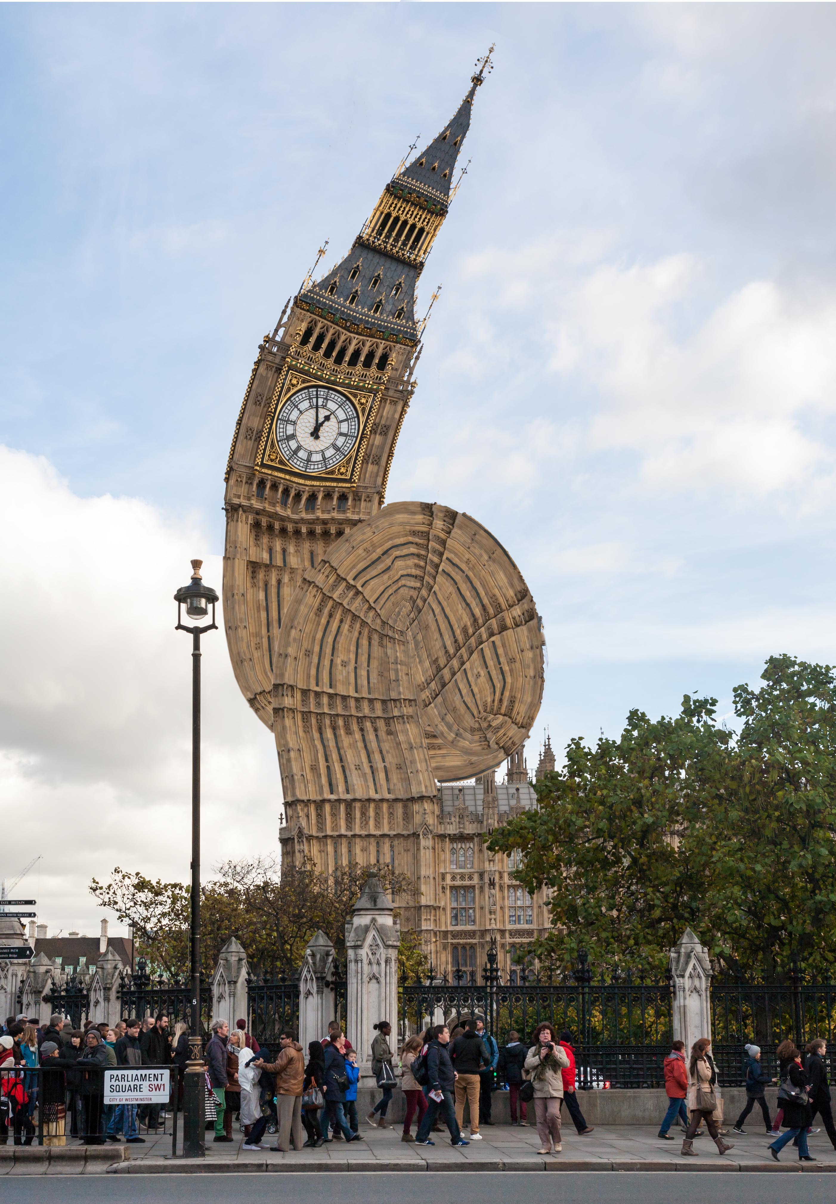
Quick and dirty:
Copy link to clipboard
Copied
Very appropriate Pierre. The government have been tying us in knots for years !
Jane - we expect to see the video following the next Max ![]()
Dave

Copy link to clipboard
Copied
The new Clockmill ![]()
I know the spikes are missing off the tops but I got lazy
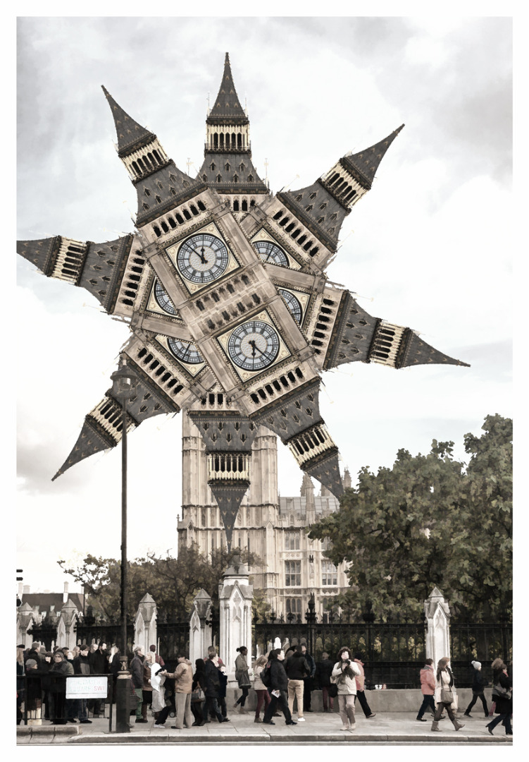
Copy link to clipboard
Copied
That's great—I can even (almost) see it turning and grinding the corn from the fields!
Copy link to clipboard
Copied
davescm wrote
Jane - with all that heavy rock I'm afraid the tower will soon look like Dag's image from post 2 !
Dave, those rocks won't fall as long as Bill Haley and His Comets keep singing! ![]() When I was a young lass, I could do those fancier dance steps they do toward the end of this video:
When I was a young lass, I could do those fancier dance steps they do toward the end of this video:

