- Home
- Photoshop ecosystem
- Discussions
- Re: Something for the weekend - Part 31 - Right up...
- Re: Something for the weekend - Part 31 - Right up...
Something for the weekend - Part 31 - Right up our alley!
Copy link to clipboard
Copied
Hi
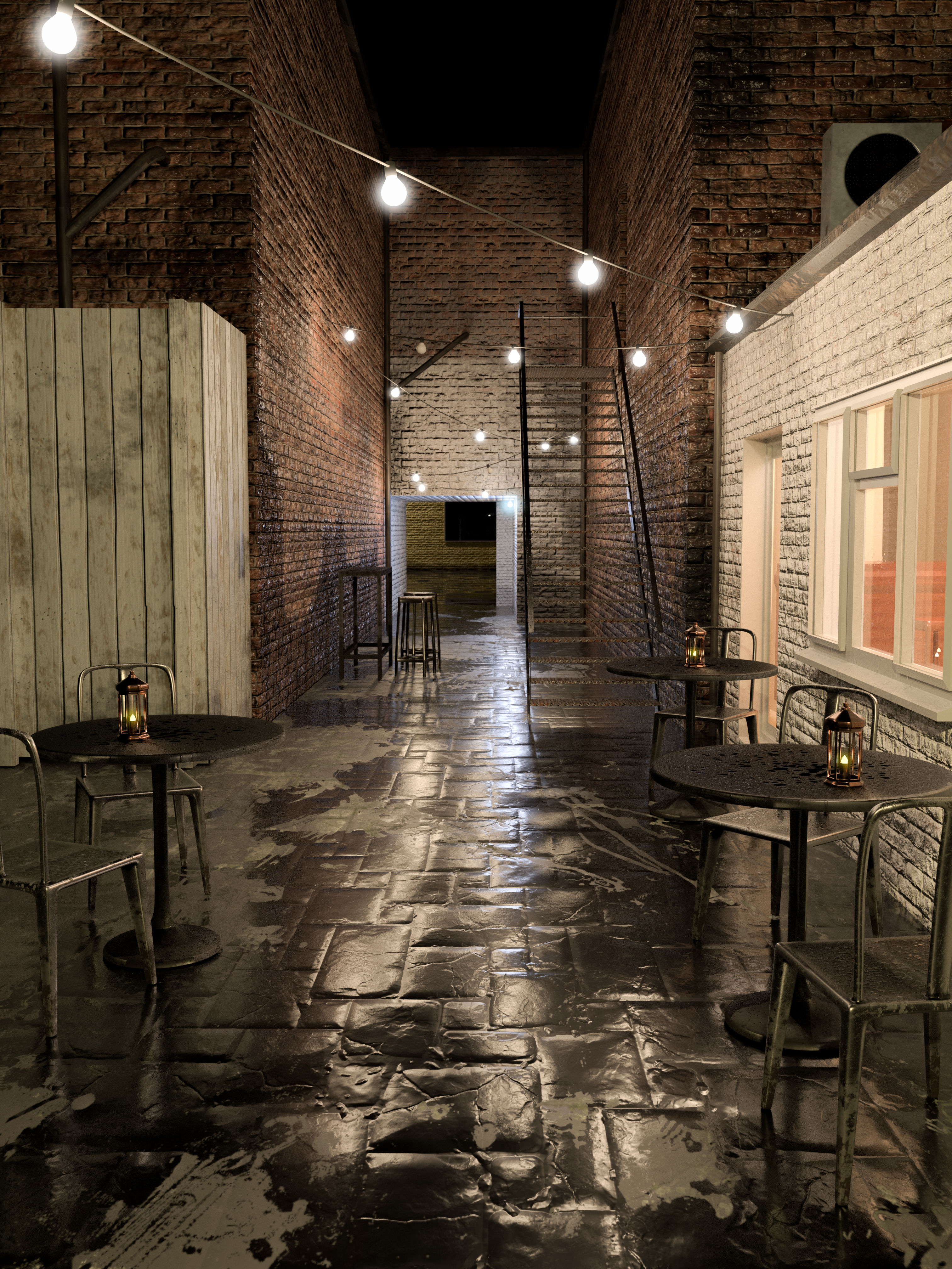
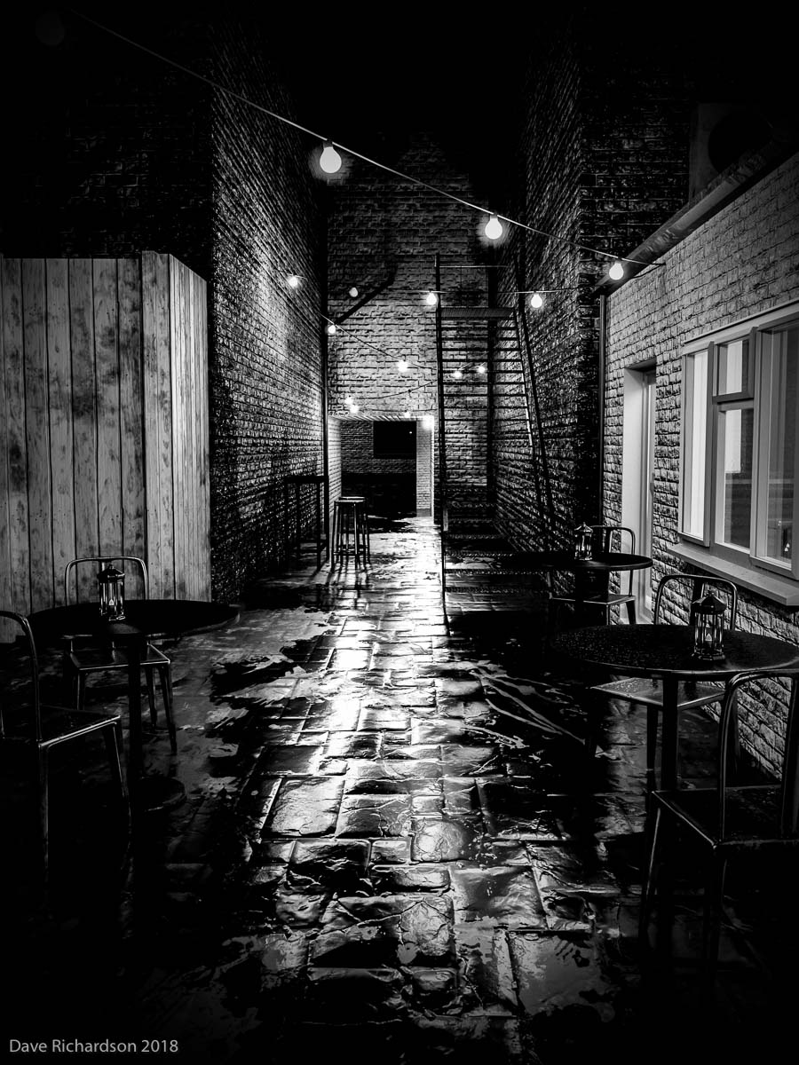
I saw this alley on a "beer and curry" night last week. A thunderstorm had passed through an hour or so before, leaving things a liitle damp, and I thought it would make a good "something for the weekend" starter image. So I took out my phone and snapped it. Unfortunately, when I looked the next day, the combination of dim light, a hand-held phone and, possibly, a couple of beers meant that the image was not as sharp as it should have been. Whilst I could have returned at another time, with a proper camera and tripod, we have had very little rain since. So I set myself the challenge of recreating the scene in 3D, which took a little longer than I thought it would, but was a good exercise in modelling, texturing and lighting.
So I bring you the empty alley - what will you do to bring it to life?
As always, anything goes as long as it meets the forum rules on decency, copyright etc.
Anyone is welcome to have a go - whether you are a complete beginner or a Photoshop expert.
There are no prizes - just the chance to practice, show off, or bring a bit of humour and fun.
When posting back your edited images please use jpeg and downsize to 1200px on the long side.
To download the image below in jpeg format with ICC color profile (sRGB) and without the forum scaling artefacts , right click and then use Save Image As /Save Target As (or similar depending on your browser).
Have fun
Dave
Explore related tutorials & articles
Copy link to clipboard
Copied
I live in a town where that could happen ![]()
Copy link to clipboard
Copied
Graham, but wouldn't that be with crocodiles, Brown snakes, and Funnel Web spiders? The worst we have are the sand flies. ![]()
I think one of the first things Bert does is develop the perspective and light directions in Illustrator. He is obsessive about accuracy. The overhead lights complicate things in Dave's alley scene, but I'd say that most light is coming from the window on the right. Adding shadows and 'relighting' introduced objects is key to making them belong in the scene.
If you consider how long ago Bert did Times Square, and that it took him over two years to complete, it is amazing how well Photoshop and his hardware coped. Photoshop was probably 32bit at the time, so 3.5Gb of system RAM and less than 2Gb for Photoshop. We saw the file structure for Times Square when Chuck and I TA'd for Bert at MAX 2016, and it was huge. Dozens of folders, and goodness knows how many PSD files. Although he made each element separately, he had to put it all together at some point, so I think he must have worked out the order of elements background to foreground. Added an element or two. Flattened the image and moved to the next element. There's no other way his System could have coped, and even then he'd have needed serious scratch space. He is well connected, so perhaps he borrowed an Adobe mainframe for final assembly? Chuck might know.
KJerryK, (is Jerry your name?) That is lovely animation, and beautifully smooth for a GIF. Did you use AE again?
Copy link to clipboard
Copied
Trevor.Dennis wrote
The overhead lights complicate things in Dave's alley scene, but I'd say that most light is coming from the window on the right. Adding shadows and 'relighting' introduced objects is key to making them belong in the scene.
There are 21 light sources in that scene - excluding the three in the table lanterns (strength 100) . I've shown the emission strengths of each below.
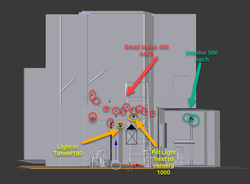
The two right at the back, shown below, light the building and road visible through the tunnel

Dave
Copy link to clipboard
Copied
Dave that is interesting and helpful. I can see now that I was misinterpreting some of the scene, like I hadn't realised that was a tunnel at the end of the alley. What did you use to produce the 3D scene?
Copy link to clipboard
Copied
Trevor.Dennis wrote
What did you use to produce the 3D scene?
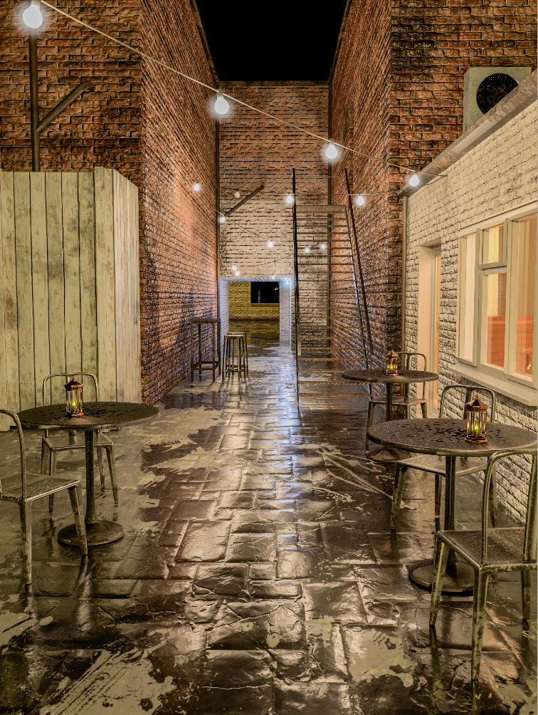
I modelled it in Blender, textured it in Substance Painter, then lit and rendered it in Blender. I then brought it into Photoshop for finishing (e.g. adding glow to the lightbulbs) and exporting as the jpeg you see in the in the first post.
I am doing a Tech Wednesday in September on Brush Symmetry and some lesser used parts of Photoshop 3D but I have offered to do another later in the year on the Blender, Substance, Blender, Photoshop workflow used in this image.
Dave
Copy link to clipboard
Copied
davescm wrote
I am doing a Tech Wednesday in September on Brush Symmetry and some lesser used parts of Photoshop 3D but I have offered to do another later in the year on the Blender, Substance, Blender, Photoshop workflow used in this image.
Dave
Hey, that would be cool, although I'll catch it via the recording as the time difference does not work for me, and will be even worse for Graham (two hours behind me). On the other hand, it would be worth getting up early to throw in some gnarly questions, except you'd no doubt have smart answers. ![]() Make sure you let us know when they are on.
Make sure you let us know when they are on.
Copy link to clipboard
Copied
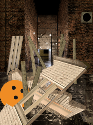
Whoops
Copy link to clipboard
Copied
Haha - I should have built the model better ![]()
Dave
Copy link to clipboard
Copied
Is that an orange bowling ball that dropped out of the sky?
Copy link to clipboard
Copied
It is a bowling ball, and I think it came down the stairs.
Copy link to clipboard
Copied
Orange is an appropriate color for anything that can do that much damage!
Copy link to clipboard
Copied
I wish I'd used a colorful ball in my first post. Then you could see the spin bur on the holes and the speed lines would show better. As it is, I think it looks like a big, fat, bug.
Copy link to clipboard
Copied
Semaphoric wrote
I wish I'd used a colorful ball in my first post. Then you could see the spin bur on the holes and the speed lines would show better. As it is, I think it looks like a big, fat, bug.
And a little wisp of steam tracing the path the ball had taken. Or make it simple, and put flames along a path ![]()

I'm sorry, but I absolutely can't bring myself to depict a spherical object as a flat disk. OCD in action. ![]()

Copy link to clipboard
Copied
I selected one I liked from Google image search. Most of them were renders, and many were hack jobs. One had a single light source, with just Phong shading. Really? In this day and age?
Copy link to clipboard
Copied
I had to look up Phong Shading. Interesting stuff
Copy link to clipboard
Copied
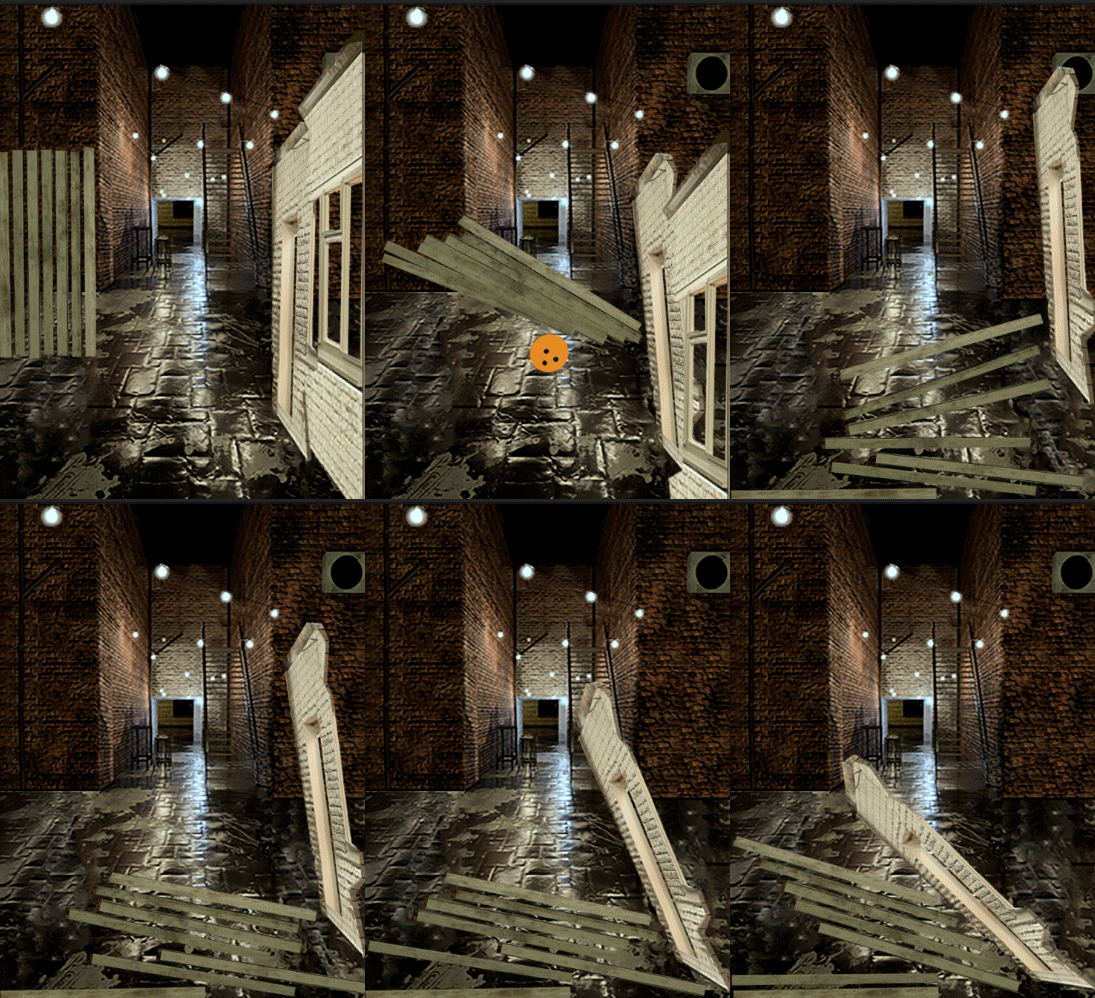
I promise this is my last one this week. I just wanted to try it in Character Animator
Copy link to clipboard
Copied
My poor model alley !!
Dave
Copy link to clipboard
Copied
Trevor.Dennis wrote
I'm sorry, but I absolutely can't bring myself to depict a spherical object as a flat disk. OCD in action.
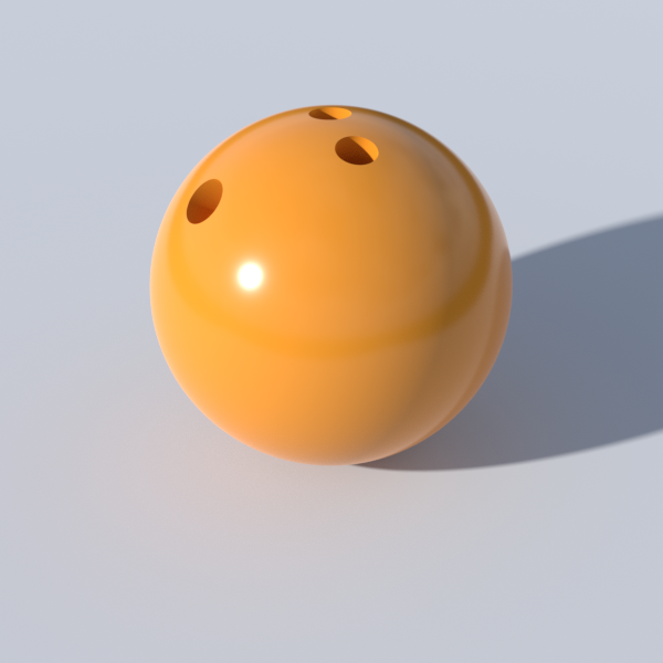
Of course a modern physically based 3D shader takes care of all that and more, including for example the fresnel effect toward the edges.
Dave
Copy link to clipboard
Copied
Jerry, I love your animation. It is beautifully smooth for a GIF, and I don't know why Animator is able to achieve that. I just 'had' to save and have a look, and it only has 58 frames — I have experimented Tweening a ton of frames for small movements with Photoshop, and it 'still' looks jerky. ![]() The 'ease in' and 'ease out' is also very apparent when you step through your GIF a frame at a time. From the very brief look I have managed to have with Animator, I can see that multi-object animation is no more difficult than single object, which is a huge advantage over Photoshop. I am so wanting to get to grips with Animator, but I'm a bit full on at the moment with two video jobs to finish, and I 'hate' editing videos!
The 'ease in' and 'ease out' is also very apparent when you step through your GIF a frame at a time. From the very brief look I have managed to have with Animator, I can see that multi-object animation is no more difficult than single object, which is a huge advantage over Photoshop. I am so wanting to get to grips with Animator, but I'm a bit full on at the moment with two video jobs to finish, and I 'hate' editing videos!
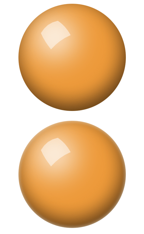
Dave, I think I like the holes in your 3D render best. I looked at a lot of photographs before illustrating my ball, but I have a go to workflow for spheres, which is always my starting point.
Filled circle.
White circle on new layer clipped to filled circle.
Huge blur of the white circle (I used a value of 50 here)
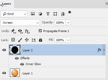
Inner Shadow layer style, job done.
Note: I don't use layer styles > Bevel & Emboss to make spheres unless they are only a few hundred pixels max.

Then, if it is shiny, it needs to reflect something, like a window. As always, it is pretty much essential to make your reflection layer a Smart Object, because it is highly likely that you'll want to fine tune it. For instance, I think I have given my reflection a wee bit too much perspective. It is hugely helpful to look at some real photographs. I could manage the ball with my limited 3D skills, but not the reflection, and the finger and thumb holes for a bowling ball... well I wouldn't even know where to start. I think I enjoy illustrating stuff too much to give 3D a proper chance, but I am in awe of some of what Dave has done with Blender etc.

Copy link to clipboard
Copied
I've just realised there is a cool way to find all the old SFTW threads. Because they tend to be the only threads that Dave starts, go to his Profile page, and click on Content.

Copy link to clipboard
Copied
Nice mini tutorial Trevor ![]()
The only thing I would add is a slight glow at the edges to simulate the fresnel effect where reflections are stronger at the shallower angles seen at the edge of a sphere.
Next SFTW due tomorrow ![]()
Dave
Copy link to clipboard
Copied
Trevor.Dennis wrote
KJerryK, (is Jerry your name?) That is lovely animation, and beautifully smooth for a GIF. Did you use AE again?
Yes, Jerry it is. I've gone through several iterations -- Jerry, JerryK, KJerryK (clever disguises, huh?) -- because that was easier than changing email address. Or so I seem to remember. I've already chosen my next screen name -- Ipso Facto -- if no one else gets it first. And i did use AE again. I really did try to do it all in PS, but I just got impatient. Besides, we have summer visitors, and they all wanted to go down to the local brew pub.
Copy link to clipboard
Copied
From what I remember, Bert built every detail in a suppose file, the flattened pieces for final assembly. But I could be wrong.
Copy link to clipboard
Copied
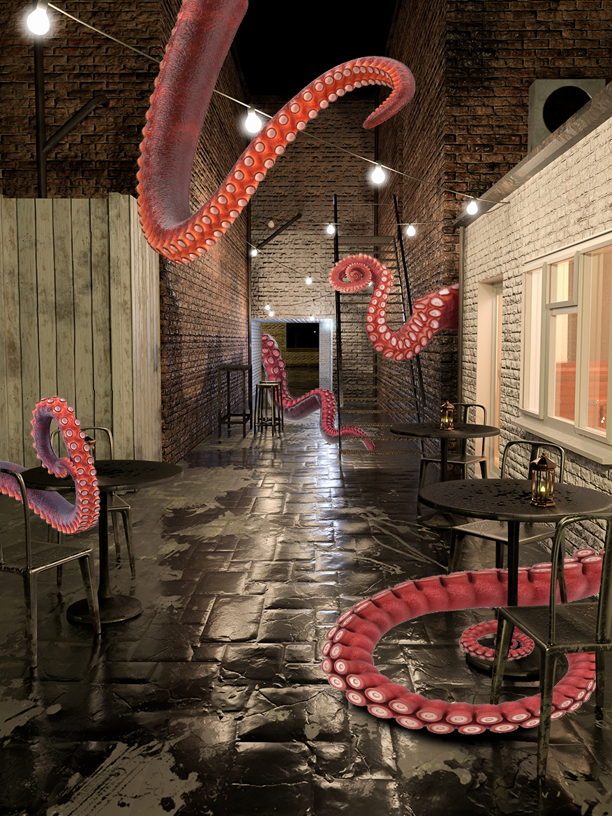
Yum! Calamari . . .
Copy link to clipboard
Copied
]]
 I
I
Nice Challenge Dave. I like my alley's dark with a little light to show the way if you dare.


