

- Home
- Photoshop ecosystem
- Discussions
- Re: Something for the weekend - Part 32 - The Inn!
- Re: Something for the weekend - Part 32 - The Inn!
Something for the weekend - Part 32 - The Inn!

Copy link to clipboard
Copied
Hi
Last week's alley challenge brought some great entries so, for this week, I thought we deserved to relax. In these forums we have the lounge but what we really need is a full blown Photoshop pub.
Of course, every pub needs a name and all traditional pubs need a sign. Pub signs in Britain have been around since the 14th century when King Richard decreed that landlords should erect signs outside their premises or forfeit their ale! These days, the signs tend to bear the name of the pub/inn and can be simple graphics or very detailed paintings. A quick google search will show many examples.
So for this week's challenge, can you name the Photoshop pub and give it a suitable sign. I've kicked us off with the "Layer & Mask" but I'm sure you can do better.
As always, anything goes as long as it meets the forum rules on decency, copyright etc.
Anyone is welcome to have a go - whether you are a complete beginner or a Photoshop expert.
There are no prizes - just the chance to practice, show off, or bring a bit of humour and fun.
When posting back your edited images please use jpeg and downsize to 1200px on the long side.
To download the image below in jpeg format with ICC color profile (sRGB) and without the forum scaling artefacts , right click and then use Save Image As /Save Target As (or similar depending on your browser).

Have fun
Dave


Explore related tutorials & articles
 75
Replies
75
75
Replies
75

Copy link to clipboard
Copied
Copy link to clipboard
Copied
Is it me or has that wording changed since you first posted Jerry ? 
Dave
Copy link to clipboard
Copied
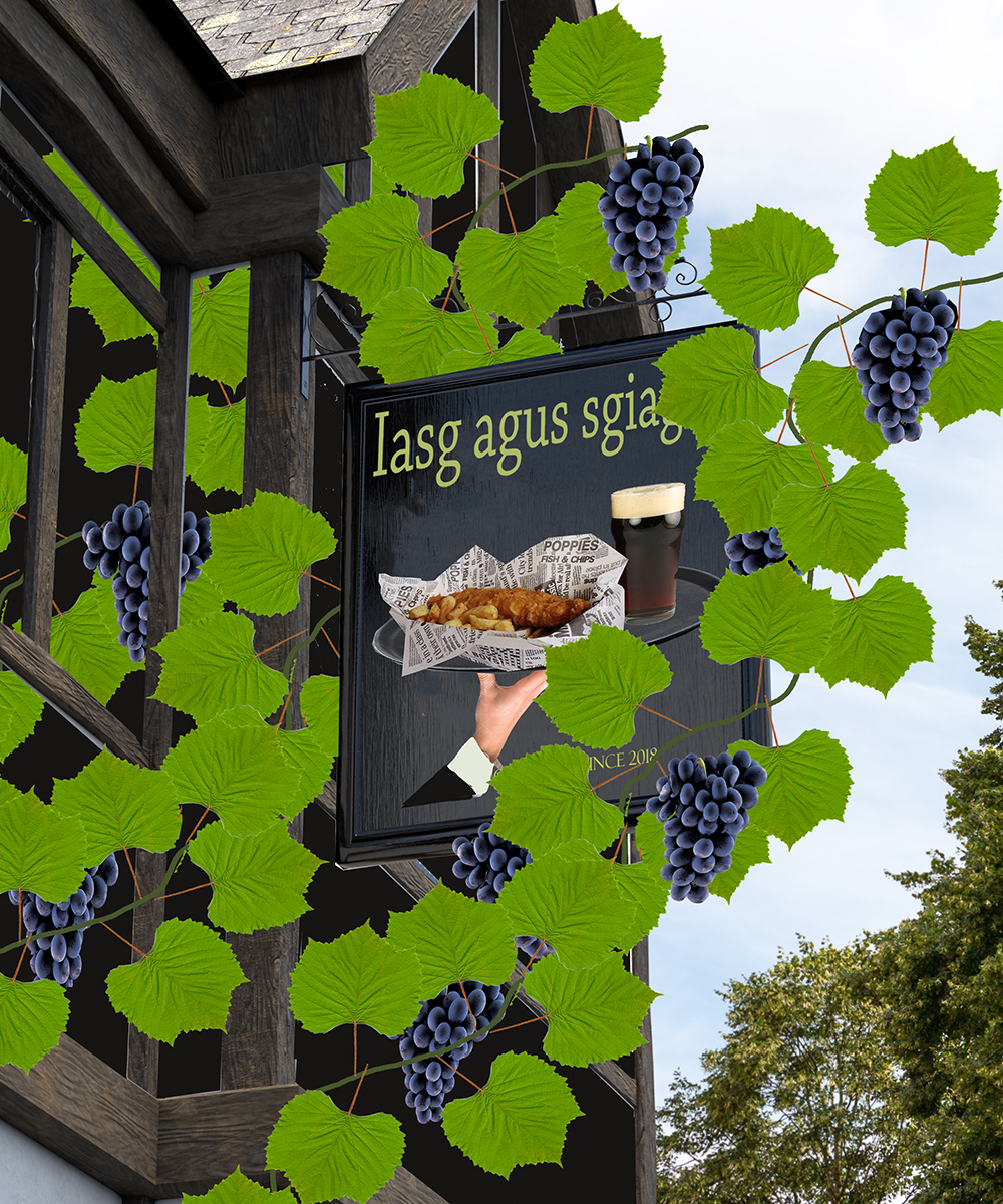
Good eye -- I'm having a little trouble with the translation, so tried another version. Notice that I also hid some of the text so i can do a little fudging if challenged. What I probably should do is put all the possibilities on a little slide show to keep changing on the sign. But I made a promise to myself that for Part 32 I would do only still images, and I will (do my best to) keep that promise.
Copy link to clipboard
Copied
I did put both through Google translate and the current version makes more sense (at least to Google translate !)
Dave
Copy link to clipboard
Copied
I realize now that it is important to test the results in both directions before actually using those translations.

Copy link to clipboard
Copied
I'm still thinking about my sign, but I found where yours is, Dave:

Bonus points for naming the town - it's obvious!
Copy link to clipboard
Copied
Corner Layer Rd and Mask St., San Jose, CA ??
Copy link to clipboard
Copied
Wrong hemisphere.

Copy link to clipboard
Copied
Semaphoric wrote
I'm still thinking about my sign, but I found where yours is, Dave:
Bonus points for naming the town - it's obvious!
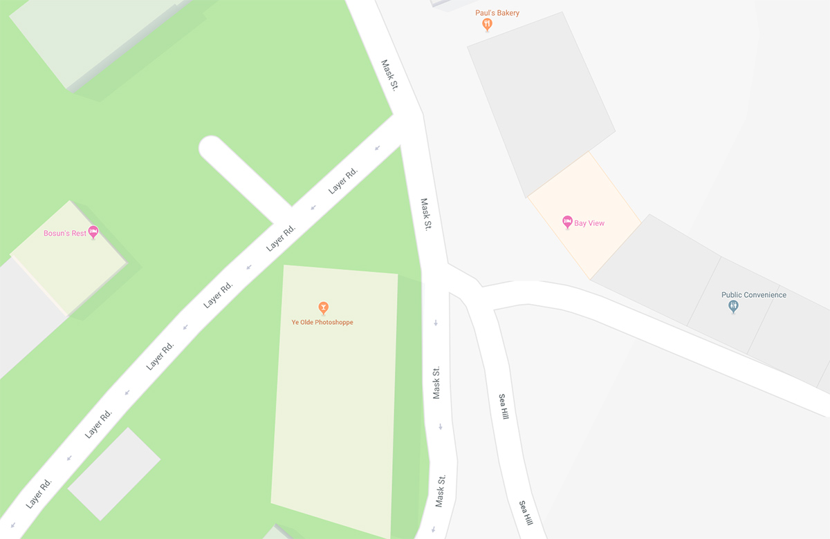
That had me going as I assumed it was in America. There are some names that will appeal to Dave, but it is 2.5 miles to the nearest Indian Restaurant.

Copy link to clipboard
Copied
Ah. I've got it now !. That would be a perfect town to put it
Unfortunately it exists only in my PC at present :
Dave
Copy link to clipboard
Copied
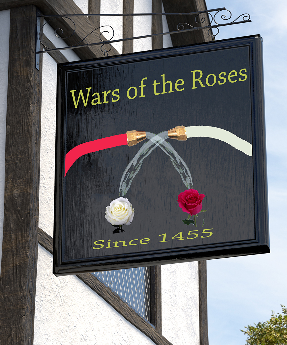
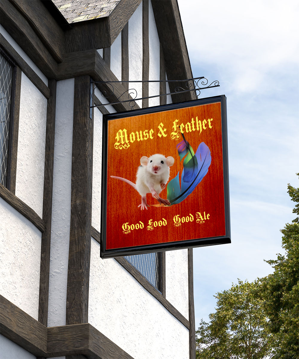
Pub signs are a great topic. I found a site ISS Pub Names - Red Lion - Kings Arms - Queens Head - Royal Oak - The Inn Sign Society where new pub signs can be submitted. But only for living and breathing pubs.
I would have bet at least a nickle that a "Wars of the Roses" pub existed somewhere, but I haven't found anything closer than "Rose and Crown," so I submit this more peaceful take on that subject.
Copy link to clipboard
Copied
Nice sign Jerry.
I thought I would stick with the Photoshop theme 
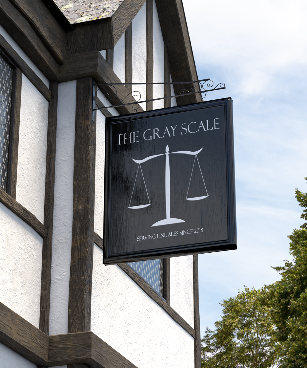
Dave

Copy link to clipboard
Copied
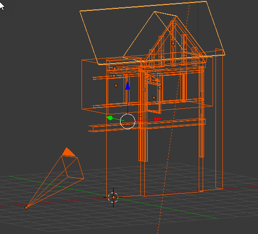
Wait a minute... You created this in an 3D app? 
Copy link to clipboard
Copied
Hi,
Yes the sky and trees are real but the pub I modelled and rendered in Blender.
Last week's alley challenge, I completely modelled in Blender. Something for the weekend - Part 31 - Right up our alley!
If you can't find a photograph of it - make it
Dave
Copy link to clipboard
Copied
Wow At first, I genuinely thought that this was a real photo...
Nice work!
Copy link to clipboard
Copied
Thank you
Dave
Copy link to clipboard
Copied
A nice subject this week. I initially wondered what to do with it, and then thought you could do pretty much anything so long as you keep with the theme of a pub sign. Unfortunately, I might have pushed my luck this week, as my project is taking a lot of time, plus it all went to custard at one stage when the PSD file was not behaving. I tried copying the layers to a new document, but no go, so in the end I had to flatten the errant layers so I could carry on. I hope it is worth it as I still have some work to do. 
Dave I guessed that was another Blender-Render (which turns out to be a cool phrase). As someone else said, you'd never know it. Illustration tends to look like what it is, and I like a nice clean look, but it is a long way from looking real. I am a fan of Adam Savage's 'Tested' channel, and he spends a lot of time making his creations dirty, rusty, and generally worm looking, but that's what makes modesl look real apparently.
Copy link to clipboard
Copied
I hope you get that project sorted Trevor.
You are right on the grime adding to realism. The render above is not perfect but I stopped once It was good enough to set the challenge which is about the sign not the pub. I once watched a few tips on realism which have stuck with me. Some are unique to 3D but some are equally applicable to illustration and making composites.
1. For rendering, use a realistic physical based shader. These reflect light realistically and avoid beaking the laws of physics e.g. the reflections being stronger than the light they are reflecting.
When making a glossy surface remember that the shallower the angle of view the more you see reflection, whereas straight on you see mainly the surface. Known as the Fresnel effect, in 3D it can be taken care of by the shader but in illustration you have to paint it.
2. Avoid sharp edges. The slightest bevel makes a difference to appearance in 3D. And a very slight softness tends to help a compositecedge to sit.
3. Apply imperfections. They are hardly visible but make a big difference. I use these for two reasons. First they make a surface look real and, second, when texturing on 3D we tend to use tiled materials on large surfaces and our eyes are very good a picking up repeating patterns. An untiled grime layer can be very effective at taking the eye off those patterns.
4. Make the lighting realistic and, if combining 3D or illustration with a photograph, make the lighting match the photograph in direction, intensity and colour. So for the image above that meant a hemisphere of slightly blue light to represent the sky and a slightly warmer directional "sun" light.
Anyway, back on topic, hopefully there is plenty of scope in the Photoshop interface for more related pub names. If not, I did say in the first post that anything goes, so just give it any name.
Dave
Copy link to clipboard
Copied
Hi
I would not trust a Pub if it's sign was not sculpted or carved on wood (3D look).
Pierre

Copy link to clipboard
Copied
davescm wrote
Yes the sky and trees are real but the pub I modelled and rendered in Blender.
Excellent artwork, Dave!
Copy link to clipboard
Copied
Thanks Jane
Dave
Copy link to clipboard
Copied
You got it, Trevor! Have a beer . I saw it on a list of unusual place names in England, and had to check it out on Google Street View. It looks like it would be a nice place to visit for a few days, with shops and restaurants . . . and a beach.
Copy link to clipboard
Copied

Copy link to clipboard
Copied
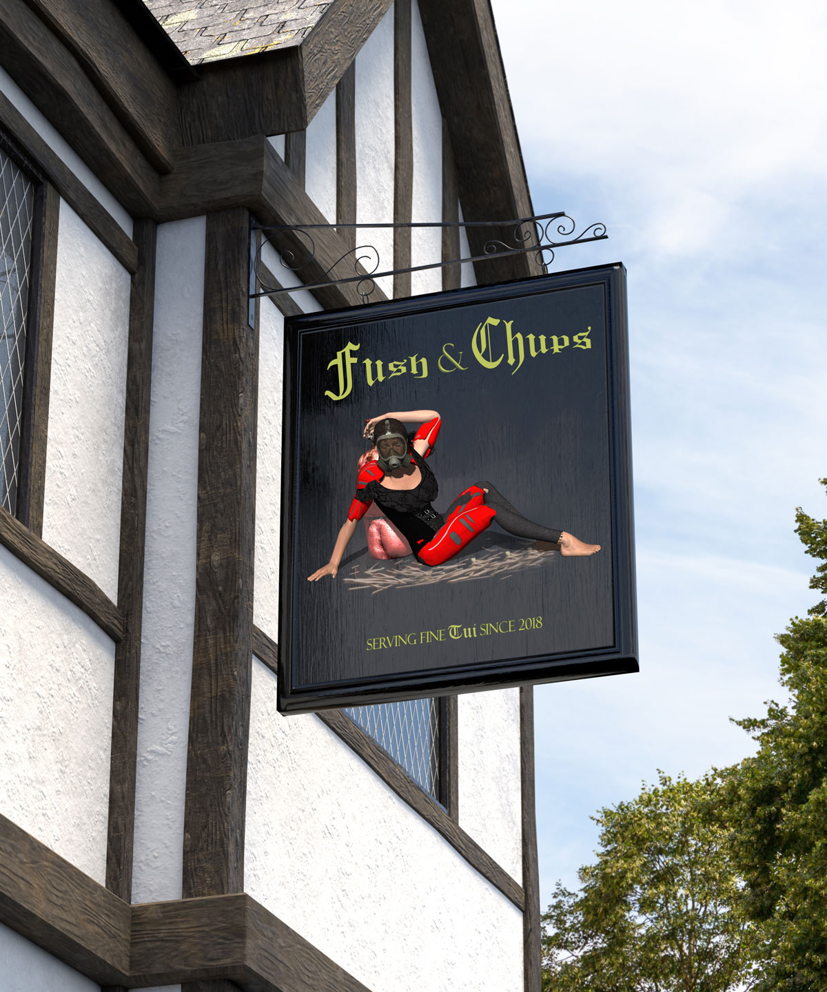
keeping with the translation theme... here is one for my mates across the pond

 AdChoices