- Home
- Photoshop ecosystem
- Discussions
- Re: Something for the weekend - Part 64 - Pulp Fic...
- Re: Something for the weekend - Part 64 - Pulp Fic...
Something for the weekend - Part 64 - Pulp Fiction
Copy link to clipboard
Copied
Hi
As another week draws to a close, another SFTW challenge starts and this week I have a triple challenge for you.
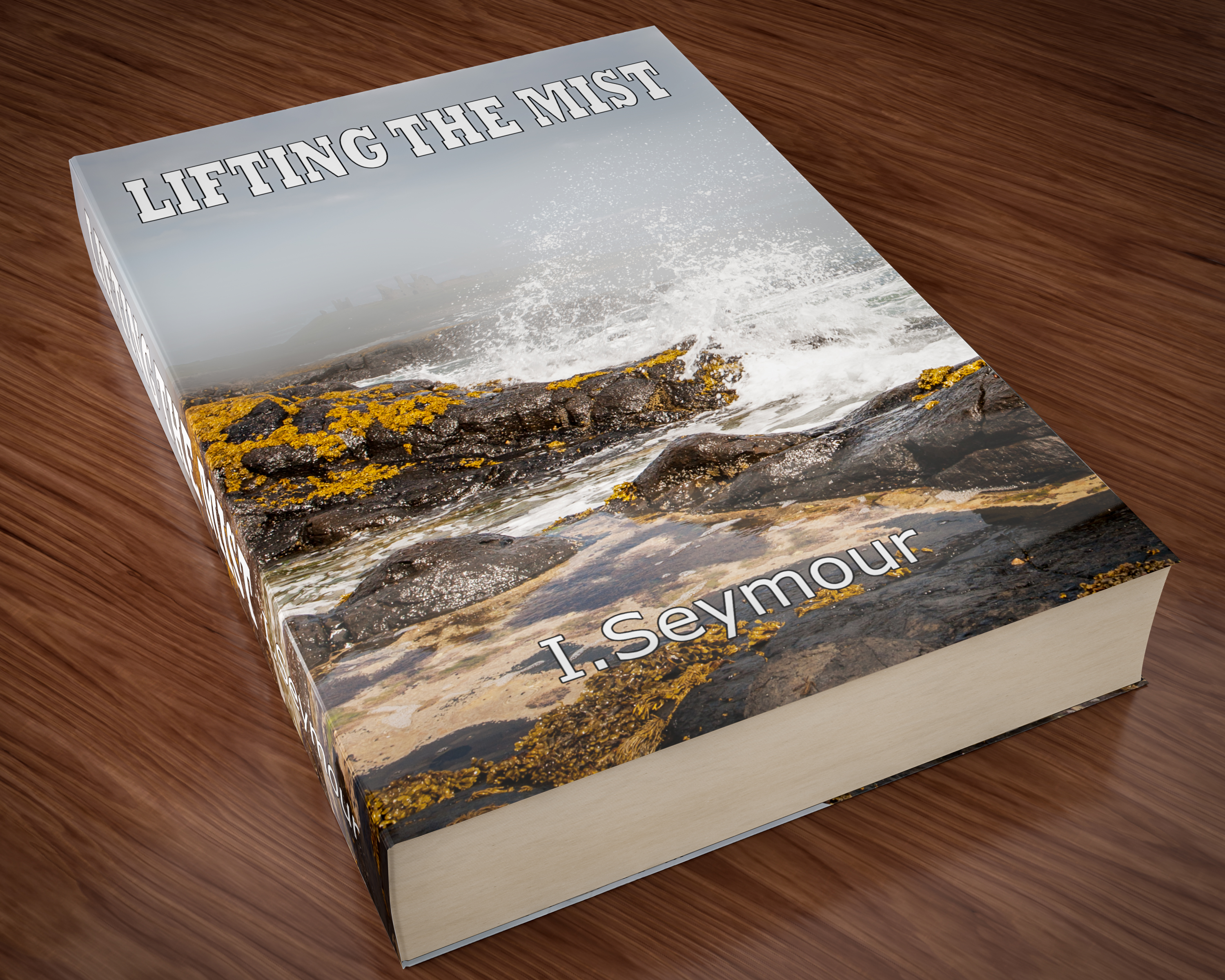
Our starting image is a book, or at least a 3D render of one. Can you replace the title, the author and the cover image to give us a new book?
Anything goes as long as it meets the forum rules on decency, copyright etc.
Anyone and everyone is welcome to have a go - whether you are a complete beginner or a Photoshop expert.
There are no prizes apart from the chance to practice, show off, or bring a bit of humour and fun. Don't be shy, join in and have a go!
When posting back your edited images please use jpeg and downsize to 1200px on the long side. This is to stop the thread slowing down when lots of images are added.
To download the image below in jpeg format with ICC color profile (sRGB) and without the forum scaling artefacts , right click and then use Save Image As /Save Target As (or similar depending on your browser).
Have fun
Dave
Explore related tutorials & articles
Copy link to clipboard
Copied
You're good at 3D, Dave!
Copy link to clipboard
Copied
Copy link to clipboard
Copied
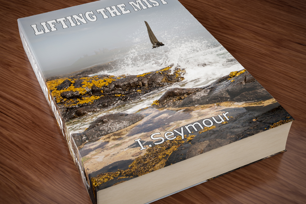
OMG I just got the joke. I "SEYMOUR" haha! Because the mist is lifted! I am a Blonde Person.
Copy link to clipboard
Copied
Haha, I'm sure our SFTW participants will come up with much better author and title combinations.
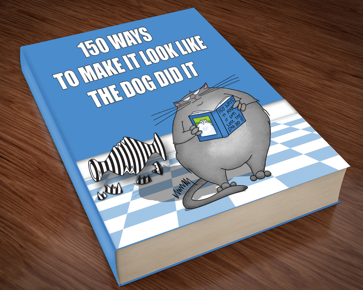
I love the cat artwork!
Dave
Copy link to clipboard
Copied
Copy link to clipboard
Copied
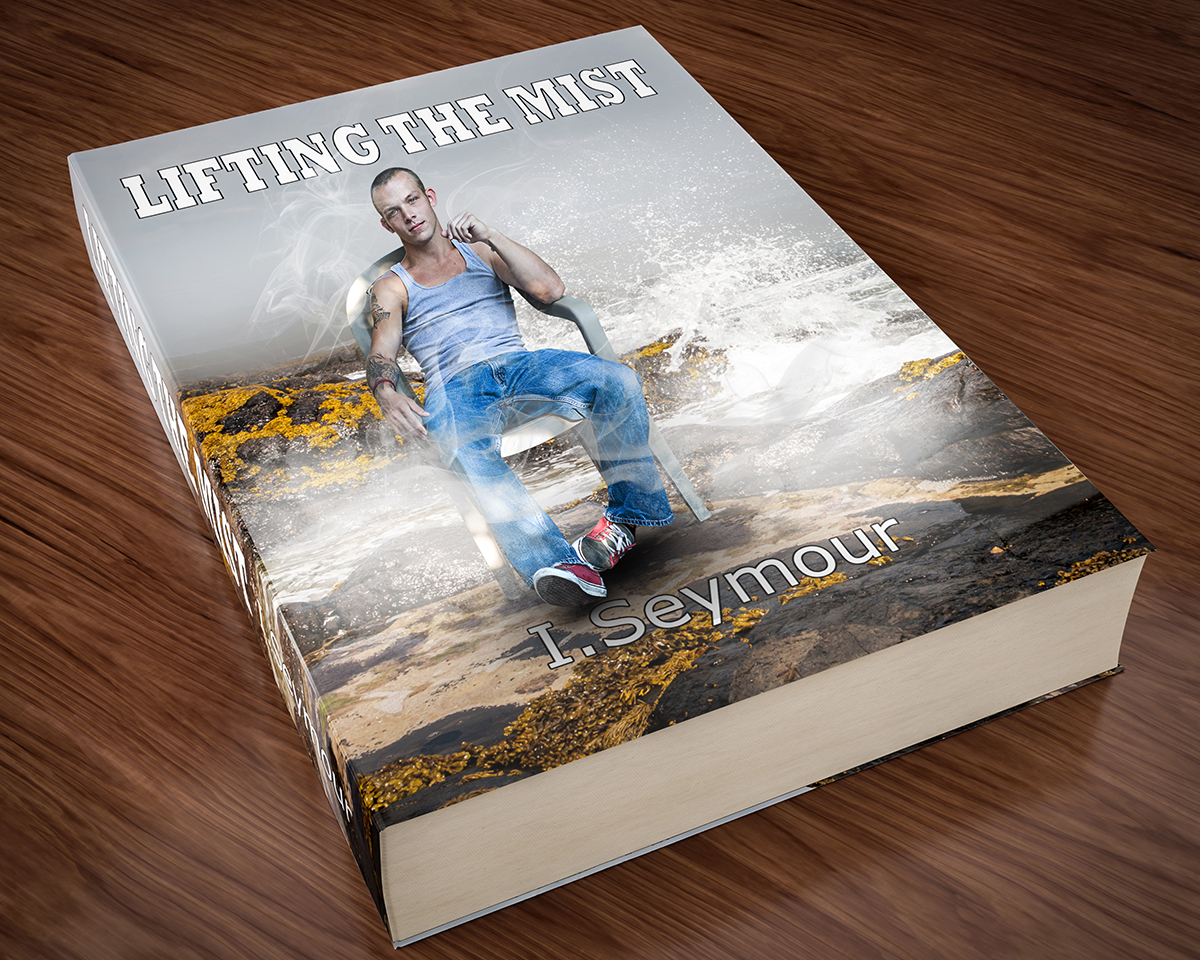
Recycling my entry from SFTW #31.
Copy link to clipboard
Copied
Hi
Graham - I now see a ship !
Ponytail - nice cover !
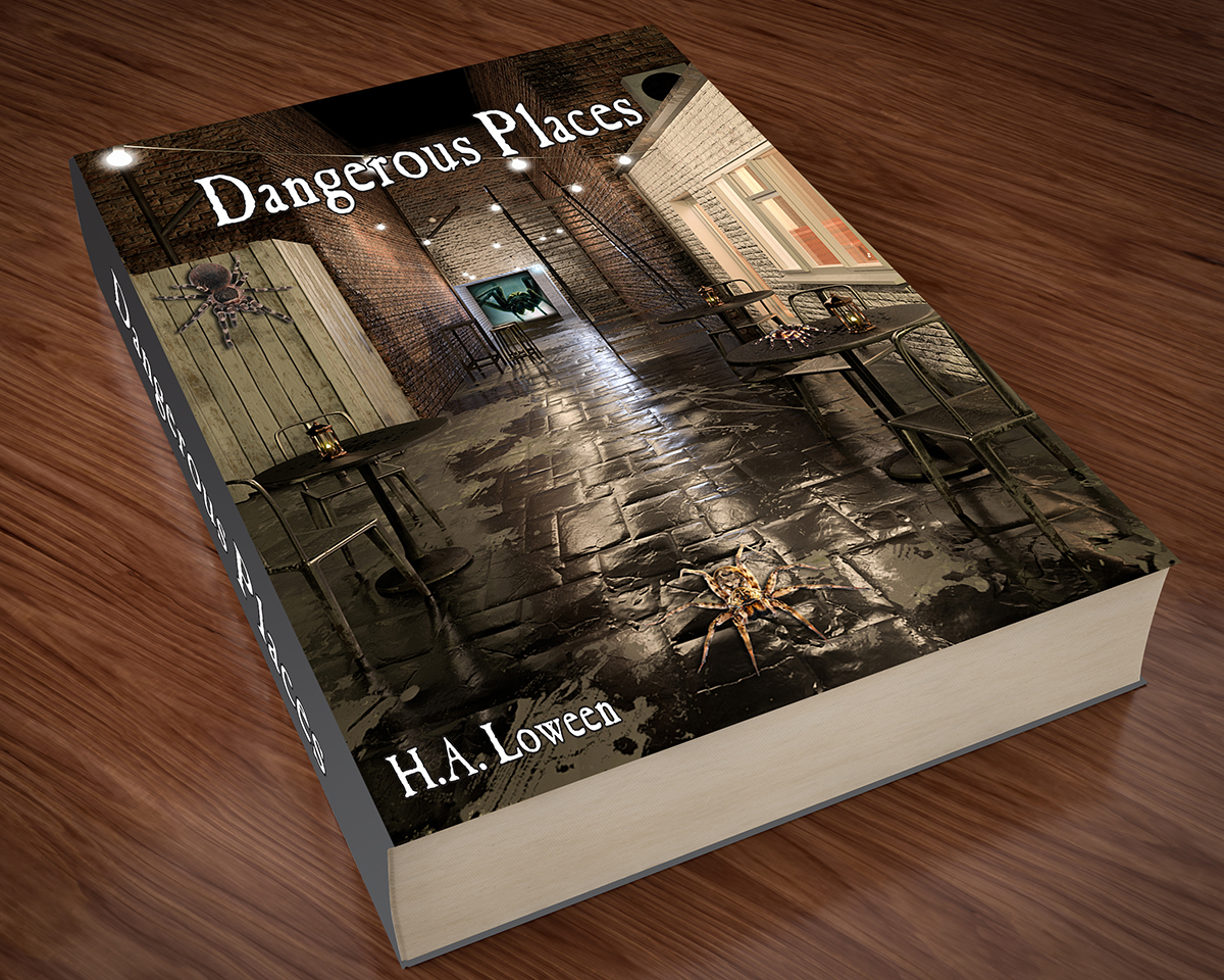
Bob - I like it , and I do recognise that alley !
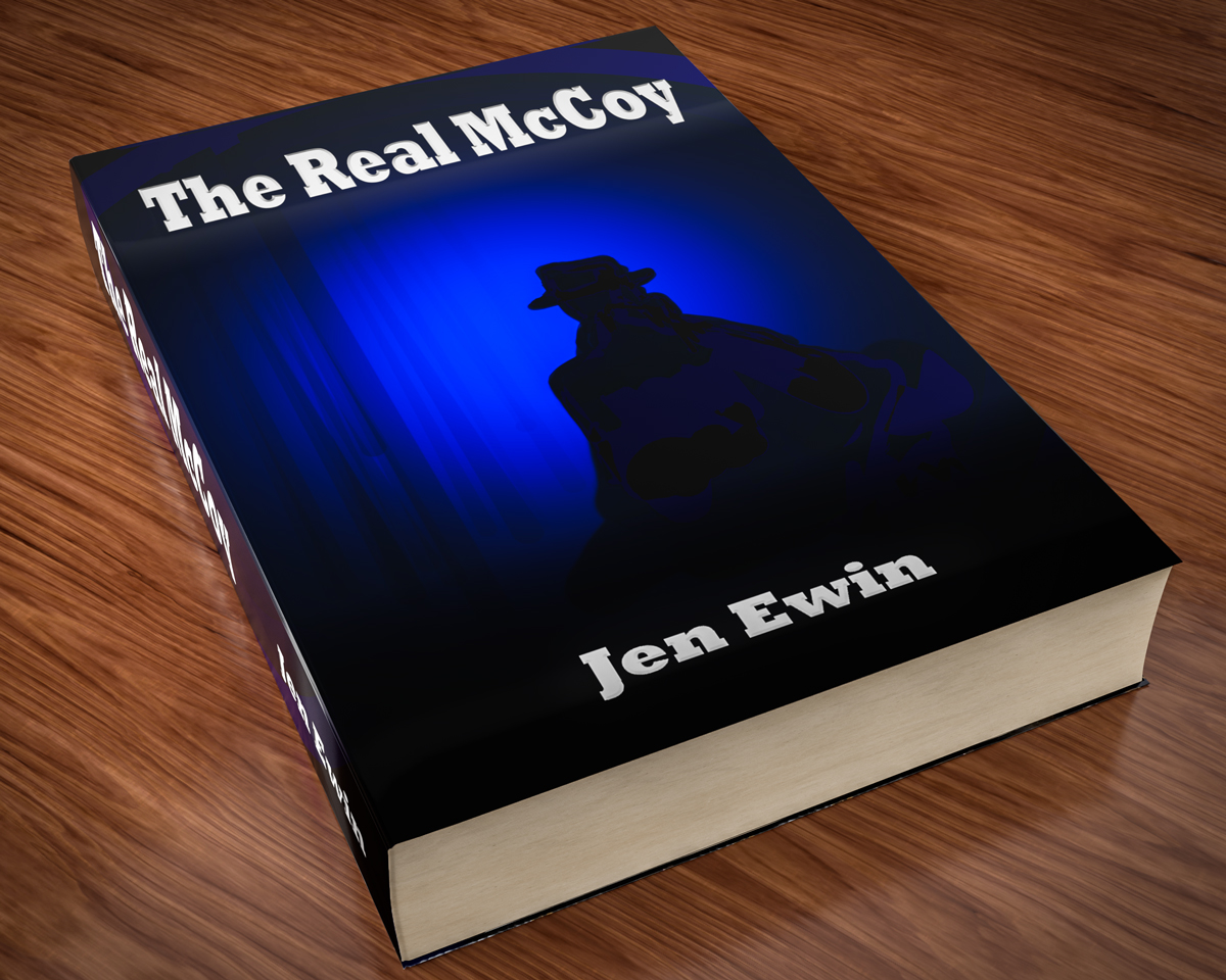
I thought I'd add another ...
Dave
Copy link to clipboard
Copied
Copy link to clipboard
Copied
Copy link to clipboard
Copied
I know these kinds of pulp fictions aren't normally in hard cover, but that wasn't going to stop me from making it 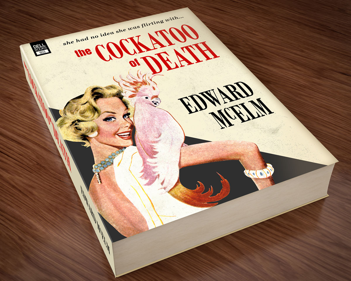
Copy link to clipboard
Copied
I love this. But then again, I'm a sucker for old paperback illustrators like Robert McGuiness
Copy link to clipboard
Copied
Thank you!
Copy link to clipboard
Copied
Copy link to clipboard
Copied
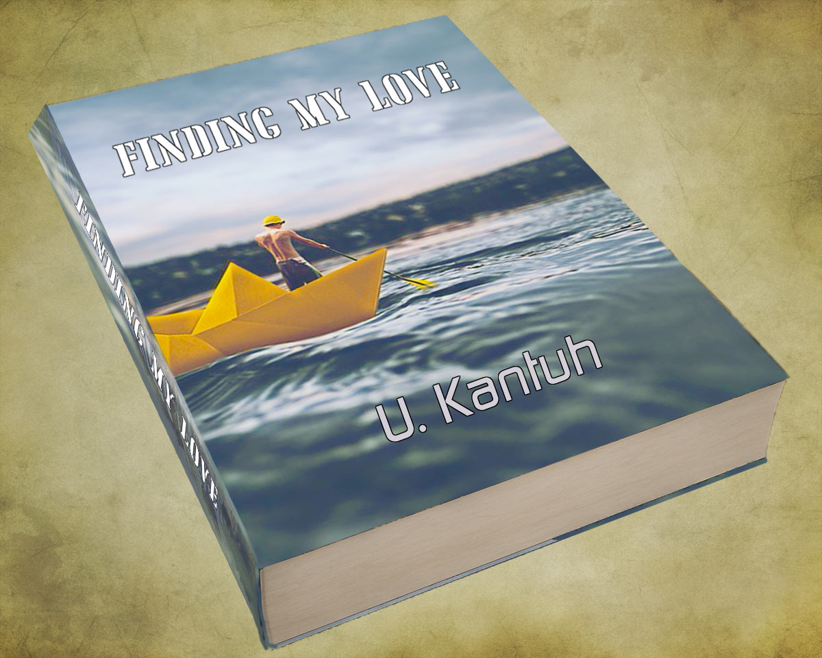
Photo from Pixabay
Copy link to clipboard
Copied
Copy link to clipboard
Copied
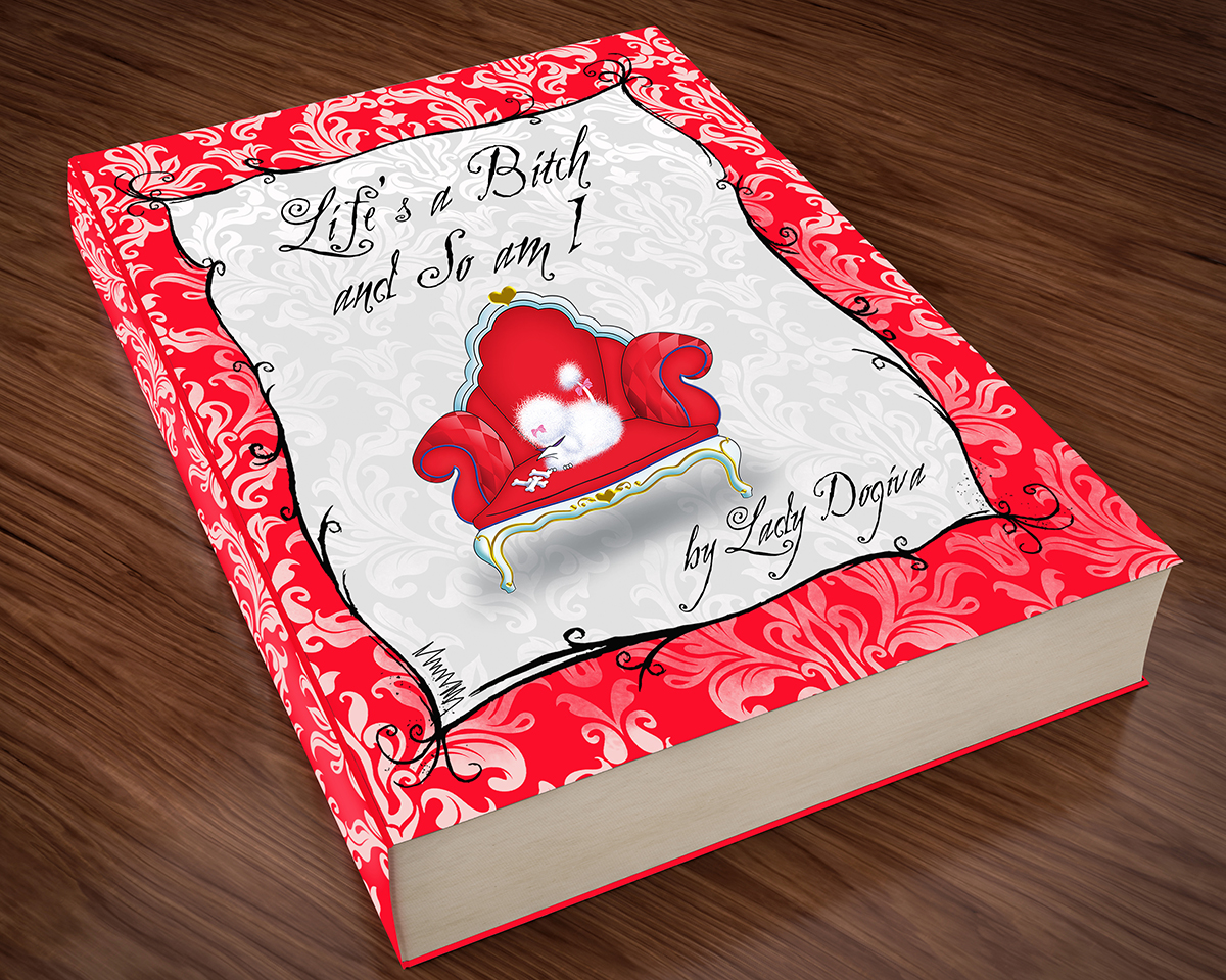
Copy link to clipboard
Copied
Cover for a book to publish in 2019 JH 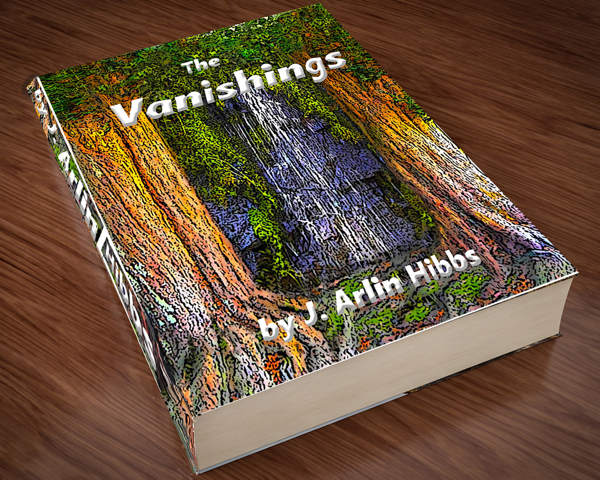
Copy link to clipboard
Copied
The final draft of the book cover for 2019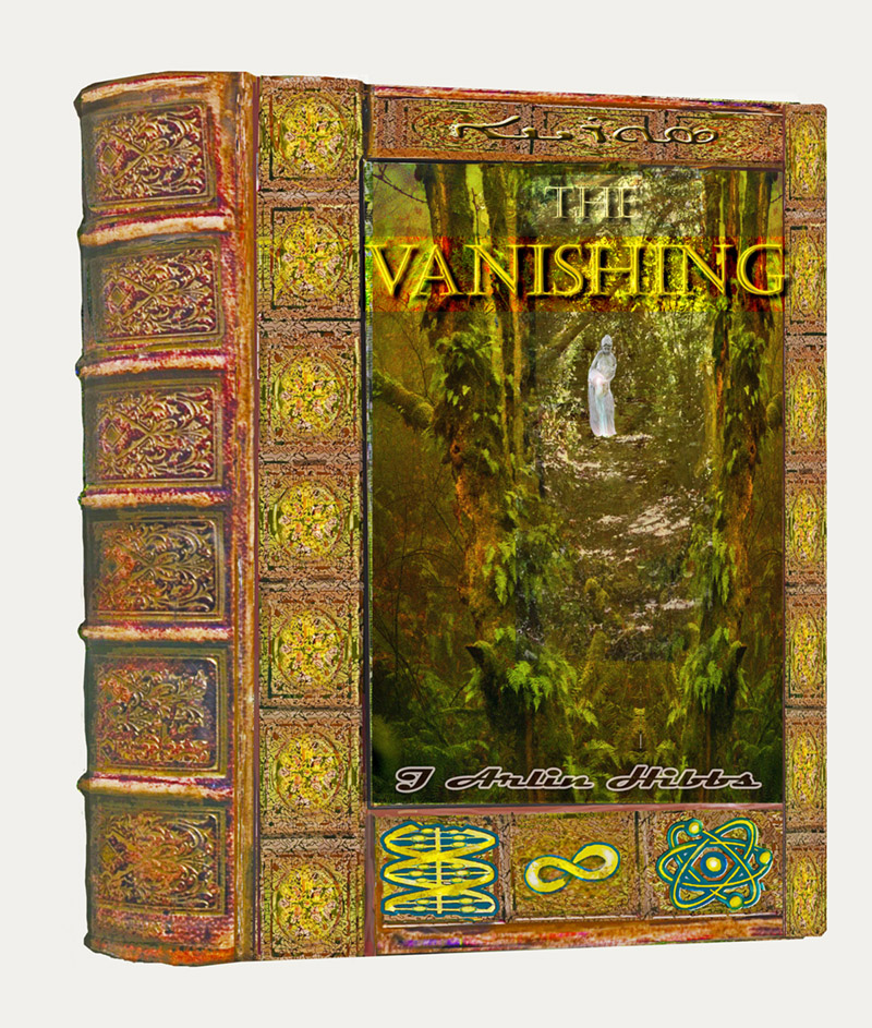
Copy link to clipboard
Copied
Nothing contentious about this one, unless those are 'Alternative' images.

Copy link to clipboard
Copied
Dave another outstanding render. You getting seriously good at this. I hope you remember us when Pixar snaps up your services.
Leslie, I just love your illustrations. #1 and #13 both made me smile fit to burst. I think some of the photographs in your previous images were of yourself, so is that your significant other?
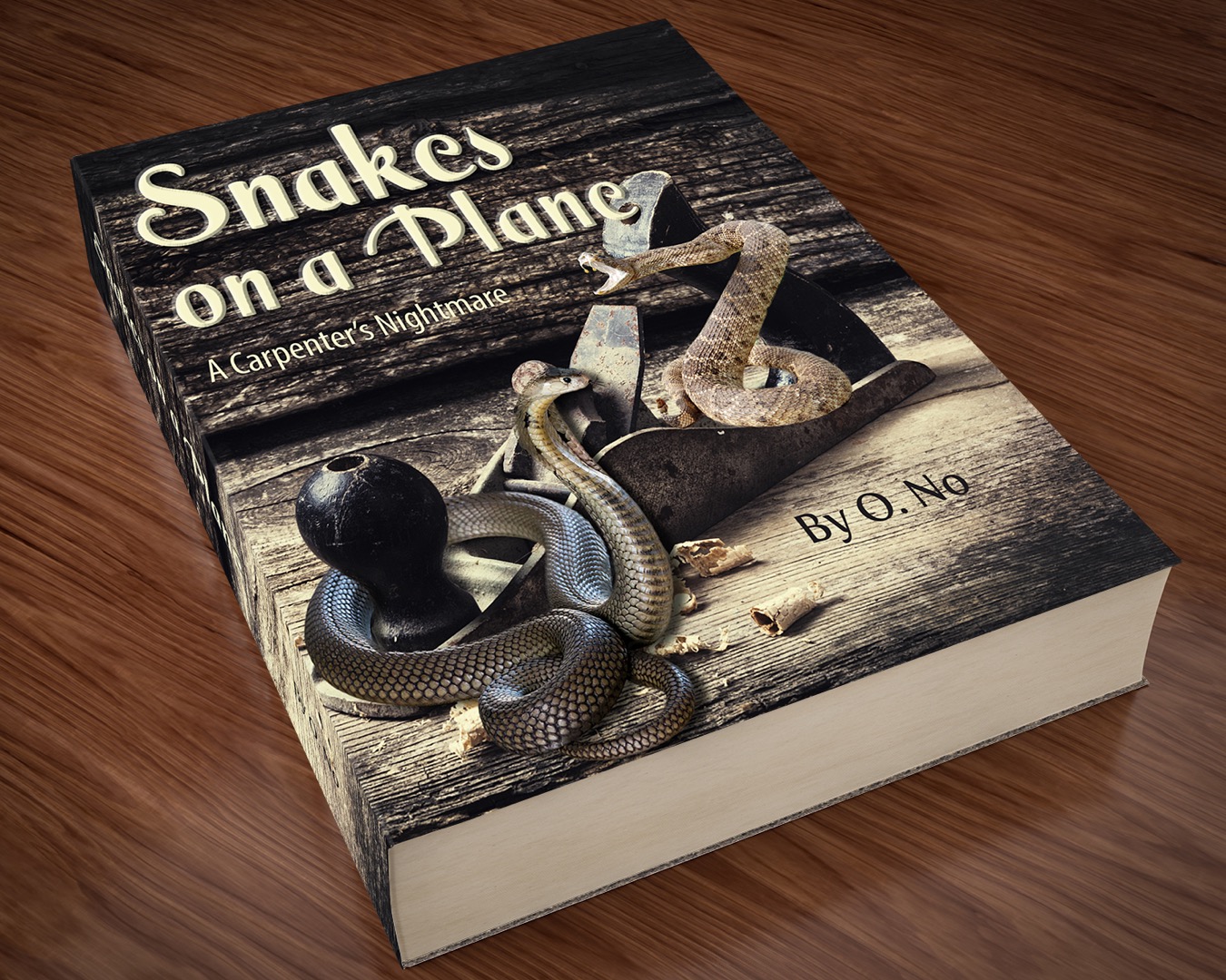
Barb, that is so clever, and so nicely done. I especially like the way you have used texture to delineate the background. Do those snakes have names? ![]()
Rista, shouldn't that boat have a tiger in it?
jradt14 your yesteryear cover is so realistic, I Googled both title and author to check them out. Very nice artwork.
Jacob, you are being all bizarre again. I think your brain must work differently to mine, because I was not getting the upside down text.
Joan, nice artwork. I feel certain that if I picked those books up at the store, I would feel the text raised from the cover.
Copy link to clipboard
Copied
Thank you, Trevor! Yes, one of the Spring images is me wearing daffodils on my head, but I should say USED to be me since it's from 1982 haha. The handsome guy on the book cover is my significant other's son. He's one of my favorite models now that I'm on the other side of the camera (it's great! I don't have to do my nails). It's impossible to take a bad picture of that kid.
And I like your entry as well, Mister Non-Contentious
Copy link to clipboard
Copied
Hi
Some great entries this weekend !
Barb - I love that snakes and plane image, perfect twist on the title.
jradt14 - Welcome to SFTW. That cover looks very realsitic, I hope you'll join us for more of these challenges.
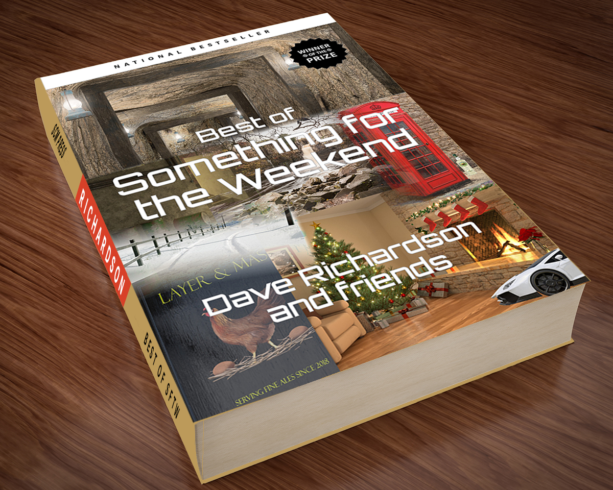
Jane - The Best of SFTW? We might have to do something like that when we reach 100!
Rista - Nice idea and artwork.
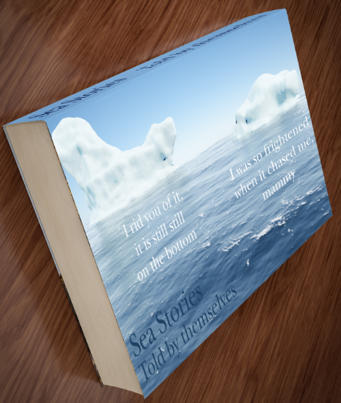
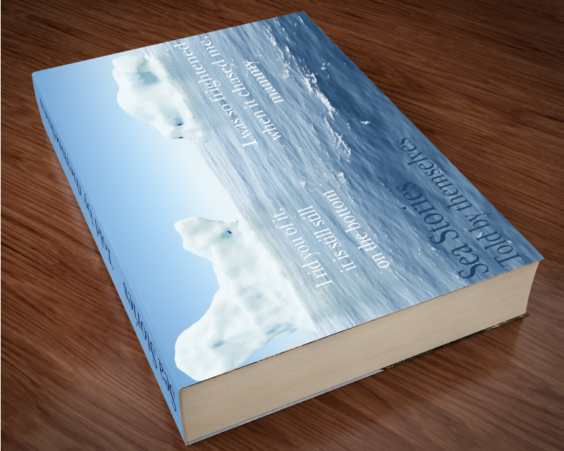
Jacob - I recognise those icebergs, good to see them get another outing.
Leslie - Another great illustration.
Joan - Very nice job on both of those books.
Trevor - You must have been collecting all those images just for this. I like the author name. ![]() . Thanks for the comment on the render, but in reality it doesn't get much simpler than this one. I did need to go to Substance Designer and create a material for the page edges. I then found that I had to reduce the number of pages as I originally made it with 300 and I was getting moire patterns on the render.
. Thanks for the comment on the render, but in reality it doesn't get much simpler than this one. I did need to go to Substance Designer and create a material for the page edges. I then found that I had to reduce the number of pages as I originally made it with 300 and I was getting moire patterns on the render.
Keep them coming guys , the weekend is young and I'm sure we have not run out of titles and authors ![]()
Dave
Copy link to clipboard
Copied
Trevor,
As you may infer from the front cover, the primary readers have only just (and reluctantly) moved from scrolls to books, so they see the spine as above the front cover and would be rather confused by a reversal; you may have a hunch about the orientation within, over the spreads.
Copy link to clipboard
Copied
https://forums.adobe.com/people/Jacob+Bugge wrote
Trevor,
As you may infer from the front cover, the primary readers have only just (and reluctantly) moved from scrolls to books, so they see the spine as above the front cover and would be rather confused by a reversal; you may have a hunch about the orientation within, over the spreads.
So cheat
