- Home
- Photoshop ecosystem
- Discussions
- Re: Something for the weekend - Part 64 - Pulp Fic...
- Re: Something for the weekend - Part 64 - Pulp Fic...
Something for the weekend - Part 64 - Pulp Fiction
Copy link to clipboard
Copied
Hi
As another week draws to a close, another SFTW challenge starts and this week I have a triple challenge for you.
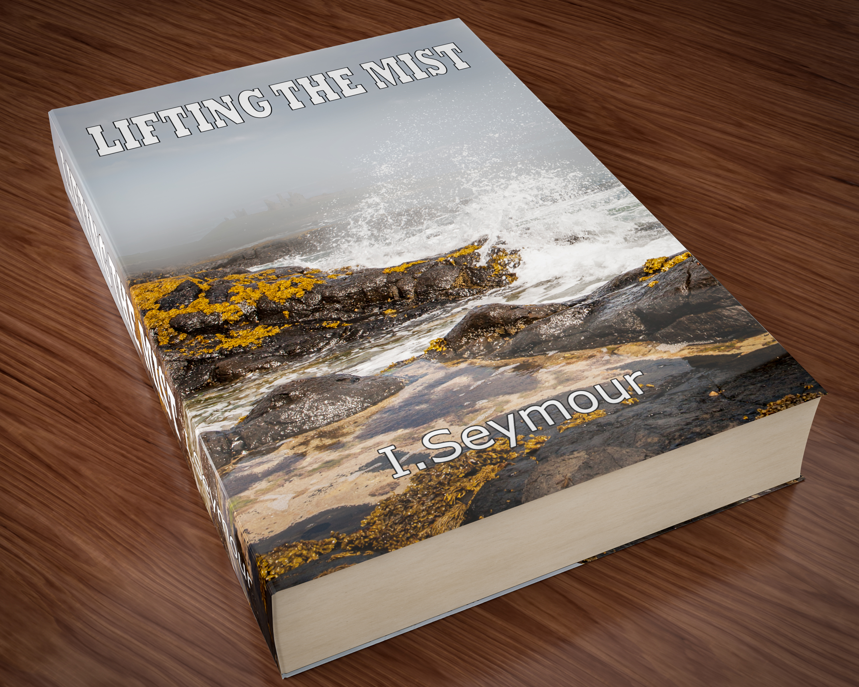
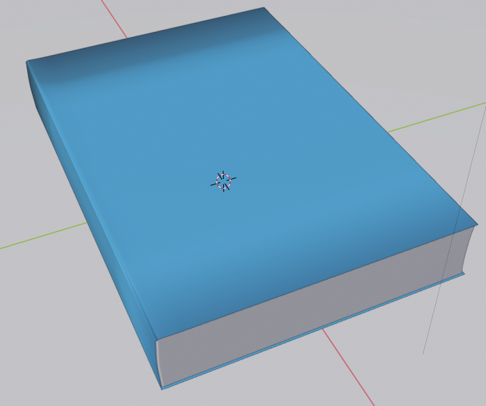
Our starting image is a book, or at least a 3D render of one. Can you replace the title, the author and the cover image to give us a new book?
Anything goes as long as it meets the forum rules on decency, copyright etc.
Anyone and everyone is welcome to have a go - whether you are a complete beginner or a Photoshop expert.
There are no prizes apart from the chance to practice, show off, or bring a bit of humour and fun. Don't be shy, join in and have a go!
When posting back your edited images please use jpeg and downsize to 1200px on the long side. This is to stop the thread slowing down when lots of images are added.
To download the image below in jpeg format with ICC color profile (sRGB) and without the forum scaling artefacts , right click and then use Save Image As /Save Target As (or similar depending on your browser).
Have fun
Dave
Explore related tutorials & articles
Copy link to clipboard
Copied
Trevor,
Actually, for an easier read (at least for most), before posting I started out with something like that (rotating the book by the -115 degrees needed to have the edge between front cover and spine horizontal).
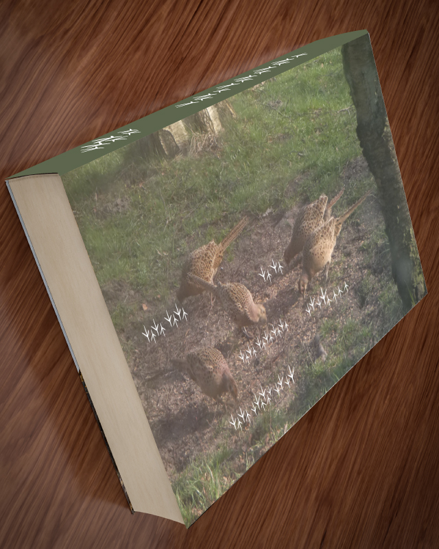
But I decided against it because at least to me that made it look as if the book was glued to (or sliding down) a sloping table, or (even) lifted by something unseen behind it and only resting on the edge of the back cover but for the shadow on the table which has a woolly structure giving no perspective clues. Or the view could correspond to the viewer stooping/leaning over beside and past the book and looking at it sideways and a bit backwards.
I apologize for the inconvenience of my less imaginative orientation.
By the way, (only) partly owing to a distant past with cheating friends, I still order and hold a hand of cards like a fan opening downwards, and use descending order; I also do the latter, and occasionally the former, in Mah Jongg.
Copy link to clipboard
Copied
Trevor,
I forgot two (further) crucial reasons for unrotating by the 115 degrees, namely a strong moire pattern on the tail, maybe even worse than the one Dave told about when he started with 300 pages, and an obvious misfit for the table.
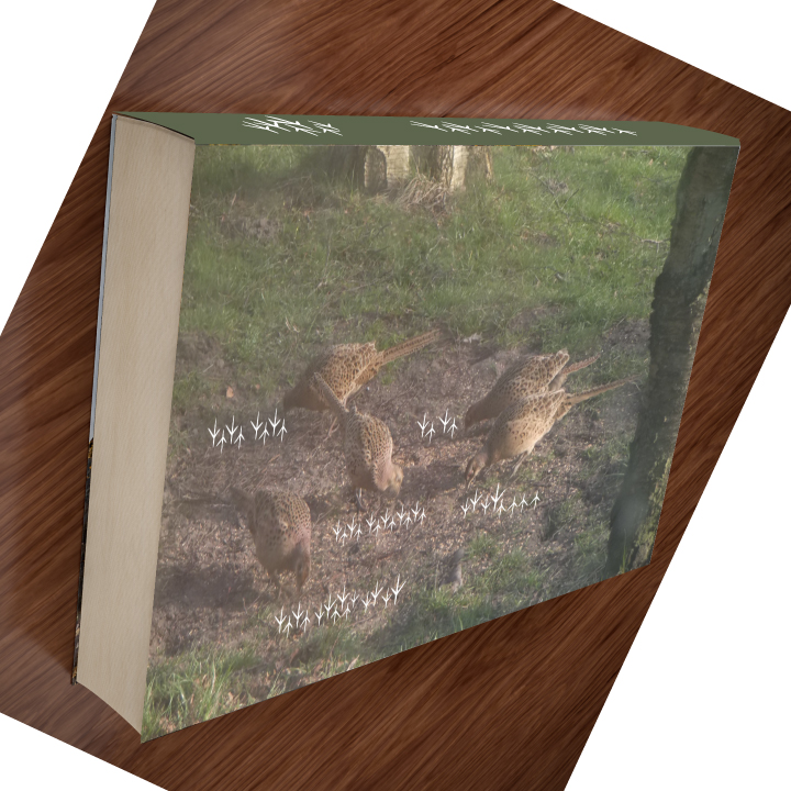
Here is the (untranslated) Corn Conversations turned right (quite literally),
and here is my first (planned) full rotation; to my surprise now, the moire proved absent from the saved image; I will remember.
Copy link to clipboard
Copied
If I was teaching this process to a student, I would have used perspective warp on a smart object. “Leave your options open”, I would have said.
Because it was just me, I cut corners—stamped the composite and warped that, only to realize the title size and position was off after I posted it. Lesson learned.
~Barb
Copy link to clipboard
Copied
Layers, layers, layers! But oh that author name hahaha!
Copy link to clipboard
Copied
Trevor, your comment about my book covers was music to my ears. I learn so much here. Never used the transform, warp tools before but they really work easily for this sort of thing. Now, if you will let me see your beautiful mind working on something positive and productive besides your trumpie art I might be excited to find more interesting ideas. Best to you youngster. Hugs, JH
Copy link to clipboard
Copied
Trevor.Dennis, there is a companion book that lists all of Trump's glorious accomplishments in the areas of world peace, dealing with climate change, researching renewable energy, fostering racial equality, providing assistance for those in need, promoting democracy and freedom of the press. Here it is:
Copy link to clipboard
Copied

(Banknotes based on image from Pixabay)
Dave
Copy link to clipboard
Copied
davescm wrote
Thanks for the comment on the render, but in reality it doesn't get much simpler than this one.
Dave
Dave, I imagine that the perspective is taken care of by the 3D app. I did this five years ago, which does not sound long in the scheme of things, but it makes me cringe looking at how wrong I got the perspective back then. I suppose I was quite pleased with it at the time, as apart from the front cover which I had as a square image, the rest is pure illustration using shading, and render > fibers (for the pages). I must have the layered psd file somewhere, so I'll have to try and find it and fix the perspective.

Norman, I believe there is a whole series of those books. The titles range from 'Truth', through to 'Honesty' with 'Decency', 'Generosity' and the even shorter volume of 'Books I have Read'. His books with actual content include 'The Artful Draft Dodger', and 'The Art of the Swindle'. I don't know why Joan is getting all sarky with me. I mean those are all unedited photographs of Trump, and the expressions he is apt to plaster across his visage. Do they tell a story about the person wearing those expressions? Of course they do. ipso facto, I rest my case. ![]()
Copy link to clipboard
Copied
Trevor.Dennis wrote
Dave, I imagine that the perspective is taken care of by the 3D app.
It is Trevor. Just set the camera focal length and sensor size (I match the sensor size to 35mm film to make easy sense of the focal length) then position the camera.
If anyone doubts the importance of perspective, look at these two views :
1. Orthographic. Measure the screen - the top edge is exactly the same width as the bottom edge - but it looks wider!
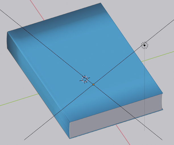
2. Perspective. Now the top edge is narrower on screen than the bottom edge and it looks right.
Dave
Copy link to clipboard
Copied
Blimey. I am having to sign back in every time I blink! I thought they had this nearly fixed.
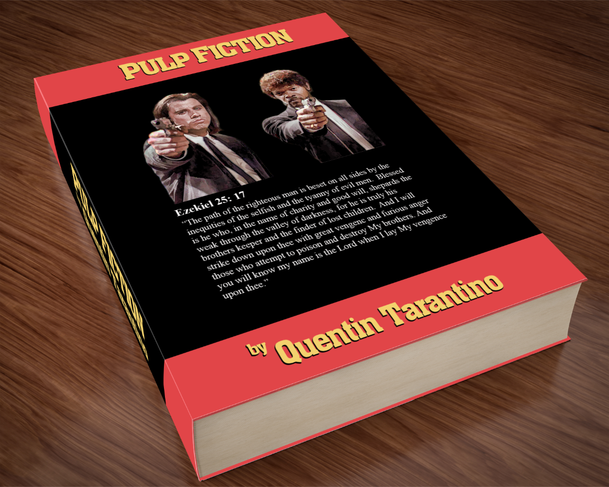
I was thinking that it was just plain wrong to have a SFTW thread with this title, and not have a reference to the movie. Difficult to be original with something with so massive a cult following, but I did put it together, and there is a certain relevance to the Bible passage.
Copy link to clipboard
Copied
Dave,
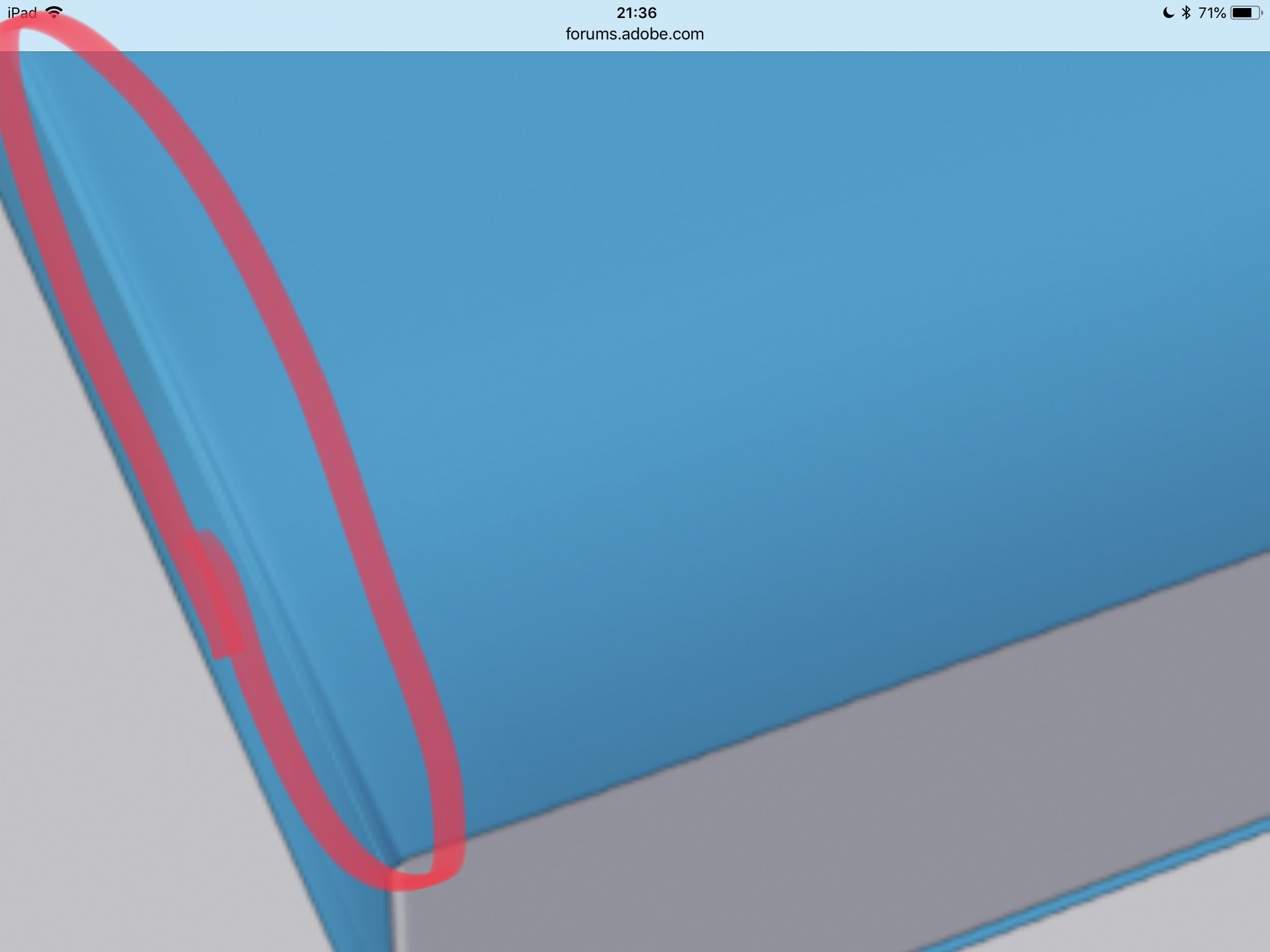
How did you keep the edge on your books? Most of us managed to lose it.
~ Jane
Copy link to clipboard
Copied
Hi
Jacob - I tried but the forum translator does not speak crow.
Trevor - Nice job and, like you said, it had to be done.
How did you keep the edge on your books? Most of us managed to lose it.
There are two ways.
1. Work in 3D - so model the book cover , drop the 2D replacement cover onto it, light it and render. I already had the model in Blender so I copied the cover model and used that, rendered against transparency and then composited it in Photoshop with the original full render. In Photoshop it can be made simply by drawing a path below and creating a 3D extrusion from that path. Then position the camera (positioning is tricky).

2. The second way is to work completely in 2D and then add a layer and put the highlight on the edge with a brushstroke. Although not as accurate as 3D - no-one will notice the difference.
Dave
Copy link to clipboard
Copied
the 3rd option is to work in both 2d and 3d i.e, use the base image as a background in Dimension and add in 3d objects to rendor your finished image
Copy link to clipboard
Copied
Dear Trevor, "Joan is getting a bit snarky with you" --- This was me being kind and gentle with your tender heart that lurks below your hidden addiction to hateful picture and word bombs that have no value.![]()
I am neither pro or con about this game, I am just on the side of reasonable energy-saving action mostly because I am older than you and have fewer minutes to waste on something that does not result in positive movement. Live, love and be happy. Your pen pal, JH
For now, if you like let's continue the discussion in Pvt. emails or not.
Copy link to clipboard
Copied
Copy link to clipboard
Copied
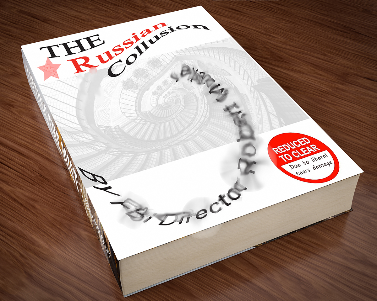
A late entry.

Copy link to clipboard
Copied
OldBob1957 Who can resist a puppy picture? ![]() There is usually a charity collector outside the supermarket I use, but I don't always put anything in the box (I don't usually have change in my pocket). But last week it was Guide Dogs and the collecter had a beautiful puppy with him, and I emptied my pocket for the collection box.
There is usually a charity collector outside the supermarket I use, but I don't always put anything in the box (I don't usually have change in my pocket). But last week it was Guide Dogs and the collecter had a beautiful puppy with him, and I emptied my pocket for the collection box.
It's shameful the way some people abuse their charity status.
Ray is this your first contribution to a SFTW thread? Nicely done, and I had to think about the blurred text, but decided they were tears. Ahhh... the clue is in the red sticker, which I'd neglected to read. All I can say is that if Trump had nothing to hide, why was he so insanely worried about the investigation? If he knew there was nothing to find, he'd have smiled and let them waste their time. A lucky escape I'm thinking, but his day will come. ![]()
Jacob, I have decided that what you do is a visual equivalent of speaking in tongues. Ged is now back from his travels, so you'll have competition for bizarre image of the week.
Copy link to clipboard
Copied
Trevor,
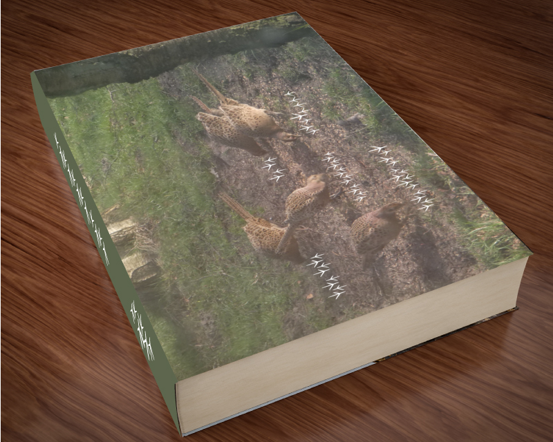
It may appear that way, but actually it is plain Pheasant, written with what they have to write with.
Whoever has ever heard the soft words among the hens at their ease will never forget.
Copy link to clipboard
Copied
"Plain Pheasant" hahaha
Copy link to clipboard
Copied
Jacob.
I believe that font is actually Pheasant Plain Old_style, is it not? As an alphabet, Pheasant has a long and proud history. Some archaeologists credit it with being a forerunner to (and the place humankind got the idea for) the cuneiform writing system. ![]()
--OB
Copy link to clipboard
Copied
So that's where Wingdings came from ![]()
Dave
Copy link to clipboard
Copied
It is indeed, Bob. And thank you for sharing your impressive insight.
Copy link to clipboard
Copied
Copy link to clipboard
Copied
Copy link to clipboard
Copied
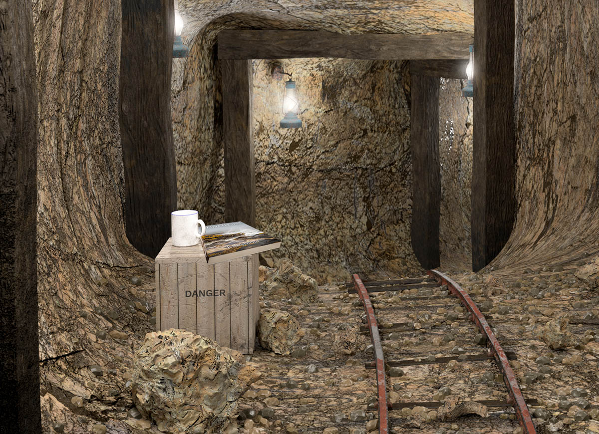
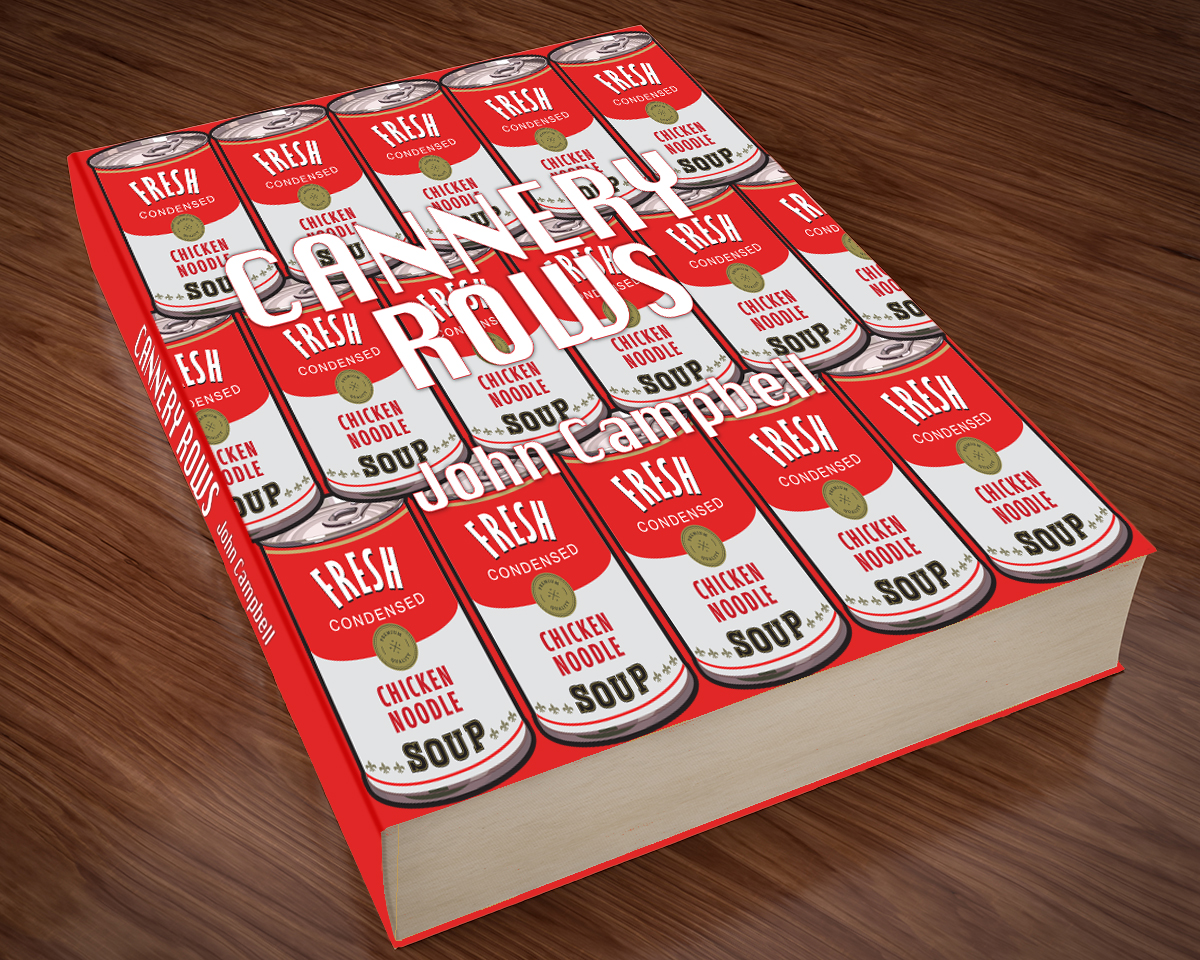
Thought I'd try a simple approach to get something in. But, took a while to get it kinda right. I still need to enhance my perspective skills.
