

- Home
- Photoshop ecosystem
- Discussions
- Re: What should be the color profile for coloring ...
- Re: What should be the color profile for coloring ...
What should be the color profile for coloring comics for print?

Copy link to clipboard
Copied
Hello!
I am working on a comic book. I am digitally coloring the comic in Photoshop CC 2014.
My color profile is sRGB. I finish coloring in the RGB settings and then change that to CMYK before print. But even then, the colors that get printed are very bland and darker than the ones I chose on screen.
I saw on another forum that working in Adobe RGB helps. Is that true?
How do I get the exact colors which I choose on screen, in print? Maybe I am missing something pretty simple. I would request some advice and help regarding this issue!
Thanks in advance!
Regards
Agni


Explore related tutorials & articles
 29
Replies
29
29
Replies
29

Copy link to clipboard
Copied
then change that to CMYK before print.
Which CMYK?
How do I get the exact colors which I choose on screen, in print?
Is your Color Management set up properly?
Unless the screen profile is accurate Photoshop cannot really properly preview any image.
Could you post an example of the kind of illustration you do?
Copy link to clipboard
Copied
Which CMYK?
The US Web Coated (SWOP) v2, from Edit> Convert to Profile or Image>Mode>CMYK.
Is your Color Management set up properly?
Unless the screen profile is accurate Photoshop cannot really properly preview any image.
Could you post an example of the kind of illustration you do?
Well, I am guessing the Color Management is set up properly, because I don't really have any problems while working on any web media.
Yes, here is an example -
Here is my RGB illustration which is bright.

And here is the printed version which is darker. I clicked the photo below on my phone, so it isn't perfect, but the darker shades are visible on the character's skin, the rocks and the wooden elements in the last panel.
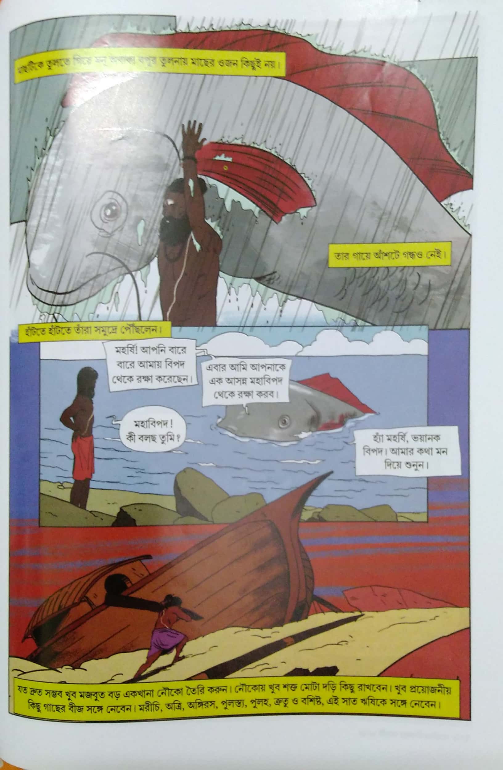
Is this normal? If so then how can I solve this issue? Because this is an issue for me if the colors I am working on get changed in the final print!
Thanks for your reply!

Copy link to clipboard
Copied
Who is doing the printing?
What have they asked for?
I prefer to work in sRGB and let the printer handle the CMYK conversion. He makes a test print for me, and if we are happy, he goes ahead with the main job. The irony is that my printer is someone I know, and I have taught Photoshop, but he is the expert when it comes to doing his job.
Copy link to clipboard
Copied
Who is doing the printing?
The publisher who gave me the job.
What have they asked for?
The problem is, they haven't asked for any particular color profile. They do have the raw files, but a few JPGs which I had changed to CMYK were also printed a bit darker than I had painted in my version.
I prefer to work in sRGB and let the printer handle the CMYK conversion. He makes a test print for me, and if we are happy, he goes ahead with the main job. The irony is that my printer is someone I know, and I have taught Photoshop, but he is the expert when it comes to doing his job.
Yeah the publisher too works in Photoshop. The raw PSD files I gave were supposed to be converted into the printer's printable format. This publishing house has been in the business for several years, so they are not novice!
I am going to have a talk with them later this week. I will surely mention this issue. I thought it was very simple, work in RGB for Web purposes, and work in CMYK before sending to print. I don't know how it got so complicated. Maybe I am missing something in the range of colors required for printing. Some colors may turn out darker in print than others. Do you know of anything like that? Can you help me with that?
Thanks for your reply!
Regards

Copy link to clipboard
Copied
You can see for yourself on screen. Just proof to the CMYK profile you'll be using, and you can see any desaturation directly. There's nothing to "do" with it assuming it's the right profile. It's just the limitations of this ink on that paper on that particular press.
Off the top of my head this looks pretty normal to me, considering that this is a photographed page that is obviously not directly comparable.
Agni7 wrote
The problem is, they haven't asked for any particular color profile.
That's usually not a good sign. There are still printers out there who don't run a properly color managed process, and they should just be avoided.
But it could also be that you have talked to the sales/customer relations people, and they usually don't know anything about this. You need to get the technical staff, the people who will actually print it.
If you're in North or South America, US Web Coated (SWOP) is a fairly safe bet, but no guarantees. If you're anywhere else, it's plain wrong. The SWOP standard doesn't apply anywhere else in the world.
Copy link to clipboard
Copied
Oh, and Gernot is right that you probably want to work directly in CMYK for this. You'll probably have blacks that should only print on the black plate (K-only black), not on all four plates (rich black). K-only black also overprints the other inks.

Copy link to clipboard
Copied
I saw on another forum that working in Adobe RGB helps. Is that true?
It could.
The sRGB color space does not contain a significant portion of a typical CMYK space's colors, so when you make the conversion from sRGB to CMYK the CMYK colors that are not inside of the sRGB gamut get clipped. Saturated blues, cyans, and yellows can be affected.

Copy link to clipboard
Copied
Hi,
if you’re going to be printing something, such as a business card, stationary, or a newsletter, use CMYK. CMYK does not include a white color because it is assumed that it will be printed on a white paper and depending on the percentage of each color that is used, the white from the paper will be used to fill the space, therefore making the shades appear lighter.
If it’s something that will only be seen digitally, use RGB. The Internet is set up to work exclusively with RGB colors and there is a simple explanation behind this. A digital monitor is made up of tiny units called pixels. These pixels are comprised of three light units, one for red, one for green, and one for blue. The RGB values are applied to these pixels, thereby setting the luminosity for each of the light units in each pixel.
Copy link to clipboard
Copied
Yup I know that!
That is first fact to know when working with digital media and print.
The issue is why isn't it following perfectly in actual life!? That's the problem. I know the fact, I just want to know the real life scenario, because somehow I am missing something.

Copy link to clipboard
Copied
The first image shows all sRGB colors by steps of 5 units per channel. This should be reproduced
on all calibrated monitors correctly.
The second image shows the conversion into CMYK for ISOCoated-v2-eci by soft proof, followed
by a screenshot, re-opened in Photoshop, assigned monitor profile and converted to sRGB.
In other words - it's a reliable preview of the print result, concerning saturation and lightness,
besides hue.
If the comic designer starts (as expected by me) with rather saturated colors in RGB, he will be soon
victim of a severe loss of saturation or "brilliance".
Therefore it's in my opinion much better to start directly in the recommended CMYK space, which
allows as well the definition of black as K-only blacks, definitely necessary for avoiding ugly effects
of misregistration.
And indeed, there will be some more CMYK colors, which are not in the sRGB gamut, but starting
with AdobeRGB(98) won't be appropriate, altogether.
For international applications it has to be tested, whether a CMYK to CMYK conversion (excluding
black) would be crucial or desastrous.
Best regards--Gernot Hoffmann

Copy link to clipboard
Copied
Hey, I was actually looking for such a chart when the RGB to CMYK conversion was not working to my expectations. I owe you one. I will surely test the CMYK range chart and see if those colors work fine! Many thanks!
Copy link to clipboard
Copied
Agni, thanks for the feedback. The RGB-CMYK comparison is based on my CMYK-swatchbook
with RGB appendix:
http://docs-hoffmann.de/swatch22112002.pdf
The CMYK pages show all CMYK values by steps of 10 for each of the four channels.
There is no profile included. It's a CMYK document by numbers.
It can be used alternatively as follows:
a) Define a CMYK space in Photoshop and load a page. View...
b) Load a page in Photoshop and assign a CMYK space. View...
c) Print by any CMYK PostScript printer without color management. This would create a
swatchbook for this printer+ink+rasterization. Useful for designing and printing posters for
exhibitions.
Swatchbooks for standard CMYK spaces are available (actually for processes, because
paper and rasterization are defined as well). Very useful for prepress work for offset printing.
Best regards --Gernot Hoffmann
Copy link to clipboard
Copied
My color profile is sRGB. I finish coloring in the RGB settings and then change that to CMYK before print.
How are you laying out the book? With InDesign? Are you delivering a PDF to the printer or an InDesign Package? The printed book looks like there may have been an additional CMYK-to-CMYK conversion somewhere in the workflow. Your reds are certainly in a typical CMYK coated profile's gamut, so it doesn't seem like they should have gone that brown.
There are a number of places in the print workflow where there may have been additional CMYK conversions, especially if you are placing profiled CMYK images into an InDesign layout and exporting a PDF, so more details on your workflow might help.
It may not be the problem in this case, but there would be no benefit in using sRGB for this kind of art, so you should start using AdobeRGB

Copy link to clipboard
Copied
If you are referring to color on newsprint consult the lithographer to get an idea of its color range and saturation limitations and certainly his specs for submitting the work for reproduction.
Copy link to clipboard
Copied
If you are referring to color on newsprint
If the printing is on newsprint or any uncoated sheet for that matter, then the conversion to the US SWOP Coated profile in Photoshop would be a huge problem. The total ink allowance for SWOP is 300%, which likely would force the printer to make an additional conversion in order to get to the typical newsprint total ink of between 220%-240%.
Also note that in the photo of the printed piece the grays in the fish have stayed relatively neutral, while the blue behind the inset has a fairly dramatic magenta cast. The default conversion from sRGB to SWOP for that blue would be around 75|44|6|0. Sure doesn't look like that's what output.

Copy link to clipboard
Copied
Let's explain RGB and CMYK.
RGB is based on light theory (red, green & blue light spectrum). Typically used to make prints from traditional film strips or for viewing on monitors, such as web site designs.
CMYK uses actual pigmented inks and will never reproduce as brightly as RGB. If you are designing, then begin designing in the colorspace to which your product will be output or the substrate it will be printed on. Start by asking your printer to supply you with their color profile or ask them what color space you should setup the art in upfront.
Copy link to clipboard
Copied
CMYK uses actual pigmented inks and will never reproduce as brightly as RGB.
Color gamuts go both ways—i.e., 100% cyan ink is not in the color gamut of most display RGB spaces.
Editing in CMYK has a number of problems. CMYK is device dependent, so you have to know the press profile before you start. With RGB you can set any CMYK space as the proof setup and use proof colors to see the CMYK conversion without actually making a conversion until the press profile is known. It also runs the risk of violating total ink limits—it would be possible to paint with 100|100|100|100 black (400%), or use a blending mode or adjustment layer (Invert white) that violates the limit.
In this case there might be a slight advantage to drawing the lines as black only, but then you would have to worry about trapping and making sure the black is consistent.
Copy link to clipboard
Copied
In this case there might be a slight advantage to drawing the lines as black only, but then you would have to worry, about trapping and making sure the black is consistent.
In this case (the black linework seems fairly thin) I would personally prefer printing them as pure black.
By keeping them as a multiplying Layer (Solid Color or normal pixels, both an option) one could still do the coloring on lower Layers in RGB and then duplicate the image and merge all the colouring Layers with the white Background Layer (or convert them to a Smart Object) before converting and adjusting the linework-layer.
One might even go further and print the linework as a separate, overprinting bitmap image with a higher resolution but frankly that might be overkill …
Copy link to clipboard
Copied
In this case (the black linework seems fairly thin) I would personally prefer printing them as pure black.
If you go to that trouble you would want to be in a printflow where you know the CMYK values will go to press unchanged—no downstream CMYK-to-CMYK conversions, which would convert the black overprint back to 4-color. Doesn't look like that is happening in this case. The photo of the print it doesn't look like registration is a problem, so keeping the art as RGB and letting someone closer to the final press output might be better for color accuracy.
Copy link to clipboard
Copied
A new test. I've downloaded the original image from #6.
First image:
Downsampled for 72ppi and saved as sRGB JPEG image.
Second image:
First image converted to ISOCoated-v2-eci, converted to sRGB and saved as sRGB JPEG.
Surprisingly, the quality is rather good. Differences are hardly visible, though measurable.
The OP uses US Web Coated (SWOP) v2, this doesn't matter, in my opinion.
As a result I would say, the OP's basic concept is correct, but his color management is wrong.
Please, could someone reproduce my test?
Best regards --Gernot Hoffmann
A remark, correcting myself: The whole gamut of ISOCoated-v2-eci is contained in AdobeRGB.
Therefore this color space could indeed be used, if the 'late' conversion to any CMYK space is
intended. Hopefully the operator uses a wide gamut monitor then...
1. image: sRGB

______________________________________________________________________________
2. image, CMYK as sRGB

Copy link to clipboard
Copied
A remark, correcting myself: The whole gamut of ISOCoated-v2-eci is contained in AdobeRGB.
Therefore this color space could indeed be used, if the 'late' conversion to any CMYK space is
intended. Hopefully the operator uses a wide gamut monitor then
That's true, AdobeRGB would be better because ISOCoated is definitely not entirely inside the sRGB space, which in most cases makes it a bad choice. The gamut of the monitor might affect the fidelity of the soft proof, but doesn't stop the color clipping in the conversion from sRGB to ISOCoated. The only way to stop the clipping would be to color correct after the conversion. Here's sRGB (white) compared to ISOCoated.

Copy link to clipboard
Copied
In post #19 I had shown that one can convert the OP's sRGB sketch very reasonably
into CMYK (coated), whereas all the experts here thought that the OP´s CMYK result
would just reflect the unavoidable bad result of any RGB to CMYK conversion.
All this has nothing to do with line art and ppi and with sRGB versus AdobeRGB. For
the OP it would be helpful to know why his RGB to CMYK conversion is so terribly wrong
as shown in Post #6.
This is, of course not an attack, it's just a clarification.
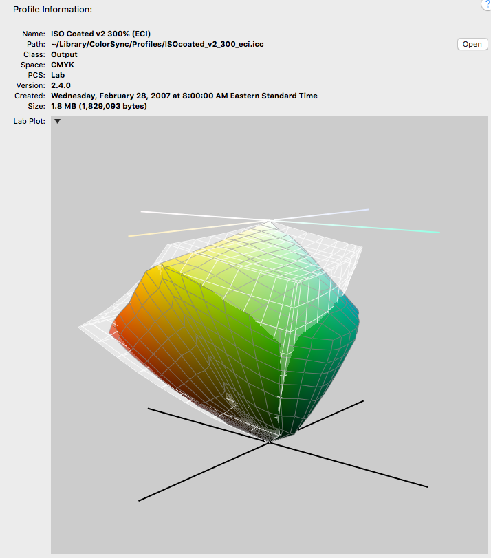
Dear Rob,
I know already all these 3D-graphics:
http://docs-hoffmann.de/gamshow15052009.pdf
Best regards --Gernot Hoffmann
Copy link to clipboard
Copied
In post #19 I had shown that one can convert the OP's sRGB sketch very reasonably
into CMYK (coated), whereas all the experts here thought that the OP´s CMYK result
would just reflect the unavoidable bad result of any RGB to CMYK conversion.
I agree, there's nothing about the art that seems out-of-gamut—the reds shouldn't be turning brown even when the source space is the smaller gamut sRGB. The problem with sRGB is more about general editing, it makes large parts of many CMYK spaces inaccessible—you can't find an sRGB color that will convert to 100% cyan and the space comparison I posted shows there are other significant parts of the destination CMYK space that could also get clipped.
The OP may have made an sRGB to SWOP conversion, but it doesn't look like the SWOP values made it to press. The art is going to a publisher (for page layout?), from the publisher to the printer, and then to a press with an unknown profile. There are many ways the OP's CMYK values could get changed in that workflow.
We still don't know if the paper is uncoated or newsprint. If it is then SWOP is the problem.
Copy link to clipboard
Copied
As a result I would say, the OP's basic concept is correct, but his color management is wrong.
So possibilities would be: the screenprofile is totally off, the printer does not print according to US Web Coated (SWOP) v2 but used the CMYK data as is, …
Please, could someone reproduce my test?
I also notice but little difference side-by-side (see Status Bar for which is CMYK and which is RGB):
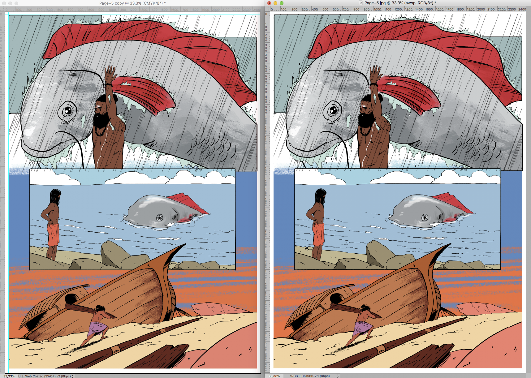
I also dragged the CMYK image back into the sRGB version and set it to »Difference« (and added a Curves Layer to increase the effect):

Seems the red flipper and the orange sky are the areas most affected.
-
- 1
- 2

Find more inspiration, events, and resources on the new Adobe Community
Explore Now
 AdChoices