- Home
- Photoshop ecosystem
- Discussions
- When i put image into photoshop, the quality is ho...
- When i put image into photoshop, the quality is ho...
When i put image into photoshop, the quality is horrible
Copy link to clipboard
Copied
Hello,
I've tried to figure it out myself, but I don't know what to do. I'm trying to make 300x600 banner size, but when i put image i want into that file, the quality is horrible.
Checkout the image in full resolution and check it in my PS..
Thank you!
Explore related tutorials & articles
Copy link to clipboard
Copied
You are zoomed in at 380+%. What does the image look like at 100%? 300x600 is small not a banner.
Copy link to clipboard
Copied
Copy link to clipboard
Copied
Again - 300x600 is small in size not 4K. You need to understand pixel dimensions with screen graphics. What deos the image size window show?
Copy link to clipboard
Copied
Kevin asked, "What does the image look like at 100%?" Can you try that?
Jane
Copy link to clipboard
Copied
Pasting a high-resolution image into a 600 x 300px box creates a tiny, low-resolution image. That's why it looks pixelated.
1. Hold Ctrl + Alt + 0 (zero) to revert to 100% magnification.
2. Go to File > Place Embedded. This inserts original as a Smart Object.
3. Resize as needed and hit Enter key.
Hope that helps.
Copy link to clipboard
Copied
Thanks, it look little bit better
Copy link to clipboard
Copied
I don't really use Adobe Stock, but it seems likely that they will have higher resolution versions of those images. Perhaps at a higher cost. Is this banner for a website, or printed page? If the latter, how big?
Copy link to clipboard
Copied
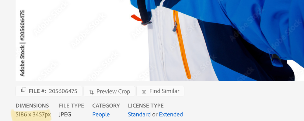
I just checked, Trevor. The Adobe Stock image is 5186 x 3457 and Dominick is squishing it down to 300 x 600.
Jane
Copy link to clipboard
Copied
It should be for a website
Copy link to clipboard
Copied
300 x 600 might work on xx-small mobile devices but it will look like a postage stamp on most other displays, especially 4K & 5K monitors that can hold many thousands of pixels.
These days, web developers need multiple sized images to fit on various sized devices -- xx-small to jumbotron and all points in between. Read about designing responsive web images with <picture> element and the SRCSET attribute below.
https://developer.mozilla.org/en-US/docs/Learn/HTML/Multimedia_and_embedding/Responsive_images
Or if you use percentage widths, use an image width in pixels that fits your major target audience's screen size. Percentage widths scale images down to fit smaller screens but contain enough pixels for larger ones.
https://www.w3schools.com/css/tryit.asp?filename=trycss_dim_height_percent
Best of luck with your project.


