

- Home
- Photoshop ecosystem
- Discussions
- Re: Why JPEG result appears different for noises o...
- Re: Why JPEG result appears different for noises o...
Why JPEG result appears different for noises on Photoshop?

Copy link to clipboard
Copied
I was trying to make a graphic element that included a subtle gradient effect with a noise texture on it, the heavy dark contrast on the Photoshop screen is exactly what I was looking for, but why does it appear different when saved to JPEG? I've tried exporting it as well and the results were still the same.
The examples are in the attachments below.
Thank you.


Explore related tutorials & articles
 9
Replies
9
9
Replies
9

Copy link to clipboard
Copied
A few questions in order to help you.
1. What zoom level are you using in your comparison? Only 100% is accurate.
2. What compression did you use for your jpeg? Jpeg compression is lossy.
3. What color profile are your documents and did you embed the profile in your jpeg.
Dave
Copy link to clipboard
Copied
Hi Dave,
1. I wasn't aware of this so really it was zoomed out most of the time, probably 20-30% ish, because I was trying to get the whole shot and 100% was too close.
2. I used maximum quality in the settings if that's what you meant.
3. The color profile is sRGB and I've tried embedding the profile after you mentioned it but the results were still the same.
Thank you.
Copy link to clipboard
Copied
You have to view and compare at 100%/1:1 (or greater and matching) zoom ratios for an accurate preview.
Copy link to clipboard
Copied
Hi thedigitaldog,
Yeah the last preview was 100% zoomed as Dave suggested.
Thank you.
Copy link to clipboard
Copied
Try something other than JPEG (TIFF) which alters the image due to image content and settings; does it now match?
See: https://www.adobe.com/creativecloud/file-types/image/raster/jpeg-file.html

Copy link to clipboard
Copied
Hi thedigitaldog,
Unfortunately, I've tried as you suggested and used TIFF but the results were still the same.
Thank you.

Copy link to clipboard
Copied
I see this a grayscale image, and that accounts for a big part of this.
Grayscale is a can of worms and always risky. To reproduce correctly, grayscale is subject to standard color management just like RGB. Obviously there's no color, but the tone response curve is defined in the profile.
The problem is that Photoshop is about the only application on the planet that supports grayscale color management. No other applications do, and they will treat grayscale totally unpredictably and randomly.
What you need to do, if you must use grayscale, is to make sure the profile you choose in Photoshop matches the intended output as closely as possible. There is no color management here; so they must match.
The default grayscale profile in Photoshop is Dot Gain 15 or 20%, which basically doesn't match anything (dot gain profiles are old and outdated generic offset press profiles). You can't use that profile. Use Gray Gamma 2.2 or sGray. Much better chances there.
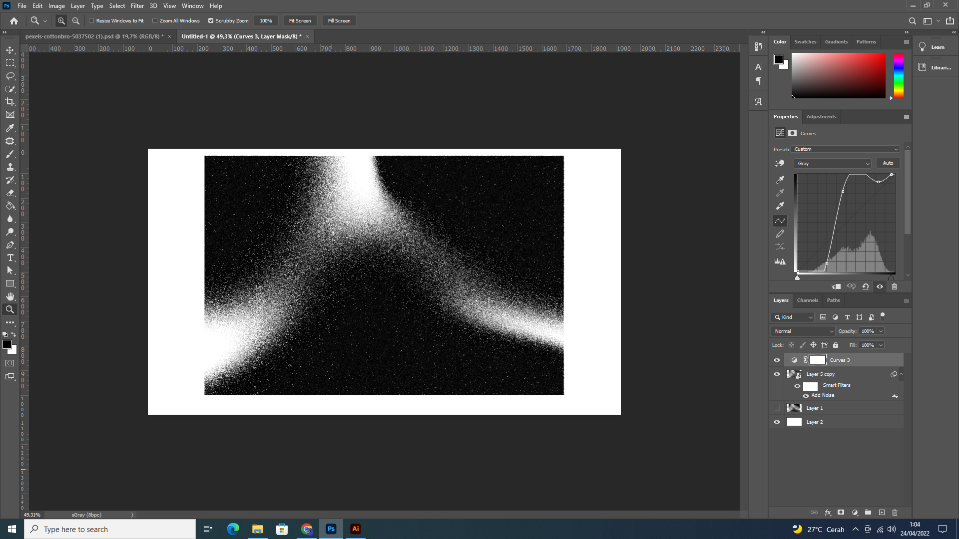
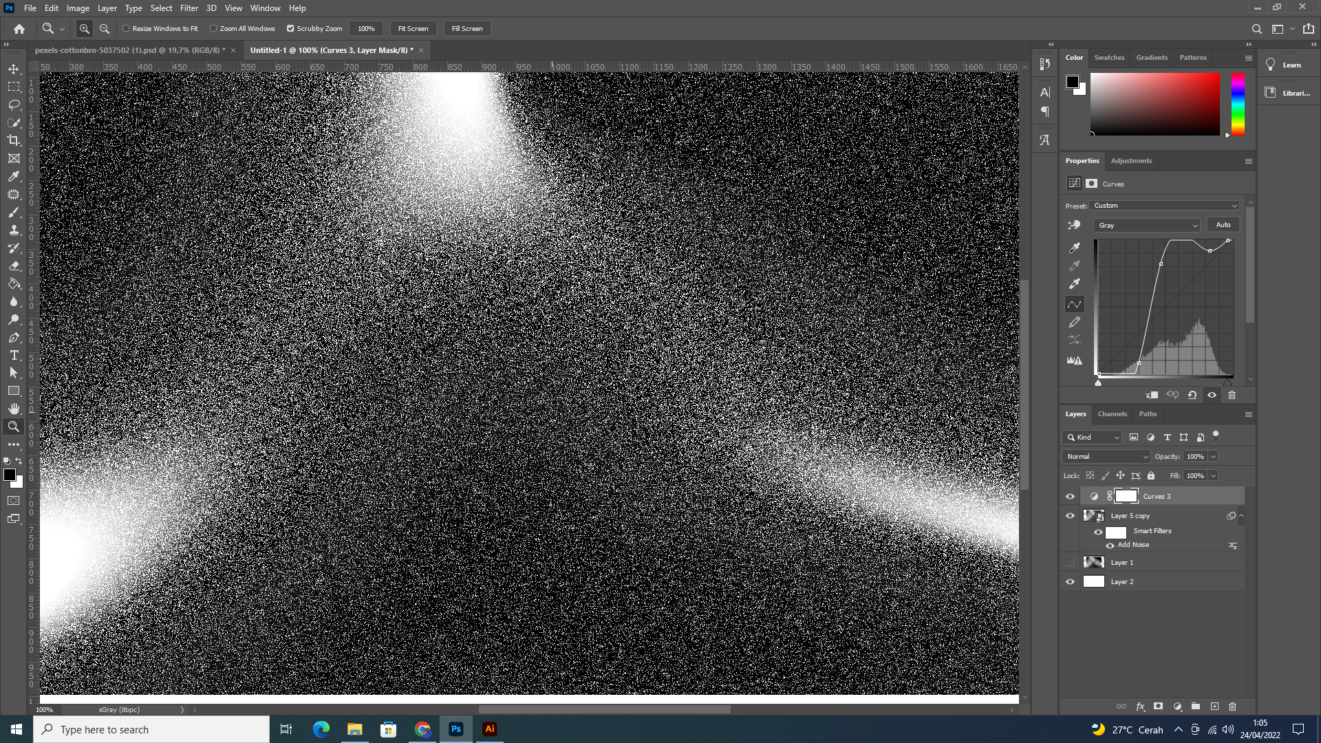
That leaves the second part, and Dave touched on that too: noisy/binary images must be assessed at 100% view! This is extremely important. In Photoshop 100% has nothing to do with size. It means one image pixel is represented by exactly one physical screen pixel. At 100% you see the actual pixel structure accurately represented on screen. At all other zoom ratios, screen resampling will muddy the result, and different resampling algorithms give different results.
Copy link to clipboard
Copied
Hi D Fosse,
Yeah I was aiming for it to be grayscale, but does this mean this same problem won't happen when color is involved? I also did as you suggested with the color profile and converted it to sGray (also gray gamma 2.2 previously), though I feel like there weren't any changes, to be honest.
I've noted the second part as well after reading Dave's reply, the noise does appear off when zoomed to 100% view, but is there any way that I could make it look like the one represented in the zoomed-out version?
Thank you.
Copy link to clipboard
Copied
The first files you posted were untagged grayscale:

Now, any grayscale profile you use in Photoshop will look correct, because it uses color management to display the file. Any profile will be converted into your monitor profile, so they will all display correctly and thus identically.
If there is no profile, the working gray kicks in as a fallback default. But if there is, it will override the working gray. Just like with RGB.
The problems start outside Photoshop!
That's where color management stops. The grayscale profile is suddenly useless and means nothing. You're left with how those numbers are interpreted on your display. That is - if the application you're using can even display single channel grayscale files. Most are just designed to deal with RGB and some use cryptic "formulae" to display grayscale.
But luckily, most displays have roughly the same native tone response curve, and it's somewhere between gamma 2.2 and sGray. That's why you need to encode the image using a similar tone response curve. You do that by creating the grayscale file with one of those profiles, or convert to one of them later. Then you can send the numbers to screen and they will look more or less right.
Long and short - avoid grayscale if possible. Monochrome RGB is much safer.
---
As for the noise. Look carefully at your 100% screenshot. As you can see, it's basically white pixels next to black pixels. How do you downsample that to, say, 33% ? Think about that for a while, and I'm sure you understand why it's important to compare at 100%:

 AdChoices
.png)