- Home
- Photoshop ecosystem
- Discussions
- Re: Writing on a broken arm CAST?
- Re: Writing on a broken arm CAST?
Writing on a broken arm CAST?
Copy link to clipboard
Copied
How can i make an effect that makes it look like black marker written on a white broken cast? I have tried everything i can think of, and nothing is giving me the look i am going for. Patterns and blending modes just give me a checkered look, displacement maps never seem to get it, and everything else just comes out looking grungy!
My goal is to make it look like a phone number was written onto a cast, so the phone number font must be big and bold and readable. I want it to look like someone drew big bubble letters onto a cast,sort of like the heart on image attached.
Please help!!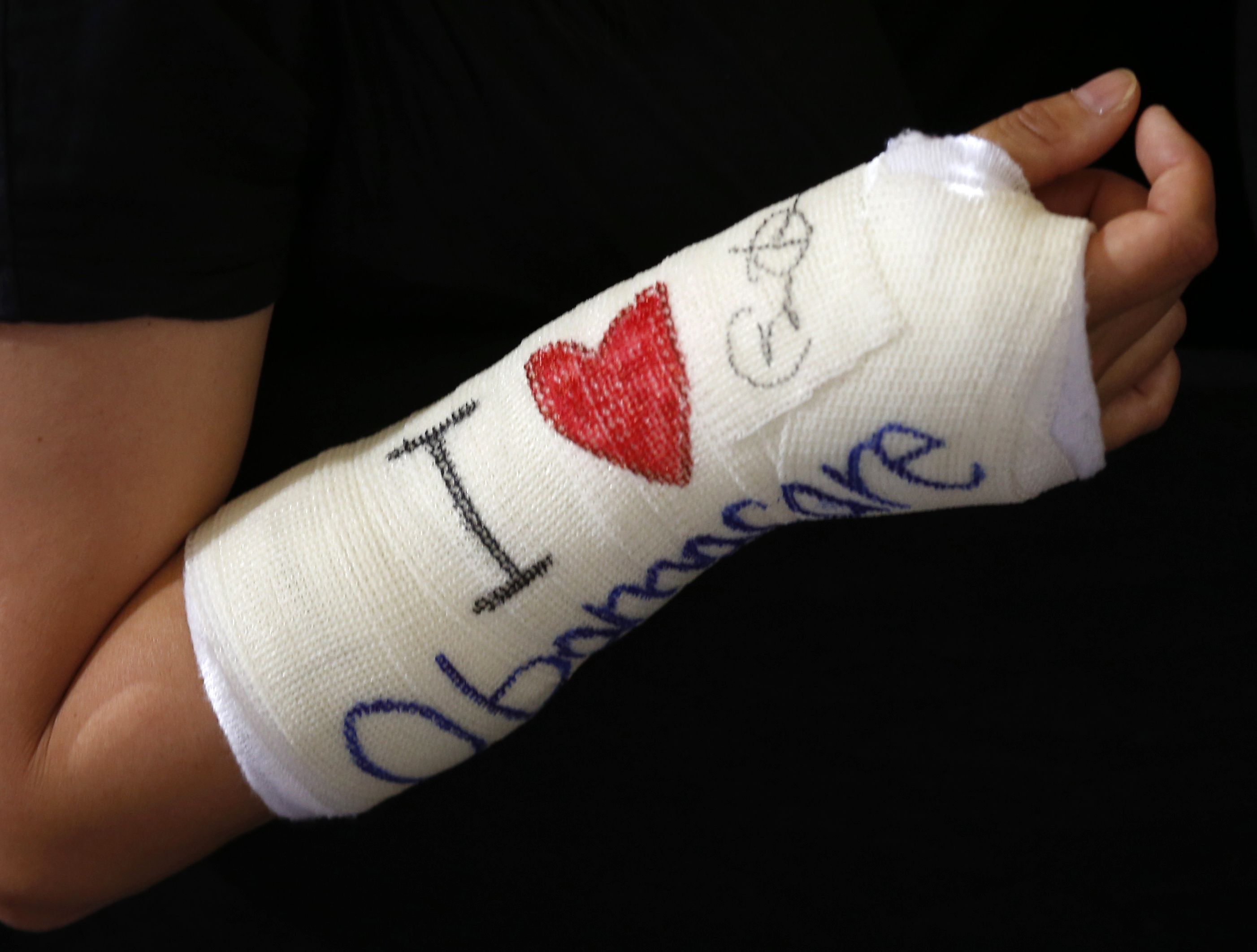
Explore related tutorials & articles
Copy link to clipboard
Copied
yuftyulgfvgtgigig wrote
I want it to look like someone drew big bubble letters onto a cast,sort of like the heart on image attached.
Hi,
Can you show one or two examples of something you’ve tried so we have a better idea of what you are going for?
Copy link to clipboard
Copied
Copy link to clipboard
Copied
I'm looking at this cast, and it strikes me there are two things that are going to make text look like it belongs. That's not counting the warping to match the curve, which is obvious
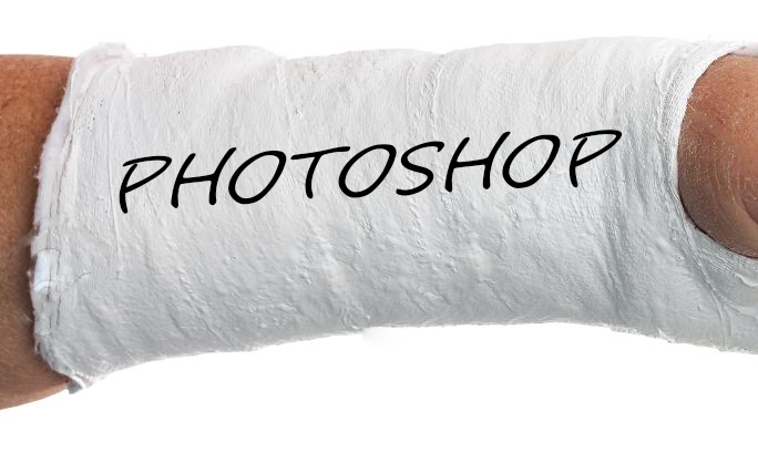
First you need to let the texture of the plaster show through. Then distort the text to follow the bigger texture.
So I have copies the plaster beneath the text, blurred it and increased contrast
This will be used as a Displacement Mask

Using low settings for displace ( 4 & 4) because of the thin text.

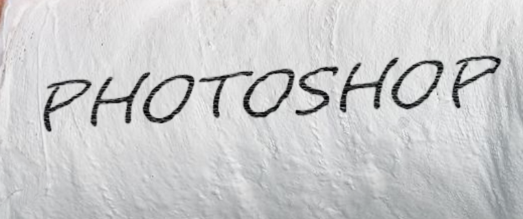
I didn't do well trying to get fine texture on the text because of it being so dark. To get this I used Filter Gallery > Texturiser > Sandstone, and boosted contrast again with a clipped curves layer. I barely shows though. The displace has worked OK I'd say.
Copy link to clipboard
Copied
Your cast is plaster and the OP's cast is fiberglass.
Use a mesh for a height map, that will make the ink raise and drop.
A blend mode would get close but I think would be more gradual instead of the sharp edge of the mesh.
Copy link to clipboard
Copied
A blend mode would do wonders. Try Overlay and mess with the opacity. And if it looks ok, but a little light, try adding a second layer of it in overlay again and messing with opacity more.
Copy link to clipboard
Copied
Hi
Try this:
Add a new layer
Draw the letters with a soft black brush.
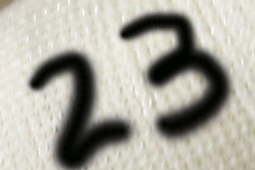
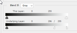
Set blend if on the drawn layer as shown below

Add a color fill layer and clip it to the drawn layer and set the colour required
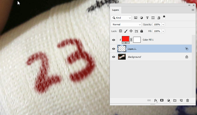
I hope that helps you
Dave
Copy link to clipboard
Copied
I like that Dave. ![]()
Copy link to clipboard
Copied
I was thinking something like the following only better. LOL.


Find more inspiration, events, and resources on the new Adobe Community
Explore Now

