Exit
  • Global community
    • Language:
      • Deutsch
      • English
      • Español
      • Français
      • Português
  • 日本語コミュニティ
  • 한국 커뮤니티
13

Photoshop: Make "Blend Colors Using Gamma" a document setting

Contributor ,
Jun 01, 2012 Jun 01, 2012
"Blend Text/RGB Colors Using Gamma" should be a document or layer setting instead of a global setting. The user should have the ability to set the default option. There could still be a global setting for documents that don't have specified gamma blending settings.

Here's a simple scenario:
A designer makes a graphic in Photoshop CS5. The Star shape and text layers are each set to black with layer fill set to 45%. All Photoshop color settings are at default. The file is sent to a user with CS6 or the designer upgrades to CS6. The Shape and Text layers no longer look the same. Mass confusion.
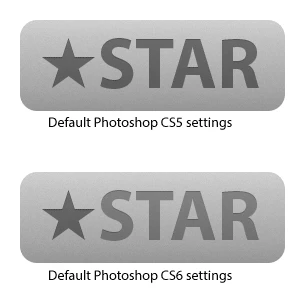

The current settings are hidden away, like they aren't supposed to be messed with, yet I am seeing recommendations to disable Blend Text Colors Using Gamma: http://bjango.com/articles/photoshopc...

I was tempted to label this as a "Problem" rather than an "Idea."

There are simple workarounds for this issue, but you can't expect users to know what is happening in the first place, especially with how well hidden the gamma blending preferences are.
Idea No status
2.7K
Translate
Report
Community guidelines
Be kind and respectful, give credit to the original source of content, and search for duplicates before posting. Learn more
community guidelines
28 Comments
LEGEND ,
Jun 01, 2012 Jun 01, 2012
The settings aren't supposed to be messed with.
Most people should not change them.

And even if it was made a document setting - that wouldn't help compatibility with older versions.
Translate
Report
Contributor ,
Jun 01, 2012 Jun 01, 2012
A newer version of PS could just open older files with the default settings of the PS version that created it.
There could still be a global option for files with an unknown origin.
Translate
Report
LEGEND ,
Jun 02, 2012 Jun 02, 2012
And then the old documents wouldn't get any of the bug fixes in the blending, and users would be even more confused about what was going on.
Text blending is a bug fix, and should stay on. Only people who know how blending works have a need to change it.
Translate
Report
Participant ,
Jun 02, 2012 Jun 02, 2012
Sorry Chris, I'm with David Jensen on this one. I like being able to control text antialiasing, and I like that text in CS6 looks nicer than CS5, but the opacity differences seems like a bad thing. Same colour type and shapes not matching when they're the same opacity seems like a real issue.

Were the text gamma changes supposed to change the appearance of non-opaque text?
Translate
Report
Community Expert ,
Jun 02, 2012 Jun 02, 2012
Chris, the Aliasing fix is supposed to work at all opacity settings, or was it created mainly for black text? I was wondering if it could not be disabled when the opacity is not 100%, given the issues demonstrated here.
Translate
Report
LEGEND ,
Jun 02, 2012 Jun 02, 2012
The fix works for all opacity settings and colors - it just isn't what you're used to. The text team thought we were doing this all along, but there was a miscommunication years ago -- and CS6 fixes that. Unfortunately, you can't get the correct blending for text and match the blending for other layers at the same time unless you also blend all layers with the same gamma adjustments.
Translate
Report
Contributor ,
Jun 02, 2012 Jun 02, 2012
For those who don't understand how the antialiasing and opacity changes are linked, considers this (quite extreme) example: ( I enlarged the image to 300% using nearest neighbor.)


I masked the text with a white to black gradient. You couldn't have the clean edges of the second example while still making the other opacity changes like the first example.
Translate
Report
Participant ,
Jun 02, 2012 Jun 02, 2012
Is this just a text layer with a bitmap mask layer? I'm trying to replicate your example exactly and failing.
Translate
Report
Participant ,
Jun 02, 2012 Jun 02, 2012
Black text at 50% opacity on a white background not appearing as rgb(127, 127, 127) seems like unexpected and unwanted behaviour to me. I don't think I'll ever get used to it, if that's how Photoshop will be by default from now on. At least it can be turned off, right? 😉
Translate
Report
Contributor ,
Jun 02, 2012 Jun 02, 2012
It's a text layer with a bitmap mask over a solid color layer.
Translate
Report
Contributor ,
Jun 02, 2012 Jun 02, 2012
It's a text layer with a bitmap mask over a solid color layer.
Translate
Report
LEGEND ,
Jun 02, 2012 Jun 02, 2012
That also shows how color is linked as well.
But we found that text doesn't blend as expected at gamma 1.0, and gives best results at a slightly higher number (but still not as high as most images (1.8 - 2.5)).
Translate
Report
Contributor ,
Jun 02, 2012 Jun 02, 2012
Marc, here's how I had the layers in the previous example:


It appears I was a bit off on in my previous post... you can combine the two methods, it just doesn't look good:
Translate
Report
LEGEND ,
Jun 04, 2012 Jun 04, 2012
If I understand the argument correctly the best measure for this setting is to have the option for "Blend Text/RGB Colors Using Gamma" turned off until this is improved or better workarounds are found.
Translate
Report
New Here ,
Oct 01, 2012 Oct 01, 2012
This is causing text layer to behave inconsistently. Text blended should maintain the correct opacity even if the edges are aliased differently. I can't imagine there is not a programmatic way around this issue.
Translate
Report
LEGEND ,
Oct 01, 2012 Oct 01, 2012
There isn't a way around it. If you want the antialiased edges to blend correctly, all semi-opaque colors will be affected. Opaque colors will be unaffected.
Translate
Report
New Here ,
Oct 01, 2012 Oct 01, 2012
So the solution is to break the way text layers blend just to get a different alias on text. How is this a good thing? and why would it be on by default?

Setting my text layer to 50% opacity now means it is not at 50% opacity. Saying this is just the way it is just wrong. No program should ever behave like this.

This setting should be messed with and most people should NOT have it on.
Translate
Report
LEGEND ,
Oct 01, 2012 Oct 01, 2012
Many people wanted to improve the antialiasing on text and more closely match how the OS renders text - and this is how it works.
Your layer is at 50% opacity, but it blends slightly differently because it is a text layer.
Translate
Report
Explorer ,
Jun 20, 2013 Jun 20, 2013
I was very disappointed to see this has not been alleviated in any way in Photoshop CC, especially with the introduction of better text anti-aliasing. Over the past few months it's caused a whole slew of problems for me, for example...

1) Making simple things like matching the opacity of a shape and a text layer like in David's original example way too cumbersome.
2) Making it impossible to share documents with people on different versions of Photoshop (or just with the setting turned off!).
3) Preventing developers I work with from directly taking the opacity values I set for text layers to use in web or UI designs.

Please do something about this, Adobe.
Translate
Report
New Here ,
Dec 04, 2014 Dec 04, 2014


I created a shape, using #005eb8 as border color and set the opacity of the whole layer to 50%.
Then I created a text, using #005eb8 as color and set the opacity of the whole layer to 50%.

Looking at both next to each other, the colors look very different. The text way more purple-ish, the shape way more blue.

Then as a test I added a layer style to the font, coloring it again with #005eb8 through the layer style. Same result.

Now, when I rasterize the font layer keeping the layer style, suddenly the difference vanishes for this layer and suddenly the color of this layer looks just as blue as the color of the shape, and not purple-ish anymore

How's that possible? Please fix this!
Translate
Report
LEGEND ,
Dec 04, 2014 Dec 04, 2014


Why does a text-layer look that different to a form or a pixel-layer. The color and opacity settings are identical for all layers. I didn't noticed this behaviour in previous versions than CS6.

Translate
Report
New Here ,
Dec 04, 2014 Dec 04, 2014
Thanks! But that just means there basically is no solution to this terrible issue. Quite sad.
Translate
Report
New Here ,
Dec 04, 2014 Dec 04, 2014
So, Adobe, how will this be addressed? The current situation is terrible.

I simply cannot use the same amount of transparency for text and a different kind of layer and expecting the same color result? This is not only sad but a terrible UX.

Please, please, please fix this.

Thank you so much!
Translate
Report
Guest
Dec 17, 2014 Dec 17, 2014
Agreed!

It's maddening to have text layers look one way when 'native', and completely differently when rasterized or converted to smart objects.
Translate
Report
Guest
Dec 17, 2014 Dec 17, 2014
As a UI designer, I've been really taking advantage of Photoshop CC's expanded SmartObject features; like linking external files and exposing SmartObject's layer comps to the parent document.

However, any text used in smart objects looks jagged and harsh, comparatively.

This might be due to the font I'm using, but the sudden change in blending is disconcerting.
Translate
Report