Participant
August 16, 2010
Answered

Pixelated Text.

  • August 16, 2010
  • 2 replies
  • 28380 views

PSE8 Mac OS X Snow Leopard

My text in PSE has always looked horrible.  Toggling the anti alias setting changes it from very, very, very horrible to very, very horrible.

I go to another tool like Mac Pages.  Create text there and then PDF or screen shot for another layer in PSE.

What's up? 

-ed

    This topic has been closed for replies.
    Correct answer

    Hi MTS!

    Say, what typeface did you use for the Test that you screenshotted?  That's a nice one.

    My test as to the look of the test is to get it to print or print to a PDF.

    I set the resolution to 300 pixels per inch like you'd scan a printed document and that made it look a lot better on the screen and as I printed it.

    So, is it true that if you've got pixels at 72 per inch then it's just not enough and type will look bad?

    -ed


    If your using the type tool in photoshop elements to make your text, then

    the resolution of the document won't matter for just viewing on a computer

    monitor (maybe a little). If you can't get any fonts to look good viewing the

    document at 100% (actual pixels) viewing in photoshop elements, using text

    you made with the type tool, then perhaps a global setting on your computer

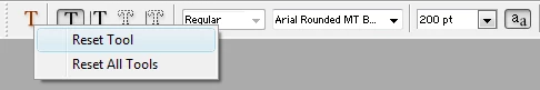
    is causing this. Also try resetting the type tool in photoshop elements by

    going to left of the tool options bar and choosing reset tool.

    If you intention is to print, then it does matter. If your making a document

    that you want to print, start out with a document with a resolution of 300

    before adding text etc.( resolutions of 240-300 or so will probably be okay)

    File>New.

    Also, doing any resizing (except resolution), up or down, by adding or subtacting

    pixels (image size dialog with resample checked), will tend to make your pictures

    or documents not as good as the originals.

    That's not to say you should never resize, cause there times you have to, for example

    images for display on the web or emailing.

    I used a Arial Rounded MT Bold font for the test images. The first e below is a 640x480

    at 72 resolution and the second e is a 640x480 at 300 resolution.

    MTSTUNER

    2 replies

    Inspiring
    August 16, 2010

    Resizing text after simplifying it will make it look dreadful, too.

    ekulisAuthor
    Participant
    August 16, 2010

    Well here's a clue.  I resampled the image from 72 per inch to 300 per inch and it looks a lot better.  So at 72 pix the pix are just too big to smooth out the edges.

    If there's more to know that please comment.

    August 16, 2010

    The zoom% could cause the text to appear pixelated.

    The best is 100%, but 50% or 25% will due also.

    Try a different font, some just are bad regardless.

    The first screenshot is 100% view (actual pixels) and the second is 66.7% view.

    Click on the images below  to enlarge.

    MTSTUNER

    ekulisAuthor
    Participant
    August 16, 2010

    Hi MTS!

    Say, what typeface did you use for the Test that you screenshotted?  That's a nice one.

    My test as to the look of the test is to get it to print or print to a PDF.

    I set the resolution to 300 pixels per inch like you'd scan a printed document and that made it look a lot better on the screen and as I printed it.

    So, is it true that if you've got pixels at 72 per inch then it's just not enough and type will look bad?

    -ed