- Home
- Photoshop ecosystem
- Discussions
- Difference between rendering intents for B&W mono ...
- Difference between rendering intents for B&W mono ...
Copy link to clipboard
Copied
I'm sorry if this is a novice question but hopefully someone will answer it.
I've just started to use new profiles from my print company. With their previous profiles I'd noticed little or no difference between Relative Colorimetric and Perceptual rendering intents when converting. However, with the new profiles I notice a significant difference, even when the source image colours are well within gamut. So I tested with a B&W mono image and it's the same there. Why is this? Is it because of the different way they adjust white points? Do your B&W images change with rendering intent?
 1 Correct answer
Both intents should remap the white point (as opposed to absolute colorimetric which does not).
The difference is that relative colorimetric hard clips at the gamut boundary, while perceptual redistributes near the boundary so that there is still some separation. The overall saturation may appear slightly lower because of this.
Standard working color spaces (sRGB, Adobe RGB etc), as well as monitor profiles, do not support rendering intents at all - or rather, there's just one, you get relative wh
...Explore related tutorials & articles
Copy link to clipboard
Copied
Both intents should remap the white point (as opposed to absolute colorimetric which does not).
The difference is that relative colorimetric hard clips at the gamut boundary, while perceptual redistributes near the boundary so that there is still some separation. The overall saturation may appear slightly lower because of this.
Standard working color spaces (sRGB, Adobe RGB etc), as well as monitor profiles, do not support rendering intents at all - or rather, there's just one, you get relative whatever you pick. But print profiles should have the necessary tables, and that's also where you most need it.
Corrupt and defective profiles happen all the time, so if there's a really big difference that could be it.
Copy link to clipboard
Copied
Thank you for your helpful reply.
https://forums.adobe.com/people/D+Fosse wrote
The difference is that relative colorimetric hard clips at the gamut boundary, while perceptual redistributes near the boundary so that there is still some separation. The overall saturation may appear slightly lower because of this.
That's what I thought, which is why I tried with a black & white monochrome image. Surely there should be nothing in a B&W image that goes anywhere the printer gamut boundary? I understood rendering intent was just about handling out of gamut colours, but it appears there must be more to it.
Standard working color spaces (sRGB, Adobe RGB etc), as well as monitor profiles, do not support rendering intents at all - or rather, there's just one, you get relative whatever you pick. But print profiles should have the necessary tables, and that's also where you most need it.
Do you mean a print profile contains separate definitions defining how to handle each rendering intent? If that's the case that might explain it. I'd thought a print profile was a single profile and the different rendering intents were handled by the conversion engine (I see little difference between Adobe ACE and Microsoft ICM).
Corrupt and defective profiles happen all the time, so if there's a really big difference that could be it.
It would be very helpful if you could try it for yourself with the profile I'm using from DS Colour Labs in the UK. Here's the link to the lustre paper profile on their site (I have the same issue with other print profiles). Then if you feel it's defective, I can take it up with them.
http://dscolourlabs.co.uk/cms/asset/f6ab402f17caf1204c8f0e800b9cb2d2.icc
Copy link to clipboard
Copied
Do you mean a print profile contains separate definitions defining how to handle each rendering intent?
AFAIK. I know print profiles are based on look-up tables, but I could still be wrong. Rendering intents is a subject shrouded in secrecy (it seems) and finding any information beyond the basics, anywhere, is next to impossible.
I don't have time to download and install this profile now, but a quick soft-proof test with my own Epson profiles, on a wide gamut monitor, shows very subtle differences. I can just barely see it in some color ranges.
And of course, a monochrome image should not show any differences at all. I think that suggests a broken profile - unless you see the same thing with all your print profiles.
Copy link to clipboard
Copied
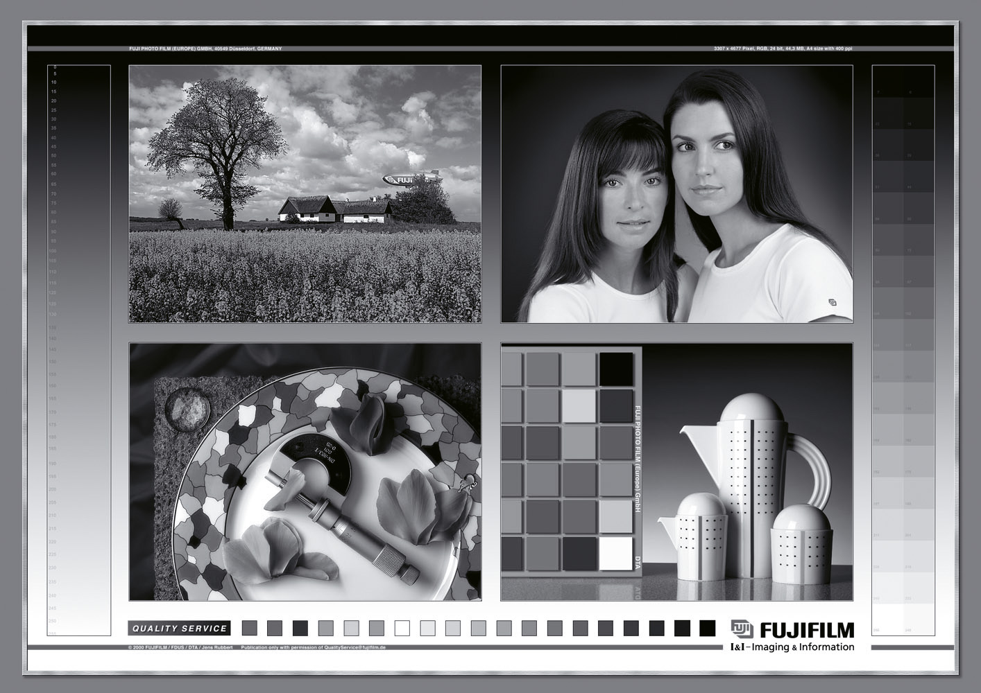
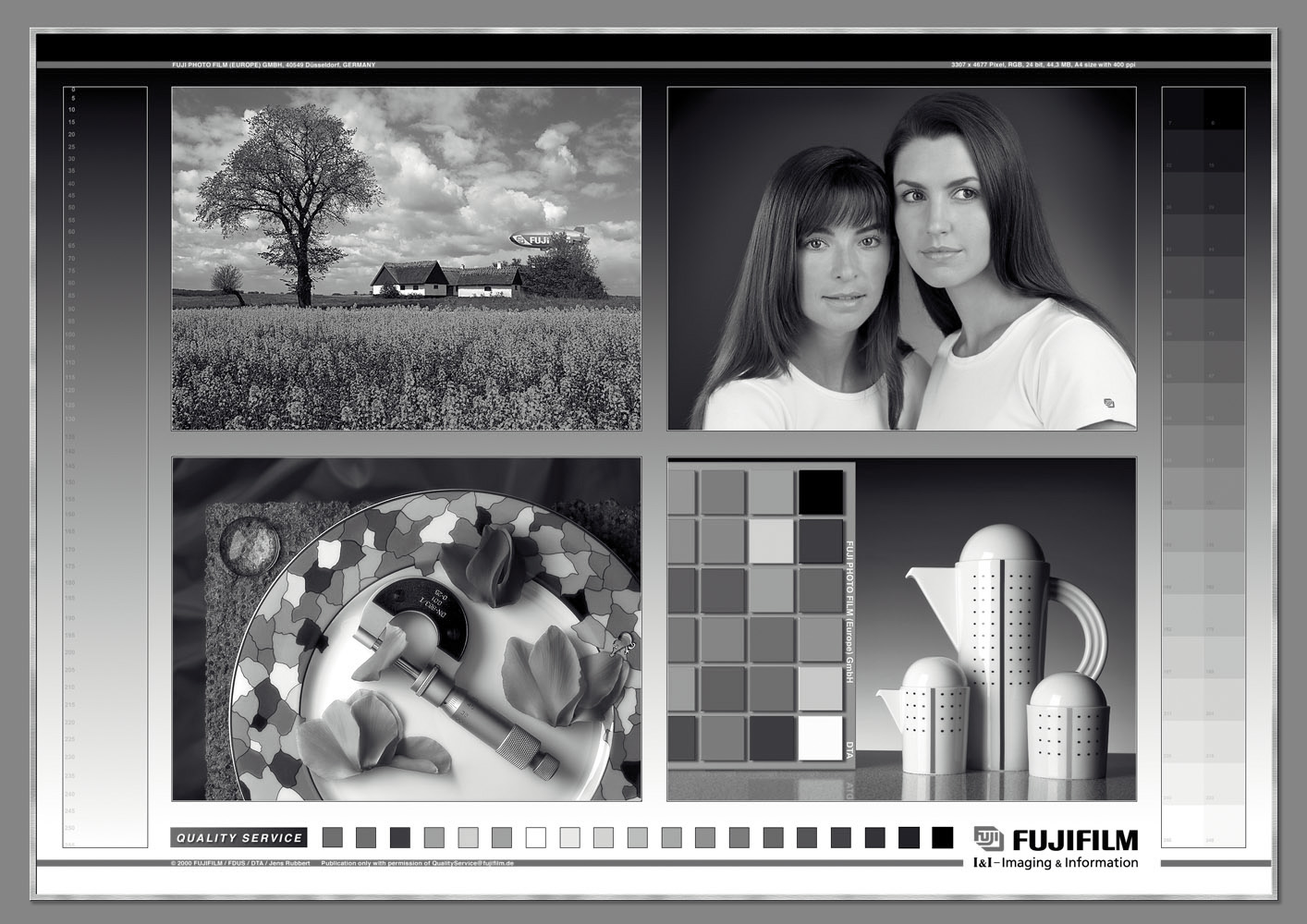
I'm not sure how well this will work but here are the two conversions, with the printer profile still attached. In the Perceptual version the shadows have been raised and it looks like the white point is warmer. The Relative conversion looks as I'd expect. The differences look greater if you download the images.
Like you, I'm surprised there are differences like this in a monochrome image (strictly speaking black & white, for you could use an out of gamut tint!).

Relative (above)

Perceptual (above)
Copy link to clipboard
Copied
No, that doesn't look right. I assume you're soft proofing here?
Do the two intents print differently from these monochrome images?
Soft-proof is, again AFAIK, fed from separate tables. I assume these just map to Lab values, which are then further converted into monitor RGB values. But if the soft proof tables were wrong, you could get this. IOW a broken profile.
Copy link to clipboard
Copied
Those were the actual output files I'd be sending off to the print lab, with the same profile attached but converted with different rendering intents. In my browsers (IE and Firefox) the images posted above look much the same as when soft proofing, which I think is what you'd expect if everything is being managed correctly.
So it looks like something to take up with the print lab. I've not yet sent anything to them using these new profiles but was about to, then spotted this weirdness. I'm confident the files would print differently. If I convert them both to sRGB they still look different.
Thanks again for your helpful comments.
Find more inspiration, events, and resources on the new Adobe Community
Explore Now