 Adobe Community
- Home
- Photoshop ecosystem
- Discussions
- Re: Something for the weekend - Part42 - Below Dec...
- Re: Something for the weekend - Part42 - Below Dec...
Something for the weekend - Part42 - Below Decks.

Copy link to clipboard
Copied
Hi
It's Friday again which means our weekly challenge is here.
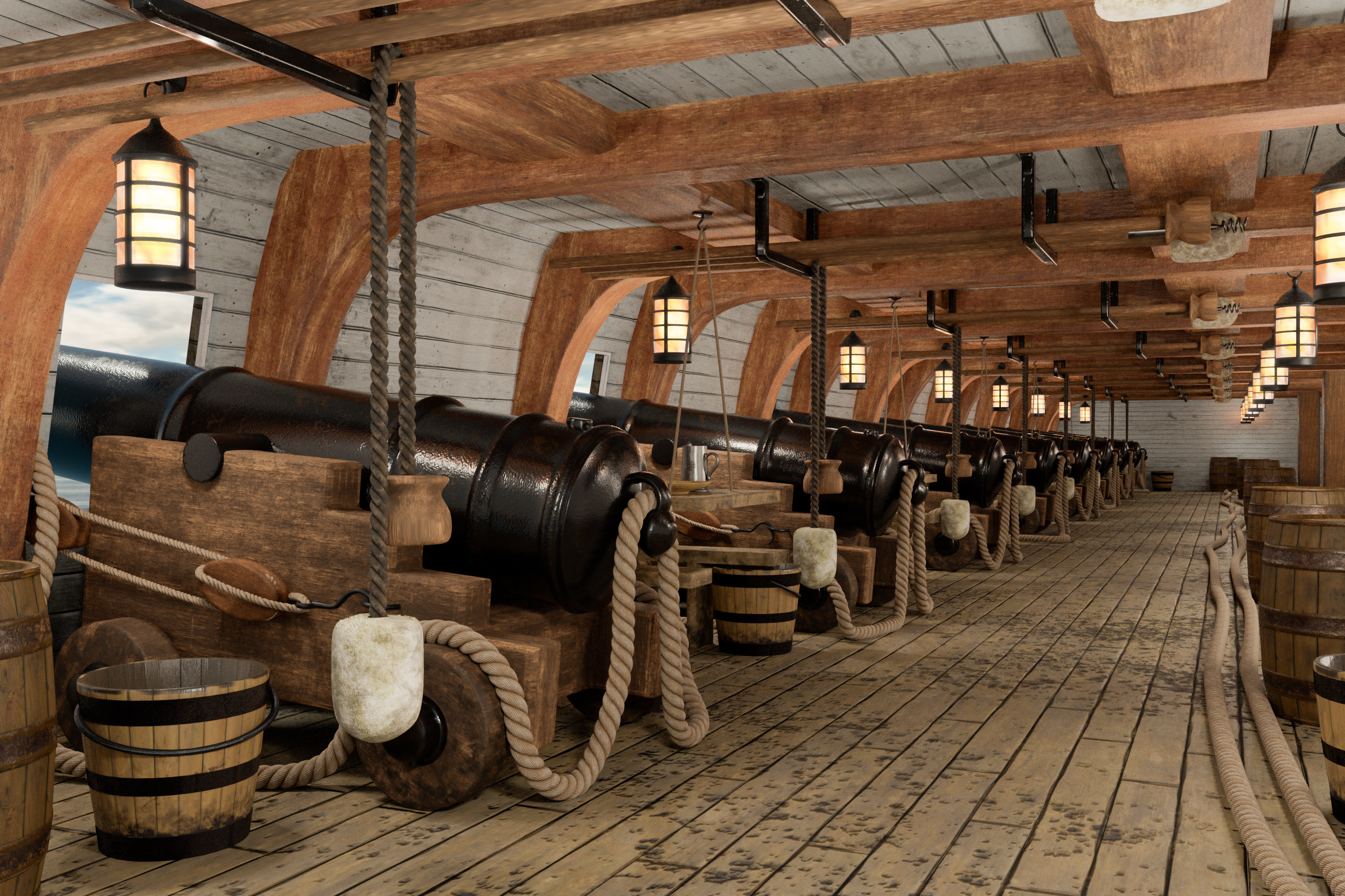
This week I bring you a 3D render, modelled on the gun deck of an old ship. The modelling and texturing kept me occupied for much longer than I planned, but I learnt a few things along the way so that's never time wasted. So there is the scene, what will you do with it? Will it be pirates, a scene from history, or something else entirely?
Anything goes as long as it meets the forum rules on decency, copyright etc.
Anyone and everyone is welcome to have a go - whether you are a complete beginner or a Photoshop expert.
There are no prizes apart from the chance to practice, show off, or bring a bit of humour and fun. Don't be shy - come and have a go!
When posting back your edited images please use jpeg and downsize to 1200px on the long side.
To download the image below in jpeg format with ICC color profile (sRGB) and without the forum scaling artefacts , right click and then use Save Image As /Save Target As (or similar depending on your browser).
Have fun!
Dave
Edit : Updated image - with better rope render.


Explore related tutorials & articles
 50
Replies
50
50
Replies
50
Copy link to clipboard
Copied
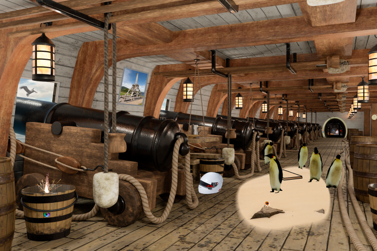
Later that night, as the ship sailed by the light of the cold-hearted moon, one could only hear the lapping of the waves and the creaking of the timbers...
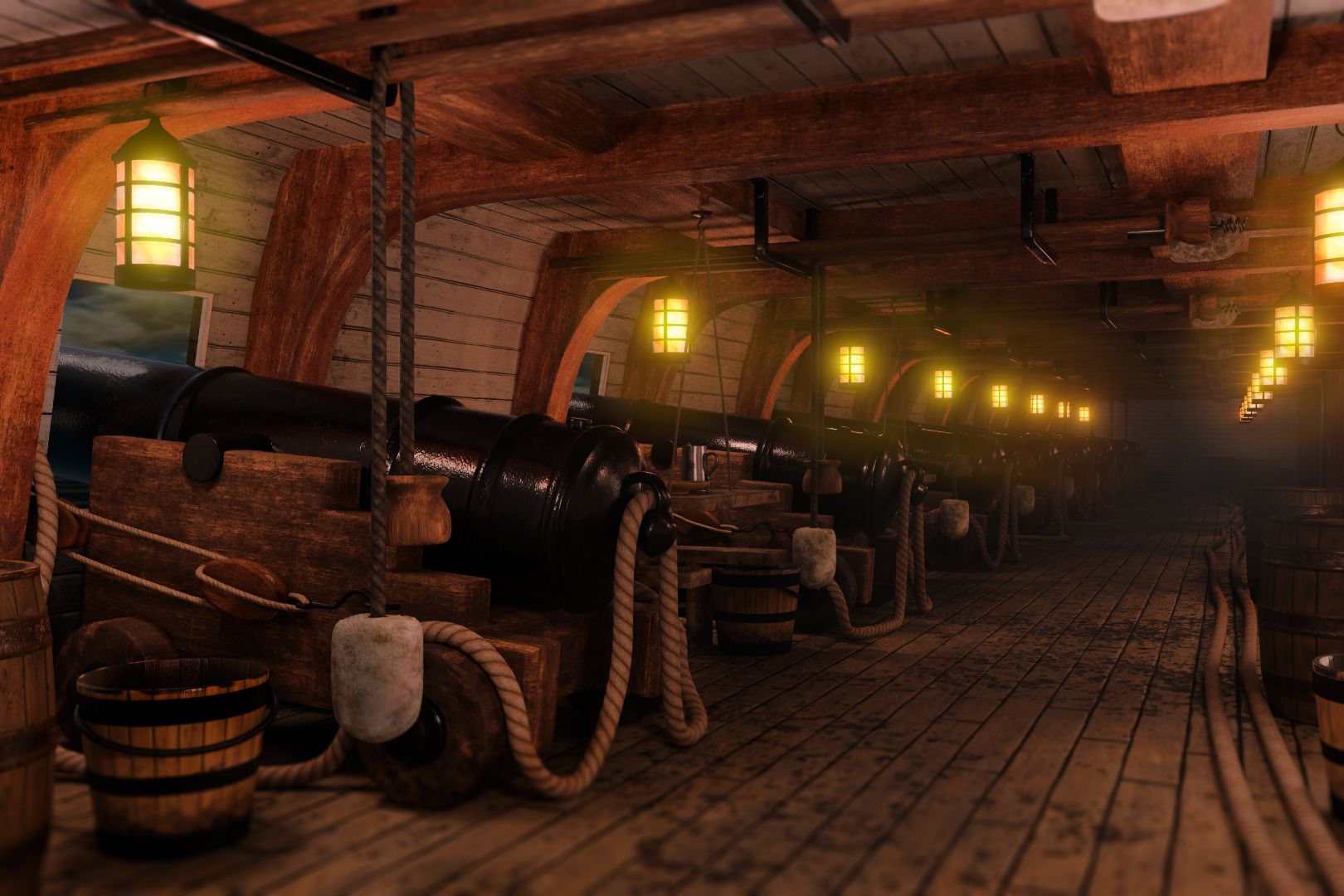
Going for a photo-realistic dim candlelight look here (best viewed large, against a dark background).
It's a very impressive rendering as a starting point, Dave. Well done!
-Noel

Copy link to clipboard
Copied
p.s, not a single drop of blood!

Copy link to clipboard
Copied
Graham, you've let us down. We depend on you for the Sam Peckinpah, Quentin Tarantino touch.
I feel a bit sad looking at my effort when squeezed down to so small a size. The info panel says it has 49 layers, but six of those Smart Objects with half a dozen layers each (average) so please double click to see the detail.

I had a wee brain wave when thinking about this. It can take ages to find composite elements with the right perspective, so I used SketchUp and downloaded 3D objects from the library, and moved them into the right perspective before copying across. They don't have that amazing near photo-realistic texture that Dave's renders have, but they are not too bad, and it also means you don't need to struggle making selections to remove the background. Just a thought.
Copy link to clipboard
Copied
Hi Trevor - you posted that whilst I was typing my last reply. I thought those were very civilised pirates, when I saw the flowers on the table , then I realised it must be the dining room from Graham's cruise ship earlier. 
Dave
Copy link to clipboard
Copied
Hi
I mentioned earlier that I wasn't really happy with the rope texture in the original render. I've now re-rendered using displacement maps rather than normal maps on the rope. Displacement has the advantage that it actually alters the mesh rather than simulating depth on the surface. The disadvantage is that it needs more vertices which eat up memory and increase render times. I used Blender's adaptive sub division which increases the mesh vertices near the camera but not in the distance. That meant rendering time "only" increased by 50%.
The difference on the ropes is worth it in my view:
Previous - using normal maps :

New - using displacement and adaptive sub-division :

Now back to the SFTW images 
Dave

Copy link to clipboard
Copied
Wonderful work as per usual Dave, how long did it take to render
Copy link to clipboard
Copied
Cheers Ged. That last render took 3 hours on a GTX1080 GPU. I could have shortened it but I used 2000 samples to keep the noise down.
Dave
Copy link to clipboard
Copied
davescm wrote
The disadvantage is that it needs more vertices which eat up memory and increase render times.
Dave
Dave, I mentioned finishing my video today. When I exported with Media Encoder, I was chuffed as heck at how quickly my new system exported the video, until I viewed the MP4 and found I'd had the Source windows selected, and not the timeline. It had actually exported a 20 second clip, and not the entire video, but it was totally unreasonable to think it had output a five minute 1080P MP4 file in 20 seconds. 
Copy link to clipboard
Copied
Haha - that would have been a serious performance gain. At least you spotted it before you sent it on
Dave
Copy link to clipboard
Copied
Hi
Very peaceful Jane. The message on the beam is a nice touch.
Semaphoric - I said in an earlier post that we'd be sunk - and you've nicely obliged.
Noel. Welcome to the SFTW threads. Nice job with the soft glow - and thanks for your comments on the render.
USSNorway - Clever idea - I'll book a hammock with a view.
Keep them coming - everyone is welcome to take part
Dave

Copy link to clipboard
Copied
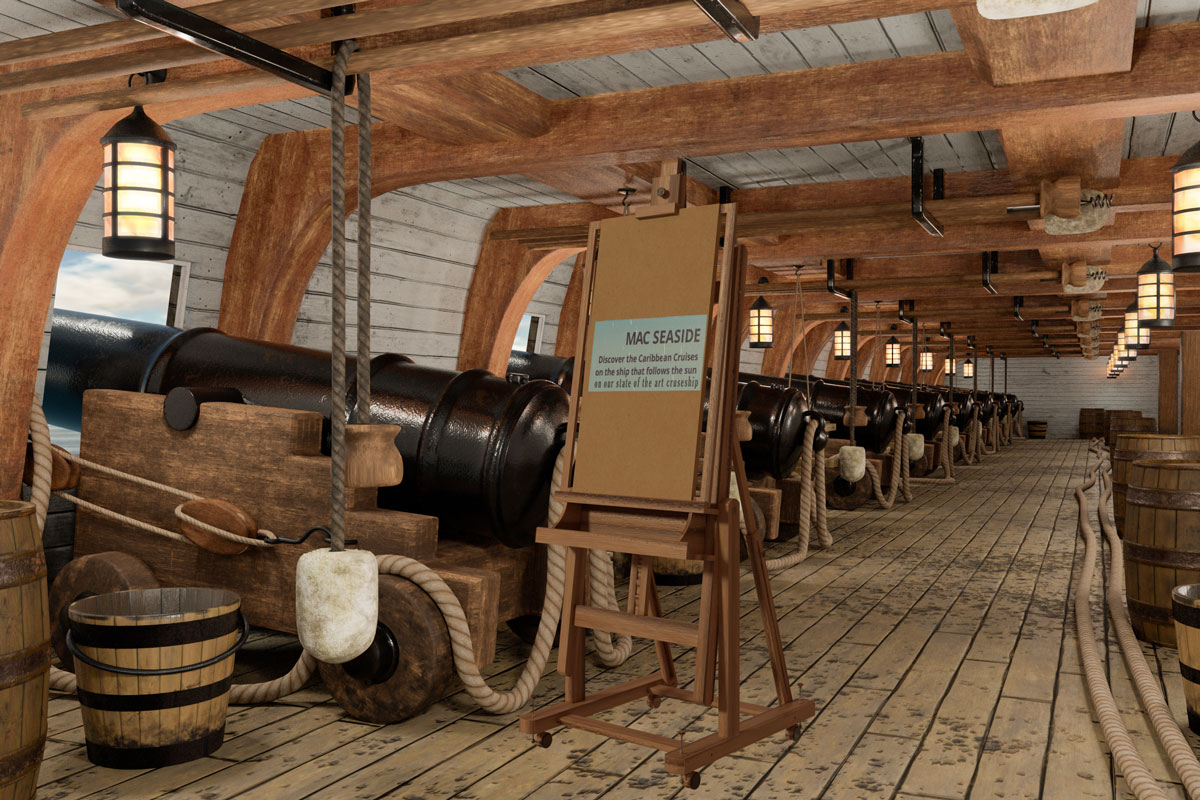
A little hommage to Dave's fantastic 3D work:
EDIT: oops, I think I overdid the perspective on the sign. Well, nevermind. You get the idea.
Copy link to clipboard
Copied
Haha
That did make me laugh Dag - nice one (and thank you) !
Dave

Copy link to clipboard
Copied
Dag,
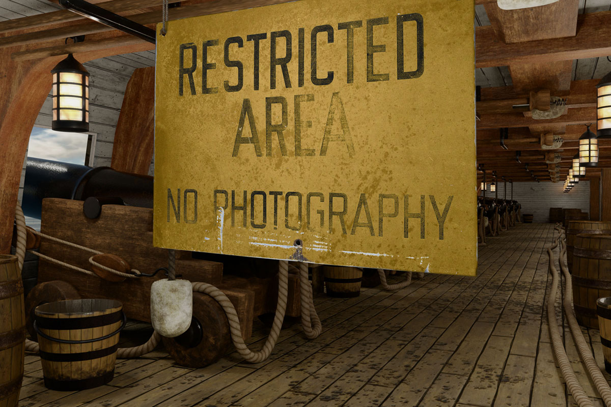
Since you were cunning enough to give only a partial view of where it was mounted, no one can tell whether it is at an angle with the beams; I saw it that way, as if directed at an entrance closer to the side of the ship, and with the near (which would be the off on a horse) edge of the sign visible (the colouring may give that impression although it is much the same at the opposite edge).
Copy link to clipboard
Copied
It's supposed to hang parallel to the beams, and so perpendicular to the floorboards - OK, deck or whatever. The question is if you extend the sign down to the...deck...as you can tell I haven't spent much time at sea...will the angle be correct? Not sure. Perspective is more tricky than you'd think.
Copy link to clipboard
Copied
I see what you mean, Dag, looking closer at the top edge of the sign, it seems to be parallel to the beams, but that part is only partially shown.
Copy link to clipboard
Copied
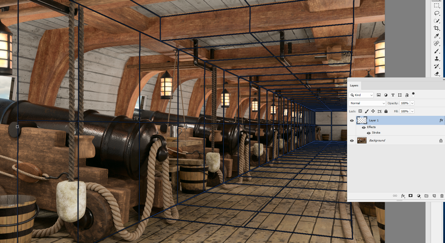
Hi
Your comment intrigued me - so I went back to the model scene and hung a board in the same place - the orange outline below. Your perspective was not far off Dag, see the bottom edge - you have a good eye to spot that it was slightly out . 
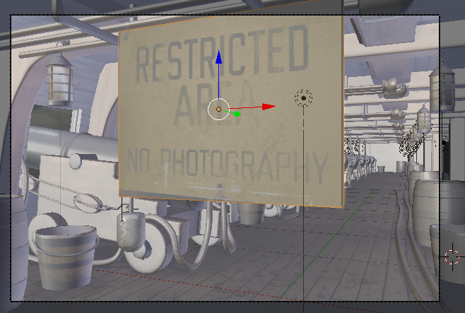
Dave
Copy link to clipboard
Copied
Yes! That's exactly it! Just a tiny bit too much perspective on that lower edge. That's just how much I would have corrected it in retrospect.
But then, it's always the little imperfections that make it interesting, isn't it...
Copy link to clipboard
Copied
One of the first things I do with a SFTW, or any other composite, is set up a Lazy Nezumi Vanishing Lines perspective aid, but I could only do a single point perspective on this one, because there isn't enough information to add any more vanishing points. LNP allows up to six VPs in this mode, but you can see I have turned off all but one.

I wasn't sure if Dave made the ceiling beams parallel, but assuming they are, and turning on another VP in LNP, does make it look like they are.
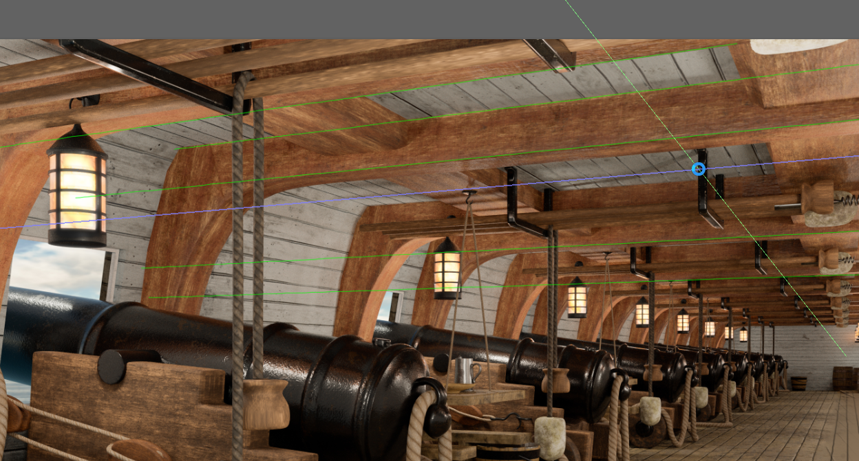
In which case we can use LNP's Vanishing Lines preset to draw the sign.
Note I had to turn on a third VP, but with nothing to reference it to I used the left and right sides of the image, and made it perfectly vertical. That would be right for single point perspective.

If you have Lazy Nezumi Pro and like to draw, or put stuff up for Dave's SFTW threads, do try Vanishing Lines. It is very easy to set up, and incredibly useful. LNP has other perspective presets, which are also useful, but not _quite_ as easy to set up and use.

Copy link to clipboard
Copied
Too bad Lazy Nezumi Pro is Windows only, Trevor.Dennis.
Copy link to clipboard
Copied
jane-e wrote
Too bad Lazy Nezumi Pro is Windows only, Trevor.Dennis .
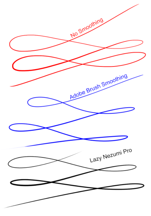
I've asked Guillaume several time if will ever get round to coding it for OSX, but he said that it was very unlikely. This before brush smoothing was introduced with CC 2017, so you'd have to think there would be even less chance. I still use LNP for smoothing, but Id thought that Adobe's brush smoothing was fairly close to LNP. I've just spent 15 minutes practicing, and discovered that I can't get close to the flowing loops with Adobe smoothing, compared to LNP. I thought it might be practice, and finding settings that worked for, which is why it took mew so long — I wanted it to be a fair test.
I couldn't even get the feel for line thickness with Adobe smoothing. It felt clumsy and frustrating. I put the no smoothing line up as a control, and you need to know it took me a few practice strokes to get it even that good.
And line smoothing is just a tiny bit of what LNP does. It has a ton of presets, and each time you look a bit deeper, you find that Guillaume has added another function.


Here you go. I just found this and didn't know that LNP can now do gear teeth in an ellipse.
So I am really sorry that LNP is unlikely to become available for the Mac. It costs US$35 to buy a permanent license for LNP, and you can use it on all your devices (OS allowing). But if you want to stay current with the updates, and they are frequent, and seriously useful, then I think it is something like $15 a year. Guillaume knows I champion his product, and a couple of years ago he offered to waive the update fee for me. I told him I get so much pleasure from using LNP, I'd rather pay my tiny bit towards the ongoing updates. LNP makes me feel like I am better than I really am. It's a graphic equivalent of that Autotune software that helps shite pop singers sing in tune.
Copy link to clipboard
Copied
Copy link to clipboard
Copied
wow thats state of the art Mac... how many hours did this take to rendor?
Copy link to clipboard
Copied

On the subject of perspective, can you look at my John Lennon quote, davescm? I wasn't happy with it, but then I realized the beams are shorter on the left then they are on the right, so it is aligned to the bottom edge. Maybe I should have increased the size on the right to match the beams?
Copy link to clipboard
Copied
jane-e wrote
On the subject of perspective, can you look at my John Lennon quote, davescm ? I wasn't happy with it, but then I realized the beams are shorter on the left then they are on the right, so it is aligned to the bottom edge. Maybe I should have increases the size on the right to match the beams?
Hi Jane
The side to side perspective of your lettering is fine but it needs to be skewed slightly, taking the top edge to the right, to make the letters vertical. See the grid overlayed on the beam below:

Trevor - yes the beams are parallel in my model

That LNP Vanishing point does look useful. You can also use Vanishing Point in Photoshop and then, before exiting VP, check "Render Grids to Photoshop" to drop them into a layer in Photoshop. Adding a stroke in layer styles makes them easier to see.
Dave
Copy link to clipboard
Copied
Something for the weekend(s) 34 - 42.
You may have closer looks (opening in new tabs/windows), unless you consider it cheating.
http://www.bugge.com/Family-and-friends/Illy/Images/SFTW34…
http://www.bugge.com/Family-and-friends/Illy/Images/SFTW34…

 AdChoices