 Adobe Community
DISCUSS: Redesigned header bar
Copy link to clipboard
Copied
The new header bar provides a centralized navigation within Premiere Pro (Beta), connecting the core phases in the editing process: Import, Edit, and Export. The new header bar will be a common design element across the Creative Cloud applications to help users orient themselves more easily within different creative cloud apps.
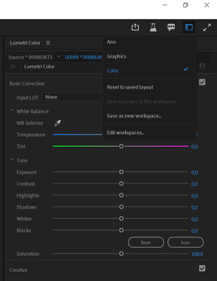
Switch between modes on the left: Import to get footage in, Edit to do all your creative work, and Export to get sequences exported for various destinations. Workspaces have been relocated into a dropdown menu on the right. This is a much better use of space.
More detailed info on the workflows: New import & export in Premiere Pro (Beta)
FAQ: FAQ | New import and export in Premiere Pro (Beta)
We want to know what you think about the new header bar. Please join the conversation below.
To leave comments about the new Import and Export workflows, please visit these dedicated pages:
Copy link to clipboard
Copied
Hi, the last source location is sticky between sessions when you use the Import workflow, so you can set up your own favorite source and its file path will be remembered if you park the view there. Otherwise, it'll remember the last location you navigated to import media from, not the Sample Media.
Would being able to twirl up (collapse) the navigation section headers (Favorites, Local, Devices, etc..) be sufficient for you?
The Project Settings dialog (and its ingest settings) isn't available yet while in the Import mode, but we plan to add that soon. As a workaround, you can create your new project without importing any clips, access the Project Settings dialog from within the Edit mode, set your ingest preferences, and then use Import to bring in your media.
Exit button: earlier in the design it was a "Cancel" button, which allowed you to back out of the session, resetting the params/state to whatever it was when you entered the session. So it worked like a dialog's Cancel button. Switching using the header tabs preserved any work you did in the session, and we felt that was the more important workflow, so we changed the button name to Exit to make that behavior more clear. We also thought it would be good to give users a more obvious way out of the Import and Export tabs so they wouldn't get stuck because they hadn't learned to use the tabs in the header bar, but that choice is looking to be too conservative. We're considering removing the Exit button from both Import and Export tabs, so users would just have to figure out how to navigate right away.
Thanks for the detailed feedback, we'll take it into consideration.
Copy link to clipboard
Copied
Hi, the last source location is sticky between sessions when you use the Import workflow, so you can set up your own favorite source and its file path will be remembered if you park the view there. Otherwise, it'll remember the last location you navigated to import media from, not the Sample Media.
Thanks David. On my system the 'previous location' memory is only valid whilst the application is running, it doesn't persist between sessions (assuming by session you mean application restarts). If I create my own favourite location(s) they are correctly listed under 'Favorites' and those favourite locations persist bewteen restarts as expected ... and can also be removed as expected... but the deault location, on my system, after a restart is always 'Sample Media' and, as previously noted, I don't seem to be able to remove that default location from Favorites.
Would being able to twirl up (collapse) the navigation section headers (Favorites, Local, Devices, etc..) be sufficient for you?
Absolutely. That would be great, thank you.
Cheers
Andy
Copy link to clipboard
Copied
As someone who likes reducing the amount of mouse clicks and keyboard shortcuts to one button using macros, I have to agree with most people that having to use 2 clicks is a bit annoying, although it does look nice. Would be nice to have the option to change the layout between the old and new. Maybe a button to open all the tabs as before and then minimise it? I dunno. I could map them to a keyboard shortcut but I alreadyt have a lot mapped and don't want to use another one just for workspaces.
Would rather have the workspaces layed out where the project name is. I personally don't see a reason for it to be there. I've never had a problem keeping tabs on where I am so it feels like wasted space. But those are just my opinions.
Copy link to clipboard
Copied
There are default keyboard shortcuts assigned to the standard workspaces.
If you go to the main menu Window>Workspaces you will see the default keyboard shortcuts (they can be re-assigned to other standard or custom workspaces that you use).
Copy link to clipboard
Copied
OK,
if there is to be a new :EXPORT bar , why can't AAF, OMF, EDL be exported this way? Don't you think it should be finally consistent ?
Copy link to clipboard
Copied
Were you thinking you'd enter Export and there would be additional accordion sections in the settings column for AAF, OMF and EDL? Unless you also wanted to export a media file/social destination at the same time, you'd need to disable the video and audio accordion sections. Very interesting idea. Seems like a lot of UI configuring would be required to just export a simple OMF, but I'd like to hear what others think.
Copy link to clipboard
Copied
In my opinion, this should be in one place..
When you edit footage , then in the professional world , both sound and color grading are done by other people . So naturally I send them video EDL or AAF and OMF options . Let's be honest this is not done on Audition or Lumetri , only on Davinci and Protools . so the import options should be in the same place ...
Copy link to clipboard
Copied
Export of course , sorry for my mistake 🙂
Copy link to clipboard
Copied
I'd agree it would be nice to have ALL deliverables set from the same place ... and this new export page should be it, in my never humble opinion.
There are some professional facilities that do some entire jobs in the Adobe apps. But as woyteks notes, most don't at this time. As someone who works mostly in the Adobe apps but some in Resolve, and with a lot of people based in Resolve, I'm for anything that makes the process of round-tripping easier.
Neil
Copy link to clipboard
Copied
Still don't like the new workspace icon.
Too much clicking.
But I gather it's not going to go away, so here a suggestion to put the icon first in line as it's probably going to be the most used icon of the lot.
Copy link to clipboard
Copied
Another reason I don't like it, it does not stand out from the background.
Text over text in nearly the same background color.
Copy link to clipboard
Copied
The look of the new header bar is fine and is pretty clean. However, having access to quick, visible workspaces is more useful than having to click the dropdown menu and then click the one you would like to use. At the moment, there is a lot of unused space to the right and left of the Project title, what if the project title were to be highlighted in that blue color and we could place a set amount of workspaces to the right of it with the dropdown menu acting as the overflow button? I constantly switch between edit, audio and caption workspaces and going through a menu instead of a single click in a specified locations would definitely take longer.
Copy link to clipboard
Copied
If someone tells that 2 clicks is better than 1 click then it raises more questions than gives answers.
UX guidelines are pretty straight forward in this sense - Less is more.
To be honest I don't care too much about the clean look. I don't need empty useless space on my screen: I do work with it.
Why not put all buttons under menus then if the clean look is the goal?
I switch between 2-3 main workspaces and the rest could be hidden behind 5 clicks as far as i care.
But yeah The pretty much empty top bar feels useless. Hide it all together then and give more screen realestate for timeline or smth.
Copy link to clipboard
Copied
Just realized i can't tell from anywhere in which workspace I am at the moment, it sucks even more.
Copy link to clipboard
Copied
I'm so tired of having the navigation changed constantly. I don't care if it might be more efficient I just want it the same
Copy link to clipboard
Copied
After working in this for hours and weeks now, I can with total confidence ...
I HATE THE NEW HEADER BAR WITH A PURPLE PASSION!
AND YES, I'M SHOUTING!
As noted by others, this change leaves blank space instead of using it ... which in and of itself is DUMB.
We can't SEE which workspace we're in, which is STOOOOPID to the MAX.
It makes me hunt way off to one upper corner to mouse to another workspace.
It has a whole lotta stooopid, and absolutely no upside nor reason for being.
Sorry, @Francis-Crossman ... your folks blew it on this one.
In my always most humble opinion.
Neil
Copy link to clipboard
Copied
This workspace is so annoying, clicking more than ever.
Being in the right upper corner instead of the middle.
Might be fine for Ps but not Pr.
Why cannot we have the same as Ae.
or Au
Copy link to clipboard
Copied
But tell us how you REALLY feel, Neil . . . Listen, I get it, muscle memory is a hard thing to change and I also agree that adding more clicks to achieve the same thing is almost never the right approach – we are investigating ways to address that part. Believe it or not, I fealt the same way as you at first (you can pry the workspaces out of my cold dead hands!). But I have been editing with this new setup for some months now and I've learned to like it mcuh better - it's cleaner - and I don't notice any reduction is productivity. It's honestly a much better use of space. The header bar of any app is prime realstate that should be researved for top level key actions and feedback. We don't feel the workspaces meet that criteria. Also - we have a longer term vision for the header bar and workspaces in general. If we reduced the number of clicks (somehow) and had some way to show you the current workspace you are in – would that talk you off the ledge a bit?
Hey - for everyone else in the thread, Neil and I actually know eachother pretty well so it's ok for him to yell at me a little when he thinks I'm getting it a bit wrong, but just a gentle reminder to everyone to keep the discourse civil and polite. Thanks for your pasionate feedback, Neil, that's one of the many reasons I like you.
Copy link to clipboard
Copied
Hey Francis! 😉
The biggest plain no-no of the current setup is that it doesn't show which workspace you're in. I've got a number of private communications on this ... and well, on this issue, I agree with them.
There's simply a BLANK space there ... with nothing in it. Why the the current workspace isn't showing is just ... weird. Everytime I work in it ... which has been MANY hours a day getting the MAX program ready ... that just always seems odd.
And I'm having to work at remembering MORE keyboard shorts, as it's just a royal PITA to go all the way to the right corner, click, scroll, click. Then move back to the working area.
The export dialog, totally agnostic on. Don't mind it, but what the hay ... and my does that rub some folks raw. Me, again, just agnostic.
The Workspace thing ... yea, that is MY thing to gripe about!
Neil
Copy link to clipboard
Copied
perdere un'efficienza del flusso di lavoro così critica da essere in grado di fare clic con un solo clic direttamente in un'area di lavoro è una grande perdita.
Copy link to clipboard
Copied
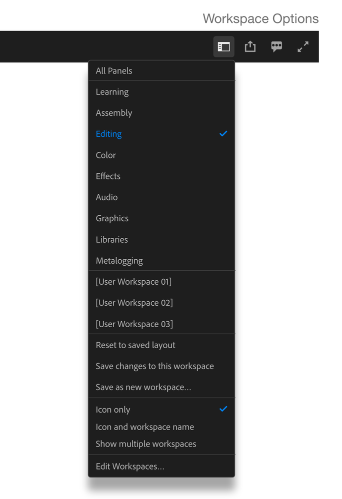
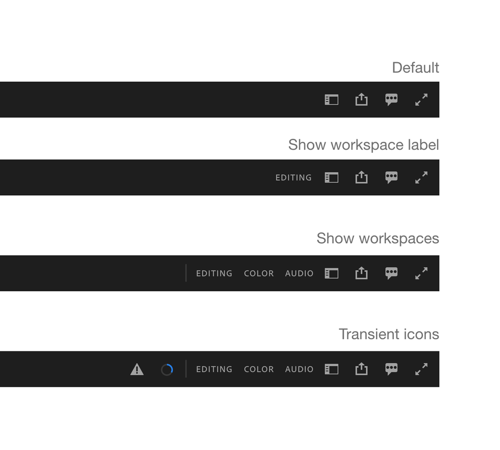
We have a proposal that we think solves two problems that people are expressing here: too many clicks and not knowing which workspace you are in. Please look at the the following mockups – this is the experience:
- Default state = compact - icon only, no workspace name
- Open the dropdown to switch between three states (icon only, show workspace name, show multiple workspaces)
- When "show workspace name" is enabled, the name of the workspace would always be visible to the left of the workspace switcher icon.
- When "show multiple workspaces" is enabled you'd see the top 3 workspaces but there would be a gripper tool to the left to drag out more or less workspaces. You could then click on these to switch workspaces in the way you are accustomed to today. You can always rearrange the order of your workspaces so the ones you use most are at the top of the dropdown list and therefore would be displayed.
- Notice that there are transient icons that appear and diapear as necesarry. These are to the left of the workspaces.
- The choice would be sticky and saved in the application preferences, so if you prefer to see just the active workspace, or several, you just need to make that choice once and that persists across all your projects.
Feedback and thoughts are welcome.
Copy link to clipboard
Copied
Yes this is certainly better, though i would rather have the default different depending on screen size, because I would always want the 3 showing.
- Jonah Lee Walker
Video Editor, Colorist, Motion Graphics Artist
Copy link to clipboard
Copied
That looks like a definite improvement. I think I would use the "Show workspaces" as my default.
I don't quite understand about the transint icons.
Copy link to clipboard
Copied
Show workspaces would be my default setting too.
I can live with just 3 workspaces showing, but the active one needs to be highlighted.
Copy link to clipboard
Copied
Yes absolutely the active one needs to be highlighted.
- Jonah Lee Walker
Video Editor, Colorist, Motion Graphics Artist


