- Home
- Premiere Pro (Beta)
- Discussions
- Re: DISCUSS: Workspace switcher improvements in th...
- Re: DISCUSS: Workspace switcher improvements in th...
DISCUSS: Workspace switcher improvements in the header bar
Copy link to clipboard
Copied
We made some changes to the header bar and received some feedback from the beta community that has now been addressed. Follow the original thread here: https://community.adobe.com/t5/premiere-pro-beta-discussions/discuss-redesigned-header-bar/td-p/1212...
There are three main issues that we believe we have solved with this change:
- Show the workspace you are currently using
- Switch workspaces with 1 click, not 2
- Retain double click to reset the workspace
Here are the options
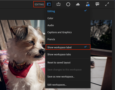
You now have two different options for showing workspace names, just the active one, or all. The default is still to not show workspace name.
Show workspace label
- Just shows the active workspace name
- Change workspaces from the dropdown menu
- Double click workspace label to reset to saved layout
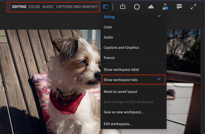
Show workspace tabs
- Show all your workspaces in a compact view
- The active workspace is highlighted
- Click on a workspace to activate it
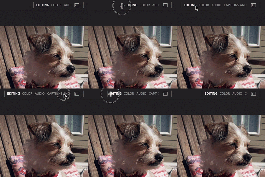
- Double click to reset
- Scroll the view left and right
- Drag the left divider bar to expand the area to show more workspaces
- If you select a workspace from the dropdown or Window menu, the active workspace will scroll into view
Pro tip
If you are like me, you probably only use 3 or 4 workspaces (mine are Editing, Audio, Color and Captions & Graphics and a custom workspace.) You can reduce the number of workspaces that show up in the list by choosing “Edit Workspaces” and dragging the ones you don’t use to below the “Do Not Show” line. You can also drag the workspaces into the order you want, maybe based on the way you typically make your way through a workflow.
We want to know what you think. Please join the conversation below.
Copy link to clipboard
Copied
Thanks, Francis!
I've got what ... seven, I think?
Neil
Copy link to clipboard
Copied
Well, you are special, Neil 😉 and we support seven or more workspaces in the new design no problem.
Copy link to clipboard
Copied
Yes this looks better. Looking forward to trying it out.
- Jonah Lee Walker
Video Editor, Colorist, Motion Graphics Artist
Copy link to clipboard
Copied
Looks a lot better.
When is this going live.
Cannot wait to test.
Copy link to clipboard
Copied
I'm glad this is looking good to you. These changes are live in the beta right now (as of Friday Feb 25 '22 - ver 22.3.0 build 86). I look forward to your feedback!
Copy link to clipboard
Copied
I usually have 3 to 4 workspaces
I like it very much: especially being able to drag to expand.
Resetting is now easy peasy.
Thumbs up.
Copy link to clipboard
Copied
Tested.
The good:
Nice and clean. Switching with minimal effort. Works for me!
The not-so-bad:
Switching is still not instant and takes a second to 're-draw'.
Thanks!
Copy link to clipboard
Copied
Yes, I like this. Without reading all the directions (sorry!), it was intuitive to resize the tab area, and then move many of the tabs to do not show area. At first I thought it was going to be hard to get to the "do not show" items, but then discovered that the Window -> Workspaces gets you to whatever is needed.
I am using very few custom workspaces at the moment, but it looks like the is a very robust solution for standard and custom workspaces.
I assume Captions and Graphics will be removed for the Captions and Graphics tab? A custom workspace could handle the only difference I could see (Graphics defaults to the Effects Panel; Captions to the Text Panel).
I hated to old (new/Beta) method. Loving this.
Stan
Copy link to clipboard
Copied
This is vastly improved, thank you!
Now, I'd still like to get a couple more workspaces displayed of course ...
Neil
Copy link to clipboard
Copied
Drag the space out.... Oh, but it will only show up to, I think, a certain number of characters. I can get 9 workspaces with "Captions and Graphics," and 10 if I use a single word space instead of that 3 word one.... On a 4K monitor.
Keep your custom names short?
Stan
Copy link to clipboard
Copied
Yea, I think I'll have to work at shortening the names. I also number them to keep them in order, make keyboard shorts work.
Neil
Copy link to clipboard
Copied
Thanks for this update!
This is miles better than initial plans and the old way.
Nice job.
I don't know how I feel about the forced all caps eventhough I personally always do this for my custom layouts but maybe because that separated them from the defaults which you can't see anymore now. It reads better in general but maybe there are users that would prefer the inclusion of small caps.
Copy link to clipboard
Copied
Unfortunately, Pr beta crashes on resetting custom workspace. (build 94)
Copy link to clipboard
Copied
Sorry to hear that, Ann. You are on Windows, right? Would you be able to share your custom workspace with us?
Copy link to clipboard
Copied
Yes, you want an empty project?
Copy link to clipboard
Copied
or profile folders?
Copy link to clipboard
Copied
Actually both would be helpful - I'll DM you.
Copy link to clipboard
Copied
This is much improved and addresses my concerns. I love it!
It's nice that there are options for small but impactful changes like this. I prefer to show the labels and expand the menu as far as it will go.
The CAPS and highlighting of the text looks clean and is easy to read.
Copy link to clipboard
Copied
A little late to the party here since I haven't hopped on the forums in a while - but I'm just wanted to echo what others have been saying. This is a much improved design, great work team! (I'm digging the 'all caps' treatment too)
I haven't given a beta build in a spin in a while, but I'll be sure to do so soon and check this out!
Copy link to clipboard
Copied
Helpful info here, as keeping tabs for frequent workspaces is easier than having to drill down into a drop down menu...or remember even more keyboard modifyers. Changing layouts does seem a bit slower though, as mentioned by another commentator.
Copy link to clipboard
Copied
This is a big improvement thanks all
Copy link to clipboard
Copied
We want to know what you think. Please join the conversation below.
By @Francis-Crossman
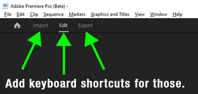
Will the be any assignable keyboard shortcuts for the High-level-navigation?
I tried to find them in version 22.4.0 (Build 31) but cannot find anything regarding those. Ctrl+M Works today for taking me to the Export section but there is no way that i am aware of that can take me back to Edit or Import unless i click on Edit.
It happens from time to time that one today launch the Export window and need to get back to the timeline only to check something, such as "-Did i really mute Audio 5?". So going back and forth in a convinient non-click-click-click-way is highly desirable.
Ctrl+M only works if i have an active Timeline/Source panel or if i select a Timeline/clip in the Project panel
Don´t hard code them into the app such as the Maximize App Window command is today in Premiere Pro. For me and other users with a non-US keyboard there is no native \-key on the keyboard so it´s useless.
BTW, Maximize App Window can be assigned in the Keyboard Shortcuts dialog in After Effects. Make this happen in Premiere Pro as well. *hint-hint* 😉
Copy link to clipboard
Copied
Its getting better by the day..........
The Default workspace looks almost like my custom workspace I have been using for years.
Find more inspiration, events, and resources on the new Adobe Community
Explore Now

