• Global community
    • Language:
      • Deutsch
      • English
      • Español
      • Français
      • Português
  • 日本語コミュニティ
    Dedicated community for Japanese speakers
  • 한국 커뮤니티
    Dedicated community for Korean speakers
Exit
0

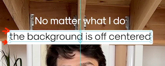
Background text off-centered in Essential Graphics

Community Beginner ,
Nov 29, 2024 Nov 29, 2024

Copy link to clipboard

Copied

Hi all!

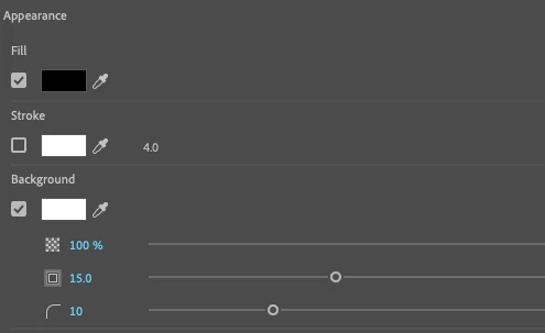
I'm trying to replace our mogrt templates using text-linked styles to make it easier for our editors to apply our clients' approved fonts/colors/styles, but I ran into this issue that's driving me crazy. When I toggle on the background on the Essential Graphics panel, the background has more space on the bottom and looks off. I can't find a way to adjust it to make it centered.


Screenshot 2024-11-29 at 4.37.13 p.m..png  Screenshot 2024-11-29 at 4.36.43 p.m..png


Needless to say, I can't use any random fonts since each client has its brand-approved ones. This makes the text-linked style feature useless for my use case.


I'm trying to avoid using mogrts as much as possible since they slow down our editor's systems unnecessarily.


Any recommendations?


Thanks for your help.


Mario

Views

350

Translate

Translate

Report

Report
Community guidelines
Be kind and respectful, give credit to the original source of content, and search for duplicates before posting. Learn more
community guidelines
LEGEND ,
Nov 29, 2024 Nov 29, 2024

Copy link to clipboard

Copied

I think that is the space designed to allow for "ligatures", the parts of letters like lower case p & g, that go down below the line.


If you add those, does it still look "off"?

Votes

Translate

Translate

Report

Report
Community guidelines
Be kind and respectful, give credit to the original source of content, and search for duplicates before posting. Learn more
community guidelines
Community Beginner ,
Nov 29, 2024 Nov 29, 2024

Copy link to clipboard

Copied

Hey Neil, thanks for your answer!


Unfortunately, it does. At this point, I have browsed through hundreds of posts on Reddit and various other forums, and it seems that everyone has resolved this issue by using specific fonts that don't cause problems. However, in my case, that's not an option. 


Votes

Translate

Translate

Report

Report
Community guidelines
Be kind and respectful, give credit to the original source of content, and search for duplicates before posting. Learn more
community guidelines
LEGEND ,
Nov 29, 2024 Nov 29, 2024

Copy link to clipboard

Copied

Yea, like Stan says so well, the whole balancing text against the background box is quite a design consideration. Which graphics design artists state as a reason 'amateurs' should leave graphics/text design to them.


I dunno about you, but I ain't got that budget ... 😉

Votes

Translate

Translate

Report

Report
Community guidelines
Be kind and respectful, give credit to the original source of content, and search for duplicates before posting. Learn more
community guidelines
Community Beginner ,
Nov 29, 2024 Nov 29, 2024

Copy link to clipboard

Copied

Yeah, I know. The thing is that this issue is limiting the functionality of a really cool feature that could potentially save a ton of time to a lot of users. Kinda defeats the purpose.

Votes

Translate

Translate

Report

Report
Community guidelines
Be kind and respectful, give credit to the original source of content, and search for duplicates before posting. Learn more
community guidelines
Community Expert ,
Nov 29, 2024 Nov 29, 2024

Copy link to clipboard

Copied

The solution is to use only words with letters with no descenders nor ascenders. lol. And yes, the challenge of centering text on a background is one of the reasons that small caps fonts gets used.


The solution is more complicated than it appears, and the current reality is that the "automatic" background setting does not allow enough control. But the other problem is that there is no single setting that works all the time.


Note that the best comparison of the various options is with the text box NOT showing.


And consider the background for a word with only base characters (e.g. "ounce"). It is not as tall as the background for a word with only descenders (e.g. "grape") nor only ascenders (e.g. "this"); but those two are the same size. But they do not line up!


Here was an interesting discussion of this:

https://community.adobe.com/t5/premiere-pro-beta-discussions/offset-position-control-for-text-appear...


@jstrawn @Kes Akalaonu Any thoughts? Is pinning something that can be used in a mogrt? In a text style?


Stan


Votes

Translate

Translate

Report

Report
Community guidelines
Be kind and respectful, give credit to the original source of content, and search for duplicates before posting. Learn more
community guidelines
Community Expert ,
Dec 01, 2024 Dec 01, 2024

Copy link to clipboard

Copied

From experience, this feels like After Effects lane than Premiere's Essential Graphics options tbh

Votes

Translate

Translate

Report

Report
Community guidelines
Be kind and respectful, give credit to the original source of content, and search for duplicates before posting. Learn more
community guidelines
Community Expert ,
Dec 02, 2024 Dec 02, 2024

Copy link to clipboard

Copied

To center and align background text accurately in Essential Graphics, you can use a shape layer with Responsive Design.

Here's how:

  1. Create a new shape layer sized to match your desired background dimensions.
  2. In the Properties panel, select this shape layer and scroll down to the Responsive Design section.
  3. Set the Pin To option to your text layer. Then, click the center of the box next to the dropdown to pin all sides of the shape to the text layer. This will dynamically adjust the background as you add or remove text.


For more detailed instructions, you can refer to Adobe's official guide on Responsive Design features.

Votes

Translate

Translate

Report

Report
Community guidelines
Be kind and respectful, give credit to the original source of content, and search for duplicates before posting. Learn more
community guidelines
Community Expert ,
Dec 02, 2024 Dec 02, 2024

Copy link to clipboard

Copied

@PaulMurphy,


Thanks!


I have not played with the responsive design. I did a quick test. I started with text with no descenders, turned on the auto-background, matched a shape to it, and set the responsive design as you indicate. If I add a descender letter, the auto-background adds about 25 pixels (in a 1080 sequence). The responsive design adds about 12. So it is an improvement in terms of what @Mario37140797pky9 wants.


But he is trying to automate this without mogrts. A text style won't add a shape, right? But maybe a simple mogrt adding a text layer and a shape pinned to it?


Stan


Votes

Translate

Translate

Report

Report
Community guidelines
Be kind and respectful, give credit to the original source of content, and search for duplicates before posting. Learn more
community guidelines
Community Expert ,
Dec 02, 2024 Dec 02, 2024

Copy link to clipboard

Copied

A text style can't hold a shape but a Premiere MOGRT saved to the Graphics Templates can

Votes

Translate

Translate

Report

Report
Community guidelines
Be kind and respectful, give credit to the original source of content, and search for duplicates before posting. Learn more
community guidelines
Community Beginner ,
Dec 04, 2024 Dec 04, 2024

Copy link to clipboard

Copied

Thanks for the follow-up, Paul!


Yes, I know we can create an accurately centered background using a shape layer, but what we are trying to accomplish here is different. We are a company with over 100 editors creating multiple iterations of our videos and adapting them for different plarforms, often times updating them to match client's copy tratment rules. 


Imagine you have 30 editors working in slightly different versions of the very same project, for different platforms and each platform has its distictive "native look". Wouldn't be nice to select all the text layers and apply them the client pre-approved style with one (or a few) click? That was our initial thougth. Unfortunately most of our Social Media posts need to have a white background as shown in the image I shared. There's no way ourselves (let alone our clients) are going to approve a text that looks off centered like that. So basically, we need to find another solution. As I satated earlier, using MoGRTs (what we are currently using) isn't the solution we are looking for to speed up our workflow.


Is really frustrating feel the solution is so close, but so far away at the same time. 

Votes

Translate

Translate

Report

Report
Community guidelines
Be kind and respectful, give credit to the original source of content, and search for duplicates before posting. Learn more
community guidelines
LEGEND ,
Dec 04, 2024 Dec 04, 2024

Copy link to clipboard

Copied

If, when creating the mogrts in AfterEffects, you build those options into the mogrt's Editor choices, you can set them for editors to simply select. Jarle Leirpoll has taught how to both create and distribute such mogrts.

Votes

Translate

Translate

Report

Report
Community guidelines
Be kind and respectful, give credit to the original source of content, and search for duplicates before posting. Learn more
community guidelines
Community Expert ,
Dec 04, 2024 Dec 04, 2024

Copy link to clipboard

Copied

LATEST

A quick solution is to enable the background in the Essential Graphics panel but set the size to 0 so it doesn’t extend beyond the edges of the text.

Next, add four instances of the Drop Shadow effect to the text, using the same color as the background. Set the Direction for each effect in 90-degree increments (e.g., 0°, 90°, 180°, and 270°) to create an even border around the text. Make sure the background opacity is set to 100%.

To streamline the process for future projects, save the group of Drop Shadows as a custom preset that your editors can quickly apply.

Votes

Translate

Translate

Report

Report
Community guidelines
Be kind and respectful, give credit to the original source of content, and search for duplicates before posting. Learn more
community guidelines
Adobe Employee ,
Dec 04, 2024 Dec 04, 2024

Copy link to clipboard

Copied

I was re-assigned from Pr Graphics to a different PrPro dev team a while back so I don't get to browse Graphics specific topics on the forums nearly as much as I used to. So, sorry if I'm too late to this discussion. Let me respond to a few things I read above:
(1) What you @Mario37140797pky9 are seeing is an inherent of how fonts or designed and displayed in most Adobe apps. The background is using the center of the text string to determine how the background fits behind it. This is affected by ascenders and descenders, which very in length by font.
Note: Ligatures are when two characters become joined, like Th and ff and only happen with certain fonts. @R Neil Haugen 
(2) Pinning (aka Responsive Design - Position) is the correct approach to allow you to center the background yourself because then you will have two separate layers... a text and a shape. For a single lien of text, make a background shape and then pin the text to it on the left and right sides. That way your editors can change the text string and the width of the shape will respond to stayed center. You can always move the y position up or down a little to keep that part centered without affecting the pinning. It;s kind of hard to explain how it all work, but if you just try it, it should be pretty intuitive.
(3) You can still make mogrts our of Pr Graphics with pinning and they should require minimal tweaks by the end users to keep them looking right.


Votes

Translate

Translate

Report

Report
Community guidelines
Be kind and respectful, give credit to the original source of content, and search for duplicates before posting. Learn more
community guidelines
LEGEND ,
Dec 04, 2024 Dec 04, 2024

Copy link to clipboard

Copied

James ... thanks for both the corrections and the information on using pinning. 

Votes

Translate

Translate

Report

Report
Community guidelines
Be kind and respectful, give credit to the original source of content, and search for duplicates before posting. Learn more
community guidelines