Answered
Poor UX in New Project dialog
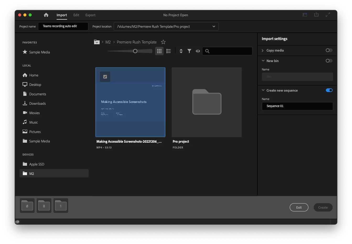
Premiere Pro 2022 first -abysmal- impressions.
I have been using pro software including Adobe software for 30 years. I am getting started with Premiere Pro 2022 after skipping many versions and this is the first time I am completely stuck on the second click.
The UX design of the create new dialog is so poor that I can't get past the create new project dialog. The Create button remains greyed out no matter what I select...
No guidance, no logic, no common sense... Are there UX designers at Adobe??
So yes, I will open the manual. But really, how did Adobe came this low in usability?