Participant
March 2, 2020
Question

Program monitor color

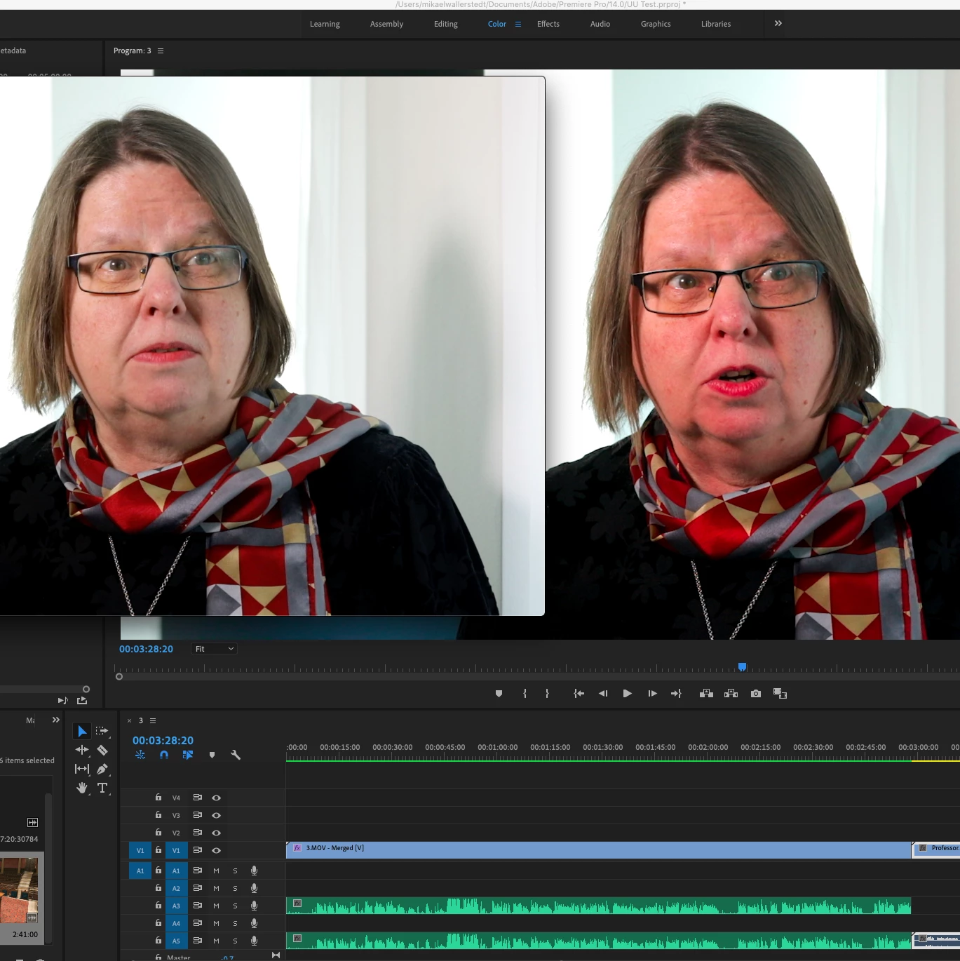
I'm importing a file to premiere. I export it in H.264. The left is the exported file and the right one is the program monitor. You can see the differens. 


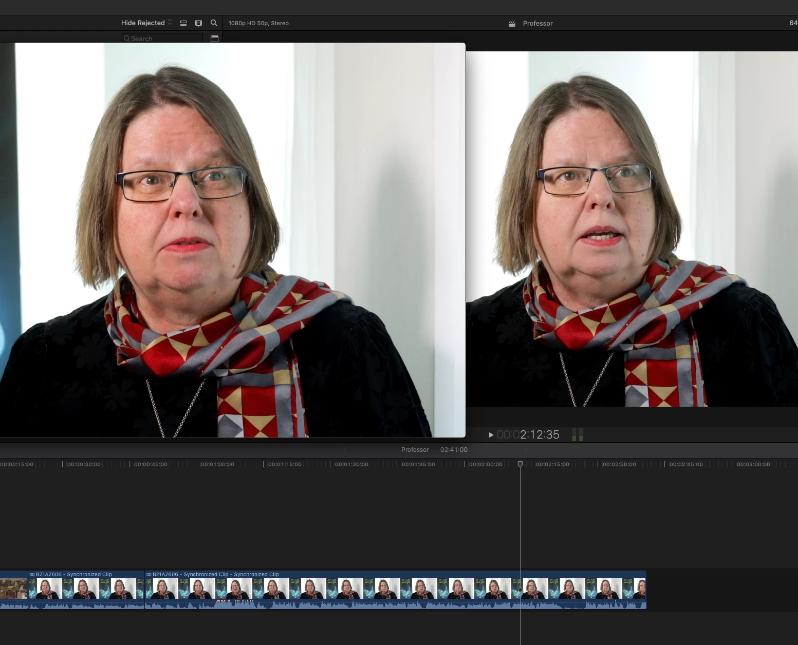
I import a file to final cut pro. I export it in H.264. The left is the exported and the right is the program monitor. It look very similar.
Why is the monitor image in the premiere so wrong? How do I fix this?


Ce sujet a été fermé aux réponses.

3 commentaires

Inspiring
March 2, 2020

I haven't really been thrilled with what I upload to youtube or vimeo.. compared to what I see in my reference monitor.. but I try not to sweat the small stuff... like, if I see your images on my junky laptop and the right one looks warmer than the left.. in your first example, and then with FCP you think it's more "accurate". I have no clue what other people are seeing it on.. their phones ??


You have to talk to the people who shoot the stuff and others that edit the stuff, and figure out where you fit in,... for that particular time in your life. If you wanna be a post house of editing and so on... (SFX, VFX, Audio, etc. ) then you're gonna have to buy some expensive stuff...and THAT standard is quickly becoming irrelevant in the commercial world of movies and episodic TV , etc.


Inspiring
March 2, 2020

she looks like a nice woman yappin about something on camera. good going !


🙂


Kevin J. Monahan Jr.
Community Manager
Community Manager
March 2, 2020

Hi Mikael,

Check out this FAQ:  "Why does my footage look darker in Premiere?"


Thank You,
Kevin

Kevin Monahan - Sr. Community and Engagement Strategist – Adobe Pro Video and Audio
Participant
March 2, 2020

Tank you Kevin. 

Ill look in to it 🙂

Kind regards

Mikael

R Neil Haugen
Legend
March 2, 2020

Premiere Pro is designed to run on a system built to pro standards ... which for video production means tightly controlled calibration set to:


  • video sRGB color primaries;
  • Bt.(Rec) 709 color standard including both the camera and display transform functions'
  • gamma of 2.4, although for some bright-room situations 2.2 may be used;
  • screen brightness of 100 nits in semi-darkened room, 120 in moderately bright, and 80 in darkened room.


You are using a Mac with a Retina montor and that rig uses the Display-P3 color "space", a very ... unique ... Apple creation. It also uses the Mac ColorSync utility, which again ... applies a very ... unique ... set of image standards.


The Apple Display-P3 color space uses the wider P3 primaries, and yea, more color is prettier, and can be more saturated. When used appropriately for images supposed to be in that color space, it's great. But that is not a color space used for any professional video work. Period.


That's your first problem.


The second one you're facing is the Mac ColorSync utility ... let's go through the application of factors by that OS utility:

  • remapping of video sRGB within the P3 monitor-native space is not particularly accurate;
  • it applies only the first part of the Bt.(Rec) 709 standard, the camera transform ... but not the second, and equally crucial, display transform function;
  • gamma is listed as 'sRGB' ... but in reality is sorta similar but not exactly the same as 1.96 with an odd flat space near the bottom;
  • brightness expected of Retinal monitors is somewhere up approaching 500 nits.


The end result is the remapping of video sRGB within the Display-P3 'space' is not necessarily ... accurate; the mis-application of the Bt.(Rec) 709 standard means the appropriate inverse display transform function (meant to counter the camera transform) is not applied ... a major problem in and of itself; the gamma is off, making especially the shadows lighter and for much of the image, often dropping apparent saturation; and viewing on such a bright screen takes the image out of any comparative situation also.


Premiere is expecting you to be working on a properly setup and controlled monitor for video production. FCPx, the "house app" ... is designed to work only within the Mac OS, and that includes being used on a Retina monitor and the ColorSync utility. So it has a certain ... um ... awareness? ... of the troubles it faces. Some say it's "juiced" to work within a non-standard environment and appear to be working correctly.


But there is a third problem that you didn't mention ... what does your media look like on other systems, especially non-Mac systems, and ... even better, properly setup and calibrated systems?


Why is that important? All professional media is produced according to those standards. NO other consumer device or system of course ever shows the media exactly as it was on the full-on reference system. However ... as all full-on reference systems are very, very close to each other ... anything produced to those standards looks relatively the same on any particular consumer device as other pro produced media on that device.


If you try and out-guess what anything would look like "out there" ... so say, you raise contrast or saturation ... when that is seen on other systems, the changes you made make it look not like pro produced media. Here's an article explaining this quite well, by the head of one of the two companies that produce the software used by professional colorists to calibrate and profile their viewing system. It also includes a quick discussion of the Mac OS/Retina situation.


Why Master On A Calibrated Display?


There's a long thread on this forum by Support staffer Caroline Sears and then-color-engineer Francis Crossman that includes Adobe's study of the Mac/Retina situation and a discussion of the efforts they've made to help users get through it:


Why does my color look different?


There is a setting ... "Display Color Management" .. within Premiere's Preferences ... that tells Premiere to look at the ICC profile of the monitor in the OS, and attempt to remap the internal monitors (Source, Reference, Program, and Transmit Out) to display a correct video image within the monitor's color space. This arcticle above explains that in detail.


I've also spent hours with Francis in preparation for giving a presentation in the FlandersFSI/MixingLight.com booth at NAB last April. And ... hours in communications between Francis and two of the founders of the MixingLight colorist teaching subscription website to make sure all their detailed questions were answered. When those communications were done, I made a tutorial on Premeire's color management that is on the MixingLight site and is available free to all ...


How Do You Finish at the Highest Possible Quality in Premiere Pro CC?


Seeing "proper" color doesn't happen by accident or just buying cool gear. It only happens when the user takes charge of their system, and builds that system to proper color management standards.


Note, there are a lot or pro colorists who are total Mac folks. But their Retina monitors (if they even use one) are totally used for UI work, and ... never ... for reference for color and/or tonality. For that they typically use a device other than a GPU to get the video signal out of the computer without the OS getting to mangle it ... and run that signal either into a Grade 1 reference monitor that can store and use LUTs created by calibration software, or ... they use an external LUT box between the computer and the monitor if the monitor can't store LUTs internally.


Neil


Everyone's mileage always varies ...
Participant
March 2, 2020

Hey!
Thanks for all the info. I will read it in detail. I use an eizo coloredge screen and calibrated it for photo and video separately. Don't have help yet but I'll dig further. However, a little frustration when I visited a colleague this week who is sitting with an imac and he does not have this problem.

But I'm working on this problem. Maybe buy a new mac and a screen that is more video friendly.

Sincerely
Mikael